
Professional rock-turner. Finding the companies the market hasn't found yet, but can't ignore for long. 10 years in the markets. Deep dives in the newsletter ↓
Joined October 2025
- Tweets 2,702
- Following 122
- Followers 1,149
- Likes 3,357
1,136 Photos and videos


Pinned Tweet

I spend all my time in a corner of the market most investors are trained to avoid: small & micro caps.
Here's how I find great companies that the market can't ignore for long. Hidden in the dirt.
THREAD

3
1
4
623
Undiscovered Compounders retweeted
This chart that has been circulating for years is a nice lie of omission.
It breaks down the contribution of revenue growth, margins, FCF, and multiples over 10 years. The conclusion they want you to reach? Buy growth.
Except it’s rigged on two levels.
First, it’s mechanically unbalanced. Margins can’t exceed 100%. Multiples can’t expand forever. Neither can cash flow yields. Revenue growth, on the other hand, has no ceiling as long as there are markets left to capture. Over the long term, it wins by design.
Second, the time period (1990-2009) is perfectly chosen to exaggerate the importance of growth. It starts at the very onset of the dot-com bubble, when the market was happy to pay for top-line growth with no profits, and it ends in 2009, at the bottom of the financial crisis, when margins and multiples were severely compressed.
It’s just mathematics. And it conveniently serves BCG and Morgan Stanley, whose business is partly selling growth strategies (shocking, I know).
Most charts don’t lie. They just answer the question they were designed to answer.
1
1
95
Undiscovered Compounders retweeted
Retail investors have 2 structural edges over institutions:
• A longer time horizon.
• A small portfolio that can go where alpha is out of reach for the big fish.
Yet most retail investors do the exact opposite:
• They hold for a few months on average.
• They pile into the same large caps everyone else is already talking about
They voluntarily kneecap themselves at one of the hardest games on earth.
1
2
104
Please. Stop comparing Elon Musk’s net worth to a country’s GDP.
One is a stock of accumulated wealth. The other is annual economic flow.
They’re not comparable. (This applies to market caps too.)
1
4
265
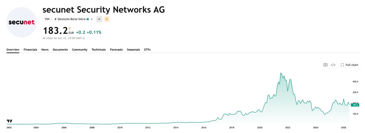
Secunet $YSN turned €1 into €200 from 2009 to 2021.
It compounds at 50% per year while suffering a max drawdown over the entire run: -40%.
A classic boring compounder that serves as the German government’s cybersecurity partner.
It faced margin pressure and heavy investment needs after 2021, but those issues are largely resolved. The long-term compounding case still looks intact.
Worth a slot in your watchlist.
4
299
A P/E is a DCF with the assumptions buried.
95% of people look at it and ask whether the price is cheap or expensive. That's the wrong question.
The E already encodes a complete causal chain: margin trajectory, revenue growth, CapEx cycle, etc. One number with an entire scenario folded in.
The real job is to unpack that chain, put a probability on it, and only then let P do the work it's supposed to do.
It's arguably the most misused ratio in finance. (Which, given what people do with EV/EBITDA, is a genuine achievement.)
Jun 14

Too many people on here live by GAAP ttm PE. This is probably the most misleading ratio to price a stock. “I wouldn’t touch $MELI at 42x earnings” is basically admitting you do not know how to value a business. Carry on.
1
4
489
As long as there are humans in the game, psychology will be an edge or a grave.
4
132
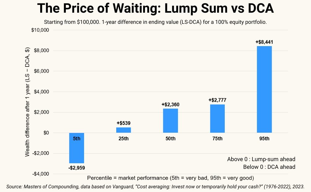
Average return with a crystal ball: 3.2%.
1/6 traders lose everything. 1/2 lose money.
Crystal ball = big macro news 1 day before everyone else.
Good information doesn't fix bad process.
2
139
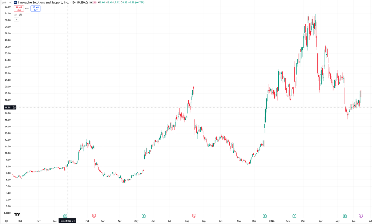
$ISSC has the potential to be my fastest 10x.
All I need is for management to continue executing like they have the past 3 years.
Worst case? The core business is already cheap, so I don’t lose much.
That’s why it’s currently 30% of my portfolio.
1
7
475
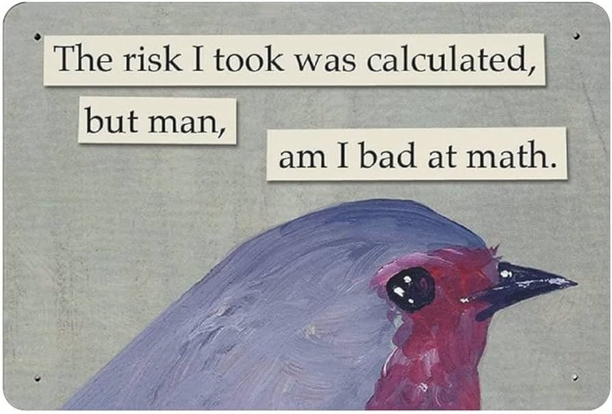
Feel free to insult me, just make it funny.
(I'm joking. Mostly. The genius here is @IndexAndForget)

1
4
174
Why would I care about SpaceX when I can buy this instead.
A US retailer posting its best revenue year, despite consumer confidence at multi-year lows and tariffs.
Clean balance sheet. 10% FCF yield. Buybacks dividend. EPS CAGR of 8% since COVID. And they’re guiding for another record year.
P/E of 7.
Time to dig back into Build-A-Bear $BBW.

5
260
If you don’t have the discipline to say “No” 50 times in a row, you have no business in microcaps.
Trash companies are everywhere. The faster the "No.", the faster you turn over rocks, the faster you find the gems.
How fast can you say "No."?
2
111
This chart has one direction. I'm taking the other side.
1975: 83% of S&P 500 value = tangible assets
2025: Only 8%
It happened on the back of globalization.
That era is ending.
I’m betting a fragmenting world order reverses this trend. Slowly, then all at once.
The companies the market is currently punishing for being “old economy” may be the compounders of the next decade.

4
186
Undiscovered Compounders retweeted
No way.
The median individual investor spends just 6 minutes researching before making a trade.
6 minutes. Median.

2
1
2
156
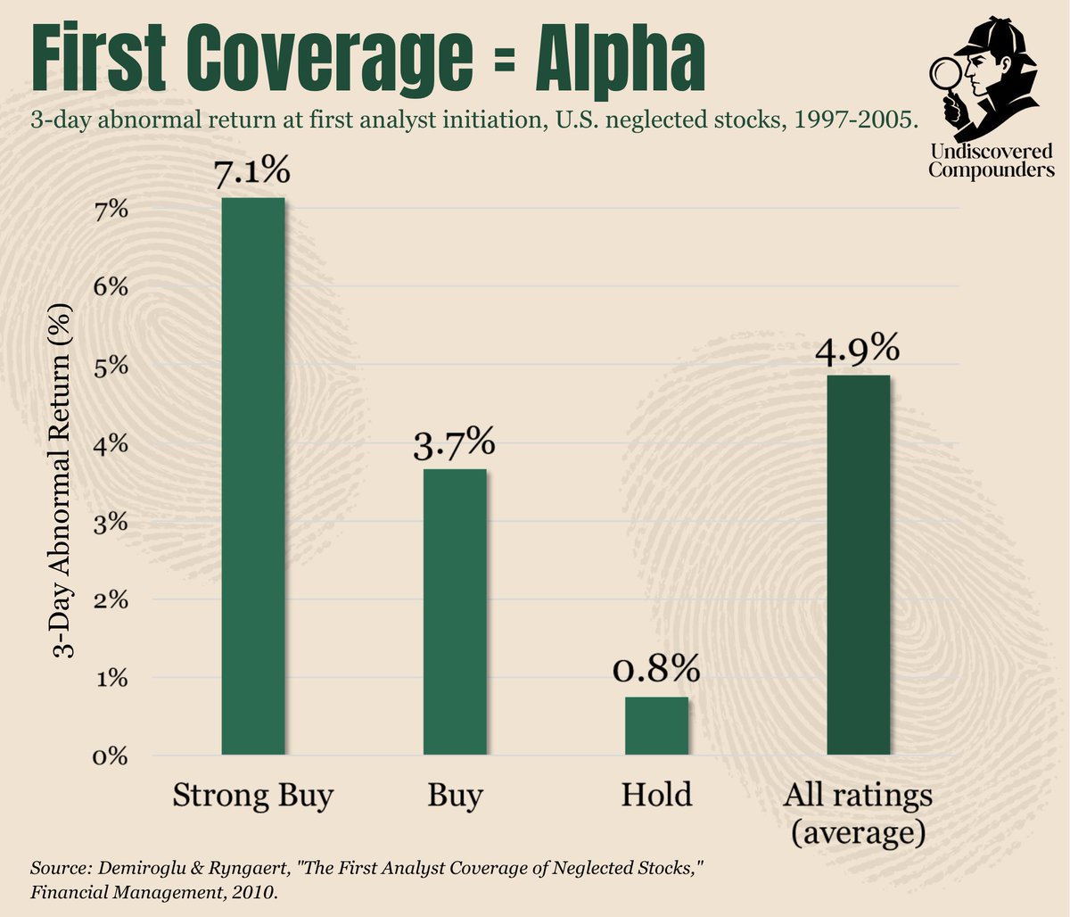
First analyst coverage on neglected U.S. stocks moved 4.9% on average over 3 days.
Strong Buy initiations delivered 7.1%.
Going from undiscovered to less undiscovered is its own catalyst.
1
1
607
Investing just became harder and easier at the same time.
More spikes. Faster fades.

4
163
For four straight quarters, $ISSC told the market Q2 would be soft, and spelled out exactly why.
The quarter came in soft. A touch above guidance, even.
Of course, the stock dropped 30%.
Same script as last year: down 60% for the same exact reasons, then a 4x in four months.
Thanks, Mr. Market. I gladly took the trade.
1
2
213