
Visually is the leading AI-powered A/B testing and personalization platform for Shopify. We make it ridiculously fast & simple to discover hidden revenue.
Joined April 2023
- Tweets 54
- Following 205
- Followers 161
- Likes 93
7 Photos and videos


Visually.io retweeted

Jun 11
A @Shopify brand lifted CR 6.2% by adding THIS to the announcement bar:
✂️ “COPY CODE” next to the coupon
That’s it.
WHY IT WORKS
A good offer already creates intent.
Copying the code increases commitment and moves shoppers closer to purchase.
Higher commitment → higher chance to buy.
TIP: save this post for BFCM
Takes minutes to A/B test with @Visuallyio
Try for free: bit.ly/visuallyio
1
1
6
23,368
Visually.io retweeted
Jun 10
Bogg Bag has already built a successful 9-figure brand, but they’re not slowing down.
Their ecommerce team is growth-focused, CRO-savvy, and fueled by an impressive experimentation roadmap.
So when Madison Johnson shared this, it meant a lot:
>> "Visually has changed how I work"
>> "Our roadmap grows bigger every day"
>> "We finally have a tool - and a partner - that can execute, optimize, and strategize at the speed we need."
>> "I've tried other testing and personalization tools but nothing compares."
Madison and the entire @boggbag team, thank you.
We're grateful to be part of your journey 🚀

1
11
379,454
Visually.io retweeted
Jun 9
A @Shopify brand boosted 🔎 search bar conversions by 10.5% with one addition.
>> Product recommendations. That’s it.
WHY IT WORKS
Shoppers who open search have intent, but they don’t always know exactly what to search for.
Showing personalized product recs right away:
faster discovery → more purchases.
PRO TIP
Prioritize relevant overstocked products to kill two birds with one stone:
1 - Increase conversion rate
2 - Reduce excess inventory
Takes minutes to A/B test with @Visuallyio
Try for free: bit.ly/visuallyio
4
1
13
57,074
Visually.io retweeted
Jun 8
A “Quick Add” lifted revenue by 4.2%. BUT the real win WASN’T “faster add to cart”…
It was answering the “do you have my size?” question - instantly.
And here’s the twist most brands miss:
HOW you implement “Quick Add” is the whole game.
TWO OPTIONS:
1. Size-on-hover/click
Seen on: @aloyoga, @Gymshark, @FashionNova
Hover/click a product card → available sizes show immediately
Zero extra clicks
Less back-and-forth → better experience → more revenue
2. Expand-on-click
Seen on: Windsor Fashions , @SPANX
Click “Quick Add” → expanded view with sizes/variants
Better when there are more nuanced selections to make prior to adding to cart
IMPORTANT NOTE:
“Quick Add” can backfire for:
- Non-apparel
- High-consideration products
(where “quick” skips info people actually need)
Want to know what’ll work best for your audience?
A/B test it.
Launch it in minutes with @Visuallyio Copilot
(currently available on Shopify): bit.ly/visuallyio
4
1
8
75,408
Visually.io retweeted
Jun 4
A @Shopify brand increased CR by 11.5% by changing ONE thing in the PDP.
👉 They expanded the product description.
That's it.
WHY IT WORKED?
First, it doesn’t always work. For visual-first products, the info is often better collapsed.
But for function-focused products, collapsing the description can hide the reason to buy.
• The benefits
• The value
• The "I need this" moment
And that can quietly cost you conversions.
THE INTERESTING PART?
It's not just product-dependent.
It can also vary by audience (new / returning).
Want to know what works best for YOUR store?
Don’t guess.
A/B test.
With @Visuallyio, you can test it by audience in minutes.
3
1
13
134,328
Visually.io retweeted
Jun 3
A Shopify apparel brand increased CR by 9.9% by adding THIS to out-of-stock PDPs:
👉 Similar product recommendations.
That's all.
WHY IT WORKS
Think about the typical shopper’s out-of-stock experience:
>> The product they want is unavailable
>> They leave or search for alternatives
Even with a “Notify Me” button, the customer still isn’t buying NOW.
Showing relevant alternatives right away turns a
frustrating dead end into another path to purchase.
Less searching. Less friction. More conversions.
Takes minutes to A/B test with @Visuallyio
Try for free: bit.ly/visuallyio
2
2
12
154,214
Visually.io retweeted
Jun 2
A @Shopify brand lifted CR by 4.6% using SMART product badges. Here’s how:
Badges are an elegant way to communicate without cluttering the experience.
Examples:
1. “High Compression”, “Ultra light” = Smart filtering
Let shoppers scan what matters most to them without reading a single bullet point.
2. “Low Stock” = Urgency
This isn’t fake FOMO.
If something’s actually running out - say it.
It moves people from “maybe later” to “I need this now.”
3. “Best Seller”, “Back in stock” = Social proof
This tells shoppers: others loved it → you probably will too.
Want to know what’ll work best for your audience?
A/B test it.
Takes minutes with Visually: bit.ly/visuallyio
1
1
12
173,383
Visually.io retweeted
Jun 1
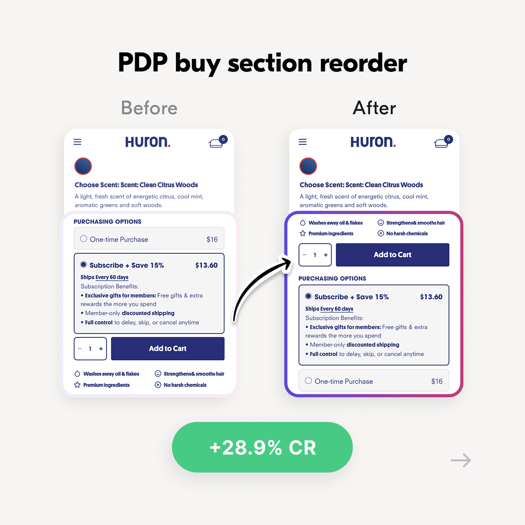
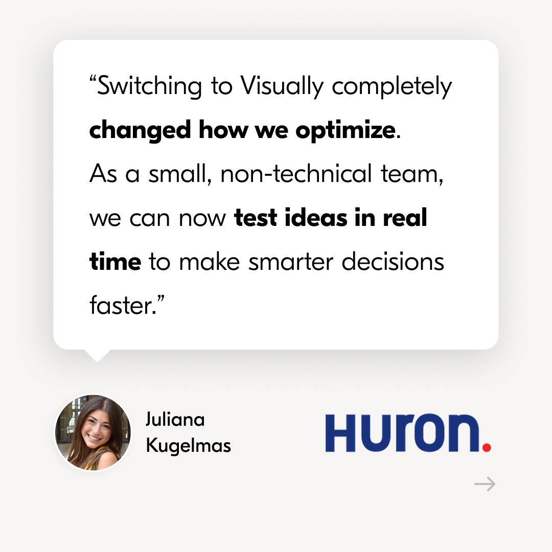
33.3% more revenue in 7 months 😱
Huron, the men's personal care brand, had a problem:
A lean team, limited dev resources, and an A/B testing tool that turned every test into a project.
So they switched to @Visuallyio
“Switching to Visually completely changed how we optimize. As a small, non-technical team, we can now test ideas in real time to make smarter decisions faster.”
Juliana Kugelmas, Senior Growth Strategy Manager
3 of the winning tests behind the growth:
1) Reordered the PDP buy section
CTA first, subscription pre-selected, one-time purchase last.
Result: 28.9% subscriptions
(with no drop in CR)
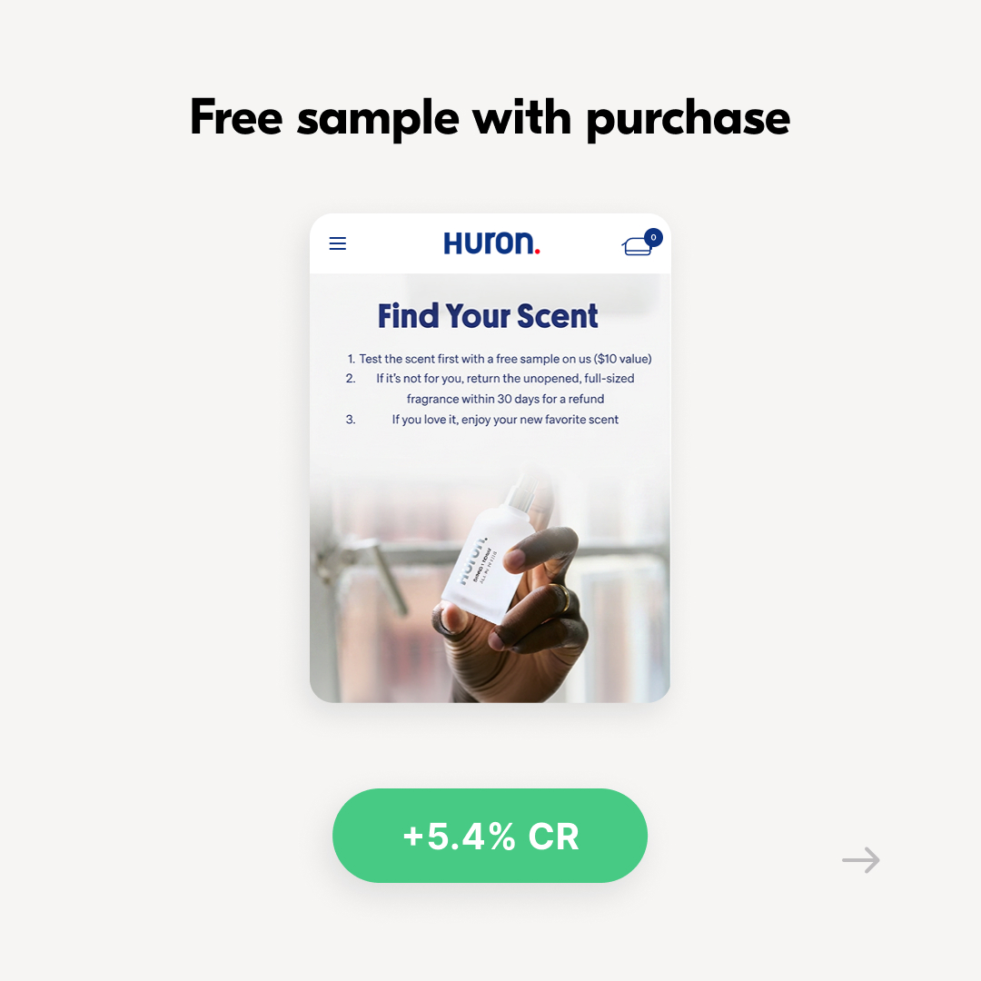
2) Added free samples to cologne purchases
Lower risk (full-size returns available) higher perceived value = more orders.
Result: 5.4% CR
(with no increase in returns)
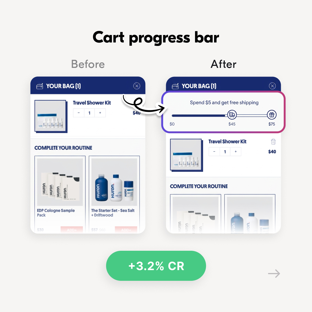
3) Added a cart progress bar
Free shipping free gift incentives increased cart sizes.
Result: 3.2% AOV
Behind these wins is a team deeply committed to
testing, learning, and continuous growth:
→ 107 tests launched
→ 33.3% revenue lift
Can’t wait to see what they uncover next!
5
3
32
1,066,814
Visually.io retweeted
May 27
A @Shopify brand boosted desktop conversions 5.1% by changing ONE thing.
The cart drawer width.
That’s it.
WHY IT WORKS:
On mobile every pixel counts, but on desktop the cart doesn’t have to feel tight.
A wider cart can mean:
- More products visible at once
- Less clutter and more focus
- A larger checkout CTA
Clearer cart, clearer next step → more checkout clicks.
A/B test this for free with Visually: bit.ly/visuallyio
4
3
29
306,357

May 26
RT @AnyaGeimanson: A @Shopify brand lifted CR 4.2% and AOV 2.8% by removing ONE thing from the collection page.
The “Load More” button.…
1
29
Visually.io retweeted
May 25
A @Shopify brand grew revenue 7.6% by adding ONE thing to the cart.
They added social proof.
WHY IT WORKS:
• The cart is where doubt lives.
Showing reviews in the cart kills hesitation at the exact moment it matters most.
• Cart returners skip your product page.
People who come back from retargeting or email often land straight in the cart.
They never see PDP reviews.
Less doubt → fewer removals → more checkouts.
IMPORTANT TO NOTE:
• Per-product reviews shine with smaller catalogs.
• Some brands win by showing the amount of reviews for the entire store
DON’T ASSUME - A/B TEST IT:
It’s faster than ever with @Visuallyio Copilot:
1. Connect Visually to Shopify → one-click install, zero code, no contracts
2. Describe the A/B test you want to run
3. Let the AI build it in minutes
Try it now for free: bit.ly/visuallyio
2
3
24
311,704
Visually.io retweeted
May 21
A @Shopify brand lifted CR 8.8% by ensuring ONE thing was visible right away.
The homepage CTA.
Many brands don’t realize their CTA falls below the fold on some devices, or the impact it has.
WHY IT WORKS:
When the CTA is above the fold, shoppers know where to go right away.
No waiting. No scrolling. No friction.
Faster navigation → more product views → more purchases.
Takes minutes to A/B test with @Visuallyio
2
6
34
620,039
Visually.io retweeted
May 20
A @Shopify brand boosted add-to-cart rate 7.1% by adding ONE thing to the collection page.
Product reviews.
That’s it.
WHY IT WORKS:
When shoppers see others buying and loving
products from the store, it builds trust and reduces hesitation.
More trust = more add-to-carts
IMPORTANT
Products with a very low review count can have
the opposite effect, so set a minimum review threshold.
Takes minutes to set up and A/B test with @Visuallyio Copilot.
3
3
37
511,088
Visually.io retweeted
May 19
Adidas & Nike use image-based color swatches. So why don’t most @Shopify brands?
IMAGE-BASED SWATCHES
Used by: Adidas, @Nike
Pros:
1️⃣ Better for complex variations
When “color” isn’t just color: patterns, finishes, materials
2️⃣ Feels more premium
Especially in fashion
ICON-BASED SWATCHES
Used by: @skims , @rothys
Pros:
1️⃣ Lower maintenance overhead
Just define color values once in the system
2️⃣ Cleaner for large assortments
Especially when you have lots of SKUs
So what’s the RIGHT solution for your brand?
Why risk revenue with guesswork when you can decide based on data?
A/B test it.
(Built with @Visuallyio Copilot in minutes 🎉)
1
1
7
351
Visually.io retweeted
May 18
A @Shopify EU brand selling in the US grew revenue 7.2% by adding ONE sentence.
They added:
“Designed at {Company HQ Location}.”
That’s it.
WHY IT WORKS:
- Adds credibility (real place, real team)
- Signals premium without saying “premium”
More received value → more checkouts.
IMPORTANT TO NOTE:
This can backfire if your HQ location doesn’t help perception for YOUR audience.
Don’t assume.
A/B test it.
5
8
69
909,888
Visually.io retweeted
May 14
A @Shopify brand increased subscriptions by 5.7% (and sales by 2.5%!)
by adding ONE line
to carts with at least 1 subscription item:
“Subscription? Edit or cancel from your account anytime”
That’s it.
WHY IT WORKS:
With subscriptions, the decision is more complex
so once shoppers reach the cart, hesitation kicks in:
• “Will I be locked in?”
• “Is this hard to manage?”
A simple reassurance in the cart reduces friction at the exact moment shoppers need confidence.
More clarity → fewer doubts → more conversions
Takes minutes to set up and A/B test with @Visuallyio Copilot.
2
1
20
364,012
Visually.io retweeted
May 13
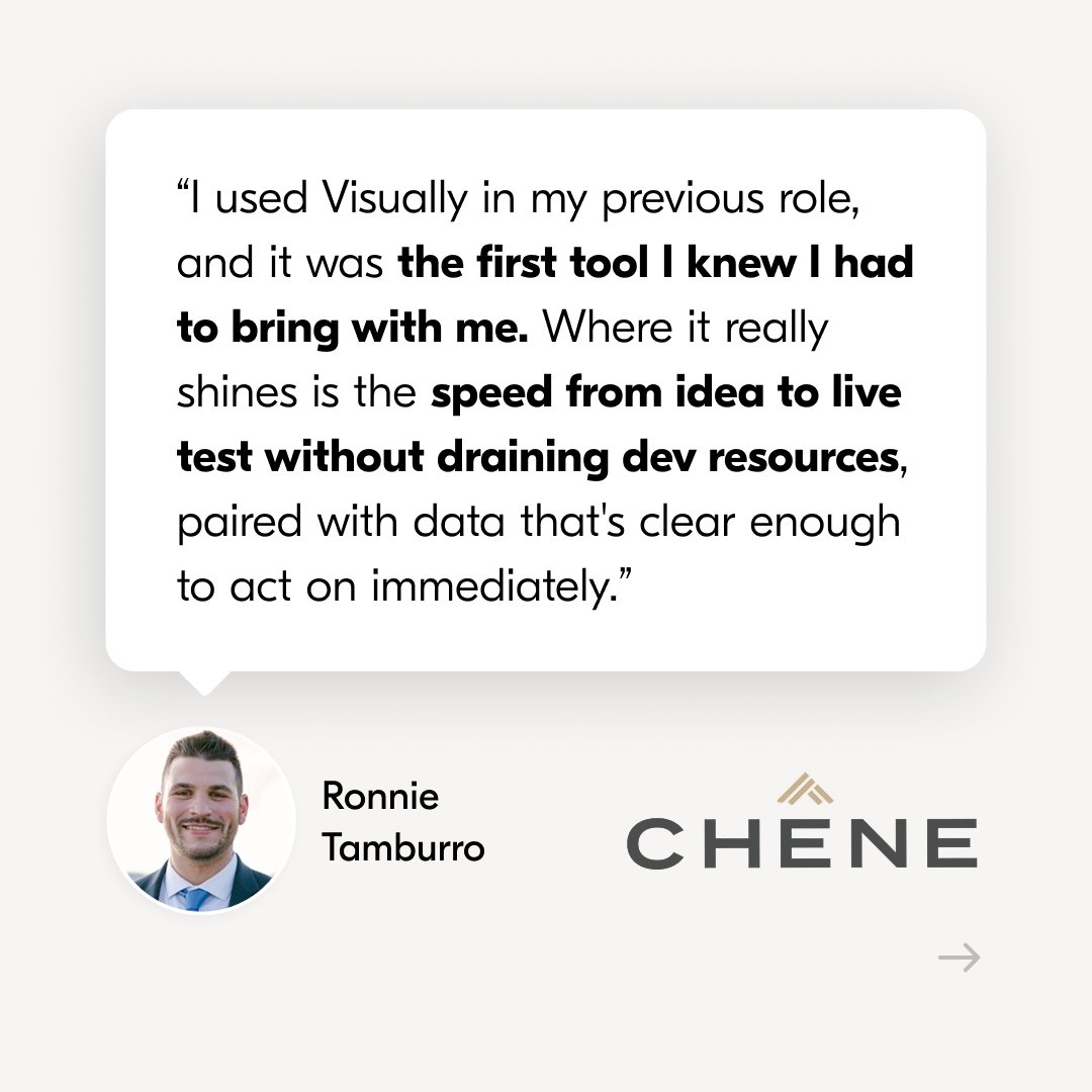
22% more sales in only 3 months (also 12,437% ROI 😱) for Chêne Gear, the premium outdoor apparel brand, built on @Shopify .
When Ronnie Tamburro joined the company as the eCommerce Manager, there was
ONE thing he knew he must do.
Install @Visuallyio .
“I used Visually in my previous role, and it was the first tool I knew I had to bring with me. Where it really shines is the speed from idea to live test without draining dev resources, paired with data that's clear enough to act on immediately.”
Ronnie Tamburro, eCommerce Manager
He knew it’ll let him:
👉 Launch multiple tests fast without dev
👉 Personalize the user experience
👉 Easily learn and scale what works
👉 Move faster & smarter with CRO expert support
Soon after implementing Visually, the team began seeing significant KPI uplifts.
Here are 3 of the A/B tests that drove the lift:
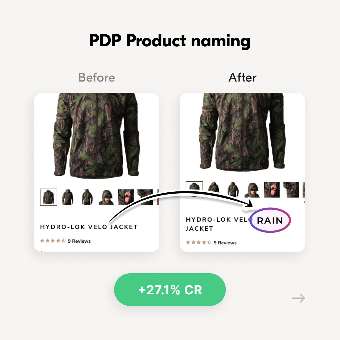
1️⃣ PDP: Product naming optimization
The team noticed the product names didn’t highlight value,
so they tested adding key benefits to the titles.
Result: 27.1% uplift in conversion rate
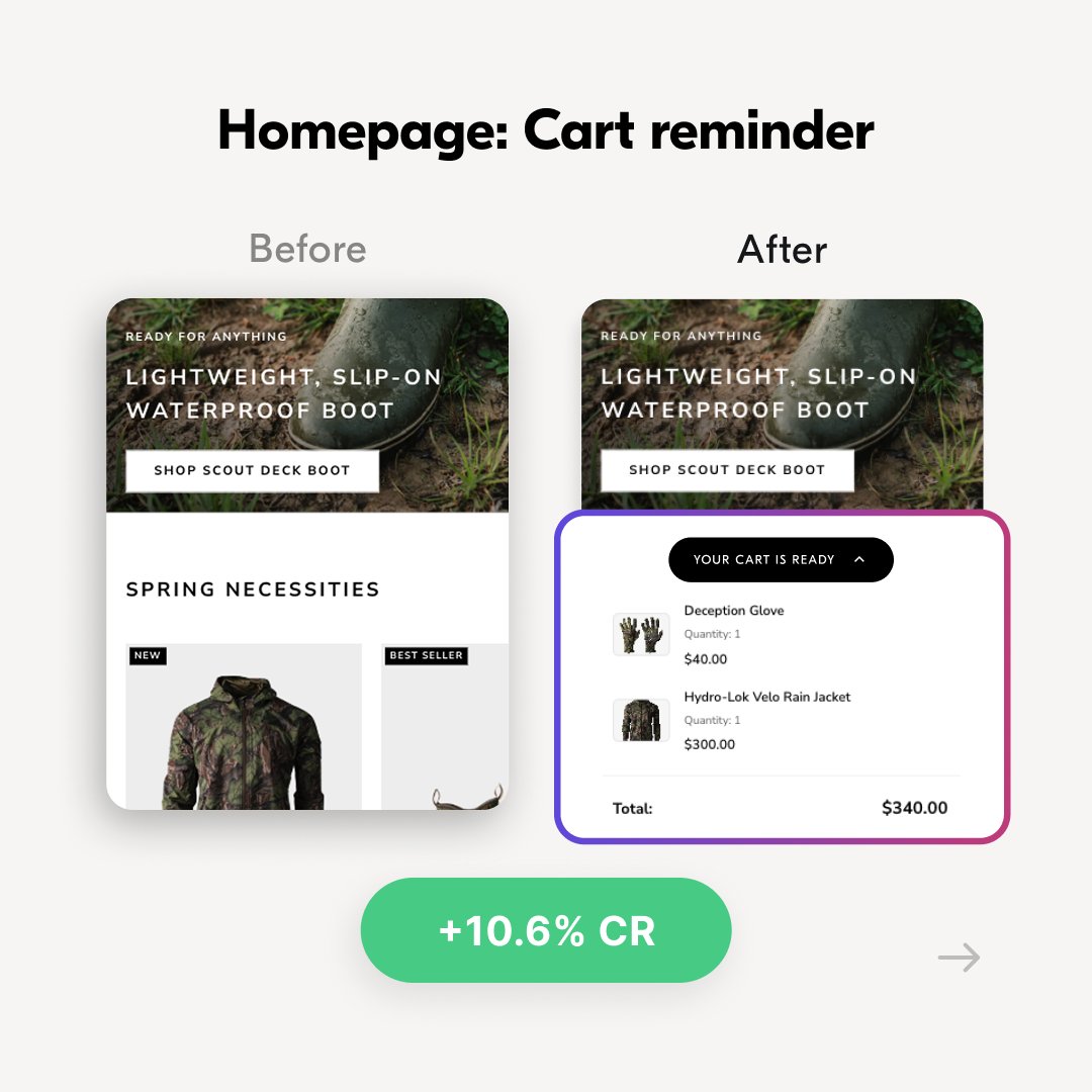
2️⃣ Homepage: Cart reminder
The team tested a cart reminder for returning visitors,
encouraging them to complete their purchase.
Result: 10.63% uplift in conversion rate
3️⃣ Personalized countdown timer
To add urgency, they tested a geo-targeted countdown timer
based on each visitor’s state-specific hunting season.
Result: 40.8% uplift in conversion rate.
-----
What’s most impressive about the Chêne Gear team isn’t just the wins.
This is a team that truly understands their customers, moves fast, and knows how to turn small insights into meaningful revenue impact.
That’s how great teams turn experimentation into compounding growth 🔥

6
1
39
1,108,473
Visually.io retweeted
May 12
Here’s a personalization tactic that feels invisible…but drives more product exploration 👀
Because the best personalizations don’t feel like “personalization.”
They feel like good UX.
EXAMPLE:
On a collection page, show a tiny peek of the next product image.
Only for shoppers who haven’t interacted with this feature before.
WHY IT WORKS:
• It guides to exploration without adding clutter
• It’s personalized based on prior interaction
RESULT:
Better collection exploration → more product views → more add-to-carts
(Built in minutes with @Visuallyio...)
5
3
22
276,092
Visually.io retweeted
May 11
A @Shopify apparel brand increased sales by 7.8% by adding ONE toggle.
A front / back view for PLP images.
That’s it.
WHY IT WORKED:
In apparel, especially swimwear,
the back view is just as important.
Being able to quickly scan and compare the back
helps shoppers find what they want faster.
Faster decisions → more sales
Takes minutes to set up and A/B test with @Visuallyio Copilot.
2
3
37
295,887
Visually.io retweeted
May 7
A @Shopify brand lifted conversion 8.5% by adding ONE LINE at checkout.
They added:
“Congrats, you’ve got free shipping 🎉”
(Only for users that crossed the shipping threashold*)
That’s it.
WHY IT WORKED:
Checkout is where doubt gets loud.
The shopper is thinking:
• “Is this worth it?”
• “Should I wait?”
When you confirm the win (free shipping unlocked) → you REFOCUS users from doubt to progress.
DO IT SMART:
A/B test micro-reassurance lines, to find what resonates with YOUR audience.
Or even better - specific segments within your audience (i.e. new vs returning, collection / product type)
*Adding a video showing how to set this up BY SEGMENT in the comments.
7
1
38
488,633