Joined February 2025
- Tweets 24,122
- Following 1,380
- Followers 1,389
- Likes 27,369
728 Photos and videos


Pinned Tweet

21h
goodmorning frens 🫶
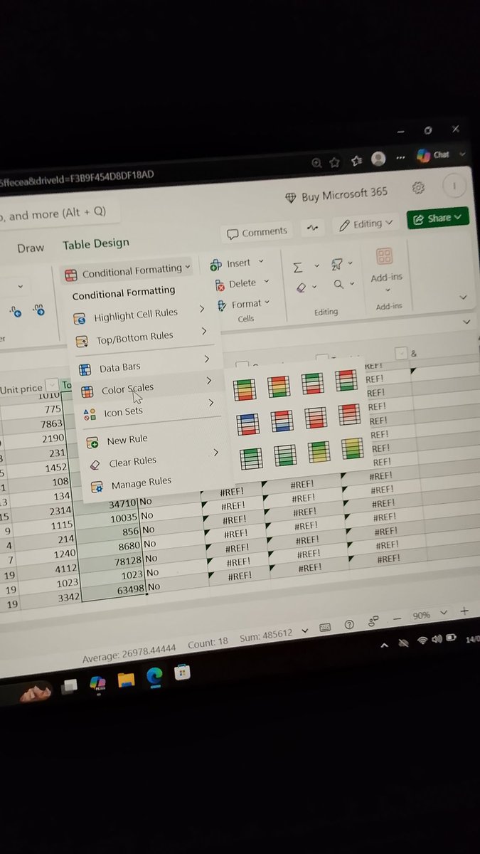
today, we explored color scales, a formatting feature that uses different colors to highlight values in a dataset, making it easier to identify patterns, compare results and spot trends quickly...
we also covered icon sets, which use symbols like arrows or flags to visually represent data, helping users understand performance or changes at a glance without reading every value.


Jun 13

good morning frens 🫶
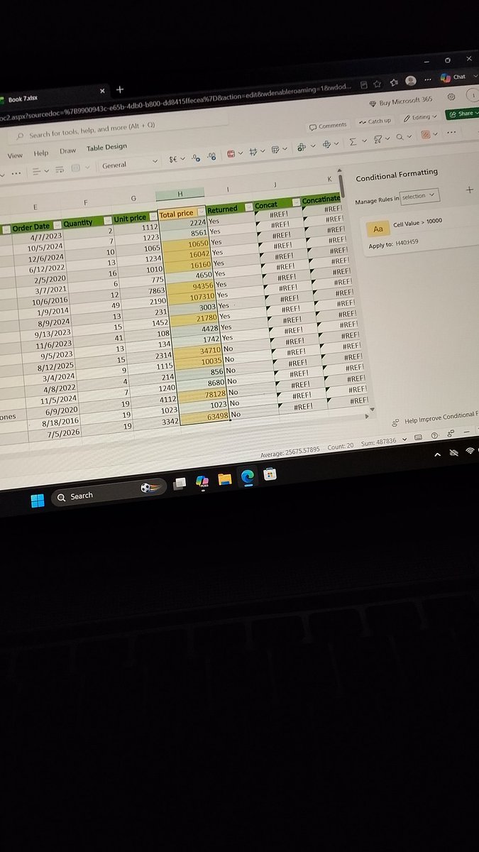
in today’s learning session we explored another powerful part of conditional formatting in excel.
which is top/bottom rules (top 10 Items, top 10%, bottom 10 Items, bottom 10%, above average, and below average)
these features make it much easier to identify trends and highlight important data at a glance.
with that covered, i'm now moving on to data bars, a visual tool that helps represent values directly within cells and makes data interpretation even more intuitive👌...


53
3
60
604
Thugg retweeted
21h
goodmorning frens 🫶
today, we explored color scales, a formatting feature that uses different colors to highlight values in a dataset, making it easier to identify patterns, compare results and spot trends quickly...
we also covered icon sets, which use symbols like arrows or flags to visually represent data, helping users understand performance or changes at a glance without reading every value.
Jun 13
good morning frens 🫶
in today’s learning session we explored another powerful part of conditional formatting in excel.
which is top/bottom rules (top 10 Items, top 10%, bottom 10 Items, bottom 10%, above average, and below average)
these features make it much easier to identify trends and highlight important data at a glance.
with that covered, i'm now moving on to data bars, a visual tool that helps represent values directly within cells and makes data interpretation even more intuitive👌...
53
3
60
604
Thugg retweeted

Morning
With a focus on accessibility, efficiency, and long-term sustainability
@NomismaNetwork is building toward a more connected digital future.
Most projects chase quick hype and disappear when incentives fade. Nomisma is building infrastructure that actually works—smooth UX, seamless trades, zero friction.
Accessibility isn't just a buzzword here. It's how the platform feels: clean execution that anyone can use without fighting the interface.
Efficiency isn't about speed alone. It's about every action contributing value to the network, not just filling a leaderboard
Sustainability isn't about surviving one season. It's about creating something that lasts when the hype dies.

Jun 13

Night
Quip Network @quipnetwork is a decentralized marketplace for quantum computing. It connects the people who need quantum compute with the operators who have it.
This is not just another crypto project. This is building the infrastructure for the next computing revolution.
Quantum computing is coming. And right now, access is locked behind expensive providers and centralized gatekeepers. Quip opens it up—anyone who needs quantum power can access it, anyone who has quantum machines can rent them out

64
23
71
13,972
Thugg retweeted
Jun 13
good morning frens 🫶
in today’s learning session we explored another powerful part of conditional formatting in excel.
which is top/bottom rules (top 10 Items, top 10%, bottom 10 Items, bottom 10%, above average, and below average)
these features make it much easier to identify trends and highlight important data at a glance.
with that covered, i'm now moving on to data bars, a visual tool that helps represent values directly within cells and makes data interpretation even more intuitive👌...
Jun 12
good morning frens 🫶
today, i spent time exploring conditional formatting and learning how to use it more effectively.
i practiced applying different colors and bold formatting to cells based on specific conditions, which helped me better understand how to make data stand out.
beyond learning the features, i took time to experiment with different examples and test how various formatting rules behave in different situations.
this gave me a deeper understanding of how conditional formatting can be used to organize and present data more effectively.


48
4
60
1,324
Thugg retweeted
Jun 12
the grind pauses for the night then continues tomorrow..
rest up fams 🫶
67
3
72
1,163
Thugg retweeted
Jun 12
good morning frens 🫶
today, i spent time exploring conditional formatting and learning how to use it more effectively.
i practiced applying different colors and bold formatting to cells based on specific conditions, which helped me better understand how to make data stand out.
beyond learning the features, i took time to experiment with different examples and test how various formatting rules behave in different situations.
this gave me a deeper understanding of how conditional formatting can be used to organize and present data more effectively.
Jun 11
good morning guys 🫶
today’s lesson was on conditional formatting and it highlighted just how impactful the right tools can be when working with data.
learning how to automatically format cells based on specific conditions makes spreadsheets more organized, visually clear and easier to interpret.
it’s a practical feature that saves time and helps important information stand out without extra effort.
overall, it’s a good reminder that even small excel features can have a big impact on how efficiently data is understood and used in real-world situations..
71
7
82
1,734
Thugg retweeted
Jun 11
good morning guys 🫶
today’s lesson was on conditional formatting and it highlighted just how impactful the right tools can be when working with data.
learning how to automatically format cells based on specific conditions makes spreadsheets more organized, visually clear and easier to interpret.
it’s a practical feature that saves time and helps important information stand out without extra effort.
overall, it’s a good reminder that even small excel features can have a big impact on how efficiently data is understood and used in real-world situations..
Jun 10
good morning frens 🫶
today i learned how small design choices can completely improve the way excel tables look and function.
we looked at features like banded rows, total row, first and last column formatting, banded columns and the filter button.
each of these helps structure data in a way that feels cleaner, more readable and easier to navigate.
the real value of these formatting tools is not in how the table looks, but in how effortlessly it allows anyone to interpret the data.


37
3
44
1,661