
Just web design tips, no bullshit.
Joined January 2023
- Tweets 186
- Following 8
- Followers 3,811
- Likes 6,578
89 Photos and videos


Pinned Tweet

23 Sep 2024
Want to start an online business?
Web design is perfect for beginners
This course will teach ALL of the technical skills you need from scratch (no experience required)
AND show you how to find clients (includes video pitches you can copy paste)
gumroad.com/a/899204307/vmyn…
1
1
8
1,727
3 Jul 2024
SOCIAL PROOF IN WEB DESIGN:
Social proof is EVERYTHING when it comes to sales.
As soon as people see your website, your social proof should be visible immediately!
You can do this by adding verification/awards badges in your hero section.
4
27
5,185
2 Jul 2024
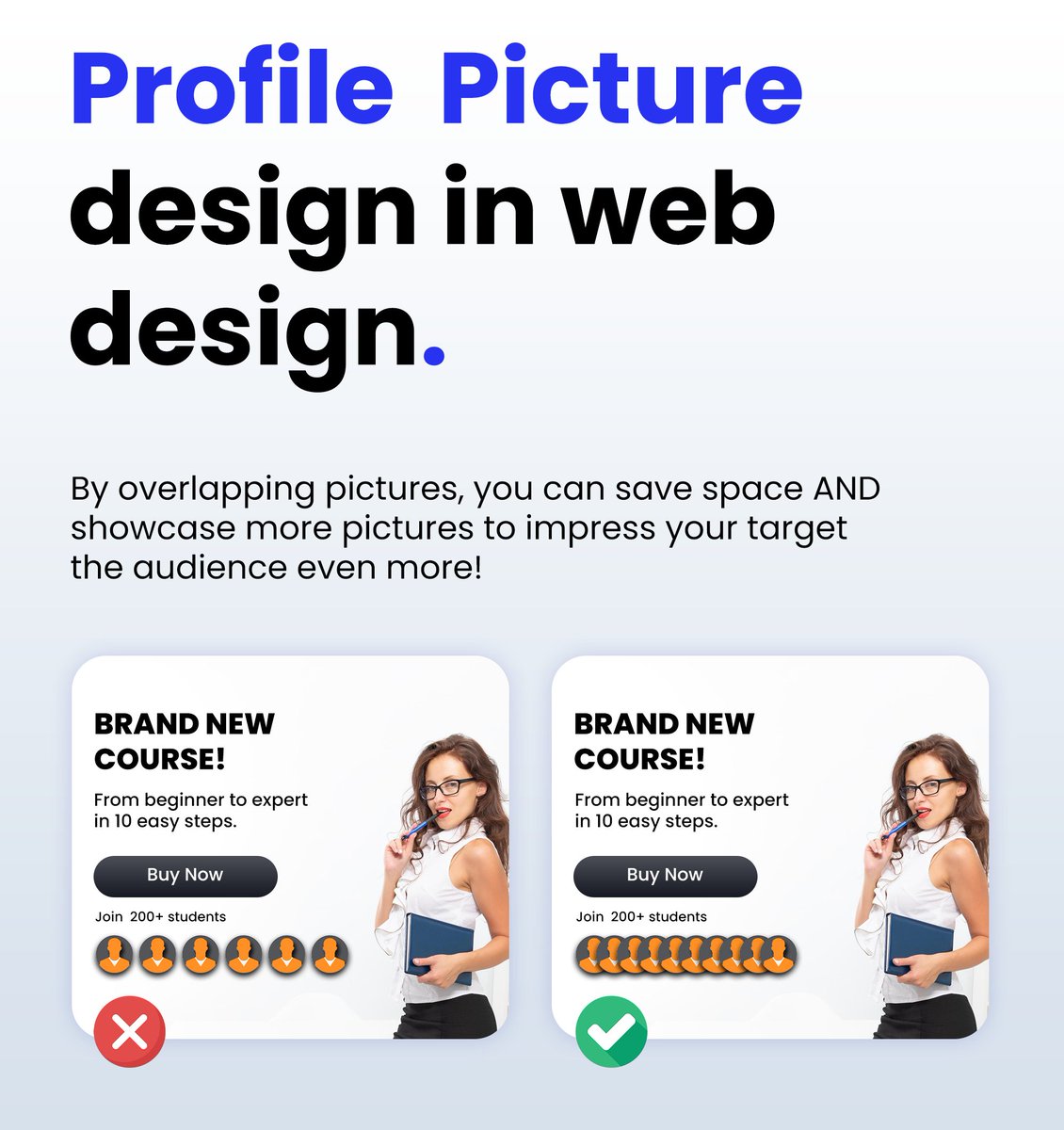
Using profile pictures in Web Design:
When using profile pictures for your landing pages or websites, always overlap them.
You don't have enough space to show off your social proof if you choose to place profile pictures next to each other.
1
14
1,637
28 Jun 2024
🚩Rookie mistake I see very often!
Many people underline their call to action and then wonder why their website & landing pages aren't converting.
You NEED to create a button that can't be missed!
This mistake is very common on squeeze pages with email signups & lead magnets
1
3
21
4,826
26 Jun 2024
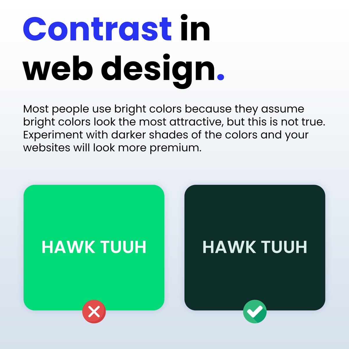
CONTRAST IN WEB DESIGN:
Most people use bright colors because they assume bright colors look the most attractive, but this is not true🚩
Experiment with darker shades of the colors and your websites will start to look modern and premium!
11
1,036
25 Jun 2024
NUMBERS IN WEB DESIGN:
This is a rookie mistake that I see too often with new businesses.
Use digits instead of letters for numbers.
People hate reading numbers when they are written in letters, it makes it difficult to understand what you are trying to say.
Digits are more user-friendly and convert higher!
1
2
11
974
24 Jun 2024
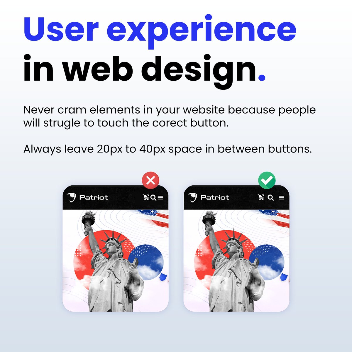
USER EXPERIENCE IN WEB DESIGN:
Ever got annoyed because you "touched" the wrong button on your phone by mistake?
Your website Vistors might be experiencing the same problem!
Never cram elements in your website because people will struggle to touch the correct button.
Always leave 20px to 40px space in between buttons.
3
14
3,957
12 Jun 2024
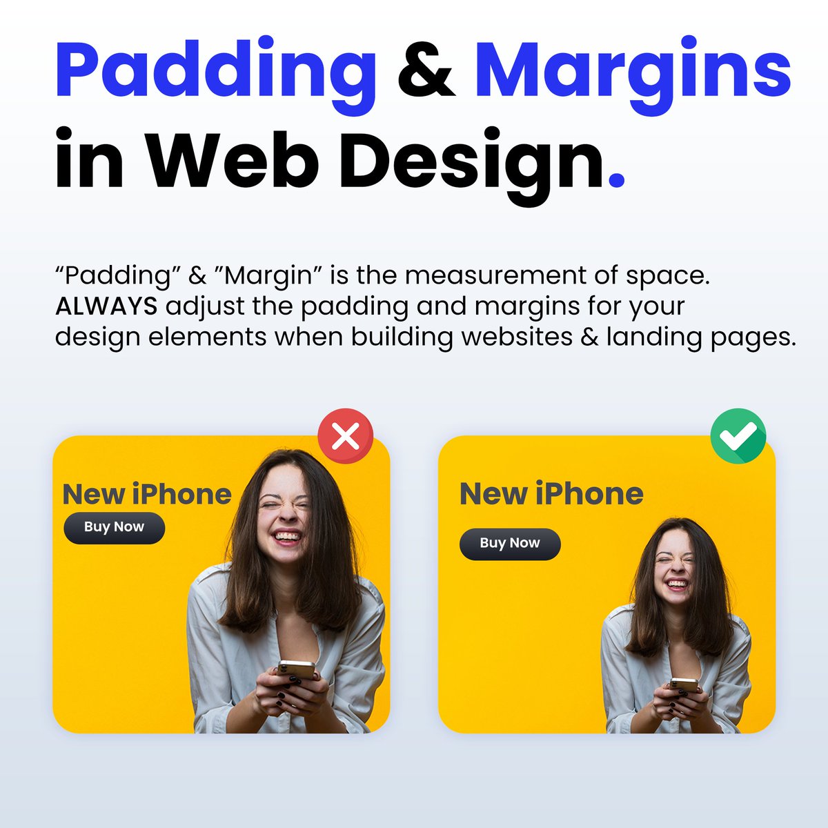
Padding & Margins in Web Design:
“Padding” & "Margin” is the measurement of space.
ALWAYS adjust the padding and margins for your design elements when building websites & landing pages.
1
17
4,259
7 Jun 2024
Mobile Navigation Menu Design in Website Design:
Always use a hamburger menu for mobile devices when building your websites.
✅ Case studies show that hamburger menus have a higher engagement and conversation rate.
✅ Hamburger menus make it so much easier to navigate the website.
✅ People are used to websites having hamburger menus so it feels familiar and they already know how to use it.
7
932
6 Jun 2024
Blog Post Layouts in Website Design:
Never complicate your blog post design.
No one cares how fancy the blog looks. People are more interested in how easy three websites are to use.
Keep your blog post design simple and clean.
9
829
4 Jun 2024
Landing Page Web Design Tip:
❌ Don't use a small CTA Button at the top/bottom of the page, because it is annoying to find the button.
✅ Create a floating CTA Button at the bottom of the page for Mobile devices. This maximizes conversions by making the button accessible 100% of the time.
1
2
4
869
3 Jun 2024
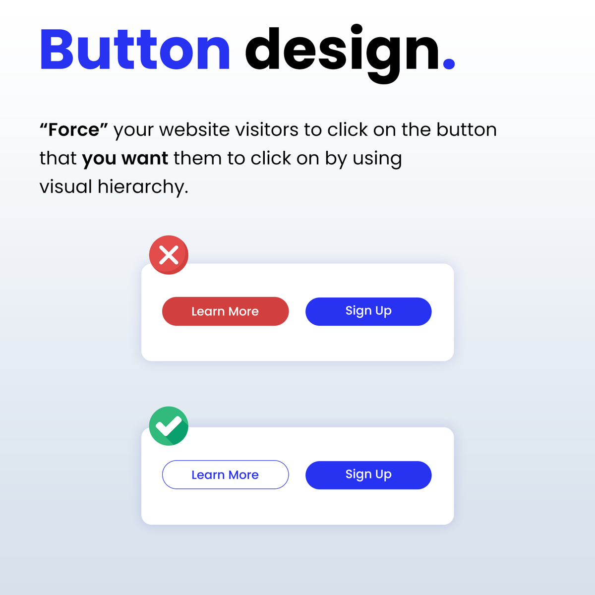
BUTTON DESIGN IN WEBSITE DESIGN:
“Force” your website visitors to click on the button that you want them to click on by using visual hierarchy.
You can do this by making the CTA button more prominent than the other buttons.
2
3
16
4,240
19 Apr 2024
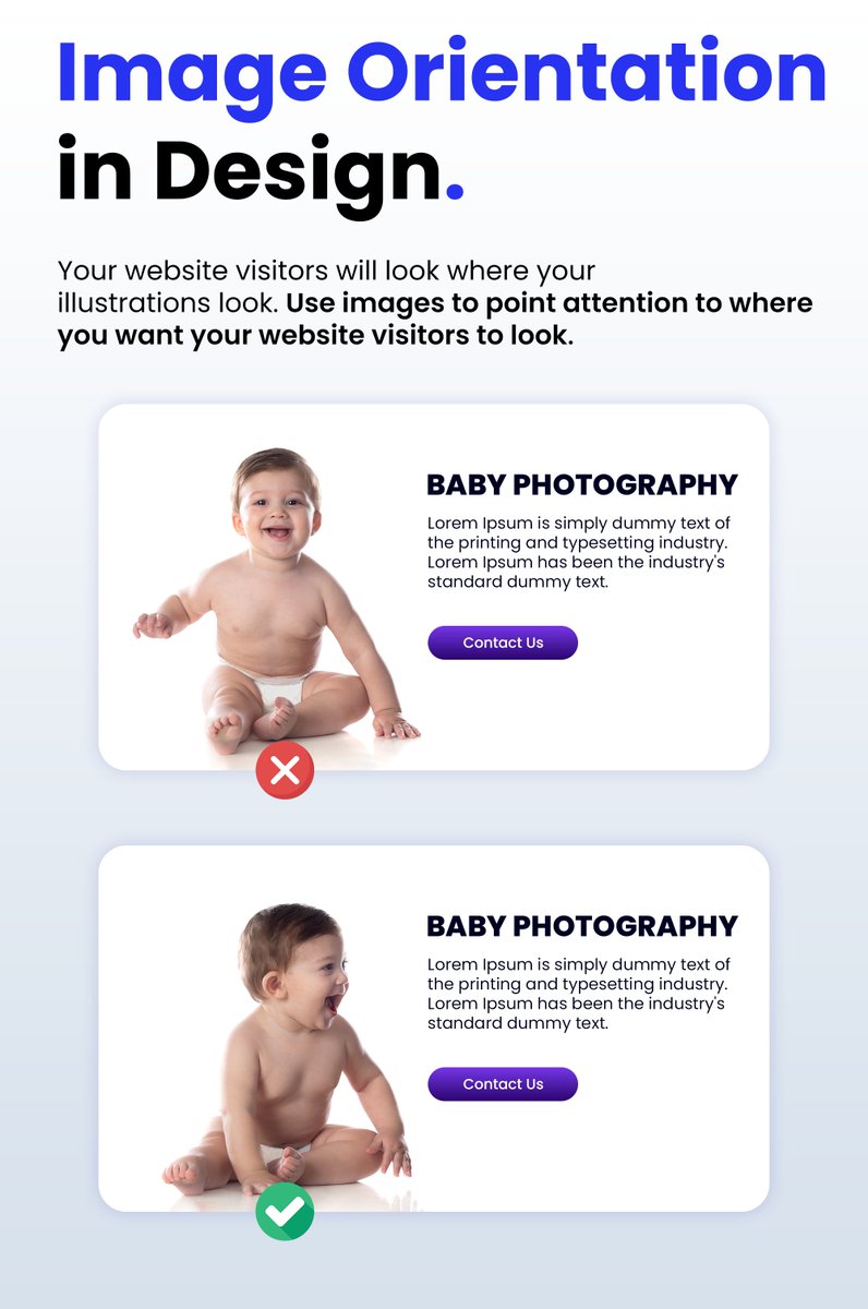
Image Orientation in Web Design:
Your website visitors will look where your illustrations look.
Use images to point attention to where you want your website visitors to look.
1
2
21
4,132
18 Apr 2024
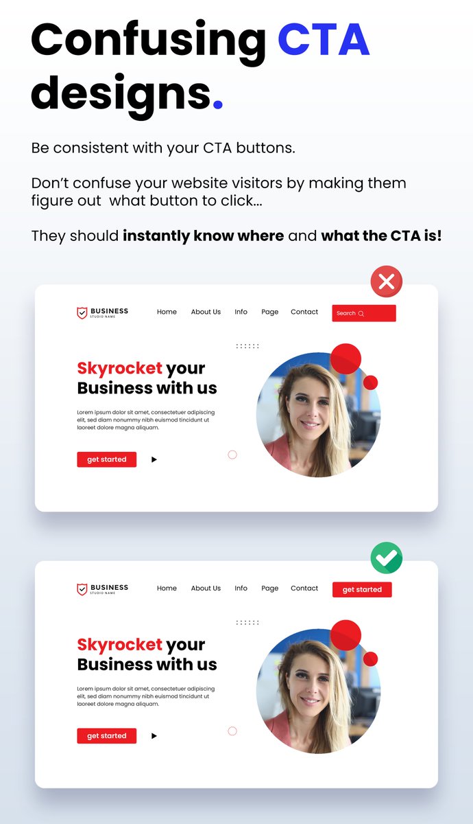
Confusing CTA Designs:
Be consistent with your CTA buttons.
Don’t confuse your website visitors by making them figure out what button to click...
They should instantly know where and what the CTA is!
1
1
11
1,150
17 Apr 2024
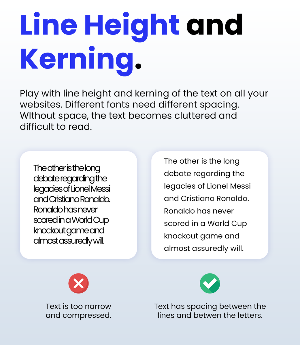
Line Height & Kerning in Web Design:
Don't be afraid to use space between the lines, especially on Mobile Responsive websites.
2
16
3,993
16 Apr 2024
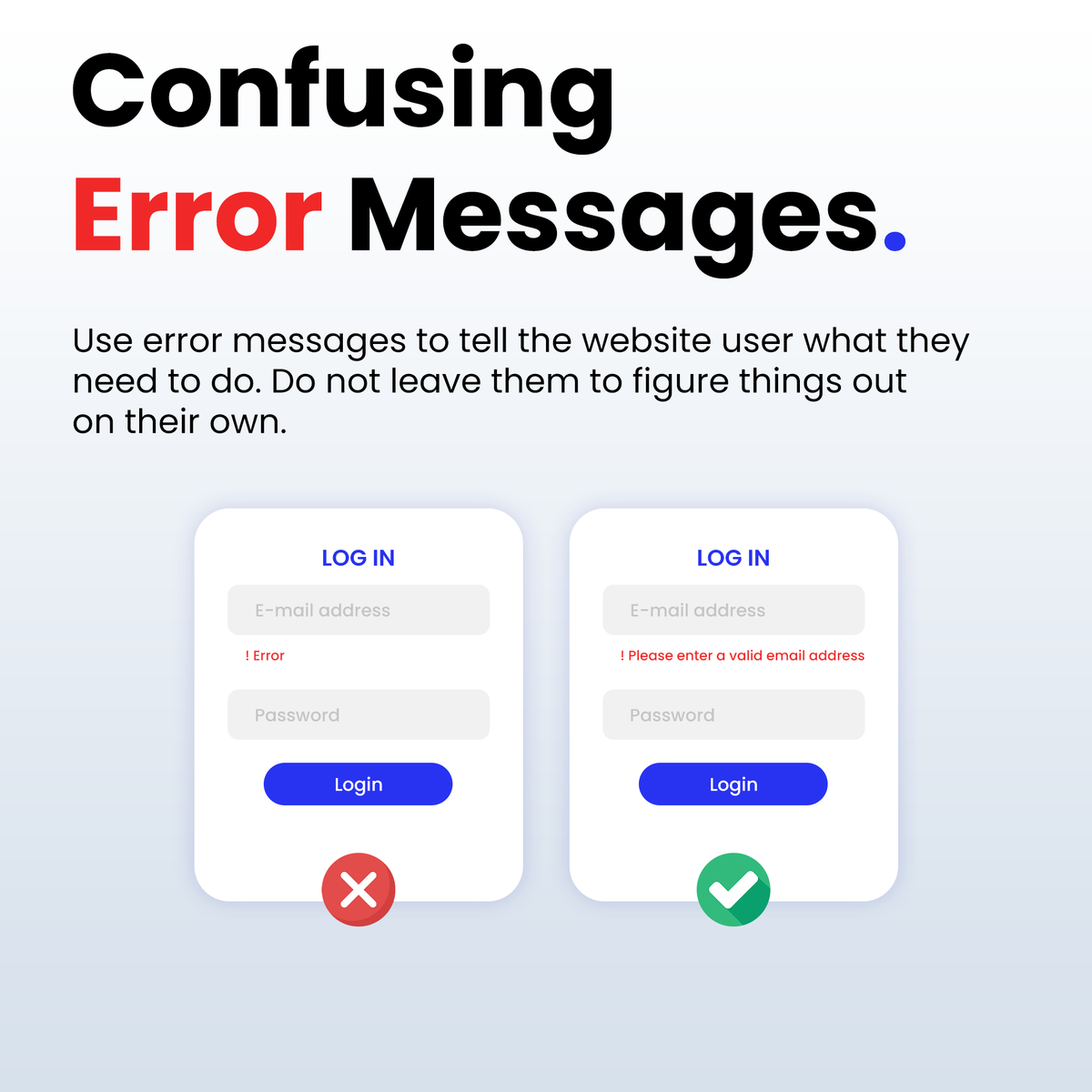
Confusing Error Messages!
When creating forms in Web Design.
Use error messages to tell the website user what they need to do.
Do not leave them to figure things out on their own.
1
2
13
3,996
15 Apr 2024
Checkout Conversion Hack!
Add bullet points next to the checkout button to
make customers feel more motivated to spend money.
This works well in web design when it comes to build websites like E-Commerce stores.

1
14
4,107
5 Apr 2024
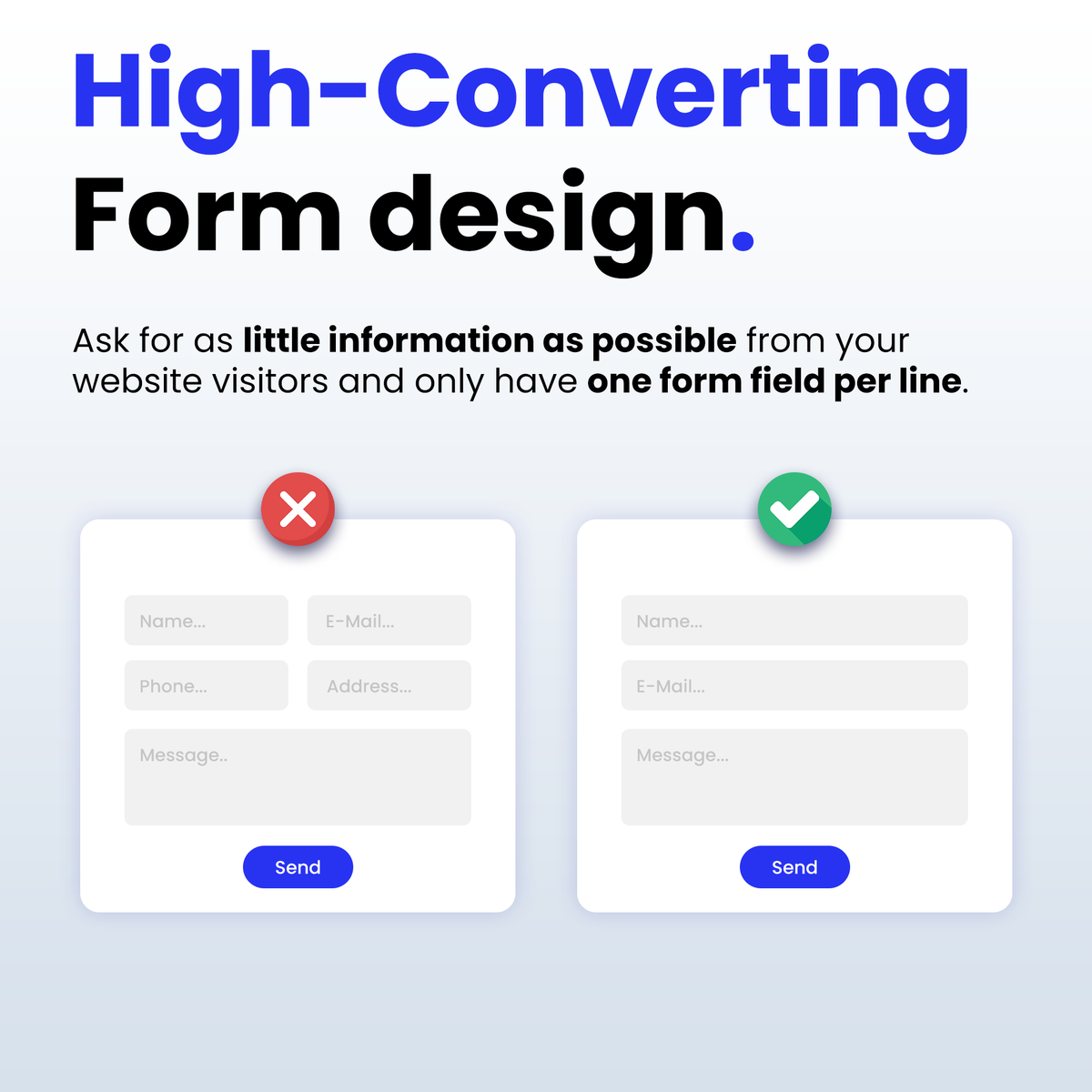
HIGH-CONVERTING FORMS IN WEB DESIGN:
Ask for as little information as possible from your
website visitors and only have one form field per line.
2
1
14
4,437
18 Jul 2023
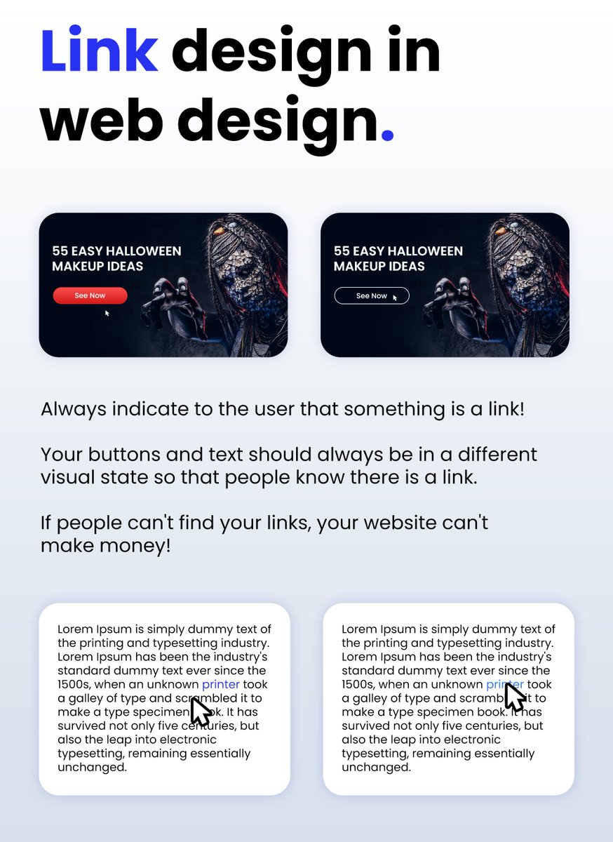
COMMON MISTAKE IN WEB DESIGN:
Always indicate to the user that something is a link!
Your buttons and text should always be in a different
visual state so that people know there is a link.
If people can't find your links, your website can't
make money!
3
5
27
3,500