
Just some guy
Joined January 2023
- Tweets 484
- Following 232
- Followers 48
- Likes 1,532
68 Photos and videos


Rizz G retweeted

This angle clearly shows the ICE agent being hit and dragged on by the car. Could have easily killed him.
6,077
12,105
45,460
6,336,111
Rizz G retweeted

Jan 7
3,619
28,944
168,089
5,830,466
Rizz G retweeted

17 Sep 2025
Shocking Video: Watch Leftist Mouthpiece "Destiny" Brag About Planning To Murder A Family, Blame President Trump For Charlie Kirk's Assassination, Call For More Conservative Deaths At Rallies, Wish For The Death of Devin Nunes.
We Are Live Now Breaking It All Down:
x.com/RealAlexJones/status/1…
17 Sep 2025

Hard Facts Are Revealed, MSM Now Forced To Admit That Charlie Kirk’s Killer Was A Leftist Trans Worshiper & Gush That It’s A “Touching” Love Story As Law Enforcement Closes In On Queer/Trans Death Cult Militia With Prior Knowledge Of Kirk’s Assassination! x.com/i/broadcasts/1jMJgRWvr…
741
3,894
14,260
1,139,203
Rizz G retweeted

8 Sep 2025
BREAKING - The French government collapses.
And now they are now demanding impeachment or resignation of Macron.
The entire country will be brought to a standstill in 2 days time as the people take to the streets to demand change.
We hear you France 🔥
4,429
31,423
150,723
6,864,629

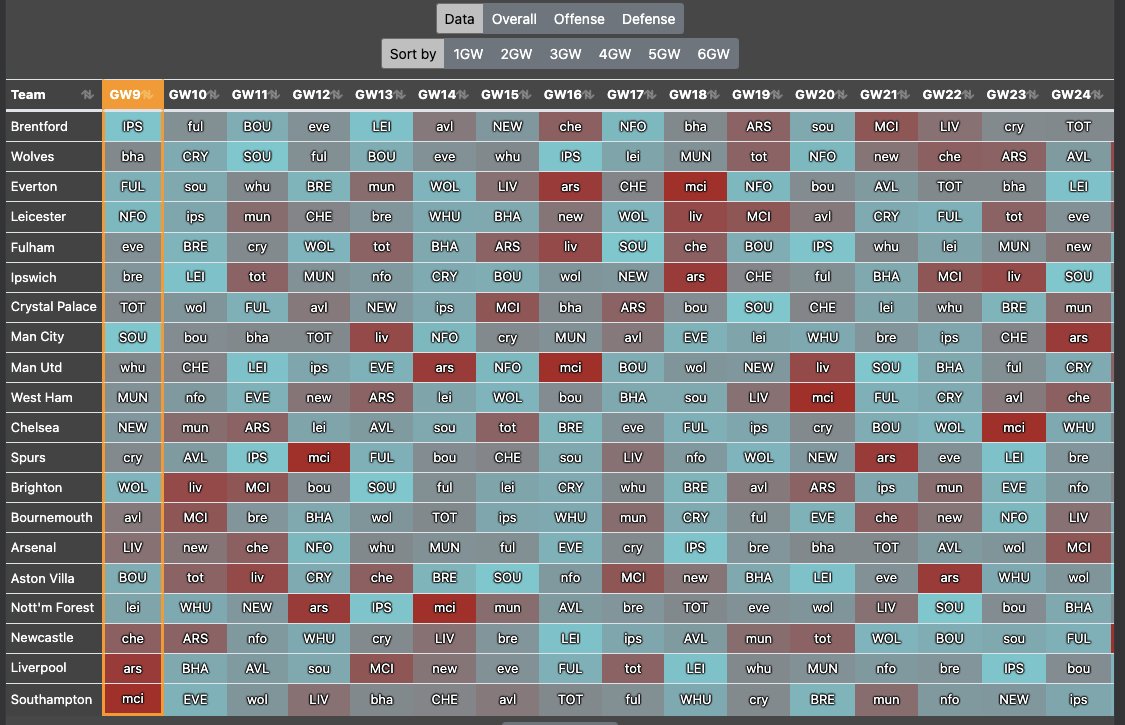
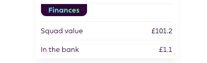
15 Aug 2025
Locked-In Syndrome 🔒
GW1 Team - No Salah, No Haaland! 😬All Killer No Filler, let’s go 👌👌
68
Rizz G retweeted

7 Apr 2025
🇺🇸 TRUMP HAS NOW REMOVED
ALL THE CAPITAL GAINS TAX FROM
STOCKS AND CRYPTO MARKET.
NO GAINS, NO TAX 😂😂

283
224
2,166
150,448
Rizz G retweeted

5 Mar 2025
Democrats refused to stand and clap for this young child who fought brain cancer.
Never forget.
5 Mar 2025

DJ Daniel, the newest member of the U.S. Secret Service, meets with President Trump in the Oval Office and gives him a hug!
182
715
6,192
335,316

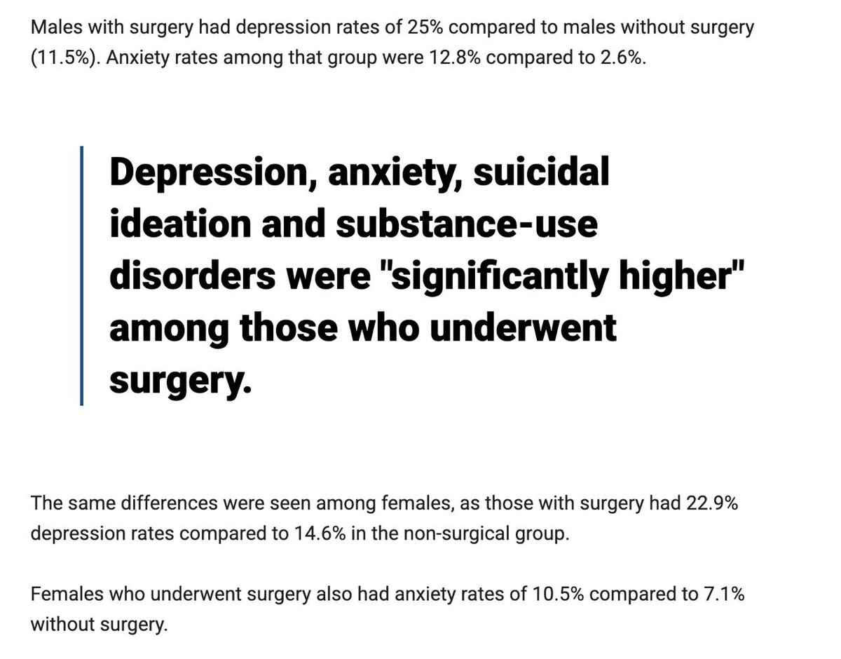
BAN IT
5 Mar 2025

New research from the University of Texas shows that all the justifications for mutilating children were lies. They analyzed more than 100,000 patients with gender dysphoria, and looked at the outcomes for those who received surgery vs. those who didn't.
Depression, anxiety, suicidal feelings and drug abuse were all "significantly higher" for those who received surgery compared to those who didn't.
Let's repeat that: Treating gender dysphoria with sex change surgery was linked with drastically WORSE mental health outcomes.
Phony doctors belong in prison for what they did to our children.
foxnews.com/health/trans-sur…
99
1,104
5,665
146,544


Fake anonymous gets busted 😂


2,750
10,872
182,527
42,705,909


Rizz G retweeted

15 Feb 2025
Fingers crossed this isn’t the beginning
14 Feb 2025

It is confirmed. There is a more or less continuous tremor in the area of #Santorini. It seems that nothing can be seen (but it is night time) but that some noise can be heard. We do not know for sure what is going on
84
151
1,461
164,772


Rizz G retweeted

23 Nov 2024
Is it time for an Australian D.O.G.E?

790
1,717
11,565
222,567
Rizz G retweeted

14 Nov 2024
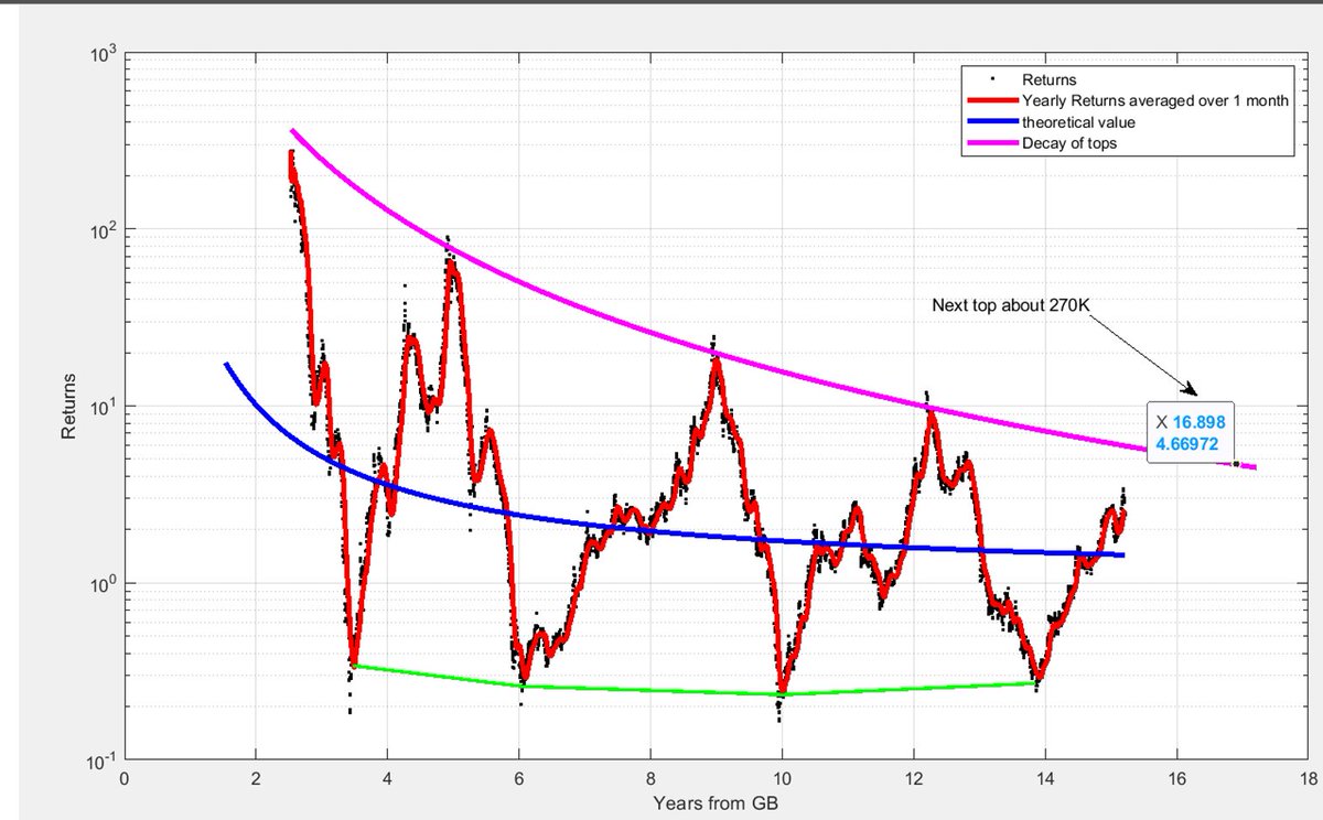
This pattern is significant. It shows the returns per year on any given day throughout Bitcoin’s history.
The peaks align with the cycle tops—if you look back one year from each peak, it covers the explosive bull run we see in every cycle (we’re just entering this frenzied bull year now). The troughs align naturally with cycle bottoms, as they reflect the year of decline following each cycle top.
Between these peaks and troughs, we closely follow the power law. The peaks exhibit a precise mathematical decay (the purple curve represents a precise equation), while the bottoms remain flat, showing a consistent distance from the average trend. These patterns are too regular and precise to be a mere coincidence.
I don’t think ETFs, Saylor, or the Trump administration will change this. As always, we continue to gather data, analyze it, and seek understanding.
If significant changes to this pattern occur, our understanding of past patterns will be invaluable in recognizing and characterizing these shifts as well.
I’m the opposite of dogmatic, and there’s no room for dogma in science.
Science is about identifying patterns and regularities to help us understand and navigate the world. That’s exactly what we’re trying to do with Bitcoin—find sense and direction in what many have assumed is chaos and wild uncertainty.
29
48
397
29,331
This seems messed up
15 Nov 2024

The British government genuinely hates its own people.
Truly sickening.

17,595
50,847
284,268
38,847,445


Rizz G retweeted

13 Nov 2024
👀 Is $FRED the next $PNUT ? Many similar trends seem to be aligning.
$FRED could be the next token listed on Binance, potentially reaching a $1 billion market cap. Here’s why:
- Shares the same animal-themed meta
- Similar holder base (details in the next part of this thread)
- Identical Dexscreener banners
Let’s dive deeper 🧵 👇

24
8
125
22,766