
Front-end Engineer • Self-taught • Helping devs level up their game through simplified visuals & lessons I learned the hard way • 80 tips: webdevvisuals.com
Joined October 2020
- Tweets 25,072
- Following 434
- Followers 23,448
- Likes 49,390
925 Photos and videos


Pinned Tweet

May 2
This one line of CSS will fix the annoying layout shift that scrollbars cause.
This happens when a non-scrollable container becomes scrollable due to its content.
This gets rid of that problem:
.container {
scrollbar-gutter: stable;
}
With that, space is reserved for the scrollbar before it even appears.
So there's no layout shifts when content grows.
Use both-edges if your content is centered.
It mirrors the reserved space on both sides of the container to keep the layout balanced.
If you found this one useful, follow for more. ❤️
14
77
1,031
65,113
Jun 11
Shimmer animations in CSS are actually simple to make.
.shine-element {
position: relative;
overflow: hidden;
}
.shine-element::after {
content: "";
position: absolute;
inset: 0;
transform: translateX(-100%);
background: linear-gradient(
90deg,
transparent,
rgba(255, 255, 255, 0.25),
transparent
);
animation: shimmer 1.5s infinite;
}
@keyframes shimmer {
100% {
transform: translateX(100%);
}
}
Now you can add the shine-element class to any element you want.
If you found this one useful, follow for more. ❤️
1
26
1,002
Jun 10
VSCode Tip 💡
You can hold 'alt' while scrolling to move 5x faster.
It makes it easier to browse through huge files.
2
1
19
940
Jun 8
CSS Global Resize Trick 💡
Changing the html font size cascades to every element that uses "rem".
You can scale down on mobile and up on wider screens very easily.
1
2
29
1,825
Jun 7
Accessibility Tip 💡
Start using 'rem' unit in CSS, It scales automatically based on user browser preferences unlike fixed units like 'px'.
5
2
32
4,412
Jun 7
Acess all useful visuals just like this one at WebDevVisuals.
Explore for free: 🔥
webdevvisuals.com/
1
231
Jun 6
VSCode Tip 💡
A cluttered file tree in a large project is killing your focus.
Use this button to collapse everything and focus on what matters.
Didn't know about this for a long time. 👀
2
1
17
1,289
Jun 4
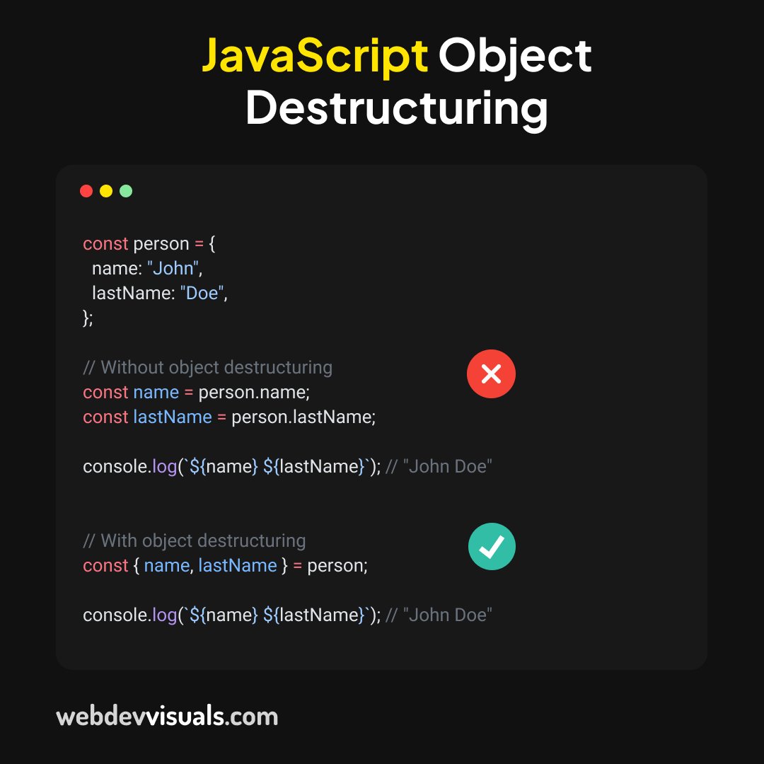
Using Object Destructuring in JavaScript, you can extract fields from any object in just one line:
3
1
13
605
Jun 3
You're updating the same value in 12 different places every time the design changes.
CSS variables fixes this.
Define it once in :root, use it everywhere with var().
Works for any value, not just colors.
3
5
49
3,355
Jun 3
Access all visuals just like this one at WebDevVisuals. 🚀
Join for free:
webdevvisuals.com/
2
150
May 29
The text-overflow: ellipsis in CSS only works on a single line.
For multiline text ellipsis, use this instead:
p {
display: -webkit-box;
-webkit-line-clamp: 4;
-webkit-box-orient: vertical;
overflow: hidden;
max-width: 300px;
}
-webkit-line-clamp sets how many lines before the ellipsis happens.
This works on all modern browsers.
Have you been using JavaScript for this? 👀
3
17
129
5,335
May 27
Most devs don't know CSS can do spring animations.
This linear function does the trick:
.btn {
...
transition: all 800ms linear(
0,
0.7 10%,
/* overshoot → spring pop */
1.2 20%,
0.9 40%,
/* another small overshoot for realism */
1.05 70%,
1
);
}
.btn:hover {
transform: scale(1.2);
}
The key is those 2 overshoot values.
Going past 1 twice snapping back below 1 is what creates the spring feel on hover.
Have you used linear() before? 👀
3
7
84
5,414
May 26
My very first portfolio after learning HTML, CSS, and JavaScript. 👀
This is an old one from a few years ago!
3
17
989
May 25
Seen those 3D buttons? They're actually very simple to make.
Just two CSS properties doing all the work:
.btn {
background: # 3b82f6;
border: 1px solid # 60a5fa;
transition: all 80ms ease;
box-shadow: 0 6px 0 0 # 1b6ff8;
}
.btn:active {
box-shadow: 0 0px 0 0 # 1b6ff8;
transform: translateY(6px);
}
box-shadow -> creates the depth layer
translateY -> simulates the press
That's it. No JS, no extra wrappers.
Did you know box-shadow could do this? 👀
5
37
2,501
May 24
Small UI change. 👀
I replaced borders with a subtle gradient background.
Both navbar and footer, and it looks 10x better.
What do you think?
2
2
23
1,658
May 24
Using CSS brightness filter, you can easily create simple hover effects for any element.
.button {
filter: brightness(1.3);
}
I've been using this a lot, found it really useful!
3
7
115
7,900
May 24
My mistake! the code snippet is supposed to be:
.button:hover {
filter: brightness(1.3);
}
1
3
438
May 24
More useful visuals just like this one at WebDevVisuals. 🚀
Join for free:
webdevvisuals.com/
1
325
May 23
Using CSS mask-image you can truncate texts with a smooth fade effect.
It looks clean and it's a great alternative to text ellipsis.
.text-container {
overflow: hidden;
white-space: nowrap;
-webkit-mask-image: linear-gradient(
to right, black 50%, transparent);
mask-image: linear-gradient(
to right, black 50%, transparent);
}
}
If you found this one useful, follow for more! ❤️
4
33
316
13,410
May 23
Access all visuals just like this one at WebDevVisuals.🚀
Join for free:
webdevvisuals.com/
1
451