Optimistic Figure-outer • Creative Studio @perplexity_ai
- Tweets 4,938
- Following 2,658
- Followers 78,918
- Likes 46,439


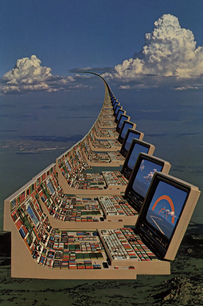
ALT Together, we mourn design—killed, according to X, approximately 847 times this year alone. And yet, no matter how many times we declare design is dead, it is alive. Design is everywhere, quietly thriving in the clarity of the subway map when you fear you have missed your stop, in the legibility of the dinner menu even when you aren't sure if sorrel is a vegetable or a new pasta shape, and in the dopamine-releasing notification that a meeting has been cancelled. Design doesn't die. It is not a trend to be disrupted or a technology to be replaced. It's the difference between caring about how something makes you feel, not just if it works. So here's to design—endlessly declared gone, endlessly proving everyone wrong.