
Product Designer @properlystudio ∙ Helping innovative startups turn complex ideas into intuitive products ∙ #Web3 #DeFi #Fintech #AI
Joined June 2017
- Tweets 267
- Following 472
- Followers 86
- Likes 2,225
16 Photos and videos


Jun 9
Working from a cafe in NYC hits different - I wouldn’t have said that before
3
100
Barto retweeted

Apr 30
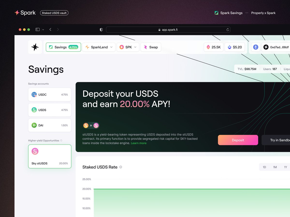
Sky Protocol has registered its strongest quarter ever in Q1 2026 ↓
5
11
115
7,185
Apr 28
Portfolio management is often overlooked or pushed to the sidelines in DeFi. At Silo, we knew right away that this page had to stand out. A product that offers a wide range of capital management options must have a single hub where users can manage their multiple positions and monitor them holistically.
Data clarity in DeFi is also often neglected, and users frequently expect simple metrics such as “Total Earned,” “Total Deposited,” and “Avg. APY” to be available in one place without having to navigate through hundreds of pages and networks.
1
1
3
162
Apr 28
💬 Read more about the entire design process in our latest article: properly.studio/blog/making-…
1
89
Apr 27
Risk is a key factor in yield-generating products. Every decentralized protocol involves some degree of risk, to varying degrees.
That’s exactly what we’ve focused on at Silo—creating a visual scale that helps users navigate and understand their risk level. Different types of products, different factors, different risks.
2
1
5
197
Apr 27
💬 Read more about the entire design process in our latest article: properly.studio/blog/making-…
1
61
Apr 24
Offering yield-related products is one thing, but how they’re presented is another. Different categories, the number of products, statistics, risk, APY — all of this is data that we need to break down into its basic components from the start. We begin by determining what we’re able to display, and work our way toward concluding what will be of interest to the user.
At Silo, we’ve implemented several different strategies, such as visually highlighting the most popular configurations, emphasizing key data within them, and enabling users to flexibly search for opportunities that interest them across all available markets. Read more about this in the article below 👇
1
1
2
148
Apr 24
💬 Read more about the entire design process in our latest article: properly.studio/blog/making-…
1
2
85

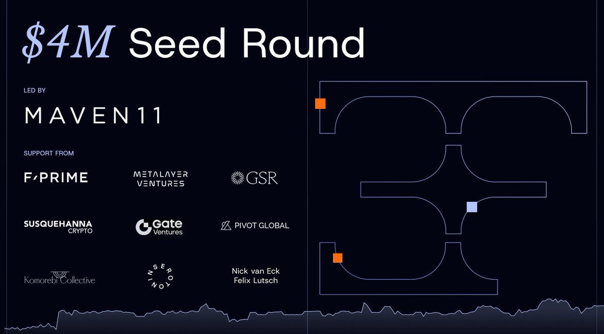
We are excited to announce that @3f_xyz has raised $4 million in seed funding led by @Maven11Capital, with participation from @FPrimeCapital, @MetalayerVC, @GSR_io, Susquehanna Crypto, @Gate_Ventures and others.
3F is building the onchain infrastructure that unlocks leveraged exposure to tokenized real-world assets.
71
53
645
143,647
Apr 22
Design vs DeFi Lending & Borrowing - complicated things don’t need to be complicated if we approach them in the right way.
If we understand how DeFi works, what problems we want to solve, and who we’re designing solutions for, we reach a higher level of awareness when proposing solutions during the design process.
The new article is already live 👇 You can learn more about the entire design process and the key features of @SiloFinance

3
99
Barto retweeted

Apr 21
Moto is hiring a Senior Backend Engineer (Go).
You’ll build the infrastructure for transaction processing, ledger correctness, and financial systems where precision matters.
Not a feature role.
Not a growth role.
This is where correctness and reliability define the product.
If you’ve worked on payments, ledgers, or high-precision backend systems, this will feel familiar.
Read the full role here: [ linkedin.com/jobs/view/44019… ]

1
4
21
3,723
Apr 20
Curious about the outcome of the design work for @SiloFinance? The case study is live.
We’ll be sharing more soon about the product design process itself and our approach to foundation-based design.
Apr 20
everything we designed for @SiloFinance in one place
branding, website, lending app, design system - the full scope, from workshops to final product
our newest case study is live: properly.studio/case-study/s…
2
81
Barto retweeted

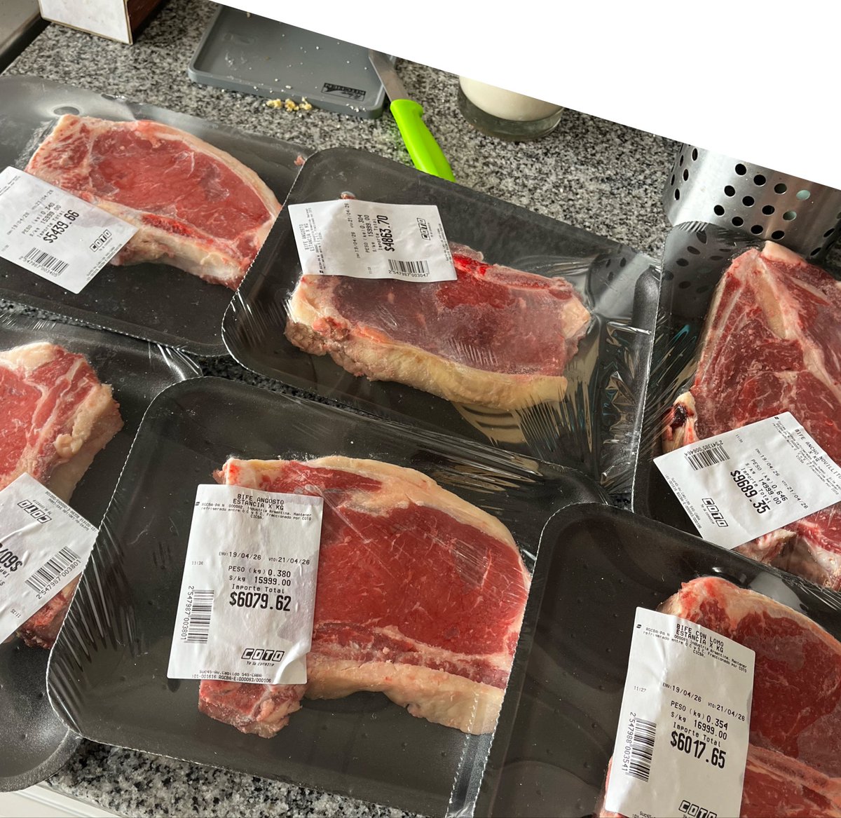
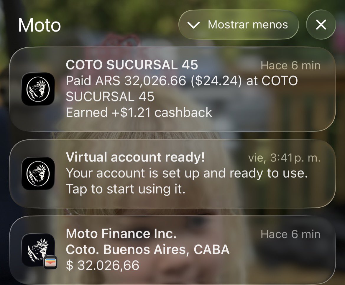
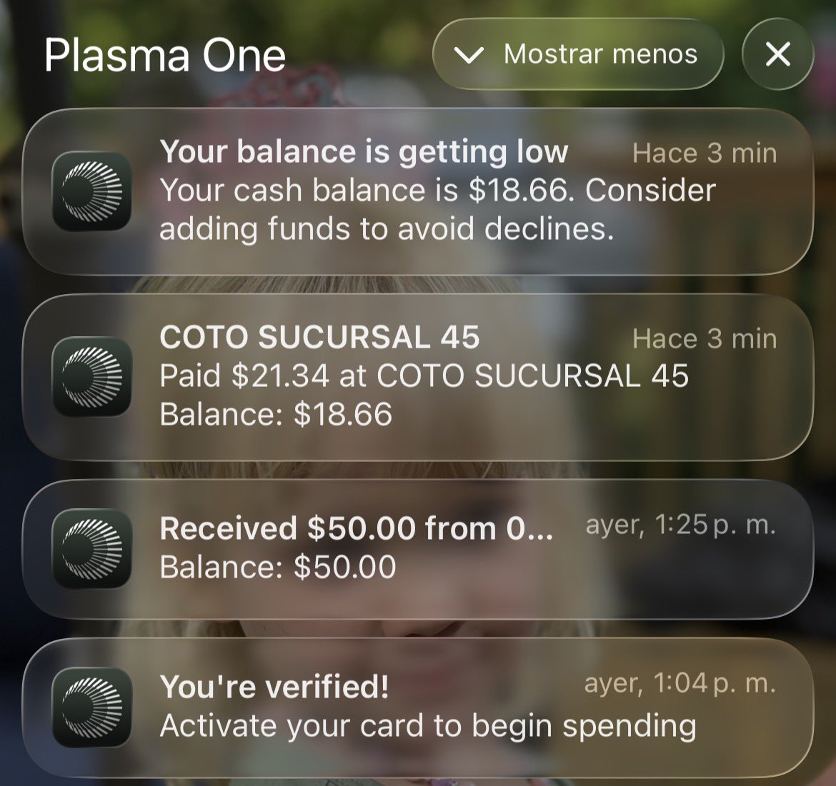
These are the consequences of testing @usemotocard and @Plasma head to head.
Both are in beta stage, so this is the first time I can also review neobanks during the GTM in a beta stage.
Buen provecho! 🥩
12
1
61
8,170
Apr 15
That's exactly how it was. Working with @SiloFinance on this was a huge challenge, but also a great experience - exploring patterns that had never been used before, making bold changes to the information architecture, and ensuring that the isolated markets do not look so “isolated”.
Apr 15
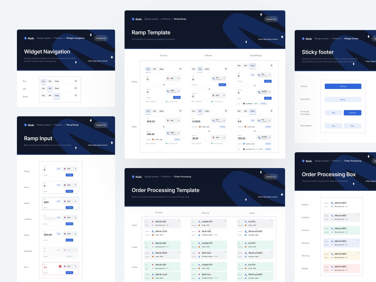
the single biggest UX improvement in our @SiloFinance project: one flexible component replacing duplicated tiles across the entire app
the old app had separate pages for lend and borrow, a markets page showing the same vault as a different card for every config
we simplified: lend became earn, dashboard became portfolio, markets page gone. each vault is now one product card with configuration built in
naming is product design
full deep-dive coming soon on our blog
2
80
Apr 10
Easier entry, smoother flow — that's exactly where good UX begins.
Apr 9

1
51

HELLO MOTO

102
61
467
33,625
