
Design • Illustration • (I use Instagram more : instagram.com/chrishardy.des…)
Joined June 2012
- Tweets 170
- Following 520
- Followers 490
- Likes 129
26 Photos and videos


Pinned Tweet

25 Jun 2025
Apparently my work is popping off over here...
That’s cool… maybe I should put some effort into building up this space? Most of my followers are now bots or vacated altogether 😂
Thanks @NoTMax1E for sharing and crediting 🖤

12
43
653
20,807
26 Sep 2025
Breaking the silence with a long overdue Timelapse of the “Even In Arcadia” battle illustration ⚔️
Originally created as exclusive festival posters for @DownloadFest @rockamring, this artwork now makes its return as a Tee on the @sleep_token merch emporium.
3
27
116
3,377
16 Sep 2025
Apple be like “let’s just put a blurry haze on everything and call it ‘glass’ in this update”
Honestly feels like I’m having an eye exam every time I look the icons.
7
327
12 Sep 2025
I’ve been very quiet, I also have a backlog of things to post.
Now I’ve missed windows to do it strategically, I’m also ill and I’m also seeing Demon Slayer: Infinity Castle tomorrow… none of those things are related.
9
524
3 Sep 2025
As a Brit, I’m somewhat unfamiliar with cracker barrel, but its logo debacle has sparked a lot of design talk.
Does simple equal boring?
Maybe? That’s debatable, but from a lot of use applications such as print, web, app icons, favicons, as well as accessibility, simple is key.
3
4
379
22 Aug 2025
Some OC meme slop
All I’m saying is that I officially want colour books back natively in AI without having to manually use Pantone connect… which isn’t even compatible in Photoshop on Silicon based Macs without launching in Rosetta.
Can Pantone and Adobe just make up 🥲
1
6
388
22 Aug 2025
For clarification that’s Adobe Illustrator not THAT AI 😂
1
112
20 Aug 2025
Okay so we all know how AI is devastating the creative industry, but do you know what it’s ruined for me?
Em dashes — I’m so worried that anything I type will look AI generated that I’m afraid to use them now. 😂
I find myself re-reading my text “does this look AI?”
6
1
46
1,016
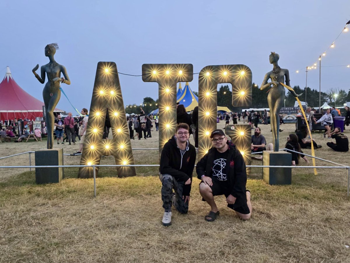
18 Aug 2025
Had a great time at @ATGFestival.
Such a refreshing chilled out vibe compared to the stressful hustle and bustle of the festivals I’m used to. Hopefully can return next year!
I didn’t take too many photos, but I took some videos here and there which I might post.

13
299
15 Aug 2025
To anyone stressing about A level results, my college grades were D/E level, but I still got into uni, earned a Fine Art foundation degree and then a 2:1 in Graphic Design.
Sometimes we fluke it, but we can recover.
Also congrats to anyone who smashed theirs!
11
274
14 Aug 2025
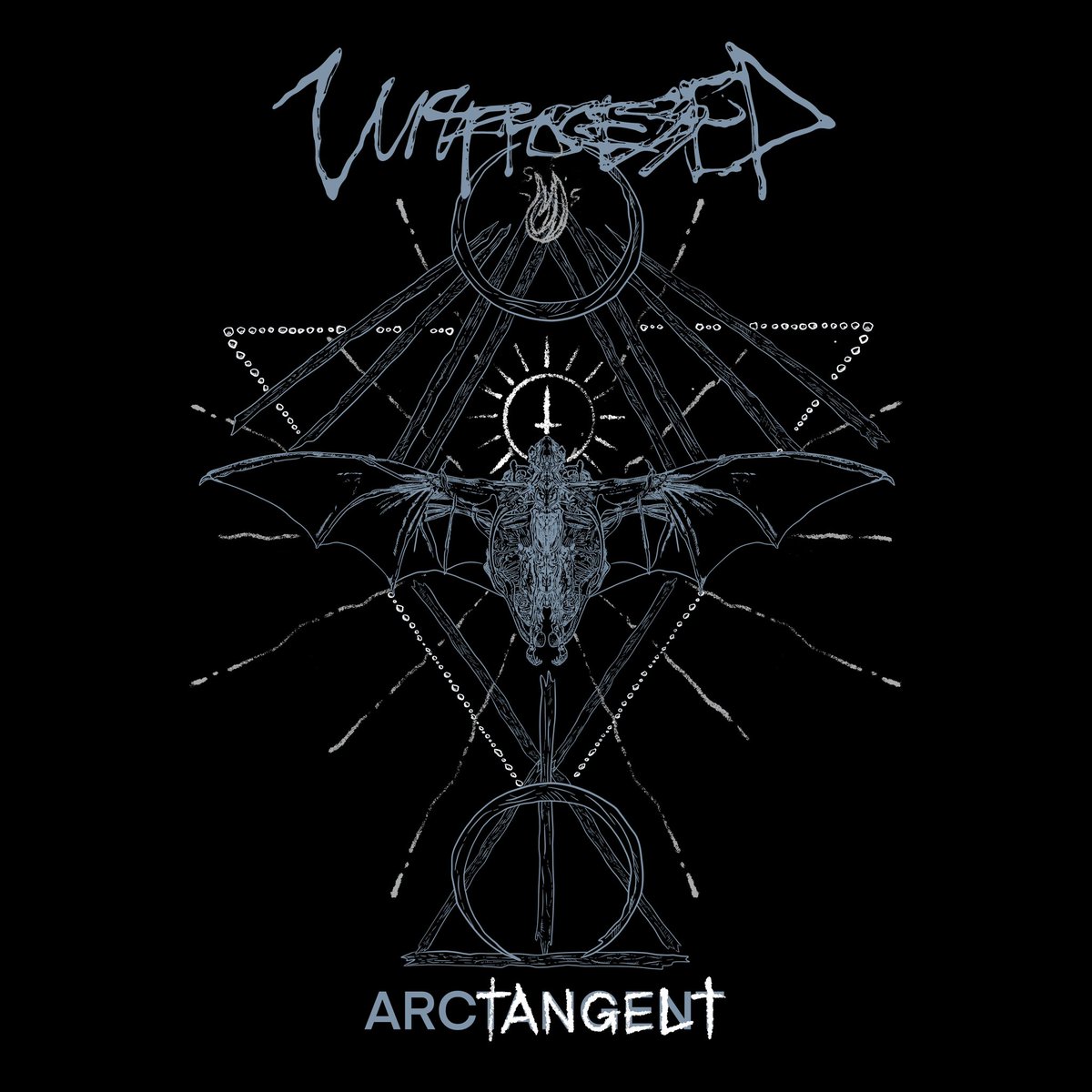
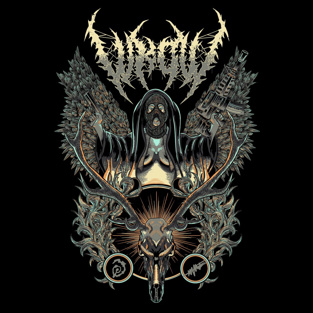
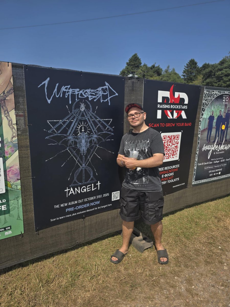
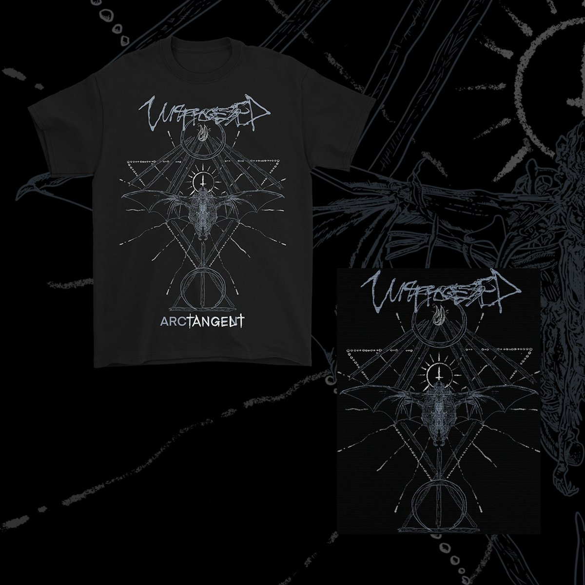
So I hear over on discord that people wanted to see the artwork for this 👀
Fresh from Tuesday’s Angel preorder drop, @unprocessedband bring the ARC†Angel† Sigil Tee and Angel poncho to @ATGFestival . The merch tent is open, so check it out, and don’t miss their set Saturday.

1
1
25
504
13 Aug 2025
Found a style challenge thing I did around 10 years ago lol
I can’t remember the last time I actually used a sketchbook.
Maybe I could redo it in new styles…
10
160
12 Aug 2025
Not related to anything, but if you use Duolingo and, like me, realise well after midnight “oh shit, I did not do Duolingo,” change your clock to a time zone that is behind. Thank you Honolulu for constantly saving my streak.
2
1
16
365
12 Aug 2025
I was spending all my gems on streak freezes 😭
2
63
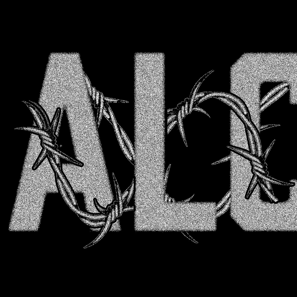
8 Aug 2025
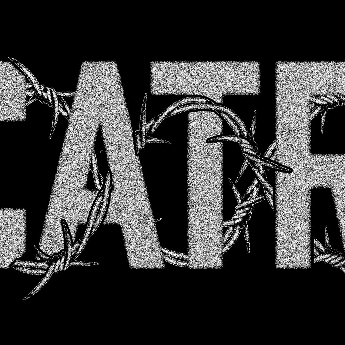
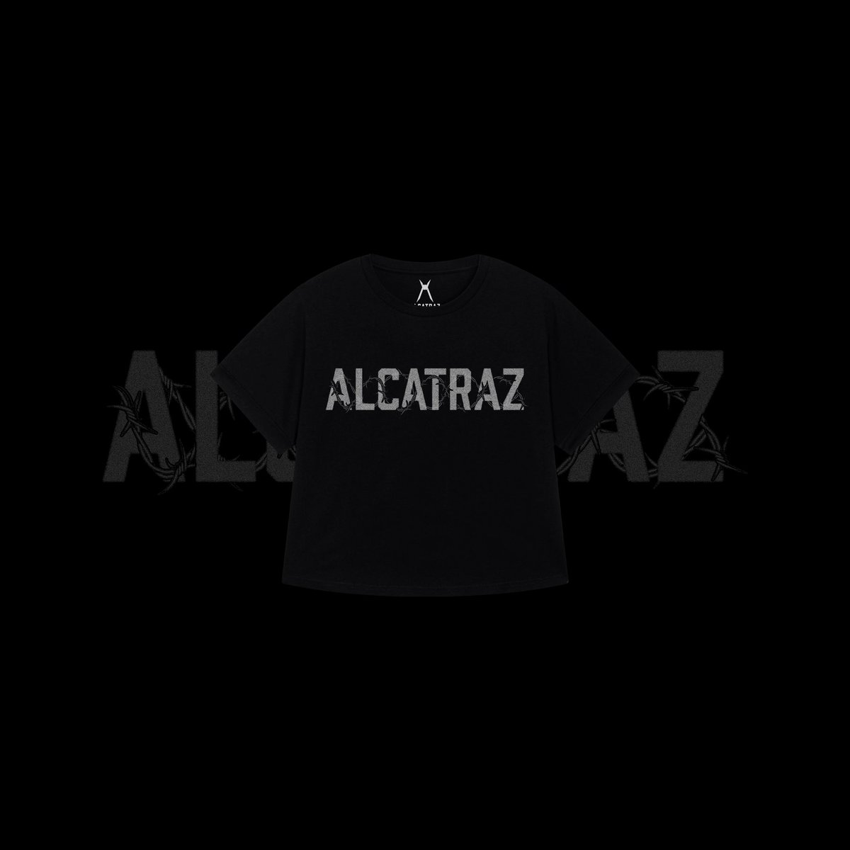
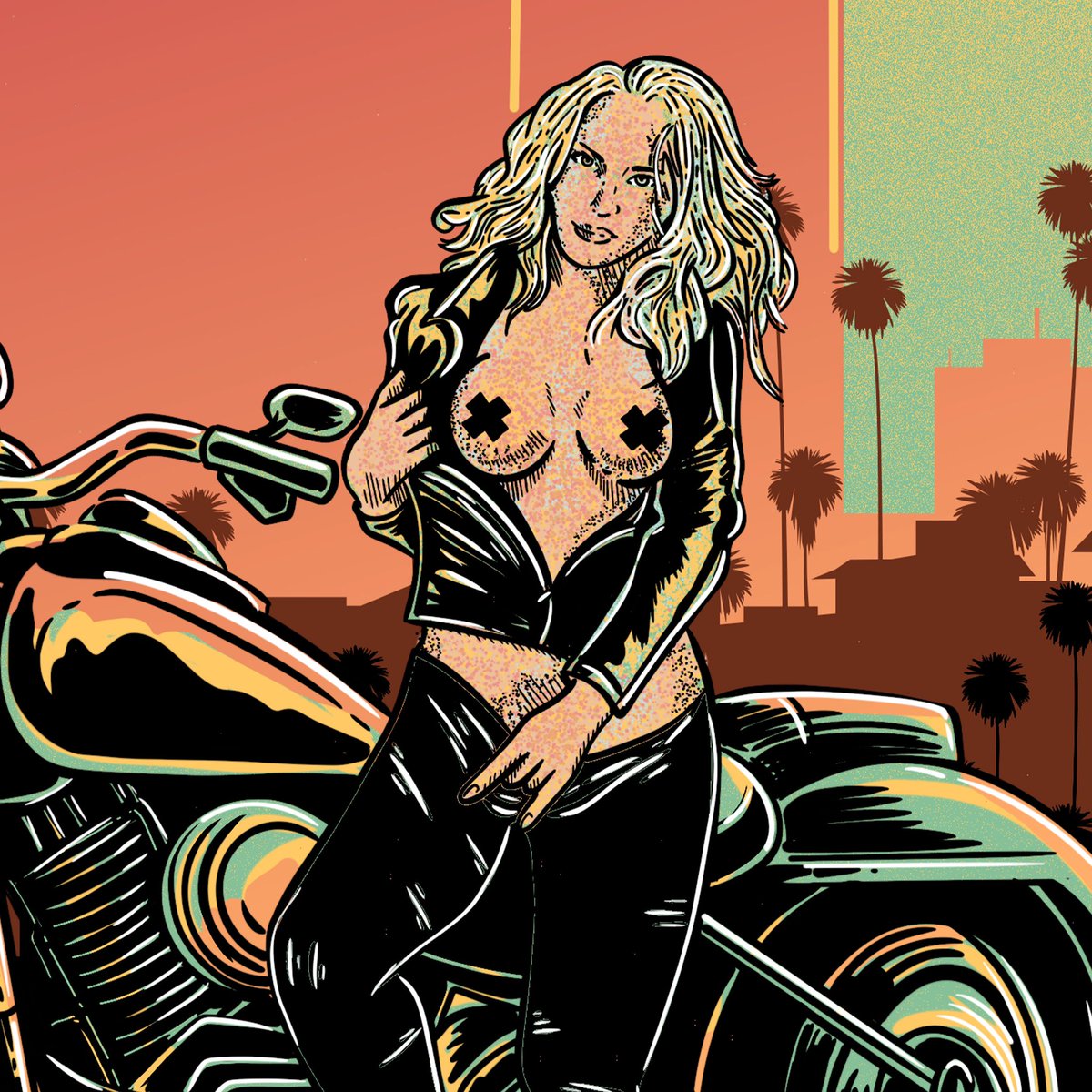
Alcatraz
Tough-wire for Women’s oversize Tee
@alcatrazfestival 2025 is officially rolling.
The range is live and moving fast.
@allotmentproductions have set up an epic display at the fest.
Swing by El Hongo to see it all in person!
#graphicdesign #illustration #artworkdesign

3
11
284
5 Aug 2025
Post for the sake of posting
Top 5 album cover artists that inspired me:
Frank Kozik - (The Offspring - Americana)
John Dyer Baizley - Baroness (all)
Alex Pardee (In Flames - A sense of Purpose)
Raymond Pettibon - Black Flag, Sonic Youth etc
Jamie Hewlett - Gorillaz, Tank Girl
1
15
286
3 Aug 2025
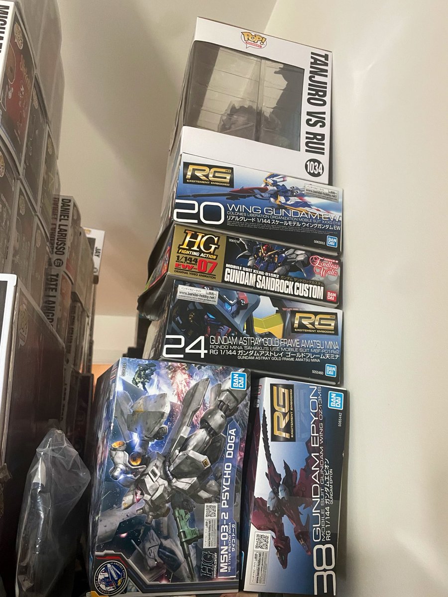
Manifesting the willpower and discipline to actually build these Gunpla instead of just admiring the boxes…
Why do I keep starting new hobbies when my last hyperfixation is still unfinished 😭
2
27
396
3 Aug 2025
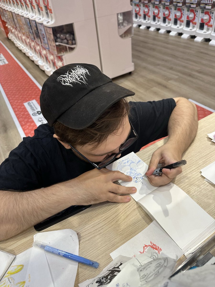
Even when I'm shopping for Gunpla stuff I get distracted if I see the pen testing table… the clerk asked what I was drawing and didn’t know Guyver so I went on a whole tangent attempting to summarise 😅

15
179
2 Aug 2025
Throwback to pre-working at AP days. I took on a very ambitious project for a friend’s (now-defunct) band in 2021 (the sketch stage of this video is really THAT old) which I abandoned several times due to release schedule changes and eventually was released in April 2023!
5
1
23
500
2 Aug 2025
Also for anyone interested, 3 past members of this band are now in Starve the Sun!
open.spotify.com/track/0ISfF…
2
76
27 Jul 2025
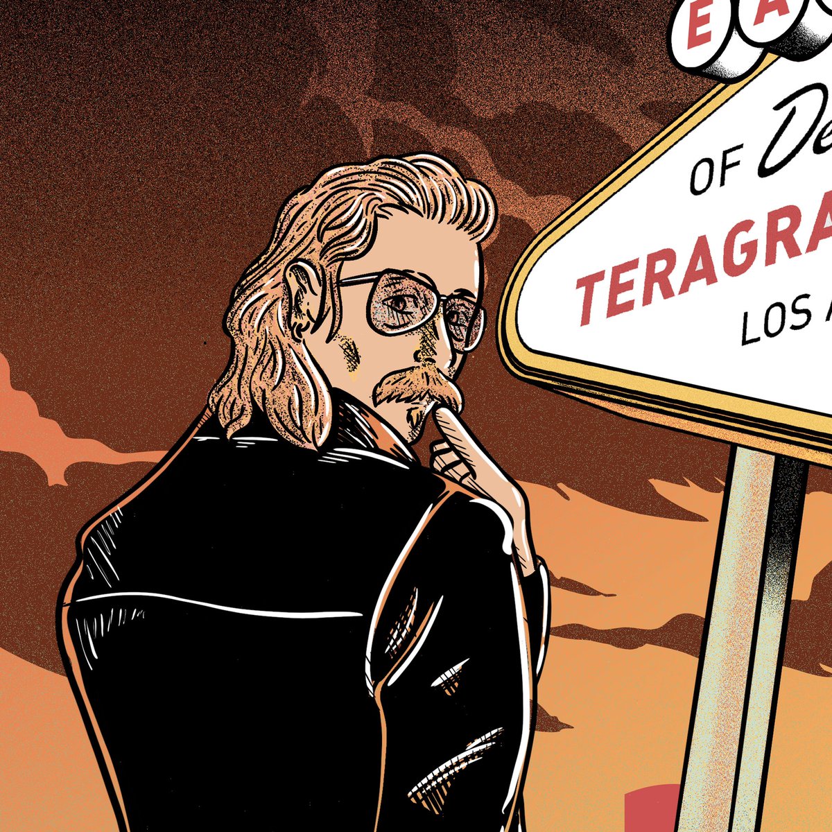
New tee for @EODMofficial ’s LA residency at the @TeragramLA.
One design packed with references from every album.
Grateful for yet another opportunity to work for the band!
Which record do you spot first?

1
7
167