
35K YouTube subs | Software Engineer who ships AI apps | Scaling AI first development Agency | DM for AI SaaS development
Joined September 2020
- Tweets 1,179
- Following 185
- Followers 878
- Likes 1,354
128 Photos and videos


Pinned Tweet

18 Nov 2025
Stop overthinking your landing page design.
I just tested Gemini 3.0. The UI capabilities are frighteningly good.
I went from blank screen to a slick landing page in just few minutes. It's fully mobile responsive.
Full prompt below 👇🏻
Checkout this demo:
8
7
81
22,840
CodeBucks⚡ retweeted
May 30
Stop asking AI to "design a clean UI"
That prompt is too vague.
Give it a design system, a product context, and a clear creative direction instead.
A simple workflow to design better interfaces faster:
1. Open getdesign. md
2. Pick a design doc/style direction you like
3. Give it to chatGPT (along with given prompt)
4. Generate a first UI concept
5. Iterate the image until the layout feels strong
6. Use claude Code or codex to convert the final image into code
The important part:
Don’t copy the design doc exactly.
Use it as a structure, taste reference, and quality then create your own version.
Here’s the prompt I use:
<prompt>
You are a world-class senior product designer, UI/UX designer, and front-end design systems architect.
I’m going to provide you with a design reference document.
Your job is to study its structure, visual principles, layout patterns, spacing, typography, hierarchy, interaction ideas, and overall design taste.
Then create a brand-new interface concept for the product/page I describe below.
Product/Page:
[Describe what you are designing]
Audience:
[Describe who will use it]
Goal:
[Describe the main business/user goal of this page]
Style direction:
Use the provided design document as inspiration only.
Do not use the exact same layout, copy, brand elements, names, illustrations, colors, or components.
Build an original design that feels premium, modern, minimal, polished, and production-ready.
Requirements:
- Strong visual hierarchy
- Clean spacing
- Premium typography
- Beautiful but usable layout
- Clear primary CTA
- Realistic SaaS/product UI
- No clutter
- No generic dashboard look
- Use realistic content, not lorem ipsum
- Make it feel like something a top-tier startup would actually ship
Output:
Create a detailed visual UI concept as an image.
Before generating the image, briefly explain:
1. The design direction
2. The layout structure
3. The key creative idea
4. Why this interface will feel high quality
Then generate the UI.
</prompt>
This turns design docs into a creative starting point.
It's all about adding taste into your workflow.
2
1
357

CodeBucks⚡ retweeted
Apr 7
Railway just moved their entire frontend off Next.js → Vite Tanstack router Nitro. 200 routes, 2 PRs, zero downtime.
Why they left Next.js:
> builds crept past 10 minutes. 6 of those were next alone, half stuck on "finalizing page optimization"
> still on pages router → shared layouts were hacky workarounds
> app router would've fixed layouts but it's server-first. their app is client-heavy (dashboard, real-time canvas, websockets everywhere)
> they were never using next's server primitives anyway, just fighting the framework
Why tanstack vite:
> type-safe routing out of the box. route search params inferred, autocomplete across the whole tree
> pathless layout routes replaced every layout hack
> instant HMR, near-zero dev server startup
> SSR only where it matters (marketing, changelog, careers). pure client everywhere else
> less framework magic, more explicit control
The migration itself:
> PR 1: ripped out everything next-specific (next/image, next/head, next/router) → swapped for browser APIs or framework-agnostic libs
> PR 2: the actual framework swap. nitro replaced next.config.js, consolidating 500 redirects, headers, and caching in one place • merged sunday morning, war room in discord, fixes shipped same day
Trade-offs they accepted:
> lost next/image → using <img> fastly edge optimization
> lost next-seo, next-sitemap → built small in-house versions
> tanstack start is newer, rougher edges exist
Result: 10 min builds → under 2. each module is a content-hashed chunk, so shipping a billing change invalidates only that chunk. returning users download KB, not MB.
Important caveat:
This isn't a "next.js bad" story. next got railway from zero to millions of users. they outgrew it because their product is overwhelmingly client-side and they ship multiple times a day. if you're building a content site, marketing pages, or anything SEO/SSR-heavy, next is still excellent. if you're building a stateful, websocket-driven dashboard and your build times are eating your iteration loop, this stack is worth a serious look.
Pick the framework that matches your product, not the one that's trending.

We moved Railway's entire frontend off Next.js. Two PRs, zero downtime.
Builds went from 10 minutes to under two. 200 routes on @vite_js @tan_stack Router, instant HMR, and dev server startup in seconds.
@vrzgc's full breakdown: blog.railway.com/p/moving-ra…
1
1
5
1,605
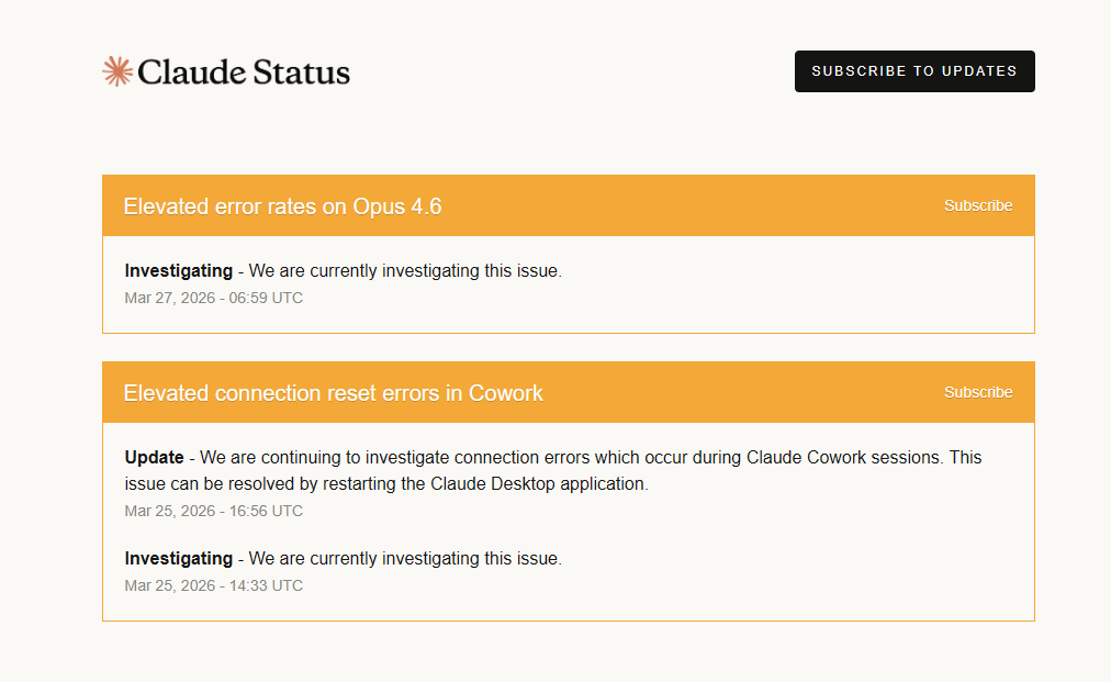
Mar 27
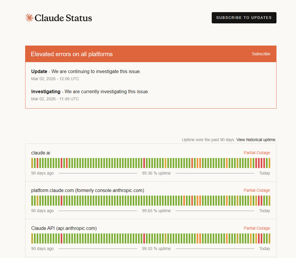
It seems claude is down again🤷🏻♂️
Getting errors in claude code.
3
1
7
1,404
CodeBucks⚡ retweeted
Mar 9
Finally started building the website for my AI first software development agency "CodeBucks"
Just one minimal section for now, but I'm obsessed with how it turned out.
Minimal. Clean. No noise.
A landscape painting as the background instead of generic dark-mode gradients.
Sometimes the best design is the one that gets out of the way.
Full site coming soon. Link below👇
3
2
8
320
Mar 10
Great writeup!
If you want to create AI agents then learn to build better harness

1
1
5
726
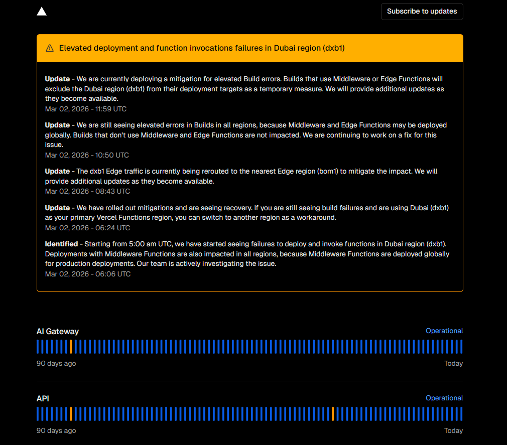
Mar 2
It seems vercel is also facing some issues!

2
2
505
Feb 28
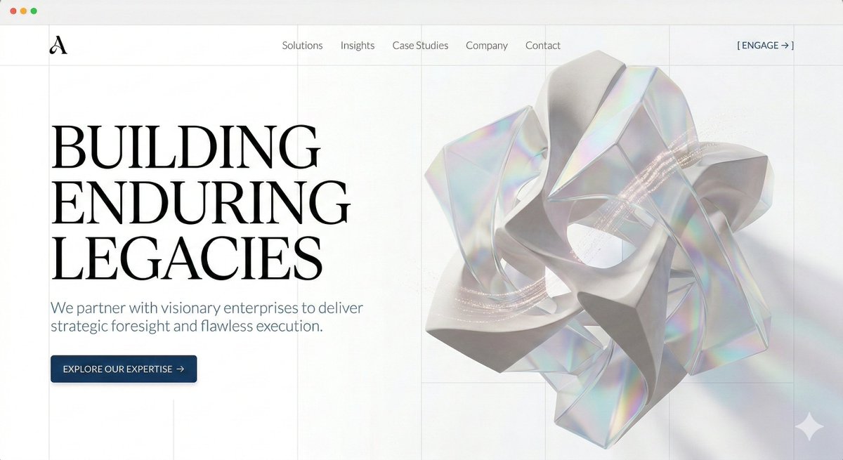
Nano Banana 2 Claude code = the fastest path from raw concept to beautiful UI.
Stop burning tokens trying to blindly explain layout to an LLM. Instead,
1. Generate the exact vision in Nano Banana 2 first.
2. Drop the image into Claude or Cursor.
3. Get production-ready code in 1-2 prompts.
It works because the model actually understands grid structure and visual hierarchy.
I prompted it for a strictly light-theme, minimalist enterprise hero section. Look at the typography scaling, the negative space, and the illustrations.
Open the image to see the details. 👇
ALT website UI image by google nano banana 2
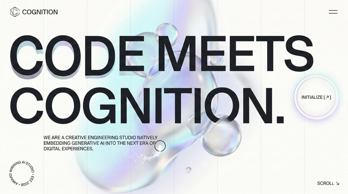
ALT website UI image by google nano banana 2
ALT website UI image by google nano banana 2

ALT website UI image by google nano banana 2
1
4
731
Feb 13
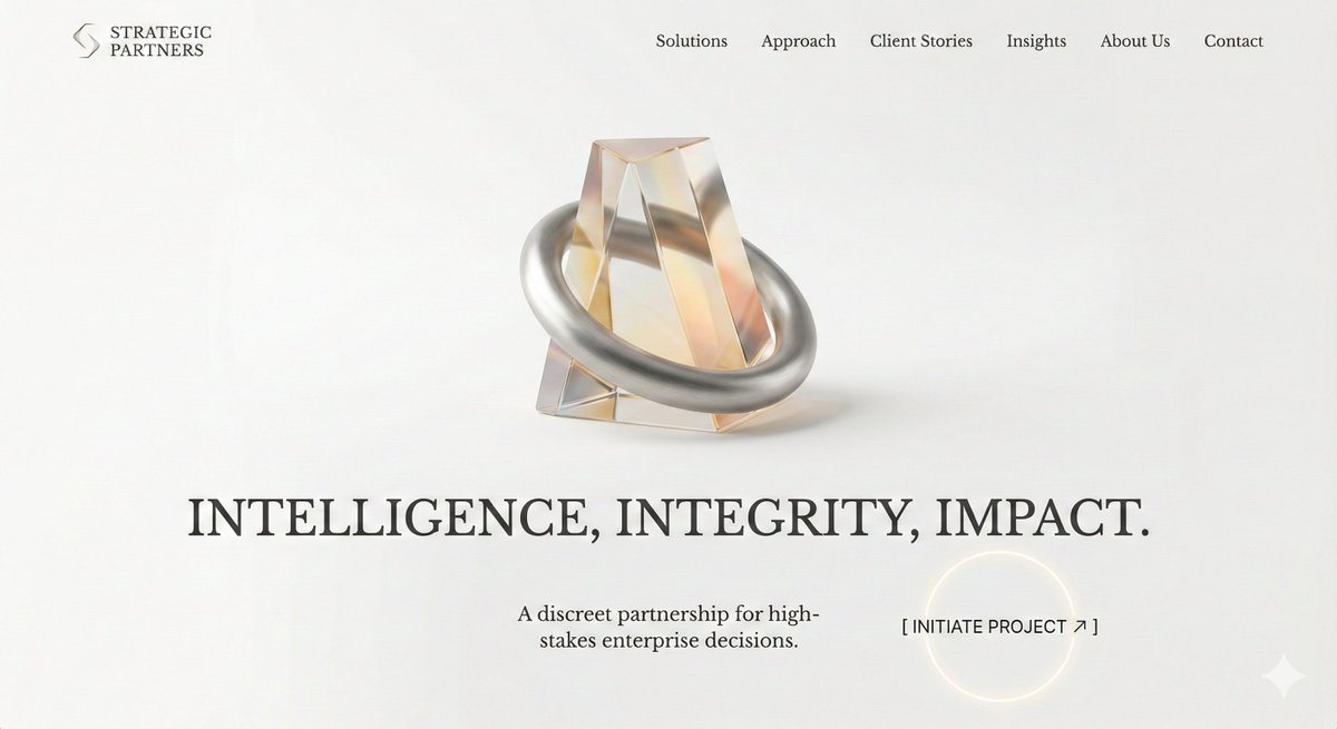
Stop paying $$$ for brand identity packages. ❌
I’ve created a single prompt that acts as a lead brand strategist. It builds a full 6-module Bento-Grid identity logo, typography, palette in 10 seconds.
Most AI prompts are too generic. They give you a logo and call it a day.
This prompt does the heavy lifting:
✅ Picks your Industry Archetype
✅ Selects specific Google Fonts
✅ Generates a cohesive 4-color palette
✅ Creates a cinematic Hero Visual
All in a high-end, behance-style bento grid.
Prompt is in the comment below 👇
Like & save this to brain storm brand identity for your next SAAS app.
ALT Brand identity image generated using gemini nano banana pro
1
6
750
Feb 13
Open gemini nano banana pro, paste this prompt, add company and industry details and press enter ✌️
PROMPT:
------------
Act as a Lead Brand Strategist and Designer. Generate a single, high-resolution bento-grid board containing 6 distinct modules that define the entire visual identity for:
COMPANY NAME: [INSERT COMPANY NAME HERE]
INDUSTRY/SERVICE: [INSERT INDUSTRY/SERVICE TYPE HERE]
THE TASK:
Based only on the company name and industry provided above, you must autonomously generate the most suitable color palette, typography, logo concept, imagery, catchy headlines, and brand voice appropriate for this specific sector.
THE LAYOUT (STRICT 6-MODULE GRID):
Block 1 (Top Left, Hero Visual): A high-end, cinematic Key Visual photograph representing the industry in a sophisticated way. Photorealistic, dramatic lighting. Overlay the generated brand logo in white.
Block 2 (Top Center, Social Media): An Instagram Post mockup. You must autonomously generate a bold, industry-relevant headline and pair it with a suitable lifestyle photograph.
Block 3 (Top Right, The Palette & HEX): A clean design block displaying 4 vertical color swatches that form a harmonious, industry-appropriate palette chosen by you. Include distinct, simulated HEX codes text below each swatch (e.g., # 1A2B3C).
Block 4 (Bottom Left, Typography Spec): A minimalist block selecting a single, highly suitable font (Serif or Sans-Serif). The block must display ONLY the Name of the Font (e.g., "Montserrat", "Playfair Display") written in large characters using that specific font style as the specimen. Add small subtext "Primary Typeface" at the bottom.
Block 5 (Bottom Center, The Logo): A solid background block featuring a newly designed, minimalist, iconic vector logo for the company. No construction lines.
Block 6 (Bottom Right, Brand DNA): A text-heavy manifesto card where you define the brand's soul based on the industry. Three short paragraphs titled:
ARCHETYPE: (Choose a suitable one, e.g., The Creator, The Sage)
VOICE: (Define the tone, e.g., Professional, Playful)
VISUALS: (Define the aesthetic style)
AESTHETIC & FINISH:
Behance Trend / Awwwards Winner style. 8k resolution, razor-sharp vector graphics mixed with high-end photography. Soft studio lighting across the whole grid to make it look like a cohesive presentation board.
------------
1
284
Feb 5
Opus 4.6 is here🔥
• Deeper planning self-correction
• Longer agentic runs (terminal-bench 65.4% )
• Massive codebase mastery
• Agent teams in Claude Code
• 1M context beta
Solid upgrade for devs, especially that self-correction on mistakes.

Introducing Claude Opus 4.6. Our smartest model got an upgrade.
Opus 4.6 plans more carefully, sustains agentic tasks for longer, operates reliably in massive codebases, and catches its own mistakes.
It’s also our first Opus-class model with 1M token context in beta.
8
2
596
CodeBucks⚡ retweeted
22 Dec 2025
One shotted this landing page using Gemini 3.0 flash.
No back-and-forth.
No manual tweaks, just one prompt and a few seconds of generation.
Flash ⚡ is incredible.
1
1
7
3,054