
Commercial Classics, a new type foundry from @commercialtype specializing in making typefaces for today, from faces from yesterday.
Joined February 2016
- Tweets 351
- Following 2
- Followers 2,138
- Likes 85
193 Photos and videos


Pinned Tweet

10 Mar 2020
We are sad to announce that we are postponing the Commercial Classics North American Spring tour. We will be rescheduling for the fall.
1
4
6
20 Jan 2023
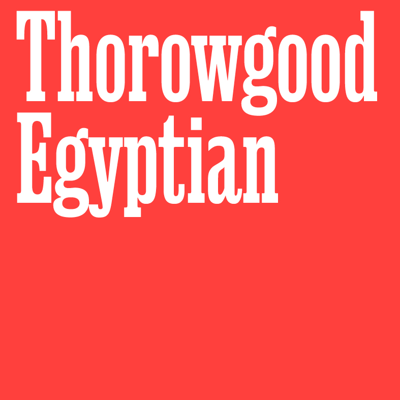
Expansion: Thorowgood Egyptian
Paul Barnes & Greg Gazdowicz
With five new weights with matching italics, it is the perfect encapsulation of early condensed slab forms. Famed for their punch in headlines it is the perfect companion to Thorowgood Grotesque.
commercialclassics.com/catal…
1
1
24
2,398
18 Jan 2023
EXPANSION: Blanchard by Paul Barnes & Tim Ripper. Two new weights have been added, available also as variable fonts.
commercialclassics.com/catal…


31
4,368
11 Jan 2023
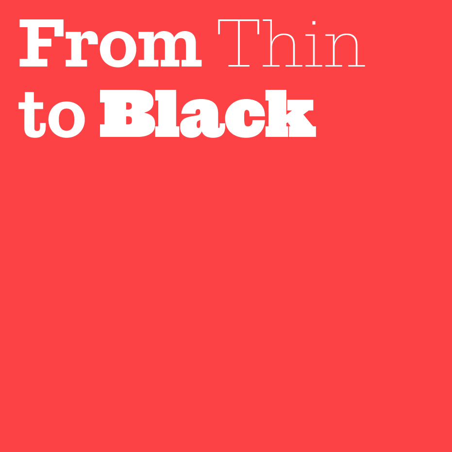
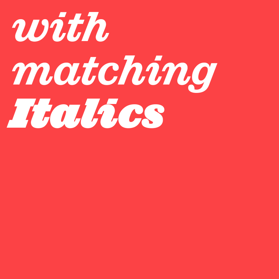
NEW RELEASE: Successor by Tim Ripper.
The slab serif convincingly reimagined for today; from Thin to Black with matching italics.
Available in Vault vault.commercialtype.com
1
14
1,834
Commercial Classics retweeted

2 Dec 2022
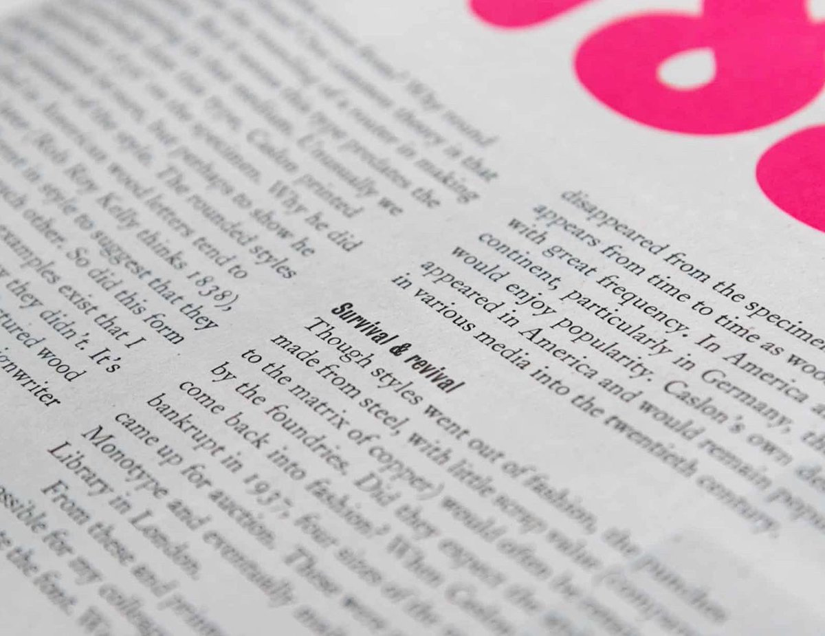
Our second contributor in EC3 is the wonderful Paul Barnes of @commercialclassics, who drew a custom version of Caslon Rounded specially to be cut as new wood type, to accompany his article. This is the first showing of that full alphabet, in upper and lowercase, in 14-line pica.

3
33
28 Nov 2022
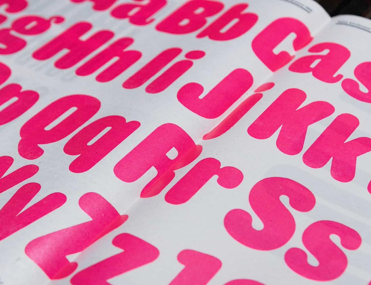
Lovely use of Caslon Rounded
28 Nov 2022

Return of the ’88 tee with @fallon_donal. Printed in East Wall and available until 5pm this evening.
threecastlesburning.bigcarte…

1
26 Sep 2022
Caslon Rounded looking fantastic in the hands of @PaulGuinan
26 Sep 2022
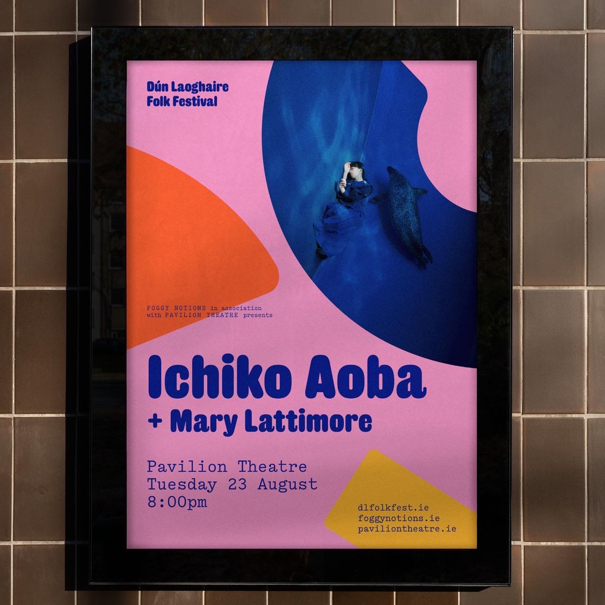
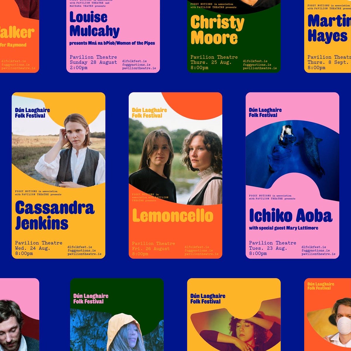
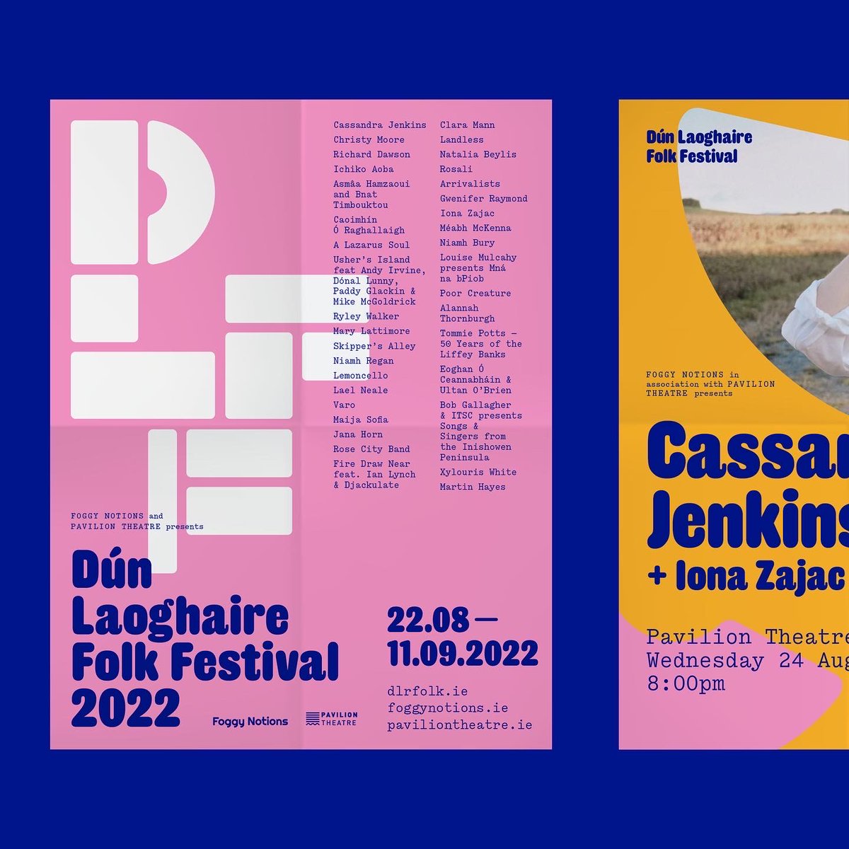
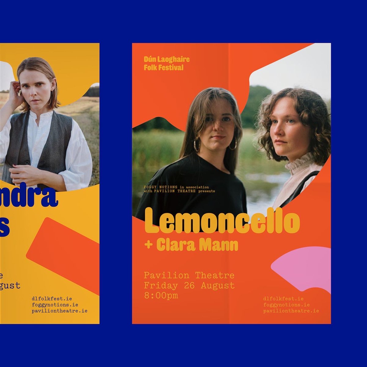
Visual identity, print and digital communications for Dún Laoghaire Folk Festival 2022. 70 artists and 20 events spanning music, film and discussion presented by @foggynotions and @PavilionTheatre
4
22 Sep 2022
Original Sans in its original form
22 Sep 2022

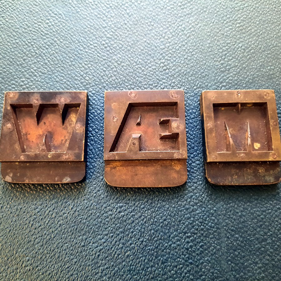
Rather than being struck with a punch, sanspareil mats, for very large types, were created as brass or copper ‘stencils’ riveted to a metal backing plate. The rivets are visible in these examples. Invented by Caslon in 1810.
2
15
20 Sep 2022
Paul will be introducing the ongoing digitisation of @stbridelibrary specimens
4
1 Sep 2022
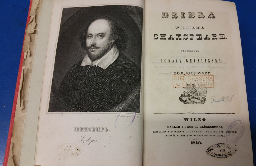
So much to love typographically, but especially Shakespeare in an Italian
1 Sep 2022

A Little Patch of Ground
A new guided audio performance created in collaboration between Parrabbola and the @E2EShakespeare Project which takes place in locations across the city centre from 15 – 17 Sept.
Free to attend however booking is required via:
everythingtoeverybody.bham.a…
1
2
27 Jul 2022
Lots of Doric Condensed and Antique No. 6 for the Quentin Blake Centre for Illustration.
itsnicethat.com/news/fraser-…
@illustrationHQ @F_M_studio @itsnicethat
1
7
1 Jul 2022
A modern classic by @commercialtype. A new take on the Caslon model, a take on the Dutch model. Double Dutch.
3
1 Jul 2022
Featuring lots and lots of Caslon Doric.
1
2
5 May 2022
Original Sans looking good over 190 years since it first appeared @order

Original Sans by @commerclassics is used as the primary typographic expression, emphasizing the power, message, and mission of the organization.

2
19
27 Apr 2022
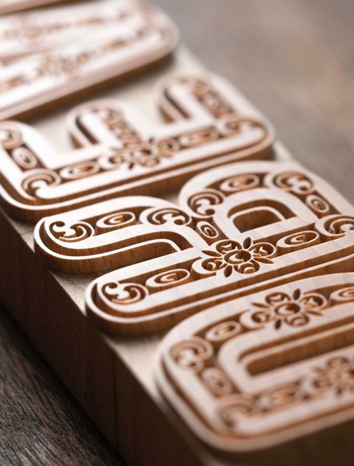
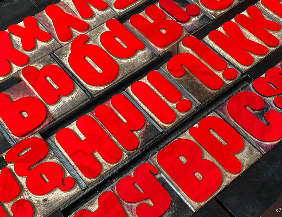
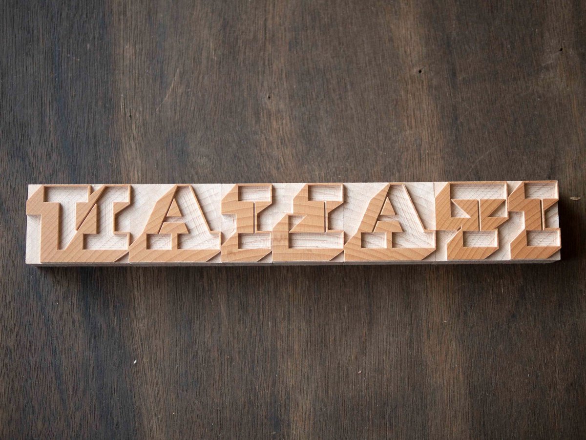
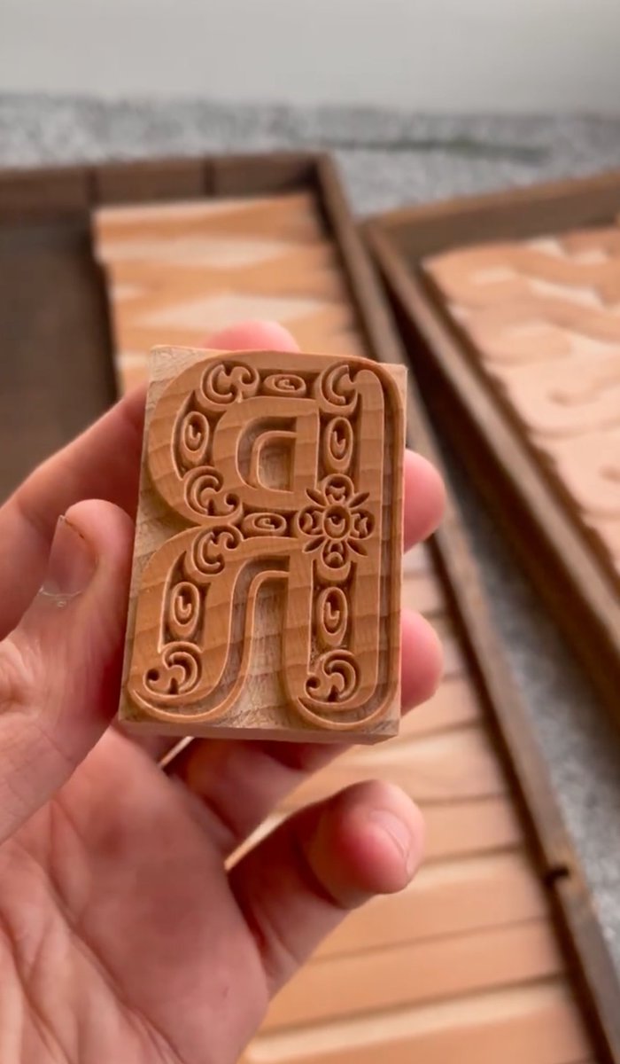
Now available in wood @reppiRmiT fantastic version of Caslon Rounded Ornamented. I think Henry Caslon would be proud. 12 line or 144 point. Coming soon Thorowgood Grotesque Dimensional. Which may or may not be true.
2
3
48
20 Apr 2022
From Metal to Digital to Wood. Caslon Rounded, Caslon Italian Shaded and soon Caslon Rounded Ornamented. typehighdesign.com
2
6
68
19 Apr 2022
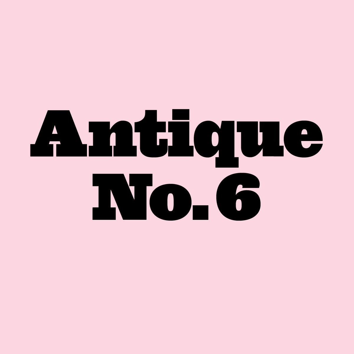
Caslon Ionic and Antique No. 6 were made for this!
3
19 Apr 2022
Lots and lots of Caslon Doric
19 Apr 2022

Commercial Classics retweeted

19 Apr 2022
2
3
2