
Joined May 2025
- Tweets 150
- Following 7
- Followers 704
- Likes 93
33 Photos and videos


Pinned Tweet

Create UI v0.5 Pre-Sale is live! 💜
It's finally here. The lowest price will ever be!
→ Figma Design System
→ Free Code Library
→ Pro Code Library (early Q3)
→ createui.co 🔗 | Create UI
2
2
24
1,641
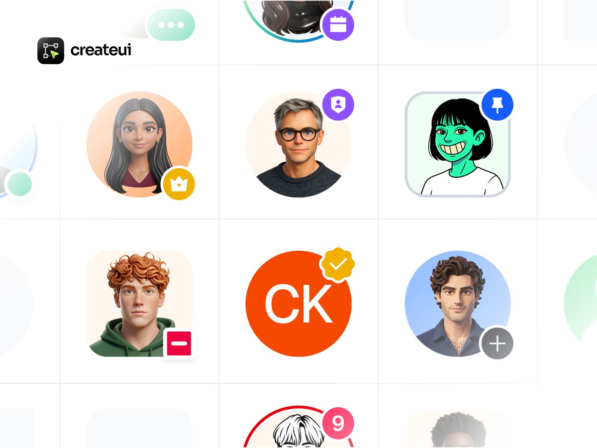
Avatars built for real product needs.
Images, initials, and icons paired with status dots, badges, rings, and stacked groups, so presence, roles, and verification read instantly.
1
1
39
Create UI finally here. The lowest price will ever be!
→ createui.co 🔗
1
31
Create UI - Design System retweeted

1h
File format icons 📂
A complete design & code ecosystem.
→ [@createuico]™

3
1
15
232
Create UI - Design System retweeted
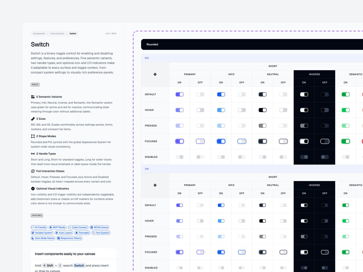
A better way to document component variants.
Every size, state, theme, and semantic style is mapped into a clear grid so designers and developers can understand the system at a glance.
3
4
77
3,510
A better way to document component variants.
Every size, state, theme, and semantic style is mapped into a clear grid so designers and developers can understand the system at a glance.
3
4
77
3,510
Create UI finally here. The lowest price will ever be!
→ createui.co 🔗
279
Button Groups for compact product actions.
Use them for view switches, filters, toolbars, dropdown actions, and grouped navigation patterns.
4
8
254
8,906
Create UI finally here. The lowest price will ever be!
→ createui.co 🔗
177
Create UI - Design System retweeted
Button Groups for compact product actions.
Use them for view switches, filters, toolbars, dropdown actions, and grouped navigation patterns.
4
8
254
8,906
Create UI - Design System retweeted
Shadows made to feel consistent, not random.
From subtle lifts to stronger layered depth. Every shadow is named, reusable, and ready for Light and Dark interfaces.
1
3
74
3,929
Breadcrumbs for clearer product navigation.
Use text, icons, avatars, badges, and dropdowns to guide users across complex interfaces.
3
138
Create UI - Design System retweeted
Jun 10
If your design system doesn't look like this, it's a UI kit.
Every detail, mapped and organized. 🤌
A complete design & code ecosystem.
→ [@createuico]™
12
8
130
5,696
Create UI - Design System retweeted
Jun 9
Everyone said this didn't exist.
So we built it. Designers' dream. 😎
→ Responsive Typography, Breakpoints, Spacing and Radius across desktop, tablet and mobile.
→ Font family selector
→ Color mode selector
→ Primary color selector
→ Neutral color selector
Create UI design system {v0.5}
2
4
22
2,566
Checkboxes for every selection context.
Built for forms, settings, data tables, and complex selection flows with semantic variants and token-driven styling.
5
177
Create UI - Design System retweeted
App Store badges, structured for every interface.
Light, dark, outlined, or filled. Icon-only or with text. 12 brand options, ready to match your interface.
4
3
31
1,371
Create UI - Design System retweeted
Jun 8
Click. Recolor. Dark mode. Repeat.
The whole component is yours to play with. 🫠
2
4
35
1,983
App Store badges, structured for every interface.
Light, dark, outlined, or filled. Icon-only or with text. 12 brand options, ready to match your interface.
4
3
31
1,371
Part of the Create UI Design System
Explore more at ⬇️ createui.co
1
183
Create UI - Design System retweeted
Chips for modern product interfaces.
Use for filters, labels, statuses, attributes, and categorized values with flexible variants, sizes, colors, icons, and interaction states.
1
2
18
1,102