
#Dad and host of @datalabpodcast. Opinions my own danlarson.io. planner of Jawns. #datajawn
Joined April 2009
- Tweets 2,936
- Following 2,005
- Followers 1,076
- Likes 7,339
340 Photos and videos


15 May 2023
2
12
38
6,073
5 Feb 2023
I just published Using the R and the Tidyverse to analyze Joel Embiid’s Player Stats link.medium.com/PPYwor35axb #sixers @JoelEmbiid
1
2
2
1,398
31 Dec 2022
I just published Three SQL Techniques to add to your toolkit link.medium.com/7kG7NTt59vb
516
27 Dec 2022
I just published Unlocking the Power of Data Engineering in the Science Lab link.medium.com/gIftiHp26vb
1
298
Daniel Larson retweeted

22 Dec 2022
Blue Christmas Part 2- Using Tidytext to calculate the sentiment of Christmas Song Lyrics by @datadanlarson link.medium.com/jOyQQIeIWvb #rstats
3
3
1,490
21 Dec 2022
I just published Blue Christmas Part 2- Using Tidytext to calculate the sentiment of Christmas Song Lyrics link.medium.com/jOyQQIeIWvb
1
1
233
16 Dec 2022
Still Blue Christmas — Still Data Driven link.medium.com/Olr2b6Y4Nvb #spotify #ChristmasMusic #RStats
1
2
545
Daniel Larson retweeted
14 Dec 2022
Three ggplot2 visualization techniques for displaying distributions by @datadanlarson link.medium.com/lUisNvzEKvb #rstats #ggplot2 #dataviz
9
18
Daniel Larson retweeted

19 Sep 2022
Pretty neat repo with a bunch of algos implemented from scratch for learning purposes.
From ML, to Computer Vision, to more standard Computer Science techniques.
👉 github.com/TheAlgorithms/Pyt…
14
321
1,334
Daniel Larson retweeted

11 Jan 2022
The “line graph extending beyond the region of the plot” thing seems like a purposeful and perhaps powerful data viz choice.
I tell my students that your aesthetics should emphasize the message of your graph. This choice emphasizes that this isn’t “normal”, it’s quite extreme.
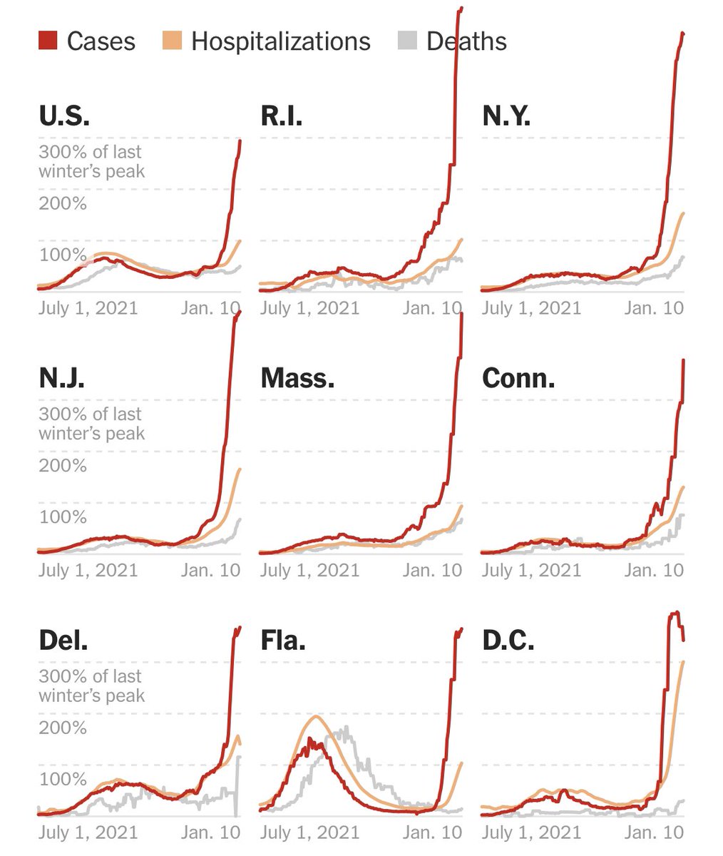
ALT A multi-faceted plot from the NYT Covid page, showing cases, deaths and hospitalizations as overlapping line graphs. 9 states/regions are shown in a 3x3 grid. From top left to bottom right: US, Rhode Island, New York, New Jersey, Massachusetts, Connecticut, Delaware, Florida, and D.C. Many of the plots has a red “cases” line that extends above the region of the graph, even overlapping with titles outside the plot.
14
102
763
Daniel Larson retweeted

10 Sep 2021
The first rule of machine learning: Start without machine learning
25
246
1,694
26 Aug 2021
Still on the hunt for a #dataanalyst to work on credit and risk analytics.
jobs.comcast.com/jobs/descri…
Daniel Larson retweeted

22 Aug 2021
I legit have no clue what's going on with COVID / delta variant anymore, and I'm too burned out to try to find out 🤷🏼♀️.
Seriously feel for parents of small kids... rough out there
6
1
63
Daniel Larson retweeted

7 Nov 2020
Today is a good day.
It’s easier to be a parent this morning.
Character MATTERS.
Being a good person MATTERS.
This is a big deal.
It’s easy to do it the cheap way and get away with stuff — but it comes back around.
Today is a good day.
#PresidentBiden
#VotersDecided
11,672
55,836
241,744
Daniel Larson retweeted

6 Nov 2020
I HAVEN'T MADE EYE CONTACT WITH MY CHILDREN IN THREE DAYS.
44
52
2,559