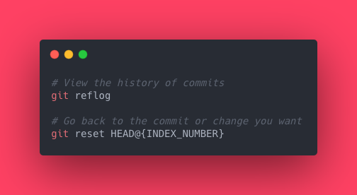
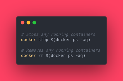
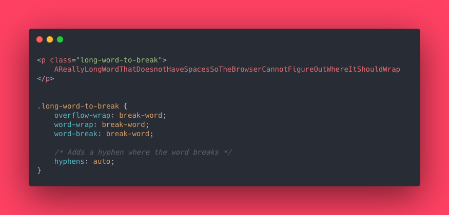
Providing the world with common and easy to use code samples to make your coding journeys easier. #100DaysOfCode #javascript #reactjs
- Tweets 443
- Following 144
- Followers 272
- Likes 311


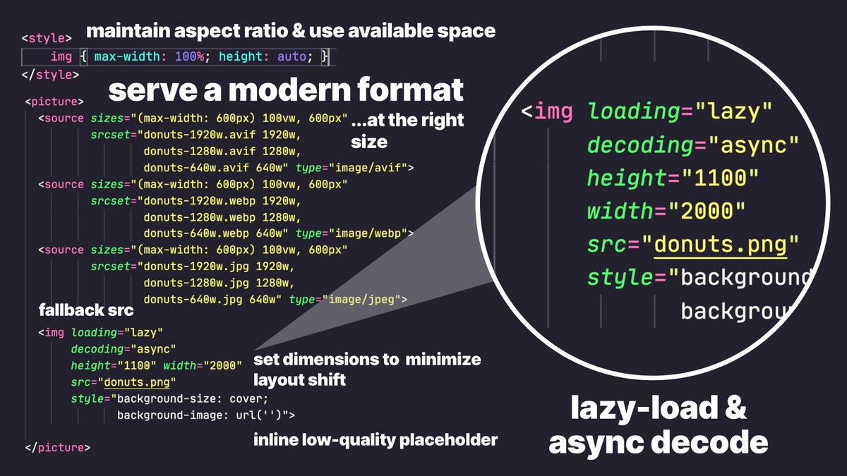
ALT In the below code-snippet, aspect ratio is maintained, a modern image format is served at the right size, dimensions are set to reduce CLS and the image is lazy-loaded and async decoded. <style> img { max-width: 100%; height: auto; } </style> <picture> <source sizes="(max-width: 600px) 100vw, 600px" srcset="donuts-1920w.avif 1920w, donuts-1280w.avif 1280w, donuts-640w.avif 640w" type="image/avif"> <source sizes="(max-width: 600px) 100vw, 600px" srcset="donuts-1920w.webp 1920w, donuts-1280w.webp 1280w, donuts-640w.webp 640w" type="image/webp"> <source sizes="(max-width: 600px) 100vw, 600px" srcset="donuts-1920w.jpg 1920w, donuts-1280w.jpg 1280w, donuts-640w.jpg 640w" type="image/jpeg"> <img loading="lazy" decoding="async" height="1100" width="2000" src="donuts.png" > </picture>