
Design Partner for Tech Founders II Portfolio: emondatta.com/
Joined November 2018
- Tweets 8,474
- Following 374
- Followers 738
- Likes 25,076
141 Photos and videos
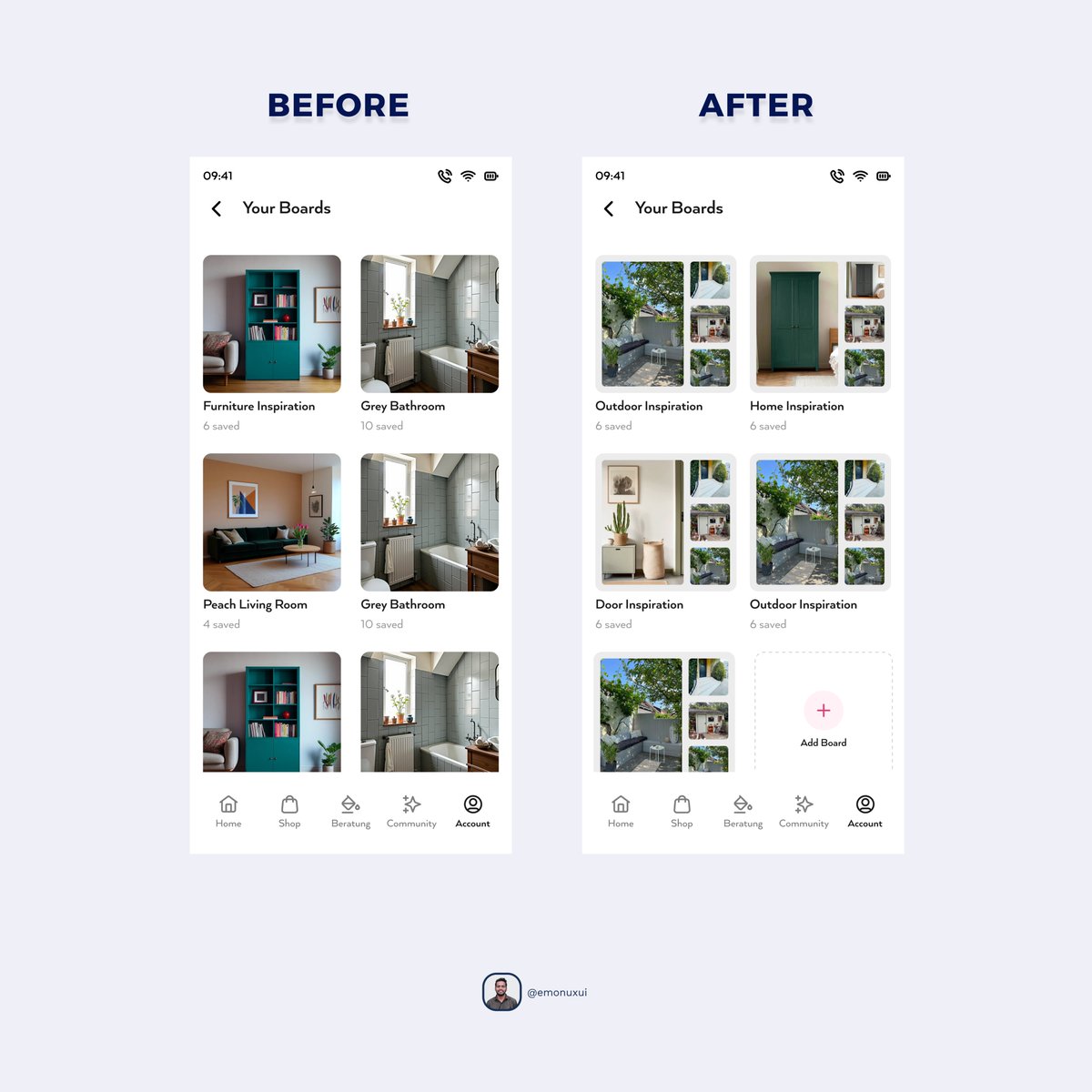


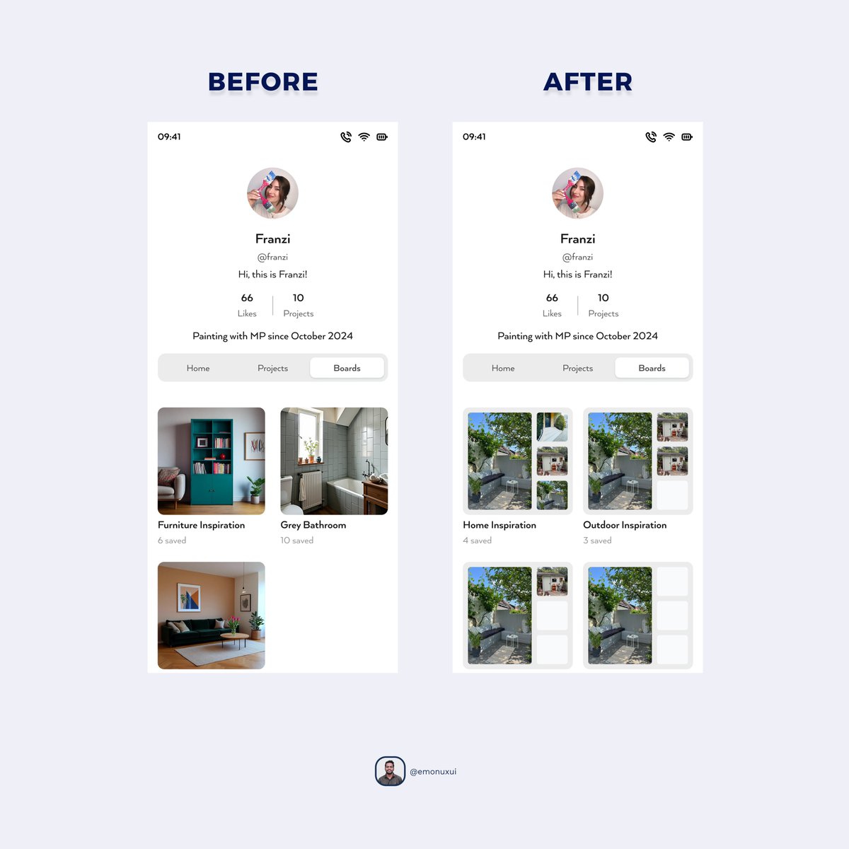

A more efficient board overview that makes saved inspiration easier to scan, compare, and manage at a glance. The updated layout shows more boards on screen, uses stronger visual previews, and adds a clear Add Board option to keep the experience flexible and organized.
8
11
213

Jun 13
A dark, futuristic AI product concept that presents the assistant as a smart teammate through strong hierarchy and immersive visuals.
14
19
394
Jun 12
A focused task detail view that keeps discussion, status, and activity in one place for faster team collaboration and clearer execution.
15
26
457
Jun 11
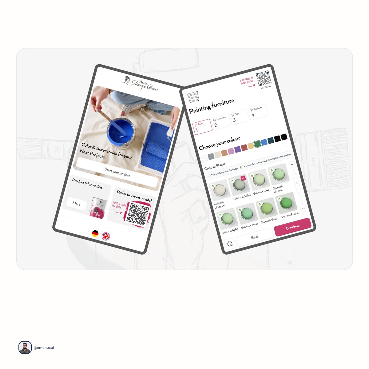
This is where most retail UX falls apart, the moment a customer has to make a decision.
Choose your shade. Choose your finish. Pick the right product for your surface.
We designed this flow so it guides without overwhelming. Every screen reduces the decision, not expands it.
Fewer choices shown at the right time converts better than more choices shown all at once.
12
23
465
Jun 10
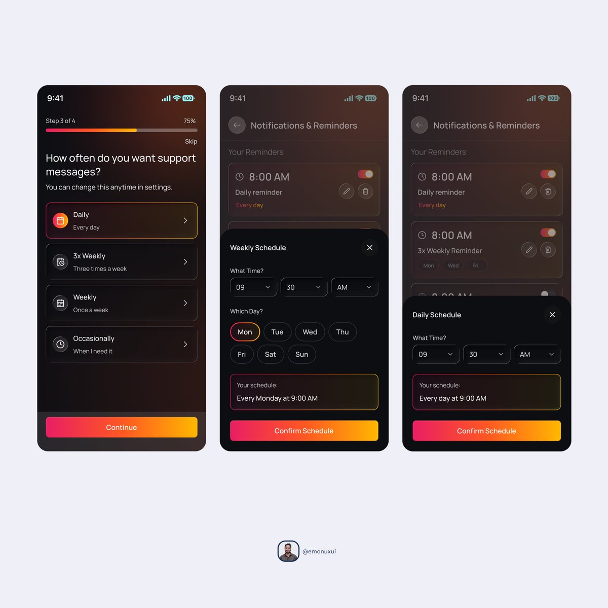
A calm and intuitive notification flow designed to help users choose when and how they want support messages, without feeling overwhelmed.
13
30
519
Jun 9
This is how we work with competitor analysis.. When a new project comes that we have to work on from start to finish, we put together different types of competitor apps, research them, and from there, we come up with a better output. We start designing. This way we give our best output where we provide better features and clean modern UI than our competitors. Clients are satisfied with us and client satisfaction is our main goal.
12
38
653
Jun 8
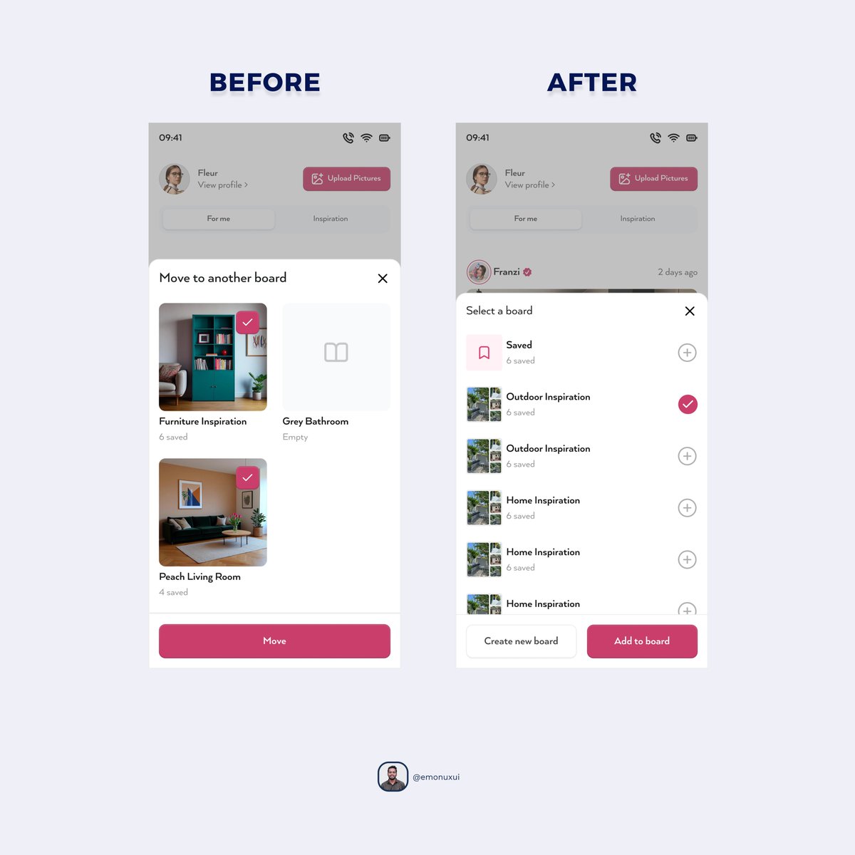
The bookmark flow was redesigned to reduce friction and make saving inspiration more intuitive at a glance. The new version shows 6 folders without scrolling, adds a Saved option for users who want to save without choosing a folder, and includes 4-image thumbnails so users can quickly identify the most relevant content.
14
38
601
Jun 7
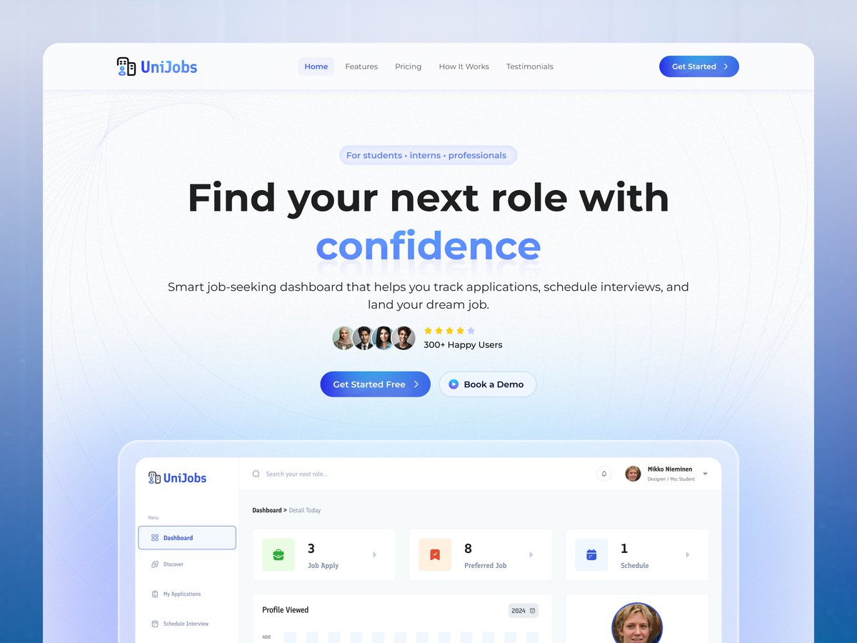
A clean recruitment-focused landing page designed to help job seekers find roles with confidence and clarity.
19
1
43
687
Jun 6
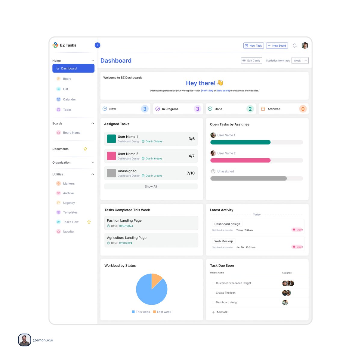
A clean task-management dashboard designed to give users a quick snapshot of progress, workload, and upcoming tasks at a glance.
18
45
875
Jun 5
Designed this to make product discovery feel clear and engaging from the first screen.
12
37
810
Jun 3
A warm, motivational onboarding flow that blends daily affirmations, goal setting, and AI coaching into a calming user journey.
13
29
564
Jun 2
After sending the design file to the client, he specifically comments on any section of the screen where there is a problem or feedback. This has many advantages for the designer and many advantages for the client, resulting in a better output, and the final draft can be reached very quickly.
14
33
606
Jun 1
The results screen has been redesigned. The UI here has been made more eye-catching and smoother, making it more user-friendly. And the navigation has also been updated so that users can better navigate.
15
1
41
662
May 31
A refined, immersive hero section that uses lighting, depth, and contrast to create a more cinematic brand presence.
8
25
590
May 30
A sleek dark-mode energy monitoring interface designed to make usage, savings, and system performance easy to understand at a glance.
17
28
588
May 29
The results screen has been redesigned. The UI here has been made more eye-catching and smoother, making it more user-friendly. And the navigation has also been updated so that users can better navigate.

6
22
557
May 28
Exploring color isn’t about aesthetics. It’s about behavior.
Different color variants test how hierarchy, contrast, and CTA visibility affect scanning.
Sometimes a small color shift is enough to guide attention and change how fast users make decisions.
6
14
343
May 27
A calm, premium wellness experience designed to make the app feel approachable, focused, and easy to explore.

11
21
450
May 26
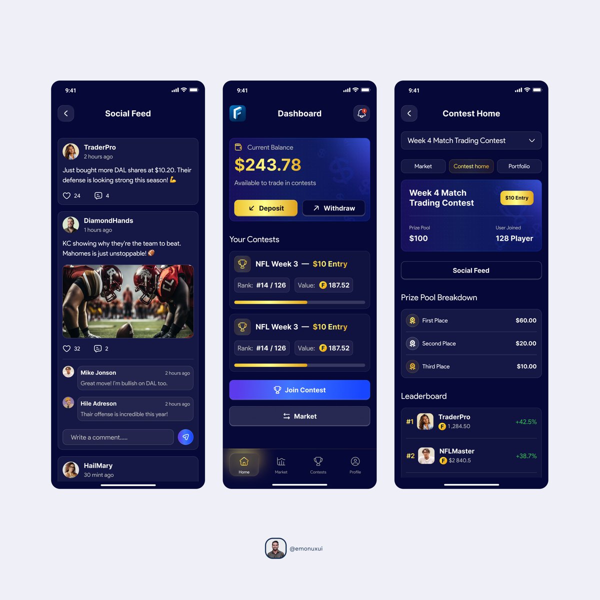
A connected fantasy sports experience that blends community, live contest action, and account management into one seamless product.
8
19
322