Evocative branding enhances performance with ambitious leaders, engaged teams, and connected customers.
Joined December 2011
- Tweets 2,160
- Following 230
- Followers 308
- Likes 19
977 Photos and videos


13 Aug 2021
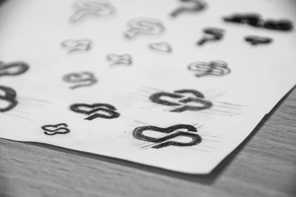
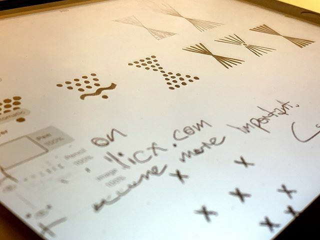
Back when we were creating concepts for the Connected Platforms #brand #design, we were still using pencil and paper for the ideation phase. These are some of the concept #sketches that lead to the final logo design that's pretty close to the bottom-right sketch!
#branddesign
9 Jul 2021
This is the final result from the Welding Wizard #brand #design project. Refining and simplifying some of the more complex sketches, resulted in a sturdy looking figure that retained the wizard cloak and hat, but also featured a welding mask for a face.
evocative.cc/projects/weldin…
8 Jul 2021
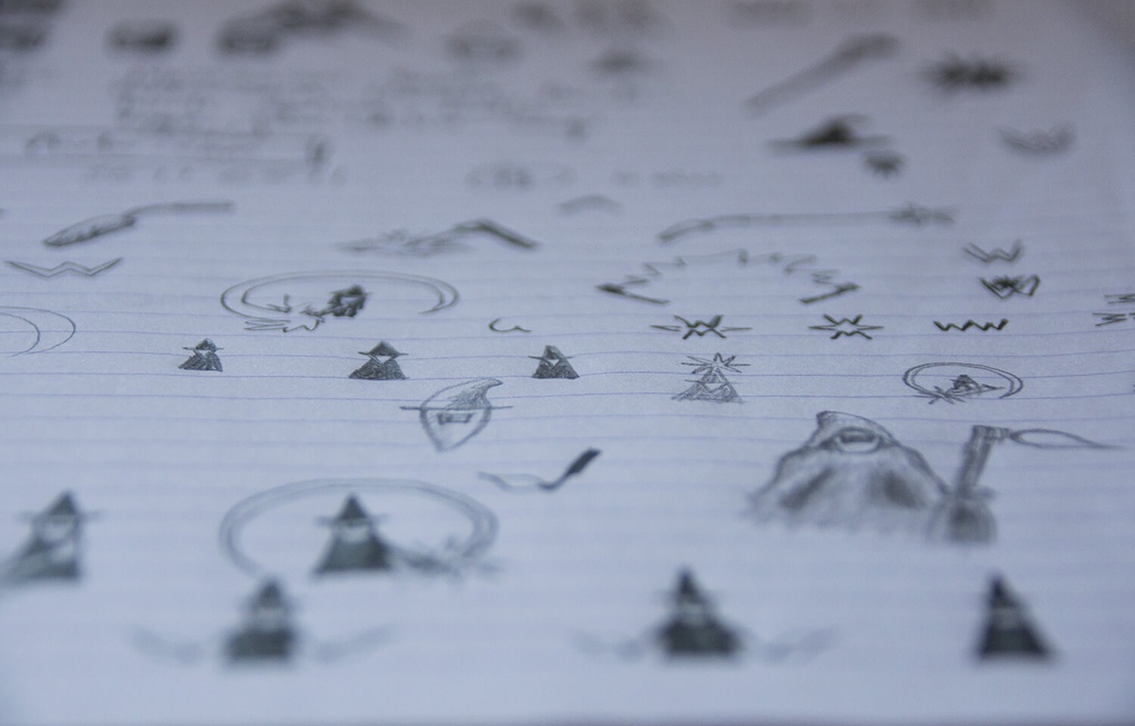
These are some of the original sketches from the Welding Wizard #brand #design project. Keen to play on the ‘wizard’ part of the name, many sketches were done: from geometric and robotic looking wizards, to more free-form supernatural type images.
evocative.cc/projects/weldin…
2 Jul 2021
Evocative Brand Design has been featured in the latest @OncordSoftware case study.
Ben talks about how Oncord has enabled us to offer website design to our clients, perfectly complimenting our core brand design and graphic design services.
oncord.com/client-stories/ev…
1
12 Jun 2020
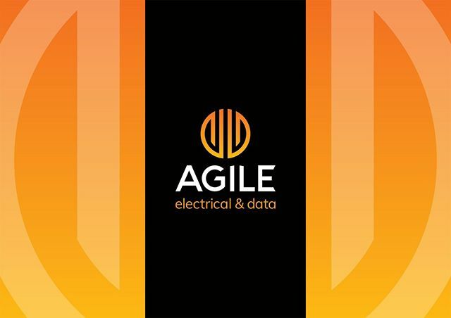
A very welcome sight to see one of our logos in the driveway!
The insights we gained during the brand design process about Agile Electrical and Data's values, expertise and professionalism, meant we had no hesitation in booking them in for some electrical work.
1
Evocative | Brand Design retweeted

3 Apr 2020
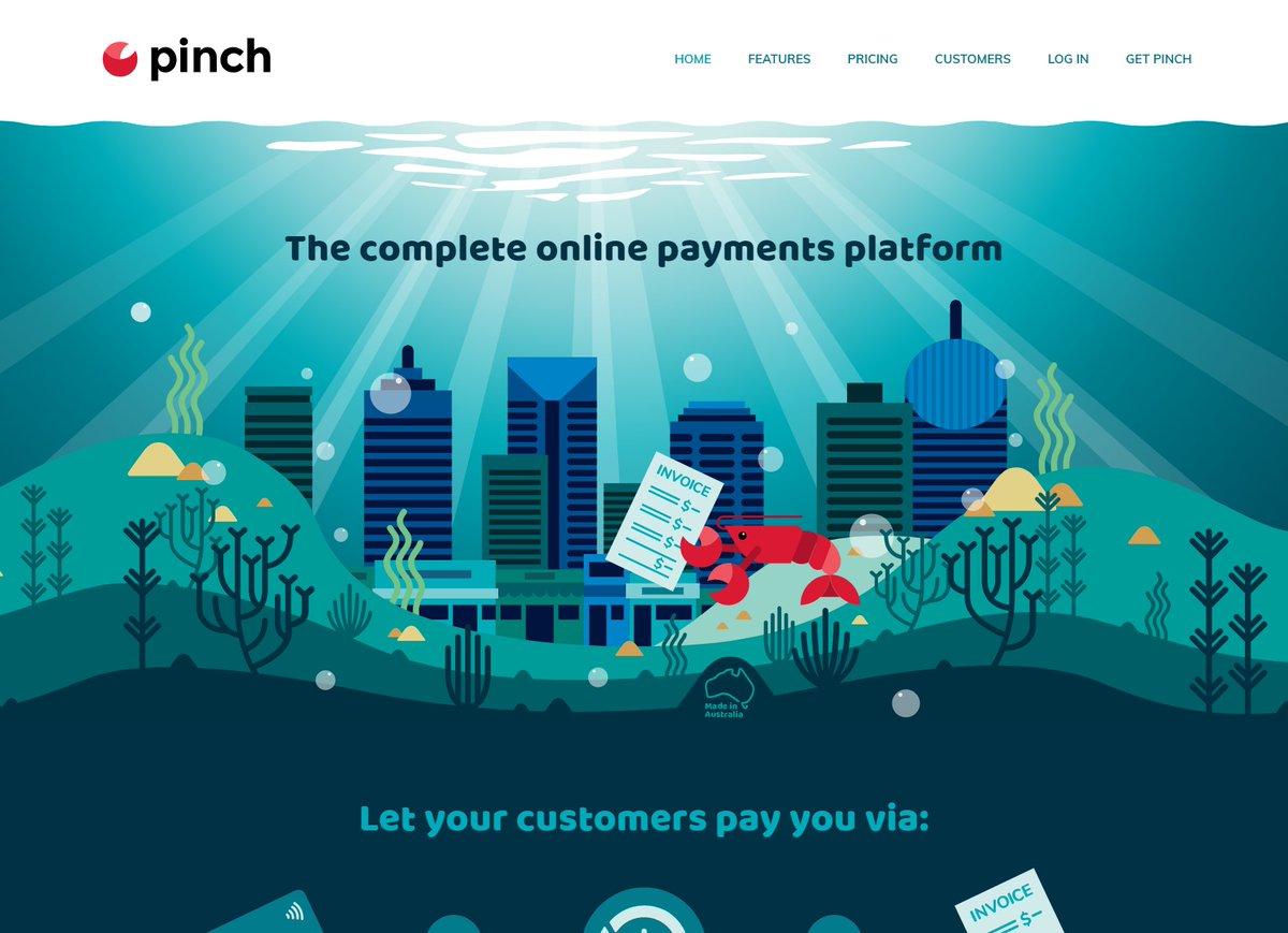
We're proud to see the new Pinch Payments website go live this week. Built on the Oncord platform with the help of Ben Johnston at @evocative_cc
Absolutely stunning site that does justice to a highly beloved and innovative brand.
Check it out here:
getpinch.com.au
2
5
21 Feb 2020
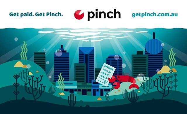
We created a range of illustrations to build the new brand design for Pinch Payments. This particular scene is made ⠀
up of a full underwater cityscape illustration and a range of individual underwater⠀
elements using the brand design’s colour palet… ift.tt/2T6XfOS
14 Feb 2020
We're very excited to present a first look at the new brand design we created for Pinch Payments (@pinchpayments). Designed to be a bit quirky while conveying trust and reliability, we developed the 'Pinchy' character using the existing brandmark along w… ift.tt/39sjkxY
5 Feb 2020
We worked with Chris and Christina to create a new name and brand design for their electrical and data business. Their old name was difficult to hear over the phone and customers had trouble remembering it—both significant issues for a business that runs… ift.tt/2GW4Zh3
28 Jan 2020
'We are so pleased that we chose to work with Ben at Evocative. We were looking to rebrand our business and the whole process was so much easier with Ben's help. It was fun too! Ben helped us really brainstorm what we were about, helped come up with a ne… ift.tt/2O6OnHr
7 Dec 2019
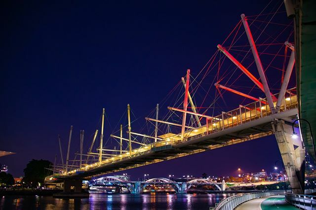
We were humbled to photograph the Kurilpa Bridge that was lit in red, yellow and black last night, in honour of late Brisbane Indigenous leader Uncle Sam Watson.⠀
⠀
Via the ABC: 'Across more than half a century, Mr Watson made an indelible contributi… ift.tt/36cmqEC
15 Nov 2019
Some Friday afternoon sketching for one of the brand design projects we're currently working on. This particular set of concepts is exploring a visual representation of data collection and analysis.⠀
⠀
hashtag#brand hashtag#branddesign hashtag#design… ift.tt/2XefgN5
1 Nov 2019
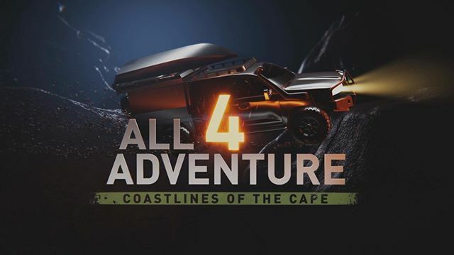
OFFICIAL ANNOUNCEMENT from our client All 4 Adventure (@all4adventure)
⠀
Jase and Simon are excited to announce that they will be returning to your screen with the 11th series of All 4 Adventure – Coastlines of the Cape! The action kicks off 1 Decemb… ift.tt/36oP8TO
1 Oct 2019
A significant part of branding a product range is the packaging design, seen here as part of the CampBoss and CampBoss 4X4 brands by All 4 Adventure.⠀
⠀
Each box relates to the others in the range, creating a sense of quality and consistency that enh… ift.tt/2nkxwqu
20 Sep 2019
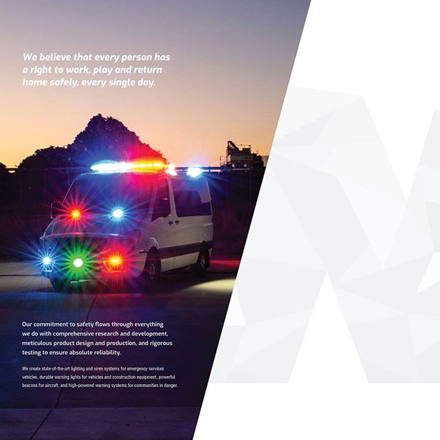
Companies that are purpose-centred provide connection and meaning for business owners, employees and customers. Priority of information is key: purpose, then process, and finally products.⠀
⠀
Working with Whelen Australia (@wheleneng), the true purpo… ift.tt/2V3lcaD
1
12 Sep 2019
We hear about this challenge from business owners all the time: they know all about what they do in their business, yet they find it immensely difficult to succinctly articulate what benefit their product or service provides to the customer.⠀
⠀
Part … ift.tt/34GFU4e
10 Sep 2019
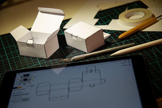
More product packaging concept work happening today. ⠀
⠀
The process starts with figuring out how the box needs to work, then some die-line sketches on the iPad, followed by a mini mockup box to ensure it folds together correctly.⠀
⠀
This particular … ift.tt/2LmFt7G
2 Sep 2019
This year Stramit is having its 30th birthday. We worked with their marketing team to create a 30 YEARS logo to help promote and celebrate the milestone.⠀
⠀
It was designed to be complementary to the original Stramit logo, incorporate their national … ift.tt/2PAUwyH
30 Aug 2019
Being an app first and foremost, creating a strong brandmark (icon) for RapidAssist was critical to allow development of app icons and other design elements. The RapidAssist system and app is designed to easily and quickly locate, track and communicate w… ift.tt/2LjZnyO

27 Aug 2019
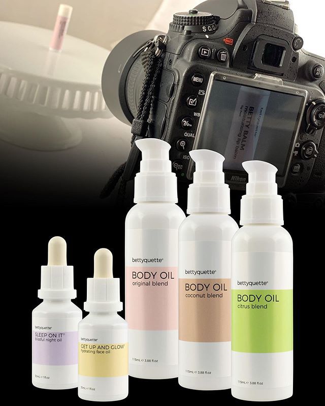
Photographing a new product in the @bettyquette range: 'Betty Balm' moisturising lip balm! High quality and consistent product photography is a crucial part of any brand that sells physical products—both in-store and online.⠀
⠀
bettyquette® began as … ift.tt/2MBUh4p