Photography, bikes, maps, lasers, and adventure. Climate warrior.
Joined May 2009
- Tweets 10,756
- Following 440
- Followers 302
- Likes 7,726
2,334 Photos and videos


2 Feb 2024
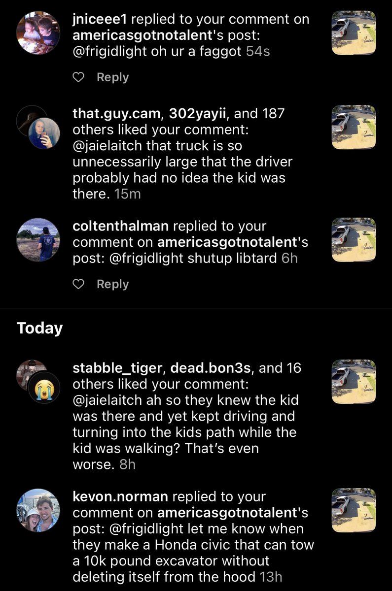
It's insane how easy it is to trigger the "my car is my entire personality" people. My comment said that the truck in the video was "unnecessarily large".
I suspect the venn diagram of these people and the "everyone gets insulted so easily nowadays" is a circle.
1
2
83
2 Feb 2024
My favorite is the one that suggests that everyone needs to be able to tow a 10k pound excavator.
27
30 Jan 2024
I'd like to flag this for all the morons telling me that bicycles need to have the same level of traffic enforcement as cars (they actually do. it's none) but also in a world of scarce resources spending any time on bicycle enforcement is asinine.
29 Jan 2024

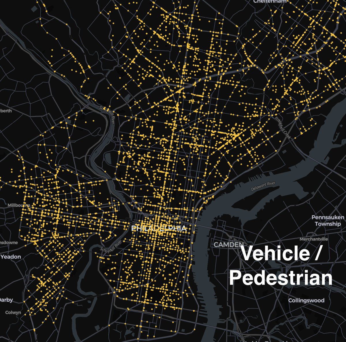
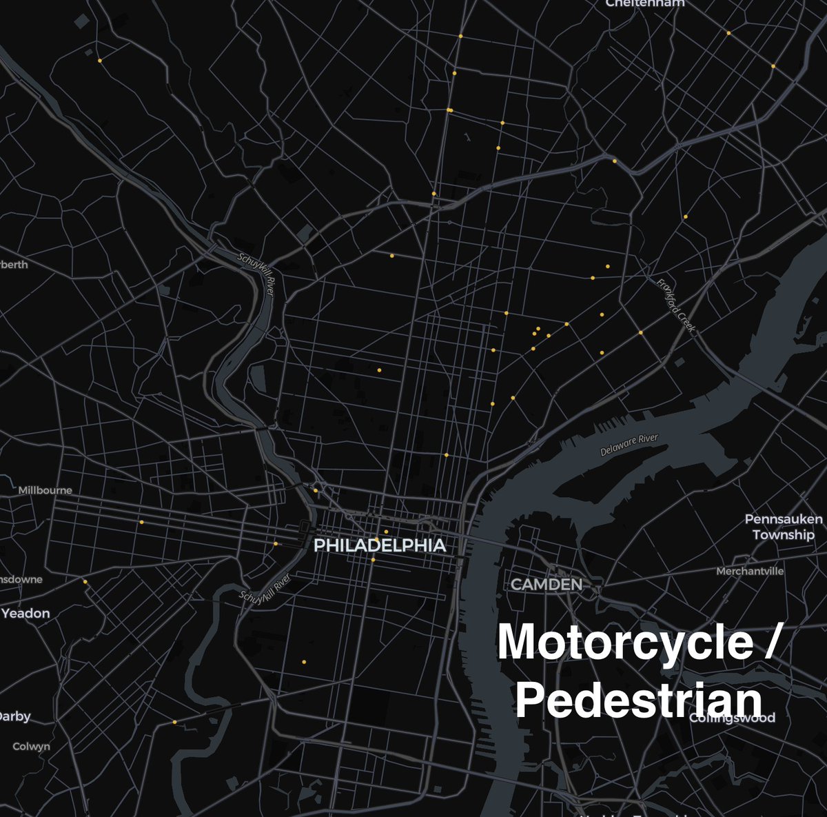
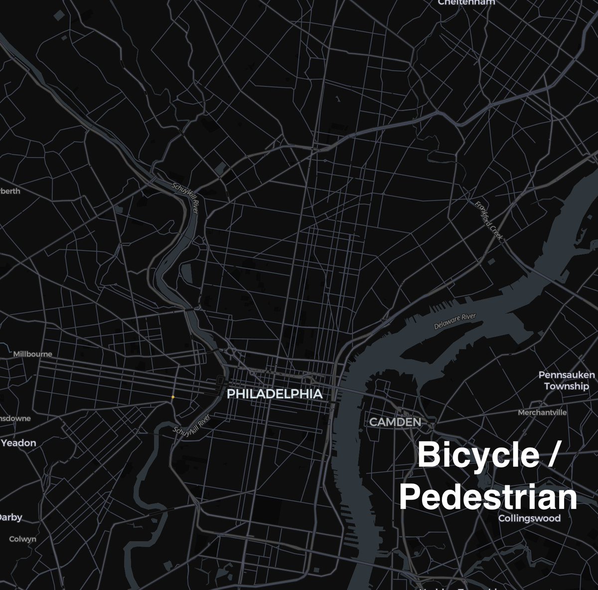
Philadelphia crash data from 2018-2022, filtered to only crashes involving pedestrians and injuries:

2
81
26 Jan 2024
I'm sure these drivers were escaping a tornado or terrorism or an abduction or something that necessitated this behavior.
19 Jan 2024

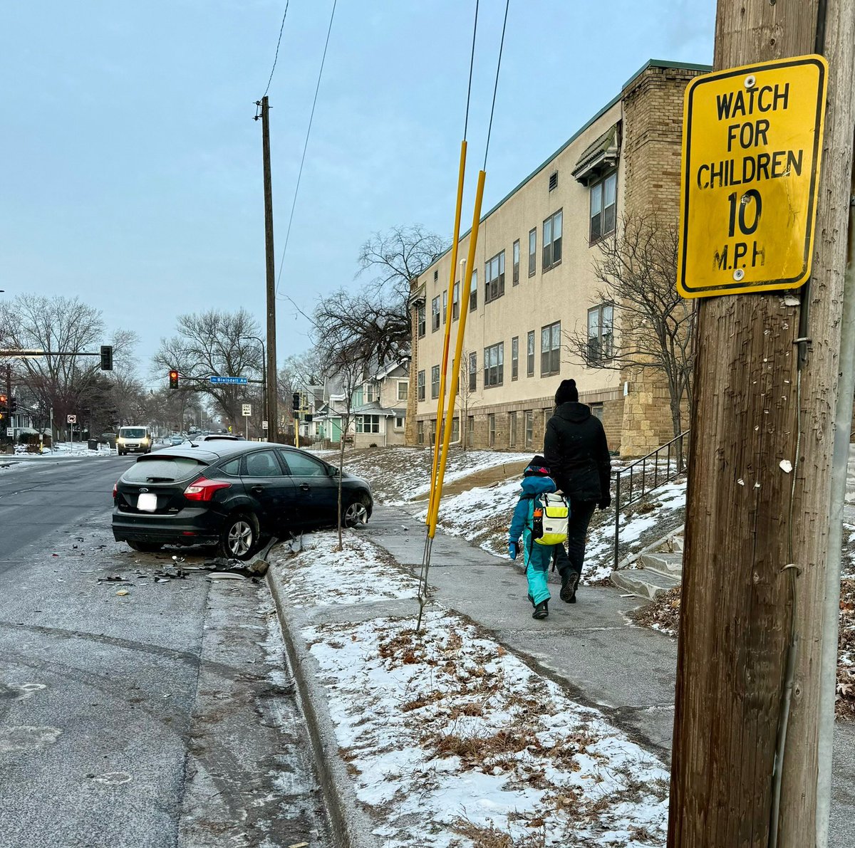
Nothing quite like finding two recently smashed cars on our walk to school… with one up on the sidewalk.
I’m not sure the specifics on these crashes, but 35th St is in dire need of traffic calming. This stretch is up for reconstruction, but won’t begin until 2027-28.

68
frigidlight retweeted

25 Jan 2024
My right to not have to dodge someone going 100mph on a public road is more important than your right to go 100mph.
If you don’t understand this you are literally a child and don’t deserve driving privileges.
147
101
1,835
95,746
23 Jan 2024
I just love this idea that inner cities are full of criminals itching to do crime in the suburbs and the only thing stopping them is lack of public transit.
This was a huge reason behind opposition to a train to KOP when I lived in Philly and it was moronic then too.
22 Jan 2024

If we cleaned up the slums in Salt Lake City, the people of Draper would be less worried about visitors from SLC traveling to their city by train.
I'm in favor of more interconnectedness, but we have to clear out some of the rot first.
2
129
23 Jan 2024
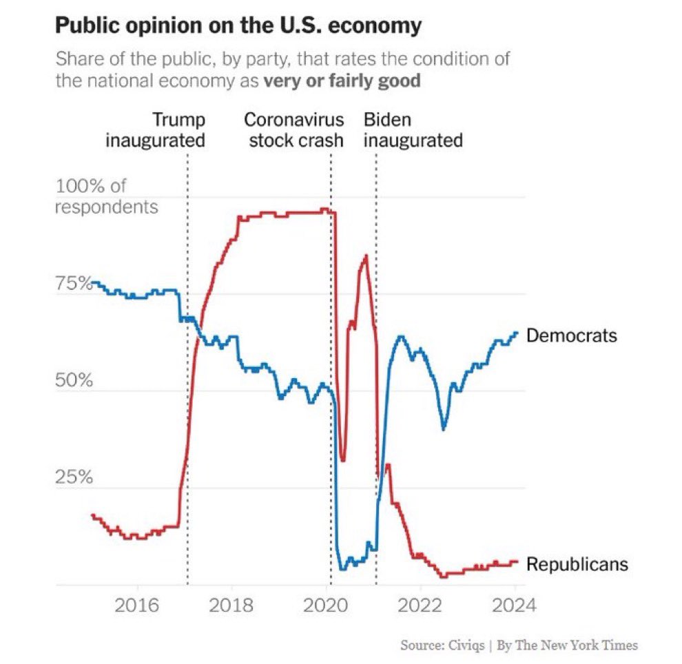
I wonder what this looks like if you layer on some actual objective financial analysis. My theory is that one "public opinion" line much more closely matches reality.
23 Jan 2024

How interesting is this chart?
Instead of using objective financial analysis to assess the state of the economy and your financial health, people let their party affiliation take the lead in determining the economic health of our country.
The numbers are the numbers, no?
83
19 Dec 2023
As if people who are this upset about alleged migrants would ever be ok with the government giving money to poor people.
19 Dec 2023

If you are having trouble feeding your family or paying your rent, just know the government is paying for illegal migrants to fly Delta premium and be bussed to a city near you
53
8 Dec 2023
This reminds me of the time a teacher told me that "brobdingnagian" was not a word and then gave me a detention when I showed her the word in the dictionary she kept in her classroom.
1
101
13 Nov 2023
I had to really hold my tongue when the old folks where I live starting bitching about having to pay to hookup to town sewer. Years of lectures about my generation being lazy, needing handouts from the gov't, etc were forgotten very quickly.
1
67
frigidlight retweeted

15 Oct 2023
Car culture is so strong in the US that people post videos of themselves breaking the law in a 3500-pound vehicle and other drivers will empathize with their misfortune of being held accountable.
14 Oct 2023

That's me driving the white Crown Vic on Blagden Ave at Allison St NW. DC has fined me $200. Should I pay or contest it?
Community note
According to the DC DMV, this vehicle (Maryland license plate PG0484) was fined $100 by a stop sign camera at Blagden & Allison on 9/29/2023—not $200.
prodpci.etimspayments.com/pbw/include/dc…
27
44
881
63,646
11 Jul 2023
Same. With glee.
10 Jul 2023

I realise this is a very unpopular opinion that’ll lose me a few Twitter friends…but whenever I see these on a beach or mountain, I kick them over.
There. I said it.

1
95

frigidlight retweeted


43
6
272
140,590
frigidlight retweeted

5 Jul 2023
I hope everyone survived the fireworks last night. The video I posted last night was an aerial shot over residential neighborhoods in Pierce County.
My opinion is fireworks, especially mortar shells, have no business in crammed neighborhoods.
What’s your opinion?
70
14
327
28,744
frigidlight retweeted

(deep sigh) All six wildfires in the Pacific Cascade Region this weekend were caused by fireworks.
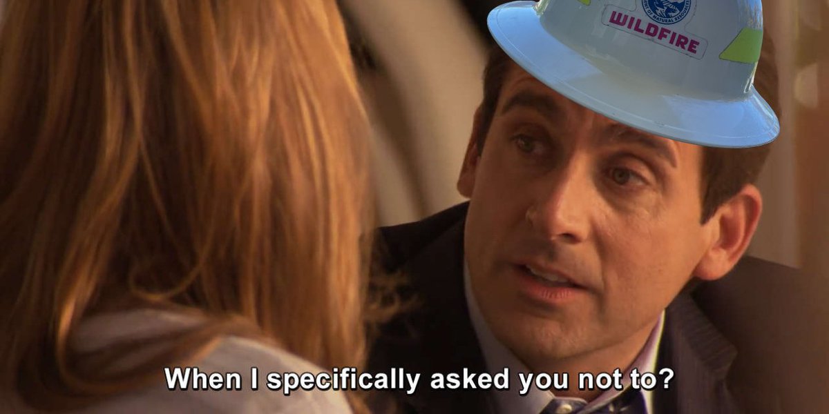
ALT Wildland firefighter Michael Scott expresses disbelief that someone would be reckless with their fireworks. "When I specifically asked you not to?" he says, reflecting on how he asked SO NICELY, too.
274
10,352
74,039
3,681,200
frigidlight retweeted

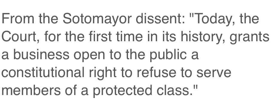
1 Jul 2023
If I understand correctly, a Christian woman invented a hypothetical scenario in which she felt threatened by imaginary gay people, and the Supreme Court not only agreed to hear the case but ruled that her bigotry is acceptable
888
4,226
17,092
880,297