
Microsoft MVP, Founder, BI Pixie
Joined April 2009
- Tweets 1,311
- Following 304
- Followers 2,800
- Likes 563
282 Photos and videos


In this video, you can learn how to track user clicks in #PowerBI in less than 7 minutes and measure the effectiveness of your dashboards like a pro
youtu.be/RaRpwd79R3A
7
296
Just published a new post on #Fabric dataflows reuse in CI/CD 🚀
Learn 3 practical tips to make dataflows reusable across workspaces without hard-coding or managing IDs — resulting in cleaner, more scalable CI/CD. datachant.com/2026/01/29/3-t…
1
8
328
🚀 New Open-Source Project!
I just released Trello-Power-BI. It's a GitHub repo that helps you bring your Trello data into #PowerBI including #PowerQuery, Semantic Model and Visualizations in PBIP format. datachant.com/2025/09/30/ana…
1
6
228
In 10 days, semantic models and dataflows using AI Insights in Power Query will stop refreshing. Sentiment analysis is one of these common features. Read this article if you need maintain this logic in Power Query datachant.com/2025/09/05/sen…
1
6
406
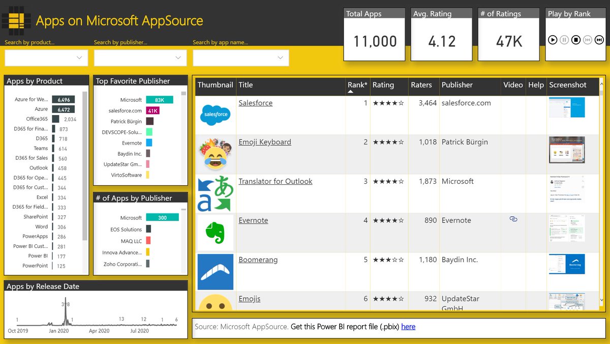
🚀 The BI Developers Leaderboard is now available on #AppSource in the latest version of BI Pixie.
appsource.microsoft.com/en-u…
1
1
171
Learn how to allow Real-Time Dashboard users in #MicrosoftFabric to select their local time zone using a dashboard parameter.
datachant.com/2025/07/16/tim…
#RealTimeIntelligence
1
10
350
Excited to share my submission to #PowerBI #DataViz world championship: a unique Power BI experience that lets you express love through emojis! 💖and see how others expressed their love as the report tracks its own usage
community.fabric.microsoft.c…
2
198
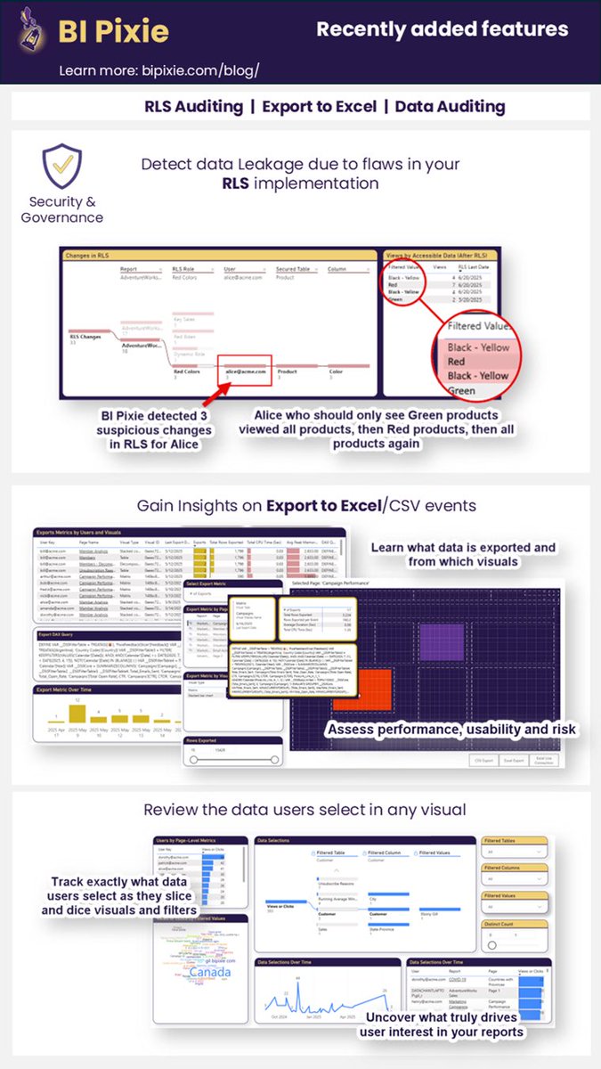
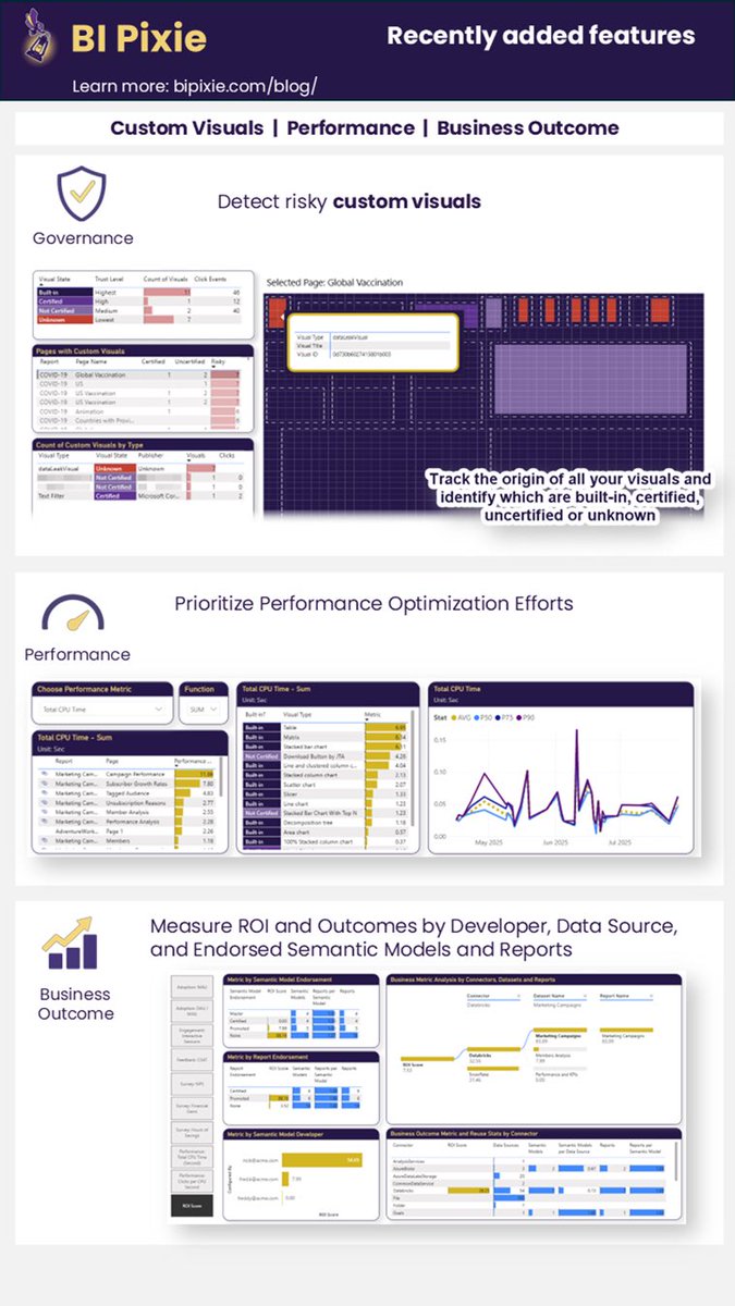
Measure performance metrics from the single visual to all your #PowerBI capacities and combine engagement data with performance to prioritize your backlog bipixie.com/user-guide/analy…
1
230
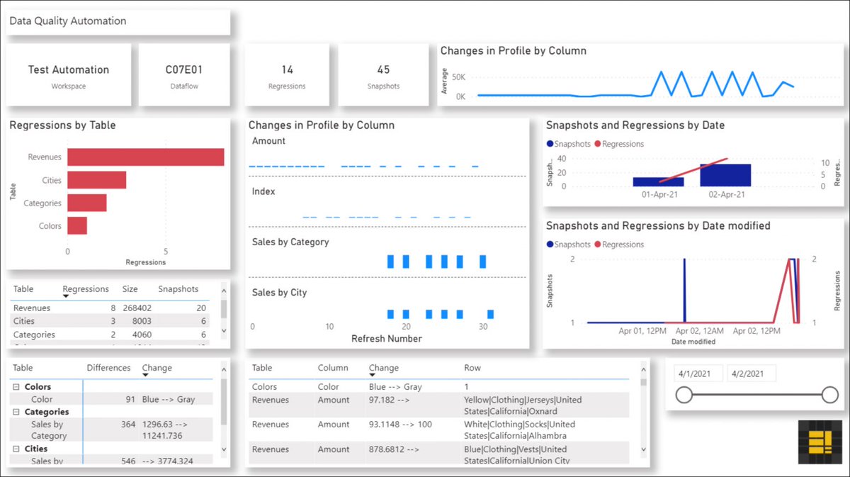
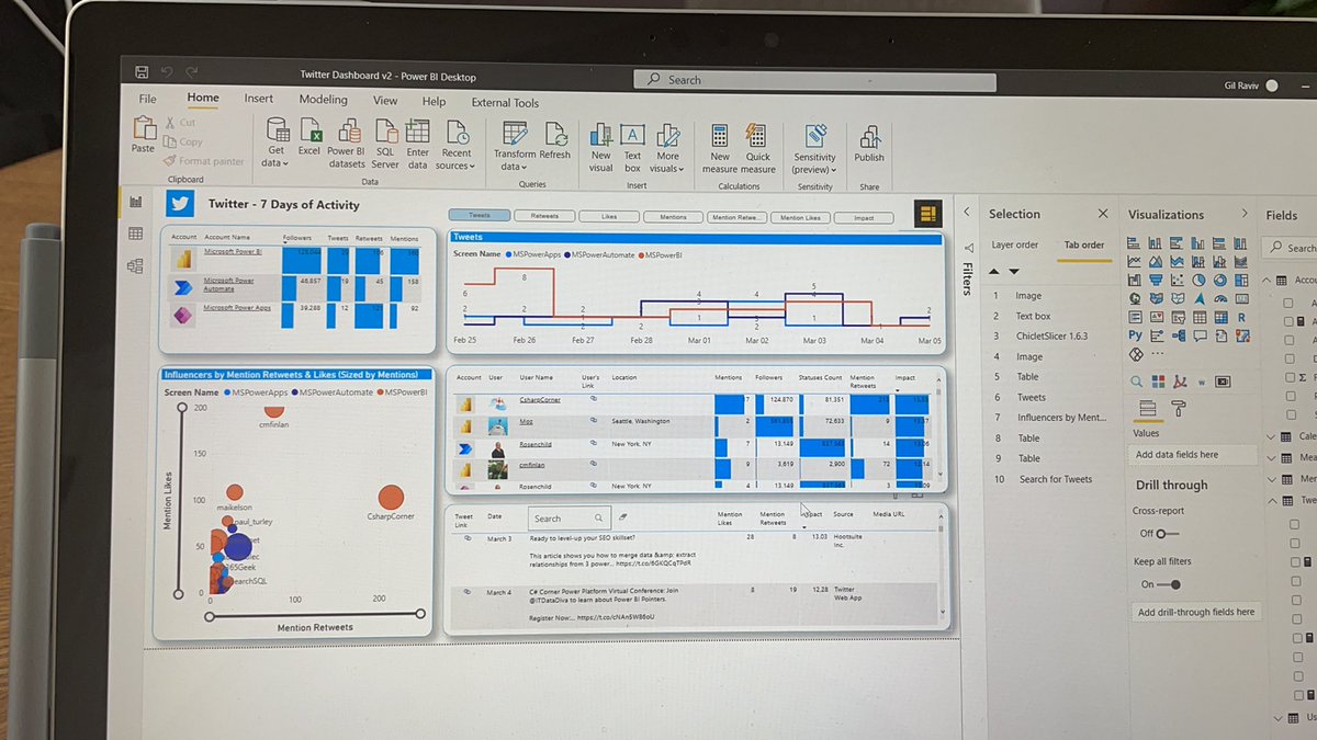
Clicks in visuals in #PowerBI reports can be now analyzed in a heatmap with BI Pixie
datachant.com/2024/12/13/ana…
1
155
BI Pixie’s visual interactions heatmap is ready. Check out the live demo
app.powerbi.com/view?r=eyJrI…
1
1
213
🚀 Exciting PR: DataChant Consulting's BI Pixie is now available in the Microsoft Azure Marketplace! #powerbi @mspartner story.cd/AAYQ3a
1
160
We have added a new strategic component to BI Pixie. Now it is not only the best engagement measurement solution for #PowerBI. It can automatically add feedback controls and collect sentiment and user satisfaction from your BI audience! bipixie.com
157
New in BI Pixie: Add thumbs up/down or smile/frown buttons in as many #PowerBI reports to collect user satisfaction from your BI audience
azuremarketplace.microsoft.c…
169
BI Pixie is available on Azure Marketplace. You can deploy the solution template in a minute. Checkout the tutorial youtu.be/XzB4JOK_iU0?si=wdSd…
#PowerBI
197
Dusting off the blog
datachant.com/2024/08/07/exc…
1
3
2
612
Gil Raviv retweeted

31 Jul 2024
Today marks an exciting new chapter for DataChant with the launch of BI Pixie, an innovative product that measures the engagement of your BI audience in #PowerBI. For the first time, you can gain unprecedented insight into your Power BI portfolio
bipixie.com
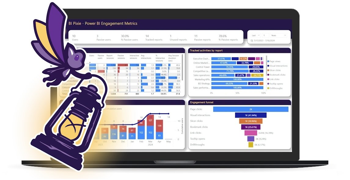
ALT A picture of BI Pixie logo in front of a monitor with a Power BI dashboard. The logo shows a small Pixie holding a big lantern. The Pixie's three wings resemble three bars in a Bar Chart visual.
3
4
604
🚀 Excited to announce the launch of BI Pixie! 🎉 Track and analyze Power BI usage and engagement like never before. Now available on Microsoft AppSource. Explore more at bipixie.com #BIPixie #BusinessIntelligence #PowerBI #MicrosoftFabric #DataAnalytics @MSPowerBI
2
5
435
How to optimize #QuickSight performance. Great article aws.amazon.com/blogs/big-dat…
Gil Raviv retweeted

19 May 2022
New Big Data post by Blake Carroll, Shekhar Kopuri, Vijay Chaudhari and Wakana Vilquin-Sakashita:
Tips and tricks for high-performant dashboards in Amazon QuickSight
aws.amazon.com/blogs/big-dat…
1
2
1