
Jun 12
Amazon Premium A content design for Wireless Earbuds
Project Overview
This Premium A content was designed for LEEMC, a tech brand offering wireless earbuds focused on sound .............more
#APlusContent #AmazonDesign #ListingImages #EcommerceBrand
fiverr.com/s/5r2lzEb

3
Jun 10
Amazon Premium A content design for Makeup Sponge Set
Project Overview
This Premium A Content highlights Real Perfection, a beauty brand offering makeup Sponge...............more
Available for freelance or agency projects.
fiverr.com/s/5r2lzEb
#APlusContent #AmazonDesign

15

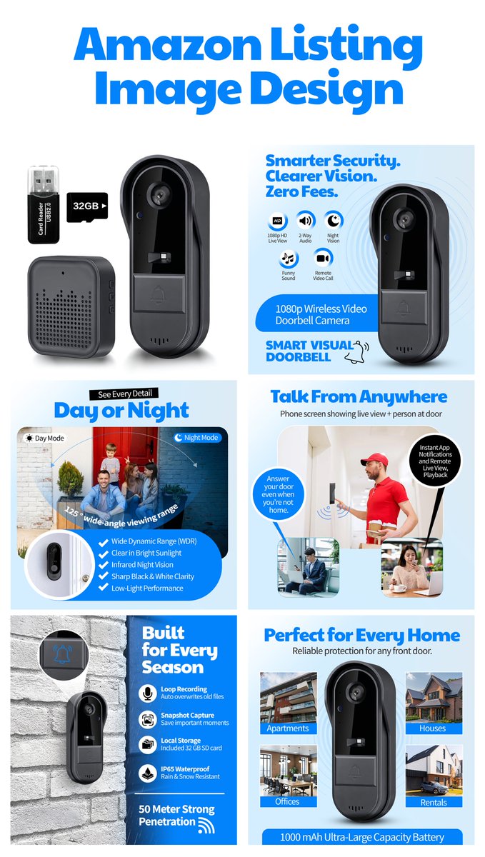
Mar 8
Amazon Doorbell Listing Images
Designed high-converting Amazon listing images highlighting smart features, security, and easy installation to attract buyers & boost sales.
DM for professional Amazon listing designs.
#AmazonListingImages #AmazonDesign #AmazonFBA #EcommerceDesign
1
1
64

24 Sep 2025
🎨 Apply Now: Graphic Designer – Paper Plan (Fully Remote)
Join a remote-first ecom team creating high-impact designs for Amazon, Meta Ads & more. Pay is $10–$20/hour, full-time or part-time.
✅ Adobe Suite or Figma | AI tools required (MidJourney, Firefly, Canva AI) | Strong portfolio
🎯 Design storefront graphics, infographics, social assets & ad creatives with minimal revisions
🗓️ Flexible hours | Freelance setup | Ongoing project potential
🧩 Key Benefit:
Work on varied digital projects with a fast-growing brand aiming for $100M by 2028.
🔗 Apply: schresult.com/jobs/graphic-d…
📢 Join our Global Telegram group: t.me/ U8js2TiOGSMyN2Q0
X 👉 @Presofthub
#RemoteJobs #GraphicDesign #PresofthubGlobal #HiringNow #AmazonDesign #MetaAds #AIinDesign #FreelanceWork
💬 Know a designer who thrives on creative freedom and remote flexibility? Share this opportunity.
6
14
2,933

16 Sep 2025
Amazon Listing Design ✦ Product: Sauce Bottle
📊 High-converting visuals for your listing:
- Clean product image
- Feature highlights
- Lifestyle mockups
Here are 2 fresh banners I made today ↓
DM if you need custom Amazon graphics ✦
#AmazonDesign #Ecommerce #ProductDesign


1
3
144
6 Sep 2025
I create Amazon listing banners 👇
Show your product in the best light, highlight features, and turn visuals into sales.
Here are 5 examples of my style.
Need custom banners for your product?
DM me
#AmazonFBA #AmazonDesign #Ecommerce

1
3
241

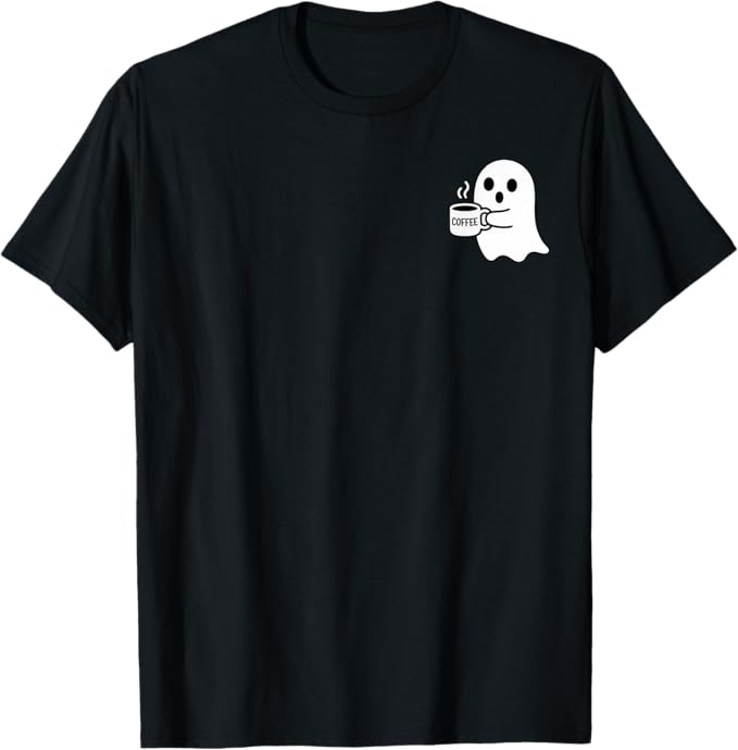
28 Jul 2025
Check my designs #tshirtdesign #tshirt #graphicdesign #gifts #amazonshirt #amazondesign #Halloween2025 #Halloween #halloweentshirt
LINK : ⬇️⬇️
amazon.com/dp/B0FHSK2HXH?cus…
1
3
50
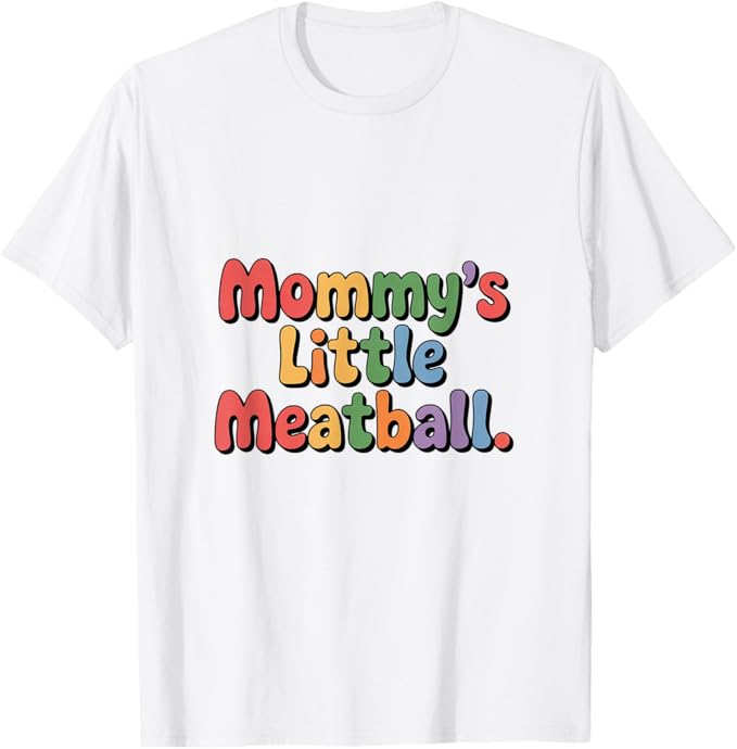
28 Jul 2025
Check my designs #tshirtdesign #tshirt #graphicdesign #gifts #amazonshirt #amazondesign
LINK : ⬇️⬇️
amazon.com/dp/B0FK452L89?cus…
2
34
9 Jul 2025
🇺🇸 US Job Alert: Associate Creative Director – Amazon Health Services
Amazon is hiring an Associate Creative Director / Design & Content Lead to drive branded experiences across digital and print for its Health Services division.
📍 Location: Seattle, WA
💷 Salary: $127,100–$210,300/year
🕒 Job Type: Full-time
🎨 Tools: Figma, Adobe Creative Suite
🔗 Apply: schresult.com/news-details.p…
Note: US-based applicants only.
Stay updated on verified US creative jobs:
Telegram 👉 t.me/ vxCF0IHsSKI0MDQ0
WhatsApp 👉 whatsapp.com/channel/0029VbA…
X 👉 @Presofthub
#CreativeJobsUSA #AmazonDesign #AssociateCreativeDirector #Presofthub #NowHiring #SeattleJobs2025 #DesignLeadership
5
7
2,524

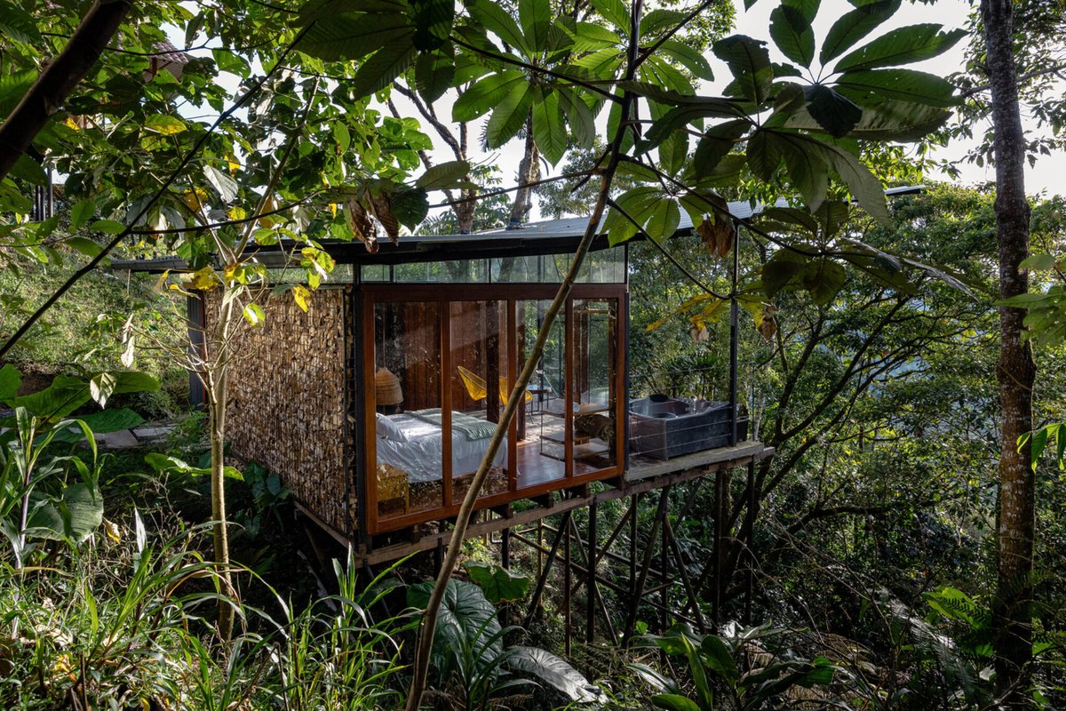
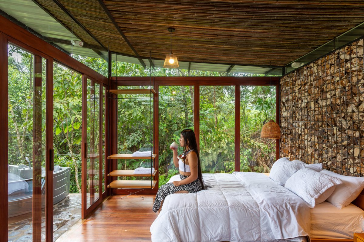
3 Apr 2025
In Pastaza, Ecuador, a 484 ft² lodge designed by Mestizo Estudio Arquitectura embraces a living Pigüe tree at its heart, built over a ravine using recycled pipes, bamboo, wood, and stone.
#Ecuador #Architecture #MestizoEstudio #PigüeTree #AmazonDesign #Green #BiophilicDesign


1
5
283

1 Dec 2024
So! @JayShah & I get promoted on the same day! What a coincidence! 🥂🥳
It's been a wild ride these past few years! But hey, it paid off!
I start today in my new role as a UX Designer II @amazon 😌
#uxdesign #uxdesigner #uiuxdesign #amazondesign #design #UserExperience
2
4
309

12 Sep 2024
You can now upgrade your Amazon store with conversion boosting designs in just minutes! See how we did it for The Pink Stuff by @star_brands_UK.
Simply copy your favorite template into Figma, and effortlessly customize it with your brand elements in no time ✨
#amazondesign
1
1
3
108

2 Apr 2024
🔥We're back with another Amazon design roast for a bottle on a mission! Sadly, we don't know what they're on a mission for, but hopefully we can help them find their PATH (see what I did there) with these simple tweaks:
🔨 Mission statement clarity: "Not just a water bottle. A bottle on a mission" is unclear. Are we saving the world? Revolutionizing hydration? Jellyfish hunting?
🔨 Image Flow: The image of the bottles at the top disrupts the flow and visual hierarchy of the design. This could be relocated further down to showcase variety.
🔨 Features Description: "a bottle designed to be refilled and reused" isn't cutting it. Directly stating the product’s differentiating features and benefits would give potential customers clear reasons to buy.
🔨 Text Alignment: This is key to a professional look. Ensuring all text is properly aligned would clean up the presentation considerably.
🔨 Background Consistency: Consistent or contrasting backgrounds would eliminate any visual confusion and enhance the focus on the product. A uniform backdrop can also increase brand recognition.
🔨 Sustainability Story: There’s mention of sustainability, but expanding on this with impactful visuals or infographics could strengthen the brand’s commitment to environmental causes.
With these tweaks, @drinkpathwater could make it's way out of Bikini Bottom and into the hands of more fun loving, eco-conscious kids and adults alike 🪼 🫧
If you'd like to work together to elevate your Amazon store, drop us a line! 👉 georges.blog/
#amazondesign #amazonsellers #designroast

2
222
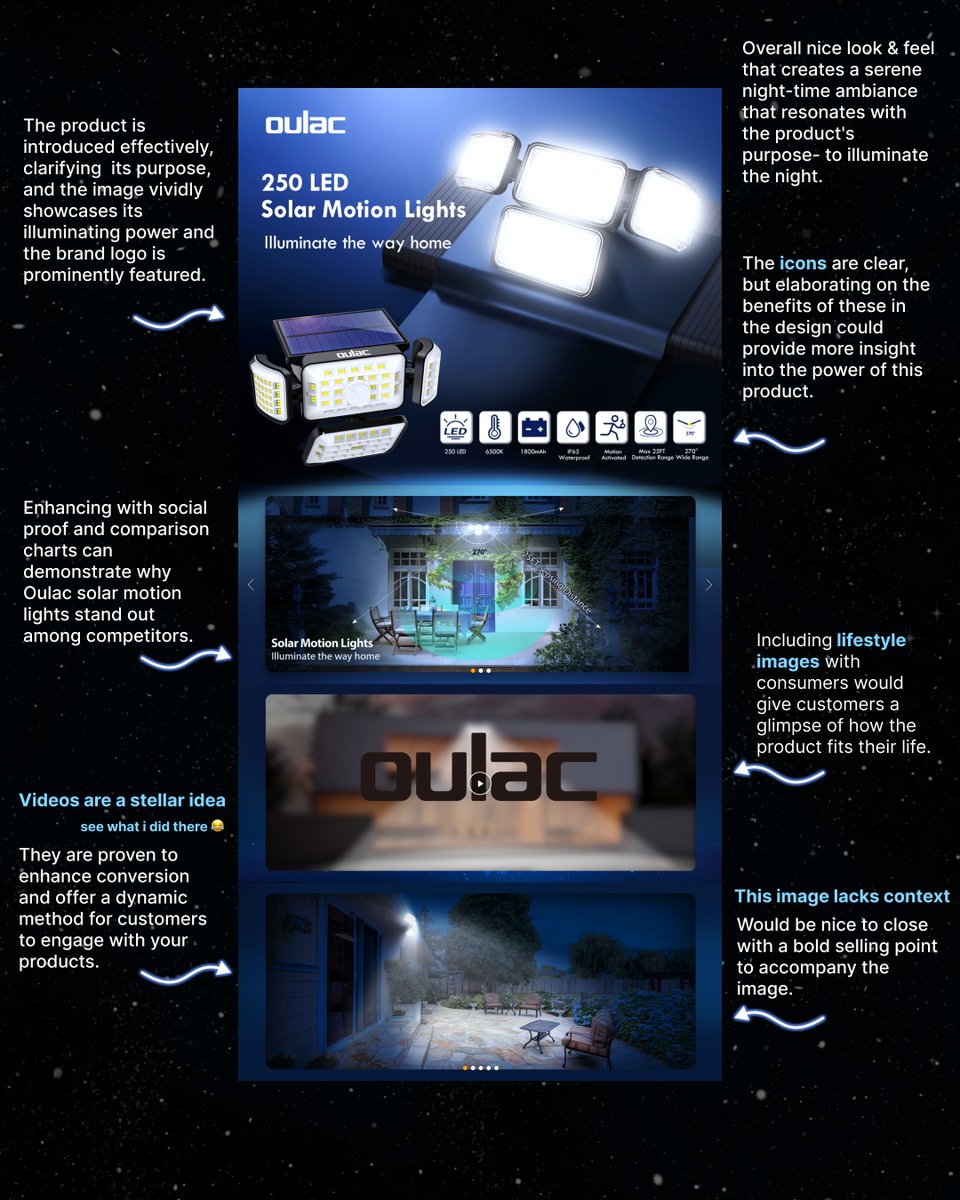
19 Mar 2024
✨Today we review Oulac's Solar Lights A Premium content. They do a great job of capturing the allure of the night but unfortunately leave us in the dark on details.
Here's what's working and how we'd improve their content to maximize conversion:
✨What's Working:
Stellar Theme:
the starry backdrop creates a serene night-time ambiance that resonates with the product's purpose- to illuminate the night.
Product Display:
The first image showcases the brightness and number of LEDs, which directly indicates the product's performance.
🔨What We'd Improve
Feature Explanation:
The icons are clear, but elaborating on the benefits of these in the design could provide more insight into the power of this product.
Image Diversity:
Including images that show the product in various stages of use, like during installation or interaction with the motion sensor, could provide a more comprehensive understanding of the product.
Closing Impact:
The last module's image lacks a strong summarizing statement or a clear call to action, which is key in leaving a final impression that drives purchase decisions.
✨If you'd like to work together to elevate your Amazon store, drop us a line! georges.blog/
#amazondesign #amazonsellers #amazonreview #designtips #designroast #brandidentity
1
2
396
6 Mar 2024
It's a shame when strong visuals on Amazon get lost in the shuffle due to weak graphic content, or vice versa. Great design and a strong, cohesive brand identity is key to turning browsers into buyers. That's where we step in, ensuring all touchpoints of your Amazon store are spot-on.
Here's what we think is working for @drinktru's storefront and areas that we'd improve on to help them maximize conversion.
♥️What's Working
Product Line Clarity:
The display of the product lineup is clear, showing the variety of offerings at a glance which is excellent for quickly capturing interest.
Lifestyle Integration:
The use of lifestyle images helps position the product within the daily lives of potential customers which enhances relatability.
Brand Endorsements:
Including logos of reputable publications adds a layer of credibility and trust, which can be persuasive in decision-making though we think they should be more strategically placed.
🔨What Needs Improvement
Overarching Message:
The header could be more informative about the product benefits or unique selling points, setting the tone for the entire storefront.
Text Legibility:
Aligning text right instead of left and using low contrast colors makes it much more difficult to read which could reduce engagement.
Consistent Messaging:
Some messaging, like "drink to be the boss of your boss," may not be clear or could be misinterpreted, which might confuse the brand's value prop.
CTA Placement:
There's a lack of clear, direct calls to action that encourage immediate purchasing or exploration of the product range.
Ingredient Highlighting:
While ingredients are listed, emphasizing key components or health benefits more prominently could enhance appeal and conversion.
If you'd like to work together to boost your Amazon sales with great design, drop us a line!
👉georgesblog.typedream.app/
#amazondesign #amazonsellers #designtips #ecommerce #brandidentity #designroast

3
526
4 Mar 2024
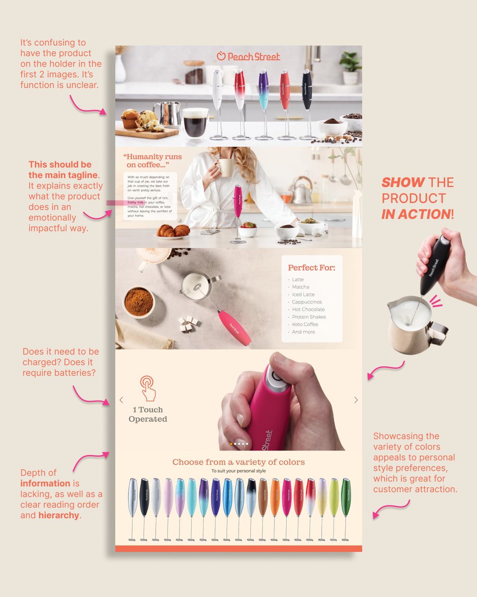
🔥 It's Monday and we've got coffee on our minds. Today's review is for Peach Street's milk frother Amazon A Premium design. As always, we'll take you through what's working and where we think they can improve to help maximize conversion
♥️ What's Working
Product Range Display:
Showcasing the variety of colors appeals to personal style preferences, which is great for customer attraction.
Usage Versatility: Clearly listing the variety of drinks the frother can be used for helps customers understand its versatility, enhancing perceived value.
Aesthetic Appeal: The design is visually pleasing, with a clean layout and a soft, approachable color palette that aligns with the brand.
🔨 What Needs Improvement
Product Function Clarity:
The absence of images showing the product actively frothing milk may leave people guessing about its function. Action shots should be prioritized to demonstrate the product's primary use.
Key Message Placement:
The crucial benefit, "the gift of rich frothy milk," is only written in a small text box. It should be a prominent headline to communicate the product's main feature instantly.
Invitations to Engage:
Sentences that invite customer interaction, such as "Imagine the possibilities with Peach Street," or "Start your day with a perfect froth," engage customers directly and can encourage purchase decisions.
Interactive Elements:
Adding elements such as a video demonstration of the frother in action could significantly boost engagement and conversion.
If you're looking to take your Amazon store to the next level, sign up for our design subscription and we'll help you get there
👉 georgesblog.typedream.app/
#amazondesign #amazonsellers #designtips #designreview
1
3
560
28 Feb 2024
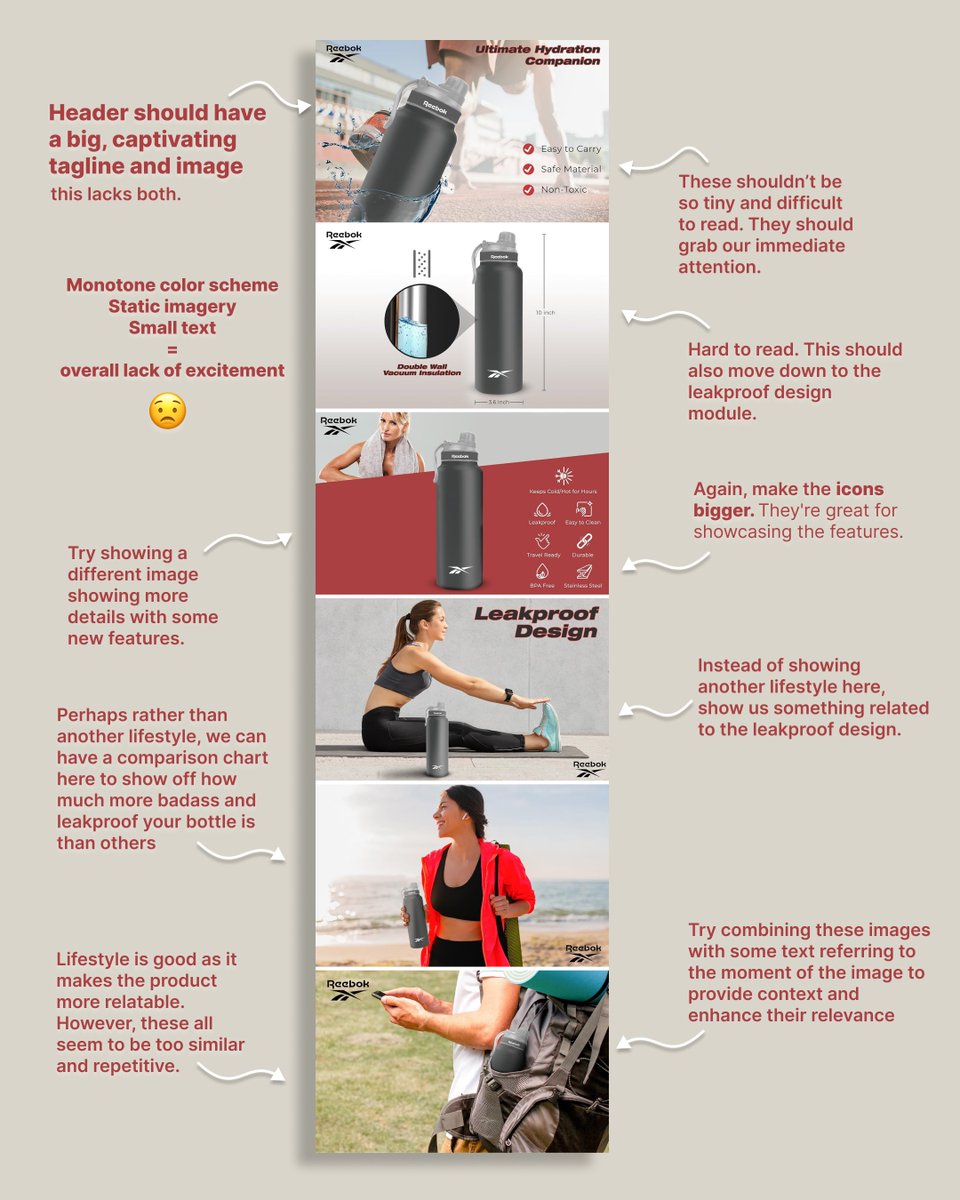
We expect more when you're at the top of the game! @Reebok's digital presence should match the premium quality of their products but it's missed the mark on it's Amazon A design.
🔥Here are the areas we'd improve:
❤️🩹Key Information Text:
Features and benefits are crucial selling points but are presented in a small and hard to read font, which fails to grab attention and generate excitement.
❤️🩹Storytelling:
There's little to no narrative that connects the customer with the product, which is often what elevates emotional appeal and relatability.
❤️🩹Technical Specs:
Providing a more detailed and visually clear section for technical specs could cater to customers looking for specific features and highlight quality of the product.
❤️🩹Information Hierarchy:
Prioritizing key information with a clearer layout can guide the eye more naturally towards purchase triggers.
❤️🩹Design Integration:
The features and graphics overall seem added as an afterthought. Integrating them more seamlessly into the design would reflect the high standards expected from a brand like Reebok.
If you'd like to work together to elevate your presence on Amazon, drop us a line
👉 georgesblog.typedream.app/
#amazondesign #amazonsellers #designtips #designroast
1
244
27 Feb 2024
This Amazon A design for @Zicam is bold and concise. As the top cold remedy, it speaks volumes on its own. But we're always finding ways to take what's good and make it great. Let's dive into what we love and some areas of opportunity that could help boost conversion even more.
♥️Clear Branding:
The Zicam logo is prominent, and the blue and orange color scheme is consistent and eye-catching, reinforcing brand recognition.
♥️Benefit Front and Center:
The key benefit, "Shortens Colds," is highlighted immediately, effectively communicating the primary value prop.
♥️Trust Signals:
Not much more needs to be said if you're the #1 Cold shortener brand. This graphic serves as a trust signal, leveraging social proof to reassure buyers.
♥️Flavor Variety Display: The use of fruit images to indicate the variety of flavors appeals to customers looking for palatable options in cold remedies.
♥️Product Range Lineup:
Displaying the range of products offers a clear, visual representation of the choices available, aiding in cross-selling and informing us of Zicam's breadth of offerings.
📈Conversion Boosters to Consider:
FAQ/How-To Section:
Addressing common questions or providing usage instructions can reduce purchase hesitations.
Comparison Charts:
Charts that compare different Zicam products or other brands can help customers make informed decisions without leaving the page.
Unique Selling Points:
Highlighting unique features or differentiators could help set Zicam apart from competitors
If you're looking to elevate your brand's presence on Amazon, you can find us here!
👉 georgesblog.typedream.app/
#amazondesign #amazonsellers #designreview #designtips

290
23 Feb 2024
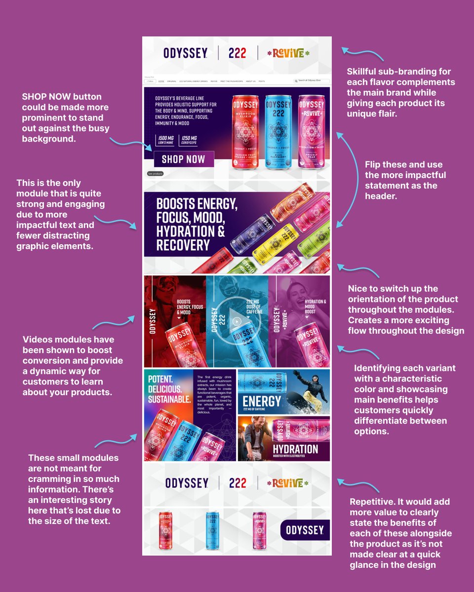
Today, the Amazon Storefront for @OdysseyElixir is in the hotseat and while we think there are a few things working well, we mostly think this is another brand that could benefit from the art of KISSing (keeping it simple, stupid 😏)
What's working:
♥️Sub-Brand Integration:
Skillful sub-branding for each flavor complements the main brand while giving each product its unique flair. Delving deeper into these flavor profiles with targeted lifestyle imagery and prominent benefits could elevate the customer experience.
♥️Clear Benefit Statement:
The design effectively communicates the key benefits of the beverages, such as ENERGY and FOCUS, which can appeal directly to the shopper's desires.
What's not:
❤️🩹Information Density:
The storefront packs a lot of graphic and textual elements into each section, which can overwhelm customers and make it difficult to quickly grasp the most important points.
❤️🩹Storytelling:
The storefront doesn't fully utilize storytelling to depict the lifestyle and emotional appeal of the product, which can be a powerful conversion tool.
❤️🩹CTA Visibility:
The "Shop Now" button could be more prominent to stand out against the busy background and placed throughout the design, driving more immediate conversions.
With all that said and done, sometimes it all comes down to whether or not @BlackLabelAdvsr would add this product to his cart.
If you'd like to elevate your presence on Amazon and maximize conversion, here's where to find us!
👉georgesblog.typedream.app/
#amazondesign #amazonsellers #designtips #designroast #BrandIdentity
1
4
450
22 Feb 2024
Are you folks enjoying our Amazon design reviews? Do you find them helpful? Is there anything you'd like to see more of?
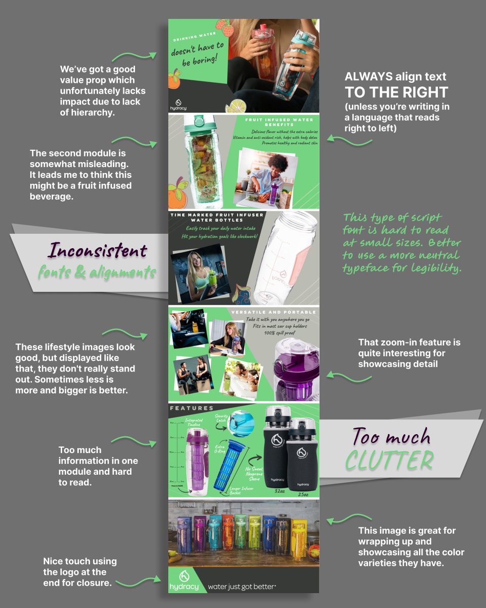
🔥Today we roast the A design for Hydracy -fruit infuser- water bottles and honestly think it could benefit from a full makeover. Here's our two cents:
❌Crowded Layout:
A tightly packed layout with limited whitespace can lead to a cluttered look that complicates navigation. Less is more.
❌Inconsistent Font Use:
Varying typefaces and alignments can disrupt the brand's visual identity and reduce the overall professional feel of the design.
Protip: Always align your text to the right for max legibility unless you're writing in a language that reads from right to left.
❌Underutilized Storytelling:
The design doesn't fully capitalize on storytelling to emotionally engage customers and illustrate the lifestyle benefits of the product.
❌Features/Benefits?
It's confusing what the product is at first glance due to the lack of features & benefits early on. They are listed in the second to last module and should be up top.
❌Hierarchy:
The product has an interesting value prop which loses impact due to the lack of information hierarchy.
If you'd like to work together to elevate your Amazon store and maximize converstion, here's where to find us! 👉 georgesblog.typedream.app/
#amazondesign #amazonsellers #designtips #designroast
2
8
957