
12 Apr 2025
Do with this what you will...
import matplotlib.pyplot as plt
import pandas as pd
import seaborn as sns
from matplotlib.ticker import FuncFormatter, MultipleLocator
# Data for cars and trucks (2024-2025 models)
vehicles = {
"Mitsubishi Mirage": (16695, 2084),
"Nissan Versa": (16130, 2598),
"Toyota Corolla": (22050, 2955),
"Honda Civic": (23950, 2935),
"Toyota Camry": (28915, 3310),
"Honda Accord": (29045, 3239),
"Toyota RAV4": (30025, 3370),
"Jeep Wrangler": (31895, 4012),
"Ford Maverick": (25515, 3563),
"Ford F-150": (39060, 4391),
"Ram 1500": (41415, 4765),
"Chevrolet Silverado 1500": (37845, 4410),
"Tesla Model 3": (40630, 3862),
"Tesla Model S": (81630, 4560),
"Rolls-Royce Phantom": (503000, 5644),
"Mercedes-Benz S-Class": (118450, 4740),
"BMW 330i": (45495, 3536),
"Range Rover SE": (109025, 5240),
"Cadillac Escalade": (86890, 5823),
"Porsche 911 Carrera": (116050, 3354),
"Lamborghini Revuelto": (608358, 4188),
"Ferrari SF90 Stradale": (520000, 3461),
"Chevrolet Corvette Stingray": (69995, 3366),
"Ford Mustang GT": (42500, 3832),
"Lucid Air Pure": (78900, 4564),
"Nissan Leaf": (29255, 3509),
"Toyota GR86": (30395, 2811),
"Rolls-Royce Spectre": (397750, 6537),
"Ford F-150 Lightning": (49995, 6361),
}
# Calculate price per pound for vehicles
vehicle_prices_per_pound = {k: v[0]/v[1] for k, v in vehicles.items()}
# Data for cheeses (price per pound in USD)
cheeses = {
"Cheddar": 5.62,
"Mozzarella": 5.58,
"Swiss": 7.00,
"Brie": 14.99,
"Gouda": 11.50,
"Parmigiano Reggiano": 20.00,
"Roquefort Blue": 26.00,
"Goat Cheese": 12.00,
"Époisses": 30.00,
"Manchego": 18.50,
"Gruyère": 22.00,
"Camembert": 16.75,
"Stilton": 28.50,
"Feta": 9.99,
"Pecorino Romano": 17.25,
"Burrata": 24.00,
"Comté": 25.50,
"Halloumi": 15.75,
"Taleggio": 19.50,
"Gorgonzola": 21.00,
"Emmental": 13.75,
"Ricotta": 8.50,
"Mascarpone": 10.25,
"Provolone": 12.50,
"Asiago": 16.00,
"Fontina": 18.75,
"Havarti": 14.25,
"Morbier": 23.50,
"Raclette": 19.75,
"Mimolette": 27.50,
"Reblochon": 24.75,
"Munster": 17.50,
"Pont-l'Évêque": 29.00,
"Cabrales": 22.50,
"Ossau-Iraty": 26.75,
"Queso Fresco": 7.99,
"Cotija": 11.25,
"Paneer": 8.75,
"Wensleydale": 20.50,
"Roquefort": 31.00,
}
# Prepare data for plotting
vehicle_df = pd.DataFrame({
'Item': list(vehicle_prices_per_pound.keys()),
'Price': list(vehicle_prices_per_pound.values()),
'Category': ['Vehicle'] * len(vehicle_prices_per_pound),
})
cheese_df = pd.DataFrame({
'Item': list(cheeses.keys()),
'Price': list(cheeses.values()),
'Category': ['Cheese'] * len(cheeses),
})
# Combine data
combined_df = pd.concat([vehicle_df, cheese_df])
# Filter data to show only items under $400 per pound
filtered_df = combined_df[combined_df['Price'] <= 400]
# Create dollar formatter function
def dollar_formatter(x, pos):
return f'${int(x):,}' if x >= 1 else f'${x:.2f}'
# Create the bar chart in its own window
plt.figure(figsize=(16, 20)) # Made slightly wider to accommodate legend
# Sort data by price descending to interleave vehicles and cheeses
sorted_df = filtered_df.sort_values('Price', ascending=False)
bar_plot = sns.barplot(x='Price', y='Item', hue='Category', data=sorted_df, palette=['blue', 'orange'])
plt.title('Price per Pound: Vehicles vs Cheeses (Interleaved, Descending, Max $400)', fontsize=16)
plt.xlabel('Price per Pound (USD)', fontsize=18, labelpad=25)
plt.ylabel('Items', fontsize=12)
plt.xscale('log') # Log scale for better visibility of wide range
plt.grid(True, which='both', linestyle='--', linewidth=0.5, axis='x')
plt.xlim(5, 400) # Set axis limits
plt.legend(fontsize=20, title_fontsize=20, bbox_to_anchor=(1.05, 1), loc='upper left')
# Set the dollar formatter
plt.gca().xaxis.set_major_formatter(FuncFormatter(dollar_formatter))
# Set dollar points starting from $5
dollar_points = [5, 10, 20, 30, 40, 50, 60, 70, 80, 90, 100, 200, 300]
plt.gca().xaxis.set_ticks(dollar_points, minor=True)
plt.gca().xaxis.set_ticklabels(['$' str(x) for x in dollar_points], minor=True, fontsize=8)
plt.tight_layout()
plt.show()
5
45
8,160

27 Apr 2022
How do I get rid of the percentages in this bar_plot? #tidyverse #rstats stackoverflow.com/questions/…
2
2

23 May 2021
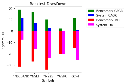
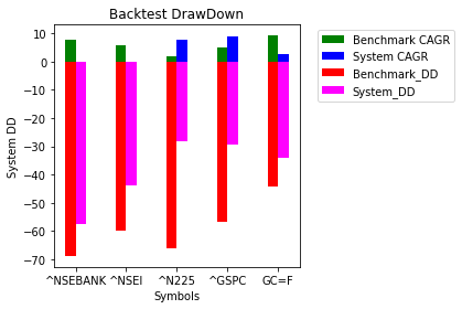
Added parameters in backtest function & tweaked bar_plot to see CAGR along with drawdowns
github.com/beinghorizontal/r…
1st graph:
Buy at close if close> 75% of daily range
Exit next day at open
2nd graph:
Buy if Close<20% of day range
Exit next day @ Close
2
4

22 Dec 2020
Error bars show the variability of the data and used to indicate the error or uncertainty. In video 18.2 (youtu.be/ZjU1IpwMUeQ), I explained how we can visualize error bars using #ggplot2 package for #Bar_plot and #Line_plot. Next video, I will explain how to generate heatmaps

3

#rstats #QuestionOfTheDay Is it possible to do this kind of #dataviz instead of bar_plot in ggplot2 ?

1
1