
1 Jul 2025
📱 𝐑𝐄𝐒𝐏𝐎𝐍𝐒𝐈𝐕𝐄 𝐃𝐄𝐒𝐈𝐆𝐍 𝐁𝐑𝐄𝐀𝐊𝐏𝐎𝐈𝐍𝐓𝐒 – 𝐁𝐄𝐒𝐓 𝐏𝐑𝐀𝐂𝐓𝐈𝐂𝐄𝐒 🧩
Design that adapts isn’t optional—it’s expected. This infographic breaks down the 𝟓 𝐩𝐢𝐥𝐥𝐚𝐫𝐬 𝐨𝐟 𝐫𝐞𝐬𝐩𝐨𝐧𝐬𝐢𝐯𝐞 𝐛𝐫𝐞𝐚𝐤𝐩𝐨𝐢𝐧𝐭 𝐬𝐭𝐫𝐚𝐭𝐞𝐠𝐲 so your site looks flawless on every screen, from smartwatch to widescreen.
🧠 𝐂𝐨𝐫𝐞 𝐏𝐫𝐢𝐧𝐜𝐢𝐩𝐥𝐞𝐬
- Design 𝐦𝐨𝐛𝐢𝐥𝐞-𝐟𝐢𝐫𝐬𝐭, then scale up.
- Use 𝐟𝐥𝐮𝐢𝐝 𝐥𝐚𝐲𝐨𝐮𝐭𝐬 and relative units (em, %, rem) over fixed pixels.
- Let 𝐜𝐨𝐧𝐭𝐞𝐧𝐭 𝐝𝐢𝐜𝐭𝐚𝐭𝐞 𝐛𝐫𝐞𝐚𝐤𝐩𝐨𝐢𝐧𝐭𝐬, not devices.
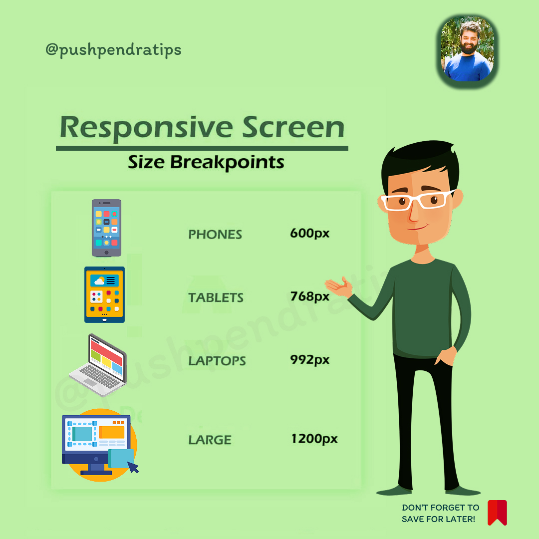
📏 𝐁𝐫𝐞𝐚𝐤𝐩𝐨𝐢𝐧𝐭 𝐒𝐭𝐫𝐚𝐭𝐞𝐠𝐲
- Define breakpoints where 𝐥𝐚𝐲𝐨𝐮𝐭 𝐛𝐫𝐞𝐚𝐤𝐬, not just at device widths.
- Common ranges:
- Small: ≤ 480px (phones)
- Medium: 481–768px (tablets)
- Large: 769–1024px (small laptops)
- XL: 1025px (desktops)
- Use 𝐦𝐢𝐧-𝐰𝐢𝐝𝐭𝐡 𝐦𝐞𝐝𝐢𝐚 𝐪𝐮𝐞𝐫𝐢𝐞𝐬 for scalable, mobile-first CSS.
🧪 𝐌𝐨𝐝𝐞𝐫𝐧 𝐂𝐒𝐒 𝐓𝐞𝐜𝐡𝐧𝐢𝐪𝐮𝐞𝐬
- Embrace 𝐜𝐨𝐧𝐭𝐚𝐢𝐧𝐞𝐫 𝐪𝐮𝐞𝐫𝐢𝐞𝐬 for component-level responsiveness.
- Use 𝐂𝐒𝐒 𝐆𝐫𝐢𝐝 and 𝐅𝐥𝐞𝐱𝐛𝐨𝐱 for adaptive layouts.
- Try clamp() for fluid typography and spacing.
🚀 𝐏𝐞𝐫𝐟𝐨𝐫𝐦𝐚𝐧𝐜𝐞 & 𝐓𝐞𝐬𝐭𝐢𝐧𝐠
- Test on 𝐫𝐞𝐚𝐥 𝐝𝐞𝐯𝐢𝐜𝐞𝐬, not just emulators.
- Optimize images with srcset and lazy loading.
- Audit with tools like 𝐋𝐢𝐠𝐡𝐭𝐡𝐨𝐮𝐬𝐞 and 𝐁𝐫𝐨𝐰𝐬𝐞𝐫𝐒𝐭𝐚𝐜𝐤.
♿ 𝐀𝐜𝐜𝐞𝐬𝐬𝐢𝐛𝐢𝐥𝐢𝐭𝐲
- Ensure breakpoints don’t break 𝐤𝐞𝐲𝐛𝐨𝐚𝐫𝐝 𝐧𝐚𝐯𝐢𝐠𝐚𝐭𝐢𝐨𝐧 or 𝐬𝐜𝐫𝐞𝐞𝐧 𝐫𝐞𝐚𝐝𝐞𝐫 𝐟𝐥𝐨𝐰.
- Maintain 𝐜𝐨𝐧𝐭𝐫𝐚𝐬𝐭 𝐫𝐚𝐭𝐢𝐨𝐬 and 𝐭𝐚𝐩 𝐭𝐚𝐫𝐠𝐞𝐭 𝐬𝐢𝐳𝐞𝐬 across all viewports.
- Use semantic HTML and ARIA roles where needed.
💡 At 𝐏𝐂 𝐃𝐨𝐜𝐭𝐨𝐫𝐬 𝐍𝐄𝐓, we don’t just design for screens—we design for 𝐞𝐱𝐩𝐞𝐫𝐢𝐞𝐧𝐜𝐞𝐬. From fluid grids to accessible breakpoints, we build responsive systems that scale with your users.
🌐 pcdoctorsnet.com
📞 1 (346) 355-6002
#ResponsiveDesign #CSSBreakpoints #MobileFirstDesign #AccessibilityMatters #FluidLayouts #ModernWebDesign #DesignThatScales #MaximumVisibility #StrategicBranding #texas #usa #UnitedStates #pcdoctorsnet #canada #india

ALT This infographic by PC Doctors NET outlines best practices for responsive design breakpoints across five key areas: core principles, breakpoint strategy, modern CSS techniques, performance testing, and accessibility. Learn how to implement content-driven breakpoints, use container queries, and optimize for real devices—all while maintaining accessibility and performance. Visit pcdoctorsnet.com or call 1 (346) 355-6002 to build responsive websites that adapt and perform.
1
2
13

17 Apr 2025
📱 Responsive Design & Breakpoints:
#ResponsiveDesign #MediaQueries #coder #CSSBreakpoints #WebDesign #FrontendDev #MobileFirst #ResponsiveWebDesign #TailwindCSS #WebDevelopment #coding #UIDesign #ReactJS
30
17
91
3,227

25 Aug 2022
Saved this Tweet to your Notion database.
Tags: [Cssbreakpoints]
24 Aug 2022
Saved this Tweet to your Notion database.
Tags: [Cssbreakpoints]