
22 Oct 2025
Fakeouts catch even seasoned traders 😬.
Here’s how to spot (and avoid) them in October.
#PropNimbus #Fakeouts #ChartTips #TradingEducation

1
4
211

30 Jul 2025
How to draw a parallel channel?
Simple 👇
To find support zone:
➤ Use 2 resistance points 1 support point → to project SUPPORT ZONE
To find resistance zone:
➤ Use 2 support points 1 resistance point → to project RESISTANCE ZONE
#PriceAction #ChartTips #parallelchannel

4
120

29 Apr 2025
Top 5 Easiest Charts for Comparing Categories
1. Bar charts: Clear side-by-side comparisons
2. Column charts: Track changes over time
3. Stacked bars: Part-to-whole across groups
4. Pie charts: Show proportions (≤5 categories)
5. Combo charts: Mix bars/lines for deeper insights
#DataViz #ChartTips

4
4
264

30 Nov 2024
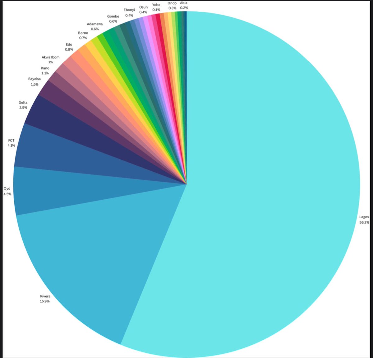
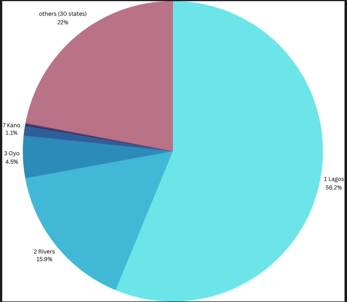
The pie chart gives us a colorful summary, but does it really tell us what each state contributes?
For “What every state contributes” a bar chart would offer clarity, making it easier to compare contributions side by side.
For “Top 3, Bottom 3, and others combined” a stacked bar chart or even a highlighted table could provide a focused view that simplifies rankings without overwhelming the reader.
The choice of chart matters as much as the data itself.
What do you think would work best here?
#DataVisualization #NigeriaStats #ChartTips
29 Nov 2024

1. What every state contributes
2. Simplified to top 3 states, bottom 3 states, my state kano number 7, and all the rest combined.
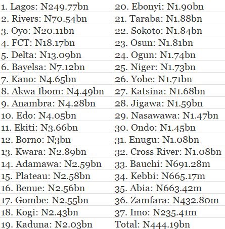
3. The data
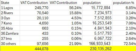
4. Simplified data
1
5
110

27 May 2024
Ever wanted to move your header to the top of a reversed bar chart in @tableau?
This article shows you how🥳
Check it out via
link.medium.com/FL9r1l00VJb
Kindly comment your thoughts😉!
Thanks to @datadzif for the feedback!
#Tableau #DataViz #ChartTips #Datafam

3
6
22
756

16 Feb 2024
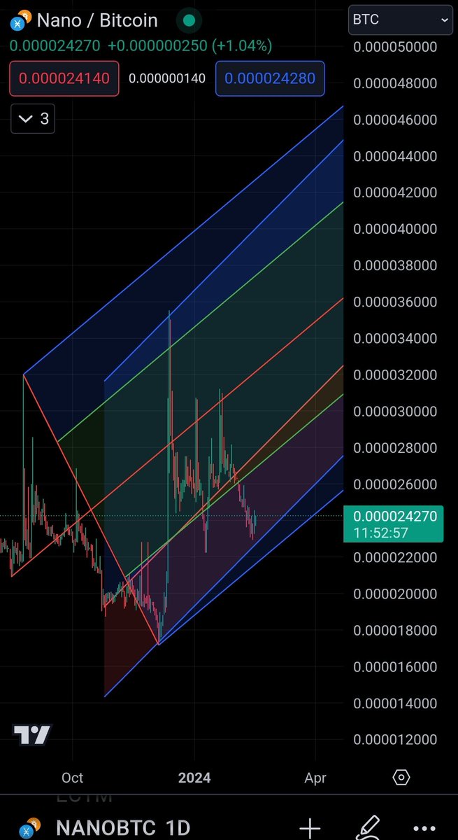
High probability of price going back to at least between the red trend lines in the center. ~Pitchfork & Linear Regression Channel overlay. #Nano $XNO #Ӿ $BTC #cryptotrading #charttips #linearregression #pitchfork
1
12
513

22 Sep 2022
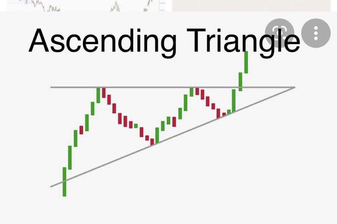
What’s an ascending Triangle? The Ascending Triangle Pattern is one of my favorite patterns and I usually buy when it breaks the resistance (top line)! I use this on the 5 minute candle and buy on the candle close over resistance which indicates a breakout for me! #charttips
3

22 Sep 2022
What’s an ascending Triangle? The Ascending Triangle Pattern is one of my favorite patterns and I usually buy when it breaks the resistance (top line)! I use this on the 5 minute candle and buy on the candle close over resistance which indicates a breakout for me! #charttips

4
17
239

18 Aug 2020
If you want to check trend of stock and don't want to draw lines you can use indicator name "zig zag" available on tradingview.
However manual trend visualisation is better always.
Like/retweet if you find it useful and want more such #charttips
14
39
276
7 Aug 2020
Pivot High Low is the indicator which shows value of swing points.
Why I use : No need to use crossover for checking price.
#ChartTips @rachitpjain
Like / retweet if you want more such tips.
7
14
101

7 Jan 2020
Notice that for all these charts, I used double Y-axis but key is that the scale is the same for both sides. When you read a chart, make sure you see that the scale is the same & if it is not, it has to be indicated otherwise author tries to manipulate perception...
#charttips 🤓
1
11