
May 13
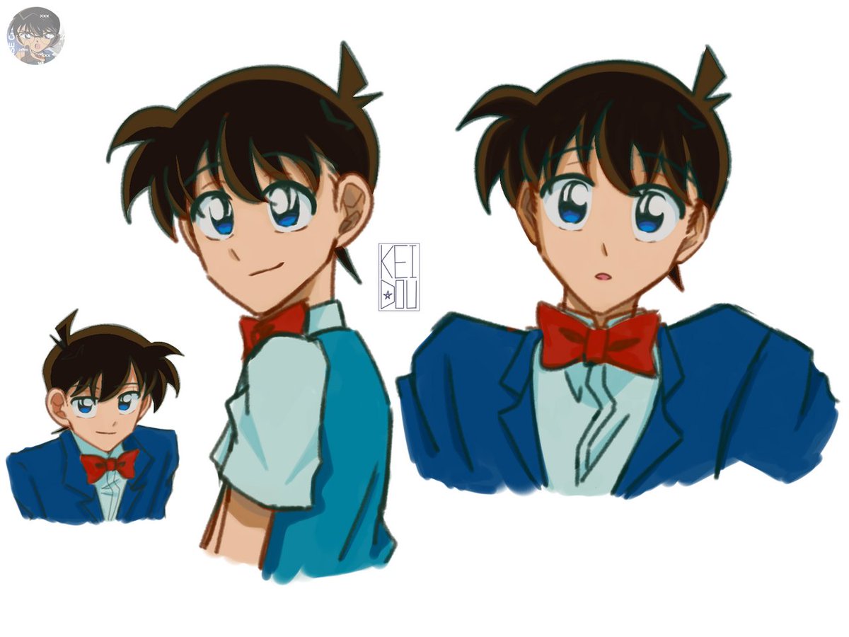
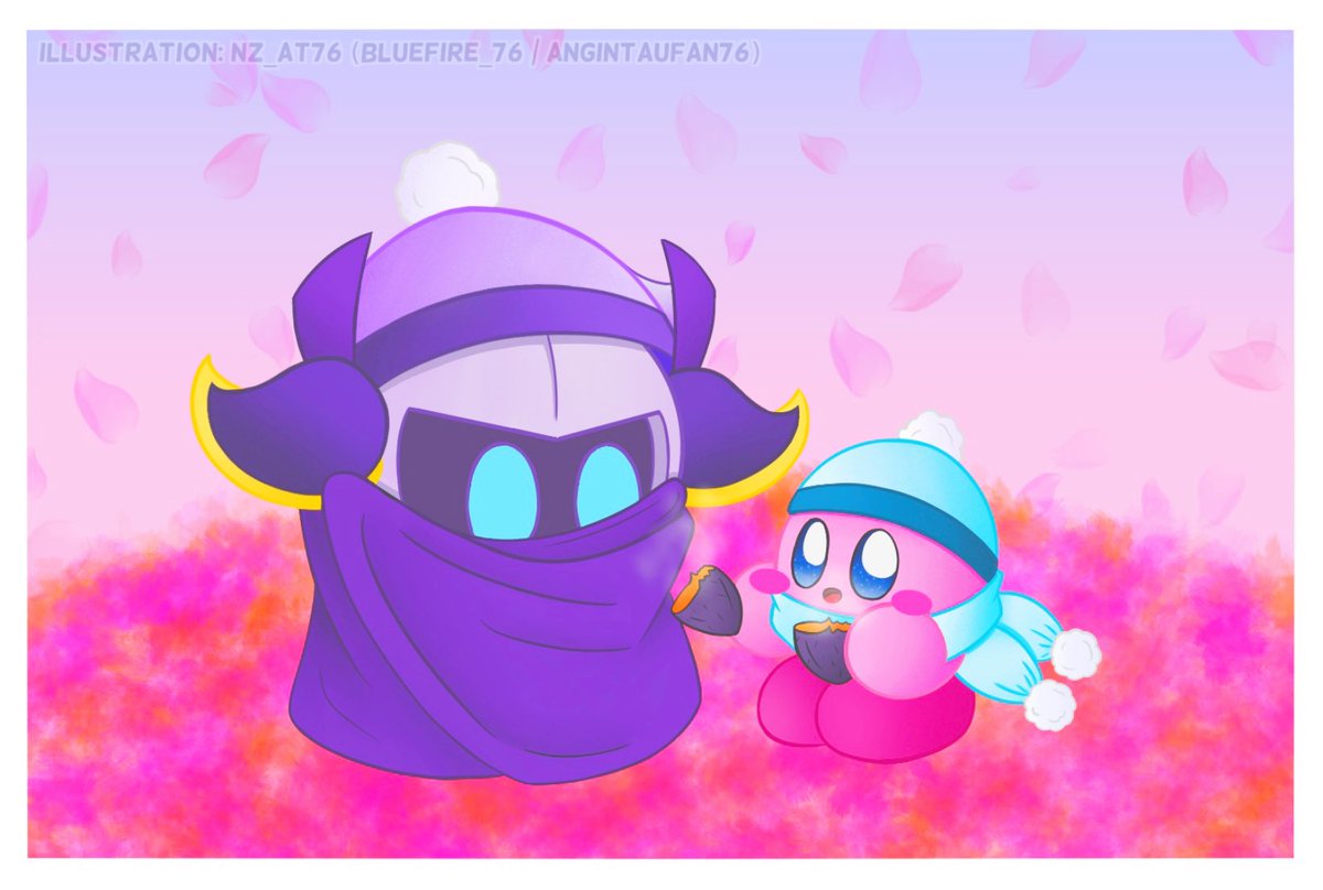
DCMKart! Haloo aku abis nyoba gambar Conan pake colorstyle jadul🥺 btw mutualan yukk (especially if u like kaishin)😘
14
9
102
1,959

Mar 25
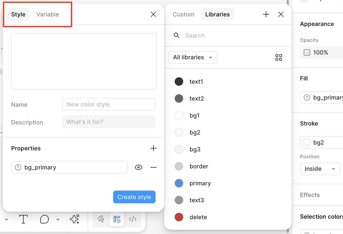
Figma MCPのuse_figmaで、既存プロダクトの新画面のデザインを作成する実験。
既存コンポーネントのプロパティの読み取りや、TextStyle、ColorStyleの利用など、中々難しい。
新規画面を作らせるなら、コードベースのコンポーネントやStyleを元にプロトを作らせる方が筋が良い感じがするな。
1
3
47
5,831

Mar 13
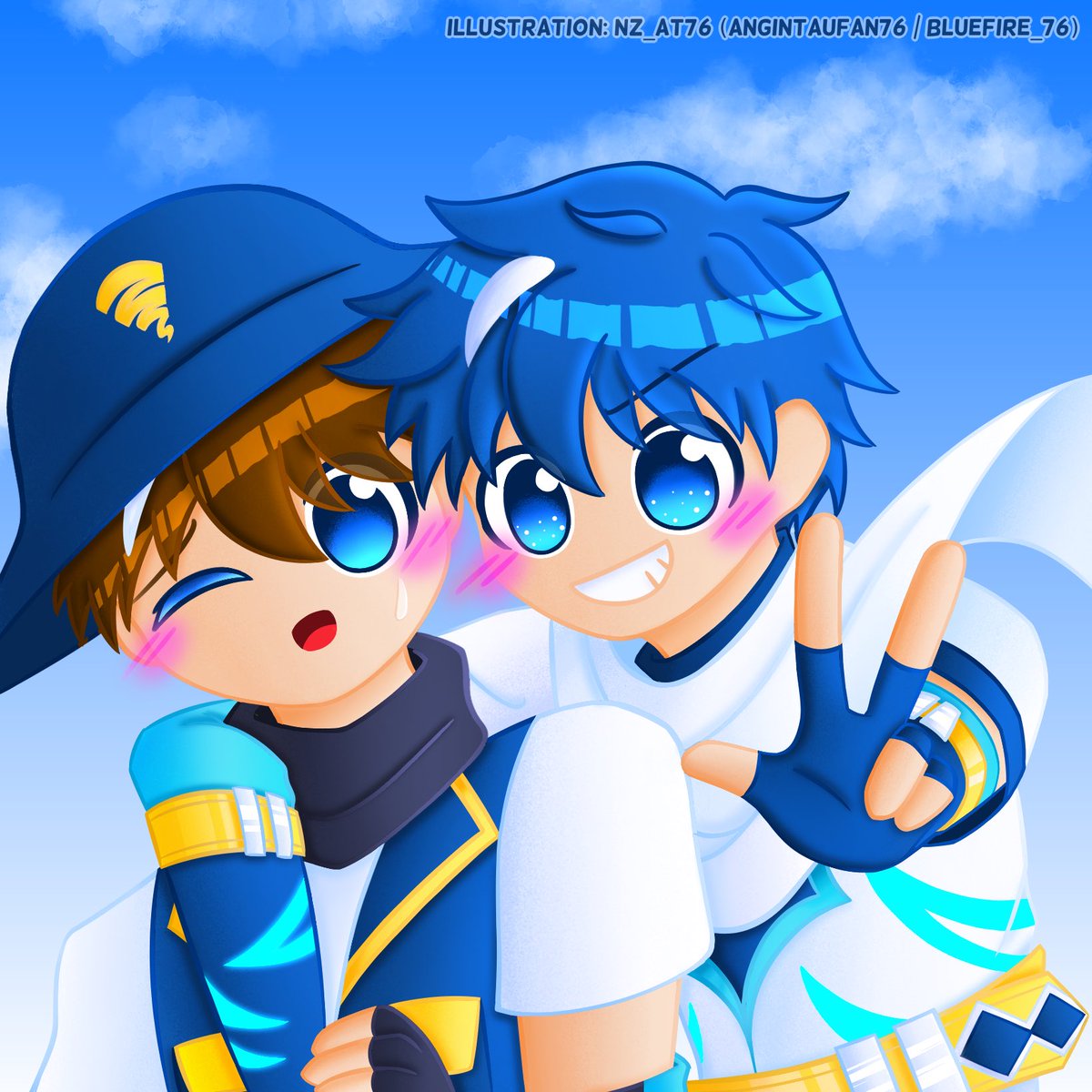
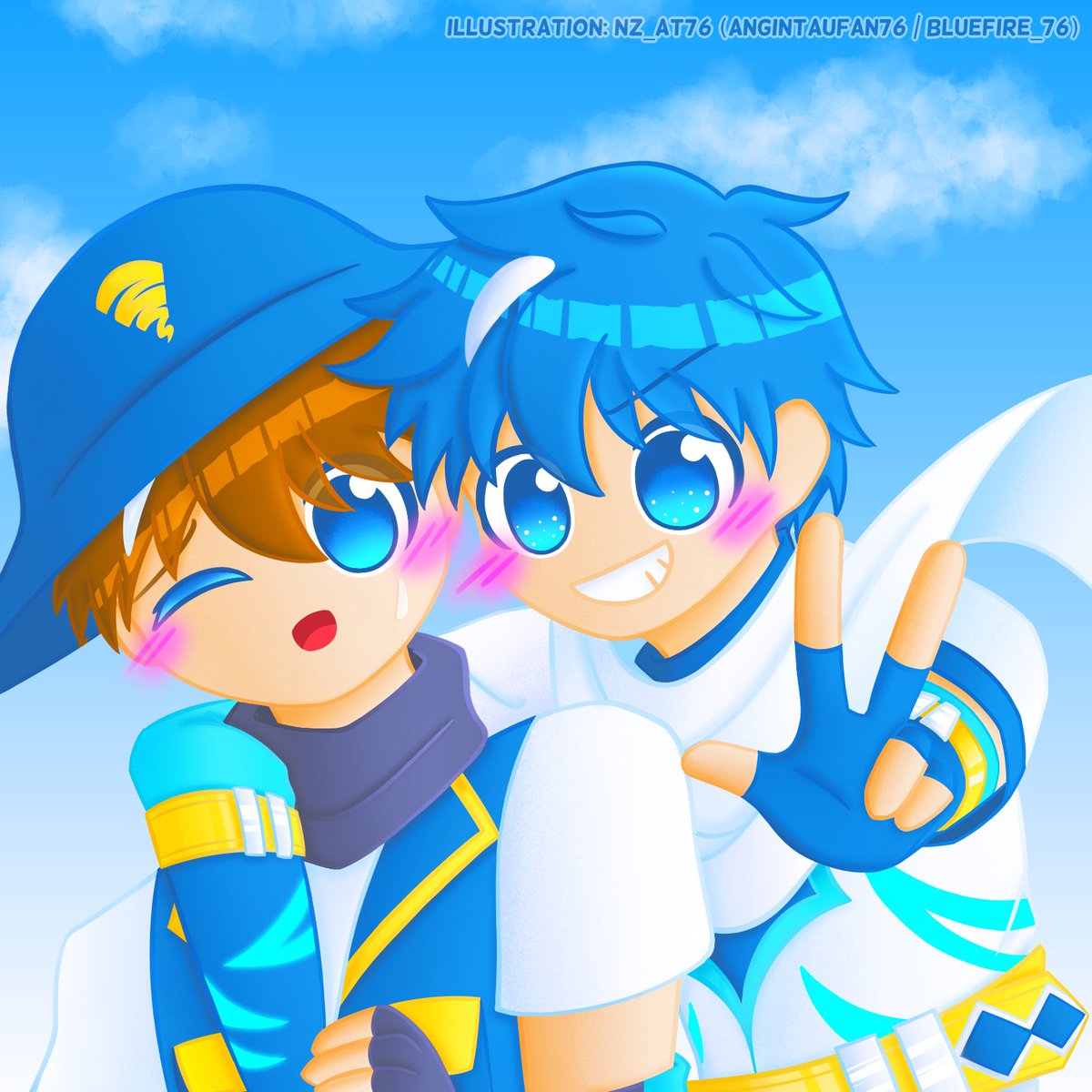
Back with some asian dance music and some colorstyle and some microwave kick?
Mar 13

Timetable for tonight Midori Comeback Special!!!!
Stream starts at 8:30PM (GMT 8) till late at
twitch.tv/midorivr
credits :
小鳥遊キアラ - EGO (Altermis DnB Bootleg)
#DoriRadio
#DoriLive
#MalaysianVtuber
#TwitchDJ
#VRDJ
2
64

Feb 16
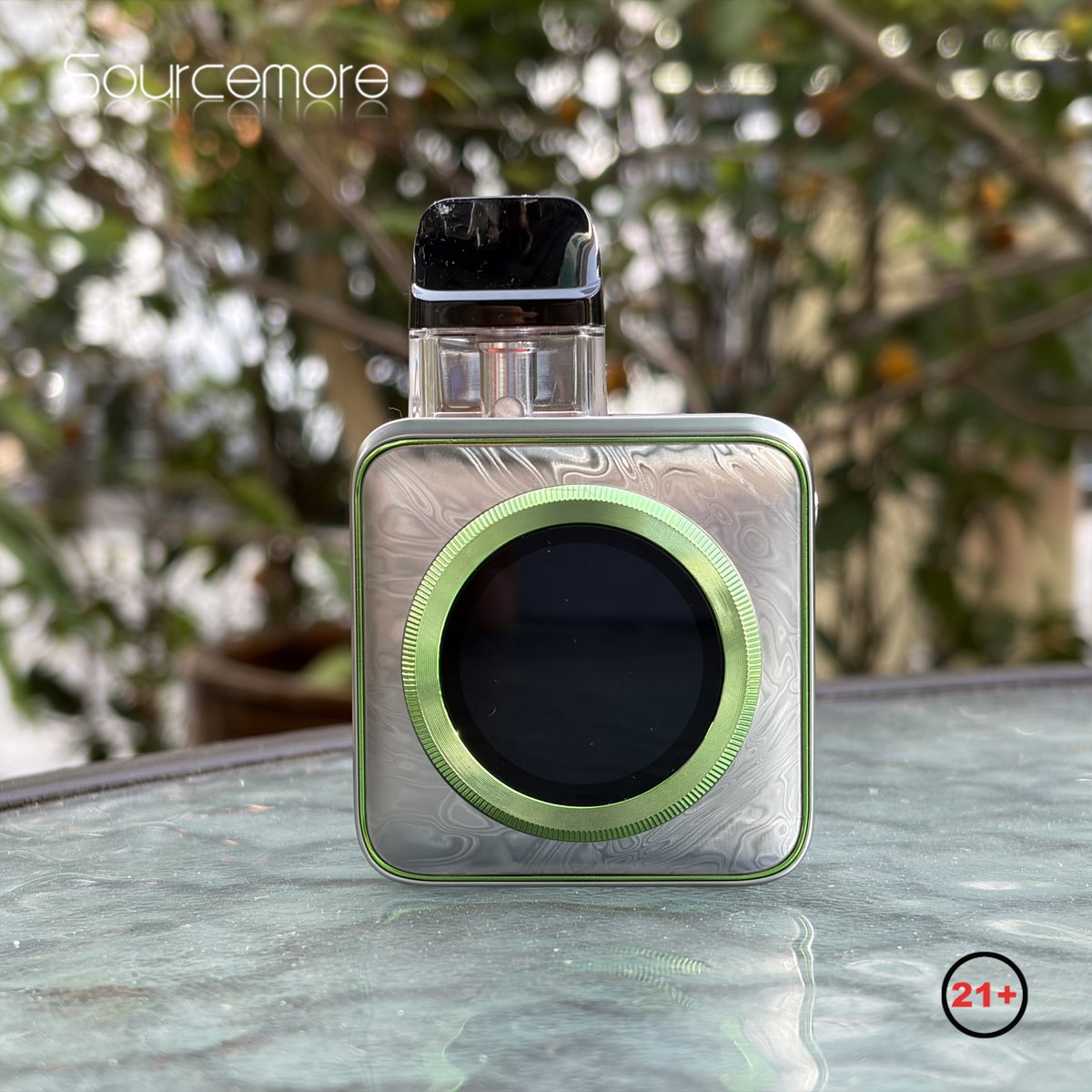
Your style 🎨 your screen 📲
Multiple themes 🌈 precise airflow 🎯 lightweight feel ✨ — make it personal 💫
Full details here 👉
shorturl.at/dnZKV
#Sourcemore #Vaporesso #Xros5Nano #PersonalTech #ColorStyle
8
231

25 Dec 2025
I DID COLORSTYLE FOR THIS CHRISTMAS!!!!!!!!! GO LISTEN!!!!!!!
25 Dec 2025

Our collaborative compilation with unlucky wind, heroin dream, and magma sphere is OUT NOW!
All CD sales profits go towards doctors without borders.
Listen / Purchase via the bandcamp in our bio
3
40

14 Dec 2025
Yall would be amazed if I used the colorstyle I use when I do commissions, it's sm better than the one yall see in my colored stuffs
3
120

1 Dec 2025
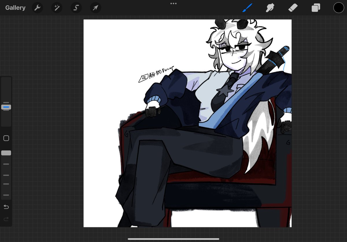
WIP! Many details are missing (Adam's halo and wings, also Lute's wings and the colorstyle is far from final), but I wanted to get this st*pid idear out of my system.
Will animate it?!
#guitarspear #HazbinHotel #HazbinHotelAdam #HazbinHotelLute #HazbinHotelFanart

3
81
540
7,293

12 Nov 2025
Sorry I haven't drawn in my actual colorstyle for a while hi #gatycil nation

5
19
84
1,303

11 Nov 2025
I tried doing the trend…
I don’t think the filter thing suit for my art (or maybe it does fit I cant tell) cause my art colorstyle is so bright
Anyway, I used my really old arts to do this cause I can’t seem to find suitable arts for this

9 Nov 2025

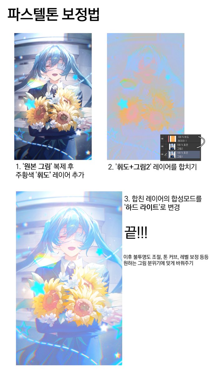
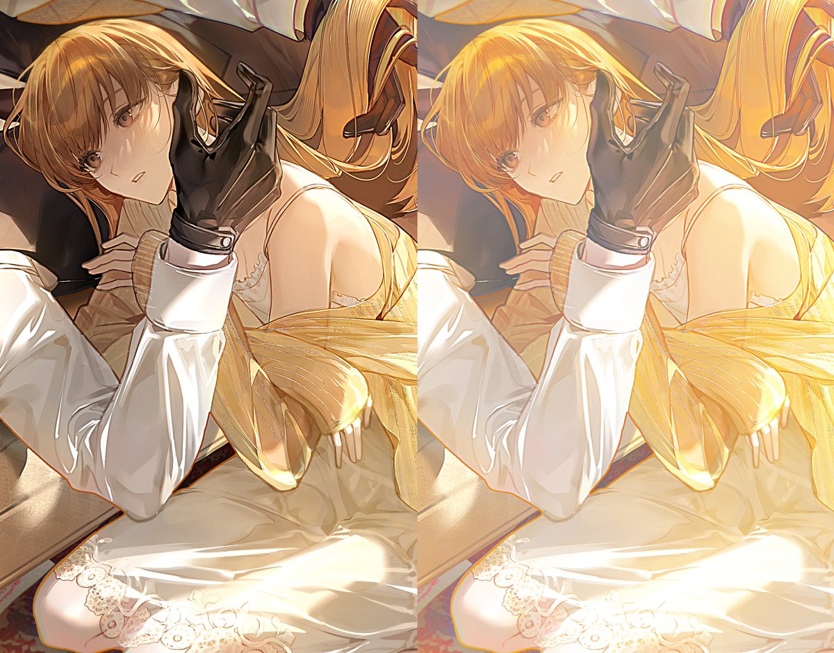
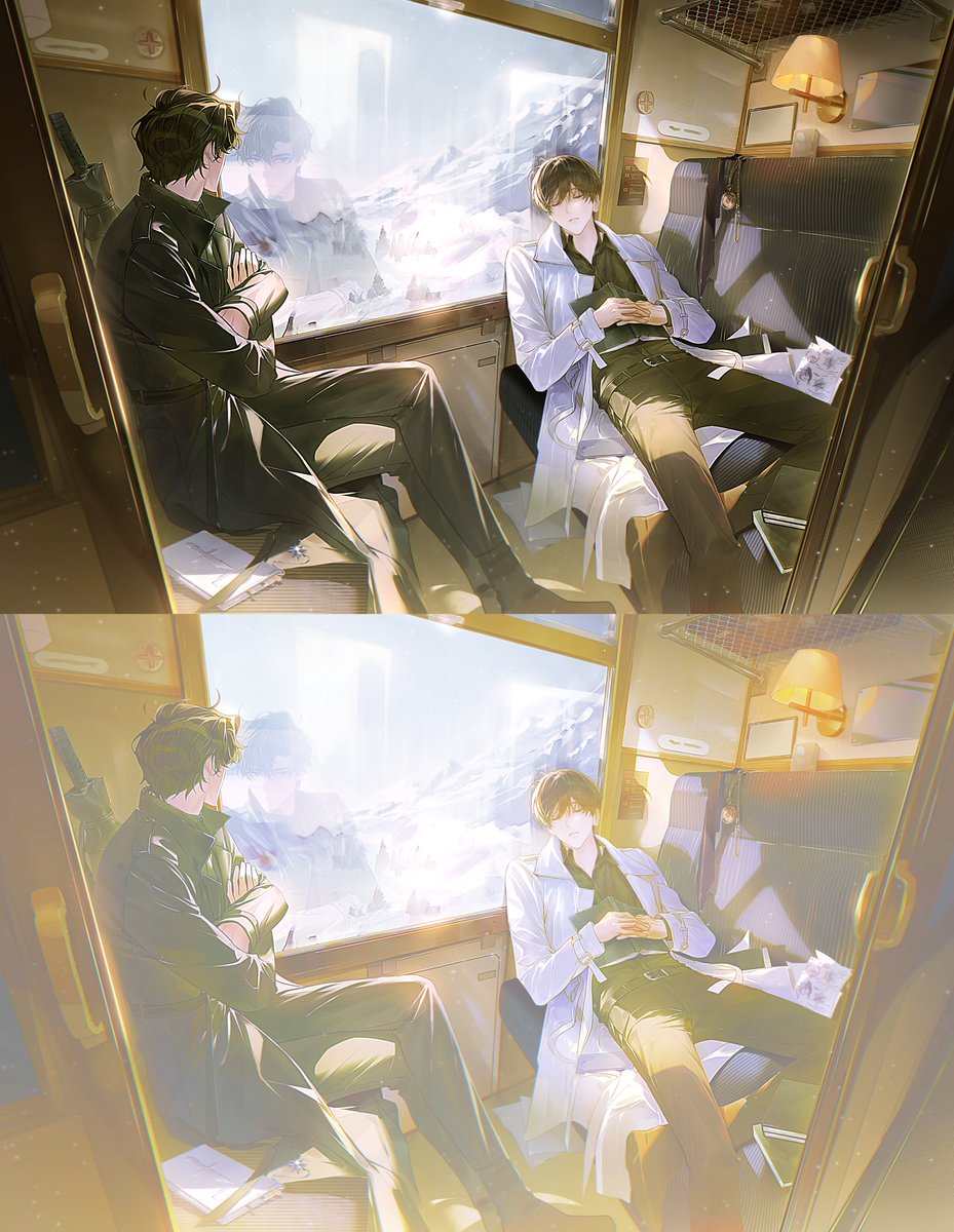
맑은 느낌의 파스텔톤 보정법!
묘사와 색을 많이 얹은 그림에 효과적이에요
주황 휘도를 하드 라이트로 얹으면 명도 대비가 완화되고 색이 투명해집니다
채도를 그대로 유지하기에 스포이드로 보면 채도 변화는 거의 없지만
시각적으로는 색이 밝고 생생해져 파스텔톤처럼 맑은 인상이 만들어집니다
1
1
3
237


13 Oct 2025
継続1060日目
Figma上でColorStyle設定を行うときにVariable化してしまい、困惑したが、設定タブにStyleとVariableがあることに気づいた。ここややこしい。明日は設定した色で統一する作業!
#MorningMogu
morning-mogu.com
2
87
17 Sep 2025
im never doing rawstyle again, time to GET GAY AND MAKE COLORSTYLE
3
66

14 Sep 2025
听过沉重的hardstyle之后再听colorstyle会有一种很神奇的感觉!
这个时候的color kick会显得格外悦耳,听着会感觉很舒服😁
2
6
112

25 Jul 2025
一般論ベースで。
Hardstyleは今や包括ジャンル名称であり、その中に更にRawstyleやEuphoricやReverseやColorstyleやら何やらと分かれていきます。
それらの分別で1番肝になるのは「キック」です。
って感じですかね。
細かいのは記事とかを読みましょう。
有識者、リプライPlease
25 Jul 2025

HardstyleとRawstyleの違いがよく分かってない…
Rawstyleの方がメロディーが歪でキックが強いらしいけど「じゃあこれもRawstyleでは…?」って曲がいくつかある…
1
3
25
2,482

8 Jul 2025
BLUEEEBLEUEBELEUEBEKEU BLUEEE EOHMYGAHHHHHHH YAYAYAYAYYAYAYAYA I LOVE THIS SMMSMM THE COLOR IS SOOOO COOOLL BROOO I LOVE THIS COLORSTYLE SOMICH I USED TO TRY TO COLOR LIKE THIS BEFORE BUT IT ALWYAS ENDED UP BECOME A MESS😔😔😔😔 URR SO COOLLL IZUKVENTT


5
1,843

6 Jul 2025
Shared my text & color styles — it may help you, take a look! 😉
#ui #ux #text #color #style #figma #stylesheet #typography #colorstyle #creativise #uidesigner #uxdesigner #figmadesigner #uiuxdesigner #buildinfigma #takealook #grabit
figma.com/community/file/152…
3
1
9
703

24 Jun 2025
Oc - @AshleyReaper
Attempt of new art and colorstyle (inspired by Nirami)…
Utter failure.
6
4
21
1,178

29 May 2025
Can we make colorstyle a trending genre please
🌈🌈🌈🌈
Hardstyle if it was gay
6
87

23 May 2025
2
21
783