Today I would like to discuss about one of my
#DataAnalysis projects that I built. The name of that project is “Salary Analysis”.
Here, I analysed the salary of various job titles. I used
#Python,
#Pandas to manipulate/analyse the data and
#Plotly to visualize.
Check Project from Here :-
ujjwal01.com/index.php/salar…
Let’s discuss about various challenges/problems that I faced in this project and how I as a
#dataanalyst solved them so that aspiring
#dataanalysts can understand that every problem, limitation, or error needs a different methodology.
1) Dirty Data :- I got data from
#Kaggle for this project and even it had good usability score, I was concerned about accuracy, cleanliness, and consistency.
What I did :- Loaded dataset into the database and checked for the basic properties such as relevant data types, missing values, data consistency, redundancy and more. Using operations such as “UPDATE”, “ISNULL”, “COALESCE”, “TRIM”,” DISTINCT” were common.
What can you learn :- Make sure to check for these things in the data especially data types as they can completely ruin or limit your data analysis if they are wrong according to the actual data of that column. Don’t consider the usability score on
#Kaggle as the ultimate factor for
#dataintegrity,
#dataconsistency, and
#datausability.
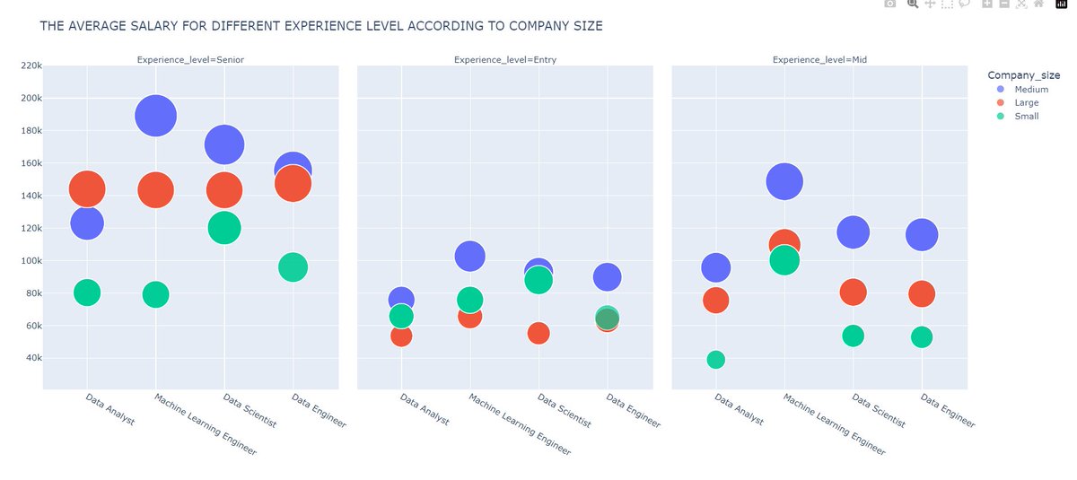
2) EDA :- On performing
#EDA, when I selected various experience level to have a better understanding about the salary trends, I saw significant salaries such as 300k USD for mid-level experience for a
#DataAnalyst.
What I did :- I quickly understood that outliers are present in the data and performed box plot technique to remove outliers from the dataset. After doing thorough EDA again, I got consistent and logical trends which were acceptable.
What can you learn :- Never run to create visuals after basic cleaning of the data, always perform EDA, if you have not removed outliers in the data cleaning process. Also, sometimes outliers contribute to critical analysis which simply means that data or outliers provide critical analysis and contribute results to the analysis, so you should not remove outliers in those scenarios.
3) Representing Analysis using Visuals :- I used
#plotly to visualize the insight and I was getting the problem of limited visuals to efficiently convey the insight. I was getting stuck at only few visuals such as bar charts, line charts, scatterplots etc.
What I did :- I noticed problem, which was for similar insights, I had to create separate tabs for visuals such as for different experience level, I had different visuals in different tabs which was inefficient. So, searched on the
#plotly documentation and got to know about “facet columns” that allows us to create multiple visuals according to the criteria that we pass it, I used it.
What can you learn :- Always use documentation of libraries/technologies, it’s really powerful.
#datanalysis #dataanalyst #businessanalyst #Python #pandas #plotly