
2

Leveling up not only with my stack but also better #designprinciples (Adapter pattern).
- Setup #NextJS with #TypeScript.
- Started with dummy data before stitching to the #API so I explore opportunities to present the data on the client end quickly, before moving to full API.

1
8

Jun 12
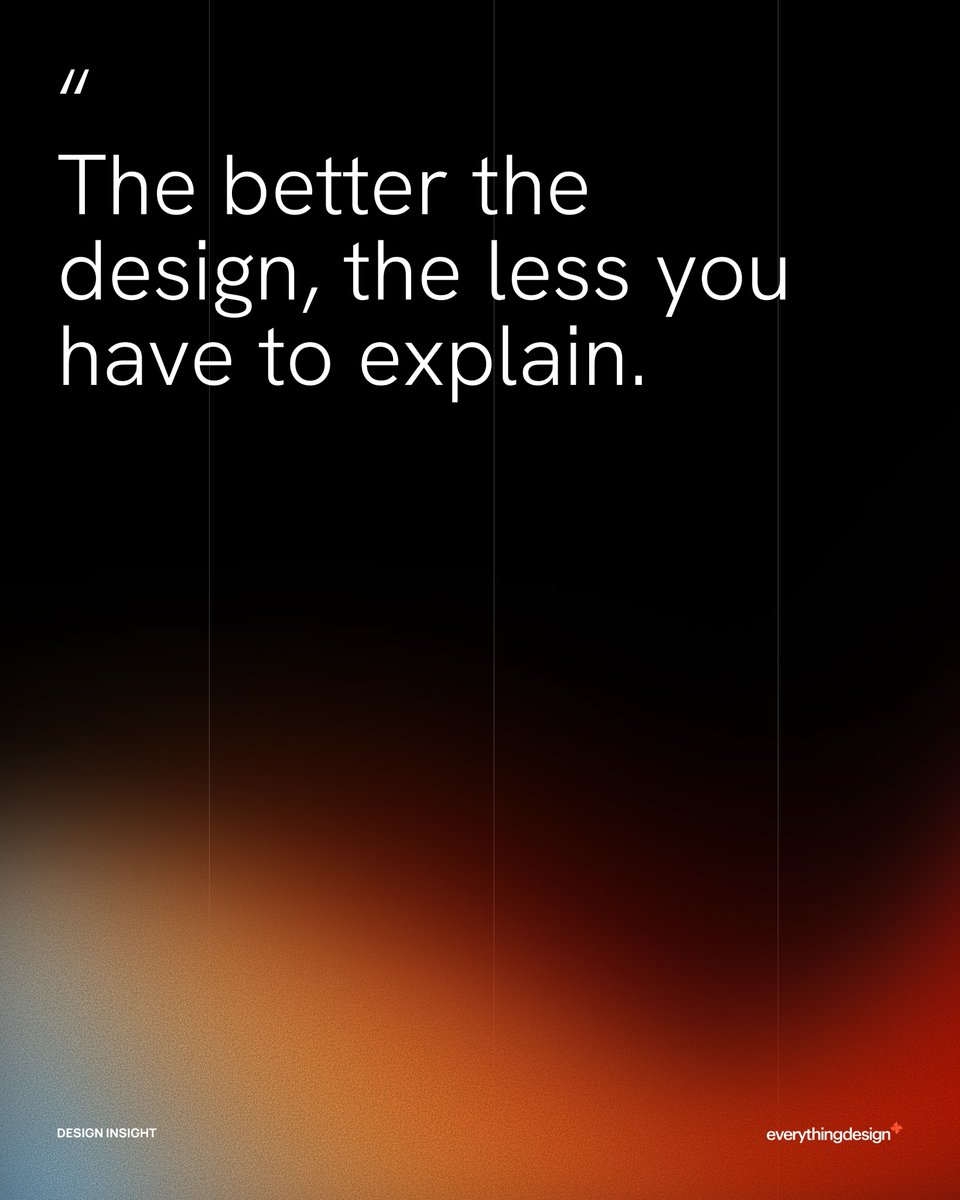
A cluttered design is a confused message. Every element on a page should earn its place. Remove what doesn't serve the goal.
#DesignPrinciples #BrandDesign #MinimalistDesign
5

18वीं शताब्दी के कलाकार William Hogarth ने बताया कि वास्तविक सौंदर्य रेखाओं के प्रवाह में छिपा होता है। क्या है "Line of Beauty
#Architecture #HogarthLineOfBeauty #ArchitecturalDesign #ModernArchitecture #DesignPrinciples #Aesthetics #LandscapeDesign #InteriorDesign #Vastulogy
1
11

Jun 11
Have you ever felt like your design isn’t perfect? Yeah, that is probably not your skill, but there's too much use of color and fonts, and a lack of depth in the use of design principles.
This is a detailed video for you to learn. #useefata #efatadesign #designprinciples
1

Every confident rule-break in design comes from someone who knows exactly what they're breaking.
Grid. Hierarchy. Type. Whatever it is, understand why it works first. Then earn the right to break it.
#DesignThinking #DesignPrinciples #VisualHierarchy #DesignLeadership
1
5

Geometry meets organic form in perfect balance.
#AIArt #GeometricArt #OrganicDesign #StructuralBeauty #BalancedComposition #MathematicalArt #NFTDesign #ArchitecturalElements #VisualEquilibrium #FormAndFunction #DesignPrinciples

6

Jun 4
Claude设计技能三件套(Taste Skill Impeccable Emil Kowalski)完整配置 & Prompt模板
一键安装三件套(Claude Code / Cursor / Codex 通用)在项目根目录终端运行下面3条命令(一次搞定):
bash
# 1. Emil Kowalski(动画 动效 设计工程)
npx skills add emilkowalski/skill
# 2. Impeccable(23条设计指令 排版/间距/颜色/布局词汇)
npx skills add pbakaus/impeccable
# 3. Taste Skill(反slop 高级审美品味)
npx skills add Leonxlnx/taste-skill
安装完重启Claude Code(或Cursor),输入 / 就能看到 /impeccable、/taste、Emil相关指令。2. 核心Prompt模板(直接复制喂给Claude Code)
markdown
你现在同时加载了以下三件顶级设计技能,请严格按顺序使用:
1. Taste Skill(Leonxlnx/taste-skill)→ 负责整体审美品味,彻底消除AI通用slop(避免紫色渐变、Inter字体、圆角豆腐块、过度对称等)
2. Impeccable(pbakaus/impeccable)→ 负责设计词汇和精确执行(用 /polish /critique /audit 等指令打磨)
3. Emil Kowalski Skill(emilkowalski/skill)→ 负责动画、缓动、微交互和动效物理感
【工作流程要求】
1. 先用 Taste Skill 分析当前设计,指出所有slop并给出高级审美改进方向
2. 再用 Impeccable 执行精确设计指令(typography、spacing、color、layout、vertical rhythm等)
3. 最后用 Emil Kowalski 添加流畅、自然、有物理感的动画和交互
输出时必须:
- 先给出「Taste Review」总结(哪里slop、为什么)
- 再给出完整优化后的代码
- 最后给出「Polish Checklist」(已应用Impeccable Emil的点)
现在开始,根据以下需求生成/优化界面:
[在这里粘贴你的需求或现有代码]
快速配置JSON(项目级 .claude/config.json 示例)如果你用的是Claude Code项目模式,可以在项目根目录新建 .claude/config.json(可选,增强效果):
json
``
{
"skills": {
"enabled": [
"emilkowalski/skill",
"pbakaus/impeccable",
"Leonxlnx/taste-skill"
],
"autoApply": true
},
"defaultCommands": [
"/taste review",
"/impeccable polish",
"/emil animate"
],
"designPrinciples": "high-end, intentional, human-first, no generic AI aesthetics"
}
使用建议:
安装后直接在Claude Code里输入 /impeccable polish 或 /taste review 就能秒用
推荐工作流:先用Taste Skill定调 → Impeccable打磨 → Emil Kowalski加灵魂
这套组合能把AI生成的界面从「明显AI味」直接变成「Dribbble质感」
2
908

May 15
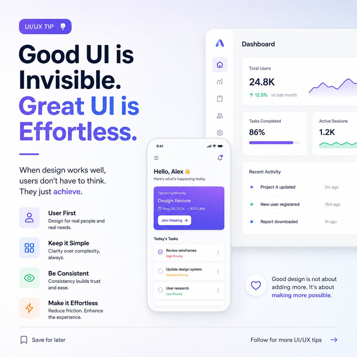
UI/UX principles I wish I learned earlier:
→ White space is not wasted space — it's breathing room for the user's eye
→ Consistency builds trust faster than any branding element
→ If you have to explain the button, redesign it
#UIDesign #UXTips #DesignPrinciples
4
38

UI is about visual balance.
Too much weight on one side,
and the interface feels unstable.
Good balance makes designs feel calm, intentional, and trustworthy.
Users may not notice balance consciously -
but they always feel it.
#UIDesign #VisualBalance #DesignPrinciples

2
21

Becoming A Motion Designer Day 13, Day 10 of Learning and sharing the design principles
Today I learned what proportion is as a principle of design, it application and function in design
Let's Learn and Grow Together
#designprinciples #motiondesign #graphicdesign #motion

Becoming a Motion Designer: My Learning Process
Finally starting tomorrow insha’Allah, I’ll be documenting and sharing my entire learning journey here from the basics to real progress.
Let’s learn📕and grow📈 together
5
41

You don't need years of experience to design well. You need 4 rules. That is it.
CRAP- Contrast. Repetition. Alignment. Proximity.
Master these and your designs will look clean and more professional.
#designprinciples #CRAP #skilltoincomeacademy
2
3
37

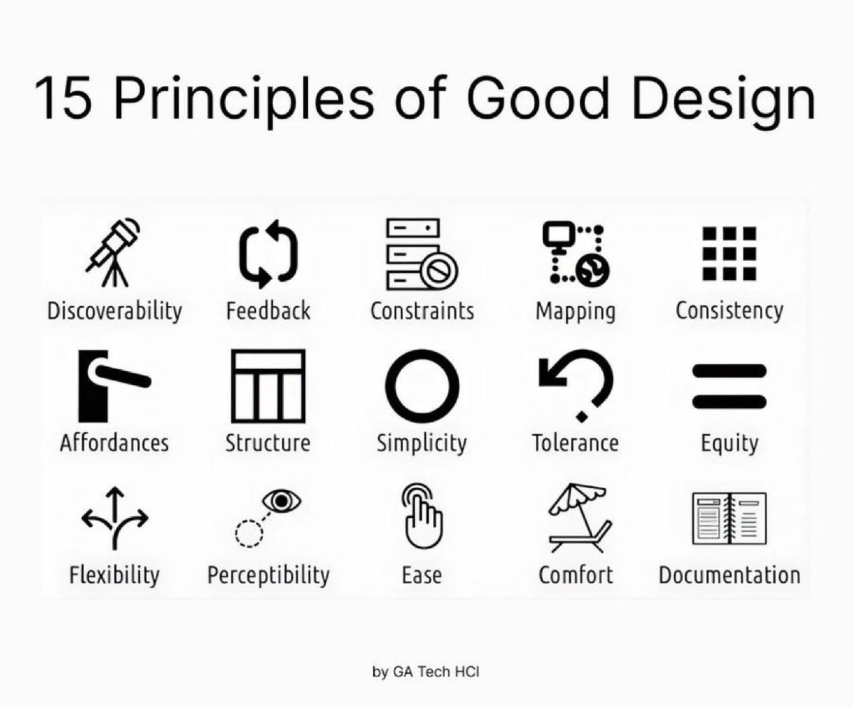
15 Principles of Good Design to Boost Your Next Design Project 🙌
Great design isn’t just beautiful, it’s usable, accessible, and intentional.
These 15 principles help guide meaningful UX 👇
1. Discoverability
Users should easily find what actions are possible and where to begin.
2. Feedback
Every action should have a clear, timely response to show it’s working.
3. Constraints
Limit choices to prevent errors and guide users toward the correct path.
4. Mapping
Controls should match users’ mental models (e.g., up means increase).
5. Consistency
Keep patterns, terms, and visuals uniform across your product.
6. Affordances
Design elements should suggest how they’re meant to be used (e.g., buttons look clickable).
7. Structure
Group related content and actions logically to reduce cognitive load.
8. Simplicity
Remove unnecessary elements—clarity beats clutter every time.
9. Tolerance
Design should forgive errors—make undo easy and prevent destructive mistakes.
10. Equity
Ensure your design works for users of all abilities and backgrounds.
11. Flexibility
Support different user needs and preferences without forcing one path.
12. Perceptibility
Make important information visible and legible to all users.
13. Ease
Reduce friction—fewer steps, simpler wording, smarter defaults.
14. Comfort
Design for emotional and physical ease—no stress, no strain.
15. Documentation
When needed, provide clear guidance to help users succeed.
Design with these in mind and you’ll build experiences people actually want to use 🙌
#UX #UIDesign #DesignPrinciples #ProductDesign #Startup #Business
2
20
98
3,997

Apr 10
DESIGN TIP: Apply Contrast Effectively
1. Use light vs dark colors
2. Combine large and small elements
3. Highlight important content
4. Improve visual hierarchy
#DesignPrinciples #Contrast #GraphicDesign #VisualHouse #DesignTips
2
158


Apr 4
Mark required fields with an asterisk *
Marking required fields with an asterisk is a concise and familiar way to clearly indicate the fields people need to complete. Avoid colouring the asterisks red, as red commonly indicates an error. You still need to include instructions at the top of the form, but it won’t matter as much if people miss them, as many people are familiar with the meaning of the asterisk
#UXDesign #UIDesign #FormDesign #WebDesign #UXTips #DesignPrinciples #Accessibility #UserExperience #ProductDesign

1
5
206

Mar 28
Minimal design isn’t about emptiness—it’s about purpose. Every element should add value; if it doesn’t, remove it. It’s clarity over clutter and function over decoration.
Less distraction. More impact.
#MinimalDesign #UIUX #DesignPrinciples

2
7
41
Mar 27
The Power of White Space
White space is not empty - it’s intentional.
It improves readability
Creates focus
Adds elegance
Less clutter = more impact
Don’t fill space. Use it.
#VisualHouse #Whitespace #MinimalDesign #DesignPrinciples
5
83

Mar 24
You refactored to this:
interface DiscountStrategy {
double apply(User user);
}
But inside each implementation you still use if chains.
Did you really follow OCP? Or just move the problem? 👀
#DesignPrinciples
1
11
1,286