
Jun 12
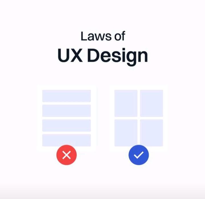
Design Tip:
Don't make users think.
The best interfaces aren't the ones with the most features.
They're the ones that feel obvious to use.
Join Afriment Cohort 20:forms.gle/uw8YdMvZyuB6mCfR9
#UIUXDesign #DesignTip
Jun 8

One week into my internship journey.
Biggest lesson?
Growth isn't about knowing everything.
It's about being willing to learn, receive feedback, and improve every day.
Still learning.
Interested in starting your own tech journey?
Join Afriment Cohort 20: forms.gle/uw8YdMvZyuB6mCfR9
4

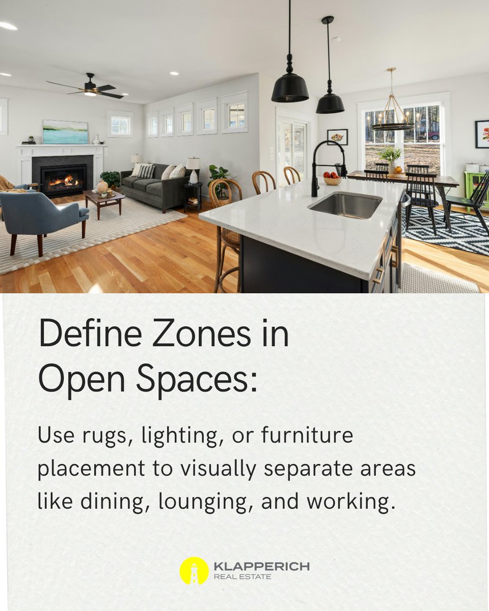
#DesignTip: Define zones in open spaces. By thoughtfully defining zones with #rugs, #lighting, or #furniture placement, you can create a sense of purpose and clarity, while still fostering harmony and connection in the space.
1

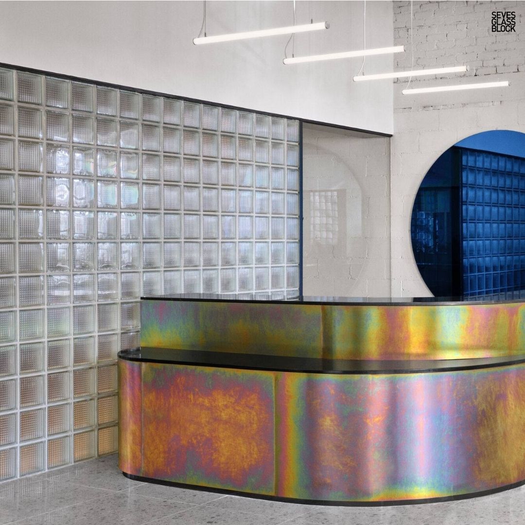
Hotel lobbies should be memorable.
Glass blocks can be used in feature walls, reception areas, and partitions to diffuse light, add texture, and create a sophisticated guest experience.
#HotelDesign #HospitalityDesign #GlassBlocks #CommercialArchitecture #DesignTip


2
4

A design detail people underestimate most? Scale.
Even beautiful furniture feels out of place when proportions are off. Rug size, lighting height, and furniture scale all shape how a room feels.
#HickoryFurnitureMart #DesignTip
6
Luis Villavicencio retweeted

24 Oct 2022
#designtip: Adding a mirror to your wall can help open up any small space. @nihaokylen shows us how its done with our HUBBA PEBBLE MIRROR that can orient 8 different ways.
9
4

May 31
Hi guys 👋, checkout this article: learn more about font psychology, it's very important, explore more if you can, it might be useful to you in one way or the other..........#uidesign #uiux #Designers #uxdesign #designtip #designerslife #fonts

1
3
1,078

May 8

1
3
61

May 6

1
5
64
2,364

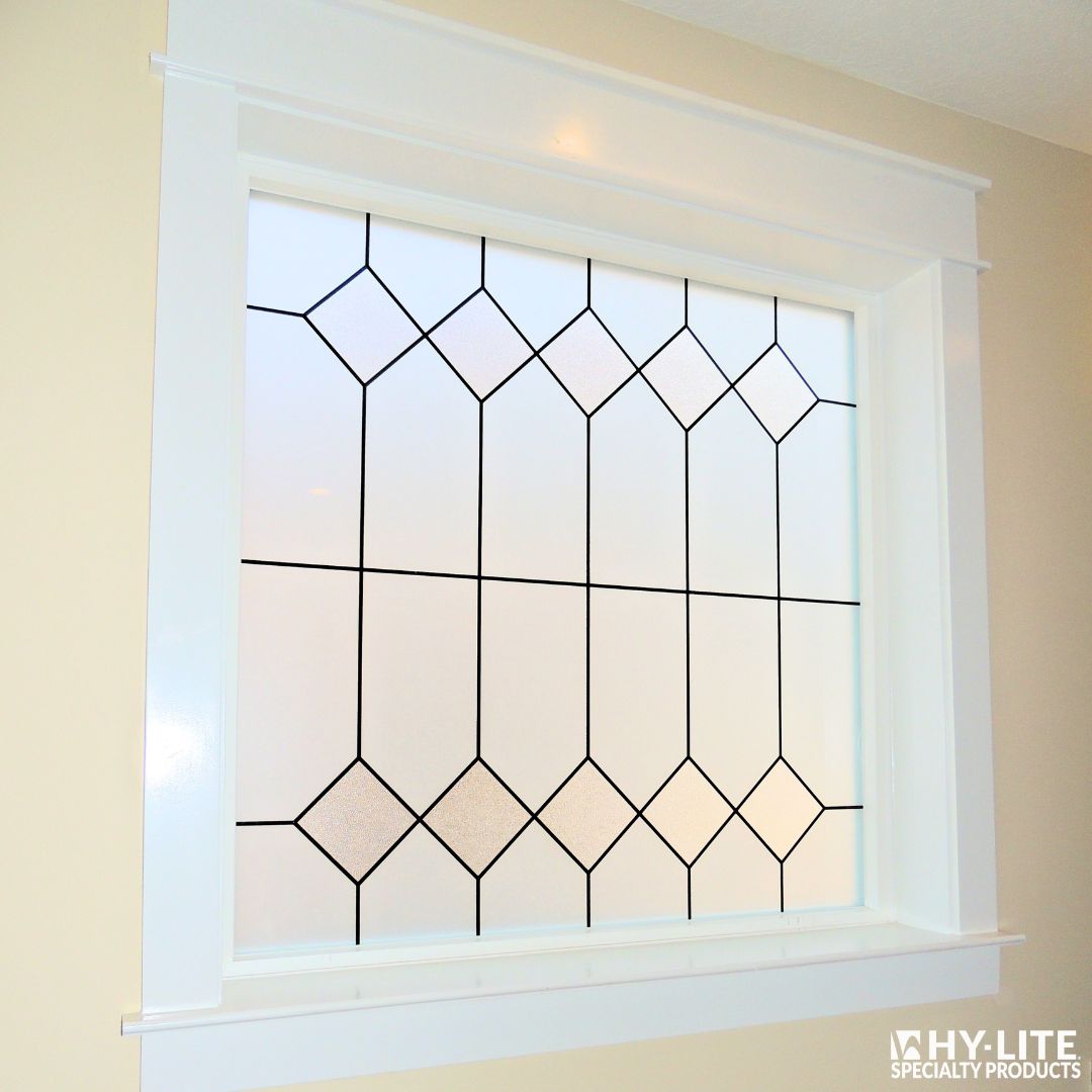
Mission decorative glass windows add clean lines, timeless character, and natural light—perfect for spaces where you want both privacy and style.
#HyLite #DesignTip #WindowDesign #DecorativeGlass #HomeDesign


3
39

Apr 11
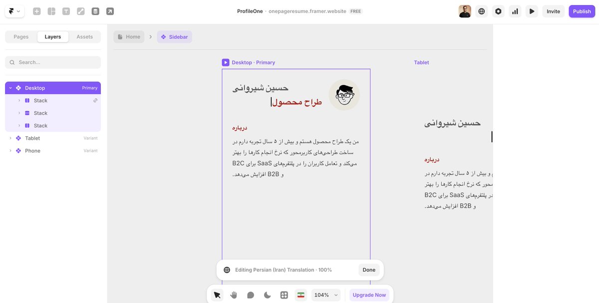
I am making my template multilingual in @Framer. One key mistake to avoid is setting alignment for text. By default, alignment is not set. If you set it, the layout direction will not work properly when switching from #LTR to #RTL.
#Framer #FramerChallenge #FramerTip #DesignTip
1
3
108
Apr 10
4
36
1,539

Feb 14
As a brand designer, you've probably struggled with typography at some point. Choosing the right font, pairing fonts that work, and making text look pretty... it can be overwhelming! 😅
The good news? Google fonts site! This is a goldmine.
Go check it out.
#designtip #Graphics
2
69

📣 Creatives, Ever felt like your design looks busy and clustered even though everything is correct?
That is a Whitespace issue.
Let's talk about Whitespace in design.
A thread 1/5
#designtip #designerscommunity
3
1
5
382

Jan 9
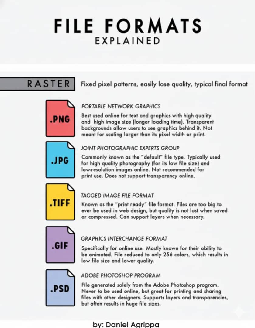
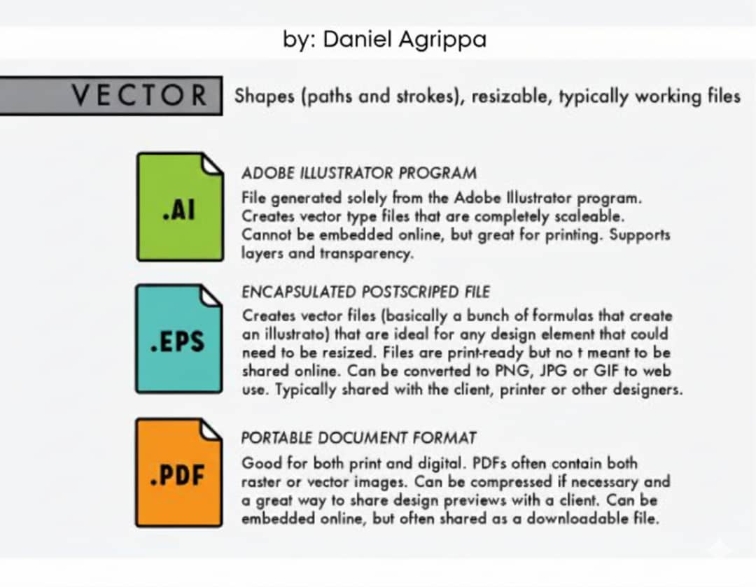
Understanding file formats saves you from blurry designs, print errors, and heavy files.
PNG = transparent logos & UI
JPG = photos & social media
SVG = scalable logos & icons
PDF = sharing & printing
TIFF = high-quality professional prints. Save & share.
#GraphicDesign #DesignTip
1
2
31
Jan 6

1
3
52
2,267
16 Dec 2025

2
22
186
5,457

20 Nov 2025
Contrast is key. 🔑 Sufficient color contrast helps users with low vision. Aim for a 4.5:1 contrast ratio for text and 3:1 for graphics. #DesignTip
7
14
265
14,071

5 Nov 2025
Too many fonts leads to visual chaos.
Stick to 2 (or max 3) typefaces in a design
One for headings, one for body, and maybe an accent. It keeps your work clean, readable & professional.
#designtip💡

5
1
16
191
28 Oct 2025
#DesignTip for creating forms → Keep screen readers in mind and use clear labels and instructions so everyone can navigate easily.
2
38
4,899

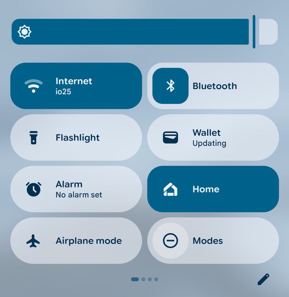
#DesignTip
Your control center looks really cheap. Please implement corner rounding in UI shapes?
3
10
335