
Mistake 4: God widgets.
One class. 1000 lines. Renders everything.
You can't reuse, test, or modify part of it without touching it all.
Decompose ruthlessly.
OrderScreen → OrderHeader OrderList OrderListItem EmptyState ErrorState.
1
3

Jun 12
🎉 Say hello to Moto UI v0.0.8
- Added EmptyState component
- Added Table component
- Remove global invalid state styles
- Fix issue unresponsive inputgroup invalid styles
- And lots more…
🔗 moto-ui.app
15

HeroUI Native Pro 1.0.0-beta.3 is out 🚀
📈 AreaChart — stacked, ranges, gradients
🎯 ChartCrosshair — Skia rule RN tooltip, shared by every chart
🔵 ChartIndicator — themed double-dot press marker
📁 EmptyState — finally stop hand-rolling zero-data screens
🎚️ Segment — Tabs-based segmented control
4
9
228
11,736

Jan 26
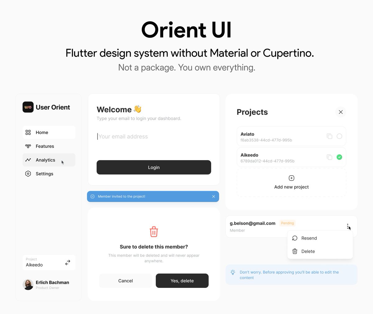
First public release of Orient UI is here! 🎉
It’s a collection of Flutter widgets without Material or Cupertino.
Don't worry! It doesn't force you to migrate your app to OrientApp, use OrientScaffold or anything. It works with them. These widgets are just pure templates.
As of v0.1.0 , there are 6 mature widgets: Button, Spinner, NavBar (mobile web), EmptyState, Toast and ConfirmationPopup ✅ The more to come.
How it works? You just run “orient_ui add button” in your terminal, and 🥁🥁🥁 that widget copied to your Flutter project! It’s yours! Change it if you want. No pubspec dependencies and no dependencies at all!
And to give you a background, it's the design system powering @UserOrient's web and mobile dashboards that are built with Flutter 🩵
So, remember, it’s early public release, API and widgets might change a bit and the more feedback you give, the more we can make it better. Let's go!
Links in the first comment 👇🏻
5
15
97
17,615

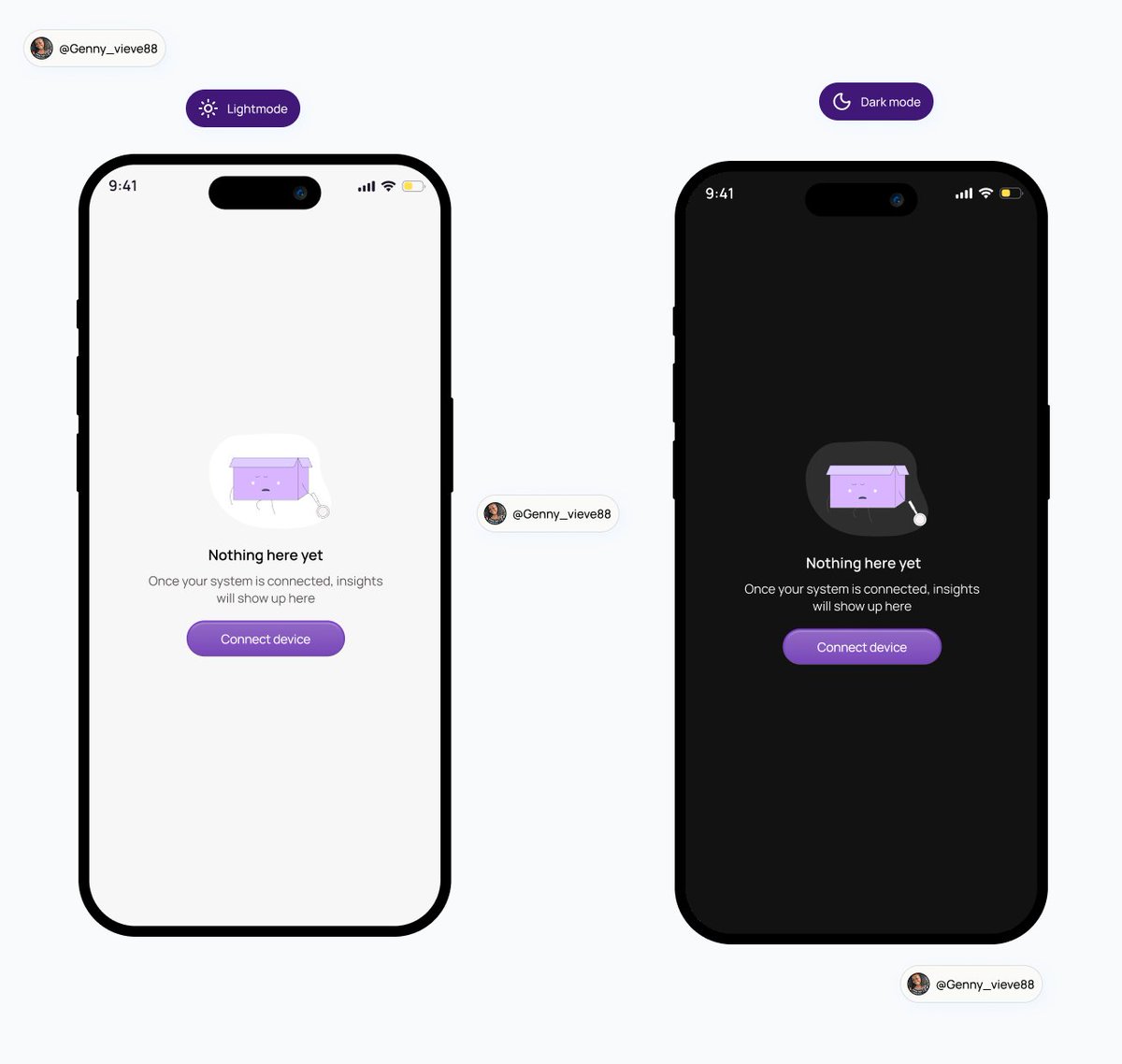
Designed an empty state for a analytics mobile app.
Empty states matter more than we think.
They guides users instead of confusing them.
Small copy, big impact.
#emptystate #uideisgn #mobileappdeisgn
1
2
12
282

The 3-doc system that'll save you 20 hours of refactoring
Takes 30 minutes upfront. Saves your sanity.
Look, you can absolutely just start building. But you're gonna hit that moment at 2am where nothing connects and you're rewriting auth for the third time.
You're creating 3 documents before you write any code. Think of them as contracts between you and Claude.
DOCUMENT 1: DESIGN STYLE GUIDE
Do this first. Not kidding.
Everyone wants to start with features. But if you don't lock in the visual language early, you'll end up with Frankenstein UI. Every component looking like it's from a different app.
Open a chat. Tell Claude what vibe you want. Be specific. "I want it to feel like Linear meets Spotify. Dark mode. Minimal. Lots of breathing room. Subtle animations."
Then ask for:
- Color palette (background, surface, border, text primary, text secondary, accent, destructive)
- Font stack (what's the display font, what's the body font)
- Spacing scale (4, 8, 12, 16, 24, 32, 48, 64)
- Border radius tokens (none, sm, md, lg, full)
- Shadow tokens (if any)
- Animation timing (what's the default easing, default duration)
Get Claude to output this as a single doc. Save it. This is your bible.
Every time you build a component, you paste this in. No more "make it look nice." You say "follow the style guide."
DOCUMENT 2: FRONTEND PRD
Now you know what it looks like. Time to define what it does.
List every page. For each page, list:
- What the user sees (components, layout)
- What the user can do (actions, buttons, forms)
- What happens when they do it (navigation, state changes)
Don't write code. Write behavior.
Example:
"Dashboard page. Shows a list of projects as cards. Each card shows project name, last edited date, and a dropdown menu with edit/delete. Clicking a card opens the project. Delete asks for confirmation."
Then list your components. Just the names and what they do.
- ProjectCard: displays single project, handles click and dropdown
- ConfirmModal: reusable confirmation dialog
- EmptyState: shows when no projects exist
Finally: global state. What needs to be accessible everywhere?
- User auth state
- Current project
- Theme preference
Save this doc. When you're building frontend, this is what you reference.
DOCUMENT 3: BACKEND PRD
Last one. This is the engine.
Start with your data models. What are the things? What properties do they have?
User: id, email, name, avatar, created_at
Project: id, name, owner_id, created_at, updated_at
Then your API routes. Every endpoint. What it does. What it expects. What it returns.
POST /auth/signup - expects email, password. Returns user object and session.
GET /projects - expects auth header. Returns array of user's projects.
DELETE /projects/:id - expects auth header and project id. Returns success or error.
Then your business logic. The rules.
- Users can only see their own projects
- Deleting a project soft-deletes it for 30 days
- Email must be verified before creating projects
Save it.
HOW TO USE THESE
When you start building, you don't paste all three every time. You paste what's relevant.
Building a component? Paste the style guide.
Building a page? Paste the frontend PRD section for that page plus the style guide.
Building an API route? Paste the backend PRD.
Connecting frontend to backend? Paste both.
Claude now has exactly the context it needs. Not more, not less.
THE REAL UNLOCK
These docs aren't just for Claude. They're for you.
Writing them forces you to actually think through what you're building. You'll catch shit early. "Wait, how does a user actually get to this page?" "What happens if they're not logged in?"
That's the stuff that turns into 3am debugging sessions when you skip it.
30 minutes of docs. 20 hours saved. That's the trade.
Now go write them.
2
7
74

4 Dec 2025
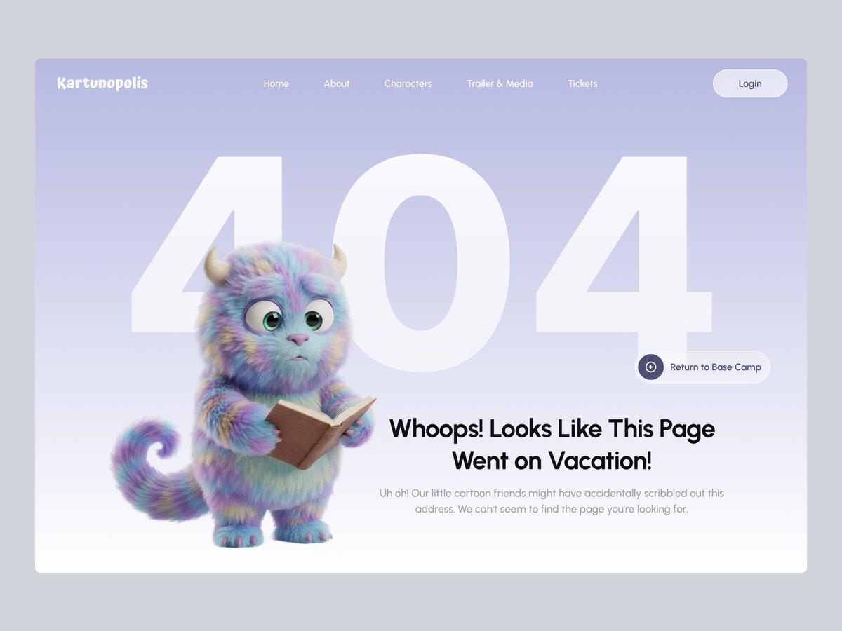
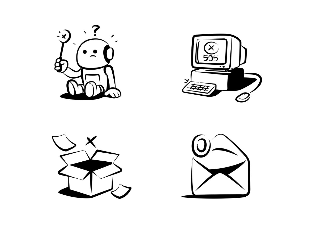
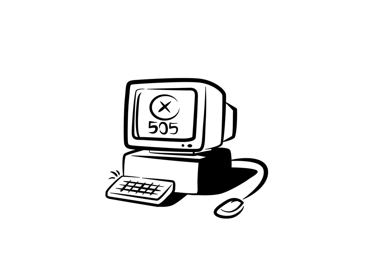
Kartunopolis — 404 Page Concept
dribbble.com/shots/26845472-…
This 404 page concept for Kartunopolis blends character illustration with minimalistic UI to create a soft and welcoming error state.
#uiux #uidesign #404page #errorpage #emptystate #error #webdesign #miawmiaw #website
2
1
4
354

4 Dec 2025
An emptystate in fintech is always a trust exercise.
How would you design it?

ALT Mobile app screen showing an empty-state view of a fintech wallet. The balance is $0.00, with two primary actions: “Deposit” and “Receive.” A verification banner indicates that the debit card setup will be available after verification is complete. Sections for Transactions, Recent payees, and Analytics are empty, showing placeholder messages.
5
167

28 Nov 2025
Day 28/30: Designed the error screen today.
Funny how these “quiet” screens actually shape the whole user experience.
It’s where clarity and comfort matter the most.
#UIDesign #UXDesign #DesignChallenge #ProductDesign #EmptyState
3
33

18 Nov 2025
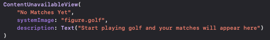
SwiftUIでEmptyStateなどのViewを作るときのContentUnavailableViewの楽さよ。
2
449

27 Oct 2025
Low-fidelity empty states are where the real UX magic starts.
It’s not about visuals yet—it’s about guiding users when there’s nothing to show.
Even an empty dashboard should feel purposeful and clear.
#UXDesign #UIDesign #EmptyState #DashboardDesign #LowFidelity #SaaS
2
24

18 Oct 2025
Day 18 of My #30DaysDesign 📦
Today’s task: Empty State Screen
I designed a simple and friendly empty state screen, the kind that appears when there’s no data yet.
#UIDesign #EmptyState #DailyDesign #UIDesigner #ProductDesign #DesignChallenge #InterfaceDesign #MobileAppDesign
17 Oct 2025

Day 17 of My #30DaysDesign 🎧
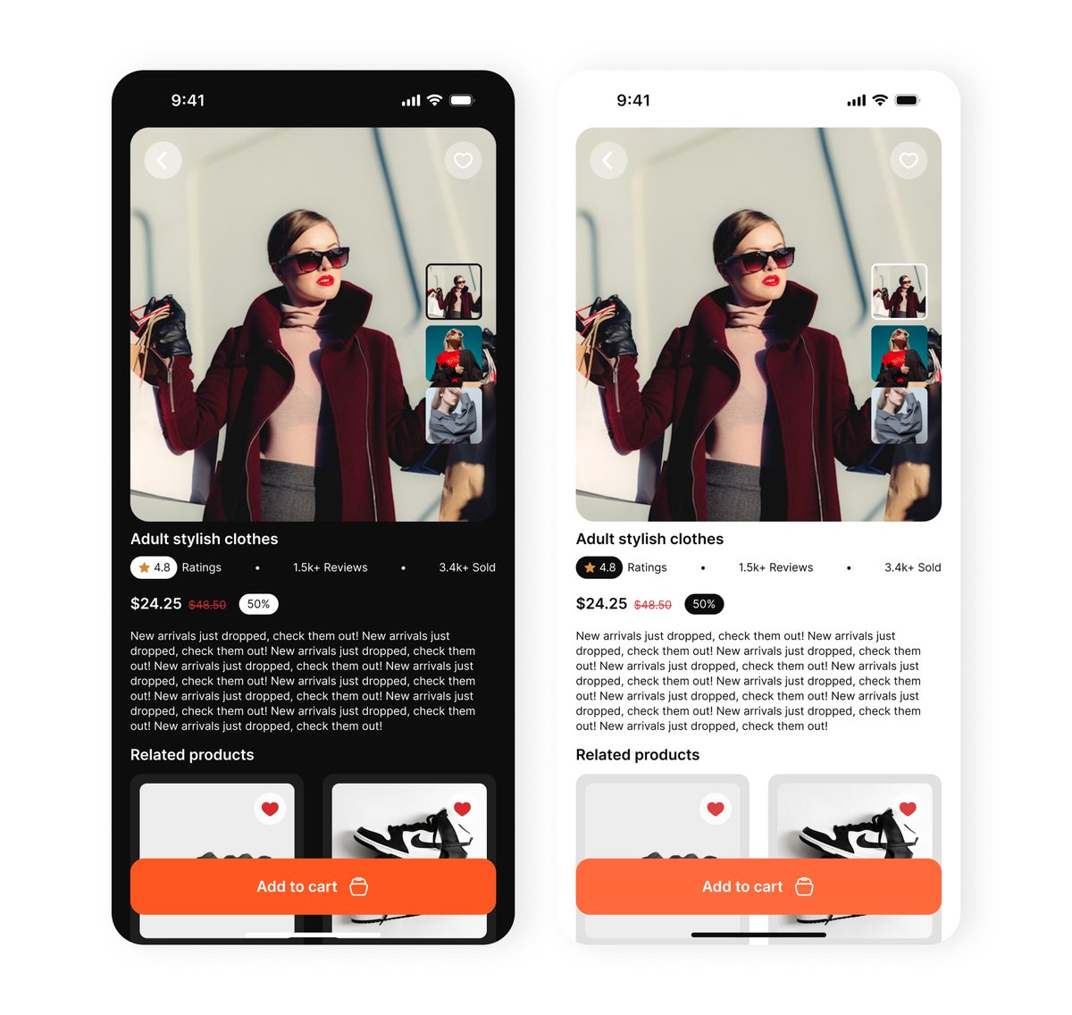
Today's task: Product Details Screen
I designed a clean and modern product details screen that highlights everything a user needs to know before making a purchase.
#ProductDetails #EcommerceDesign #MobileAppDesign #DailyDesign #InterfaceDesign
2
56

6 Sep 2025
Empty states aren’t empty.
They guide users, cut confusion, and keep journeys flowing.
• Add context so users know what’s happening
• Suggest next actions to keep them moving
• Use visuals to make the screen feel alive
• Keep it friendly
#emptystate #learningshenanigan
1
1
4
61

24 Aug 2025
No Comment Hand-drawn Illustrations
🛍 Get the full pack → gum.co/u/zhdodtwe
#illustration #art #flatdesigns #vector #vectorart #graphicdesign #artwork #design #vectorillustration #illustrationdesign #notion #vectordesign #emptystate #notionstyle

1
2
59

18 Aug 2025
With ContentUnavailableView you can create EmptyState really fast in SwiftUI

3
348
15 Aug 2025
Empty states hand-drawn notion-style illustrations
🛍 Get the full pack → gum.co/u/zhdodtwe
#illustration #art #flatdesigns #vector #vectorart #graphicdesign #artwork #design #vectorillustration #illustrationdesign #notion #vectordesign #emptystate #notionstyle
1
2
52
13 Aug 2025
Tried something a bit different in this new design, would love your thoughts!
👉🏻 dribbble.com/shots/26396200-…
#illustration #art #flatdesigns #vector #vectorart #graphicdesign #artwork #design #vectorillustration #illustrationdesign #notion #vectordesign #emptystate #notionstyle

4
1,054
13 Aug 2025
Tried something a bit different in this new design, would love your thoughts!
👉🏻 dribbble.com/shots/26396200-…
#illustration #art #flatdesigns #vector #vectorart #graphicdesign #artwork #design #vectorillustration #illustrationdesign #notion #vectordesign #emptystate #notionstyle
2
3,513

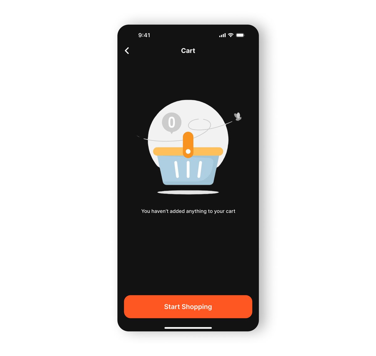
3 Aug 2025
Day 3 – Empty State UI 🛒📭
No one likes an empty cart or inbox... unless it's well designed. Today I explored how small touches—like illustrations and microcopy—
Design isn’t just about what’s there. #UXDesign #UIDesign #EmptyState #Day3 #30DayDesignChallenge #ProductDesign

2
9
406

30 Jul 2025
I created an Empty State UI for a task manager
I kept it clean, friendly & action-focused because even “nothing” deserves great design.
#UIDesign #DailyUI #UXDesign #EmptyState
6
84