DAY 52/120
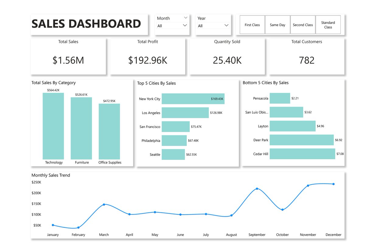
I completed a guided project by @Rita_tyna, where I worked on a Retail Performance Dashboard to understand how a business performs across sales, customers, and product categories.
This project helped me think less about just “building visuals” and more about solving actual business questions.
Business Problem:
Track overall revenue and profit performance.
Compare current performance to last year.
Understand which products, categories, and locations drive the most revenue.
Monitor customer trends and identify key contributors.
Without this, decision-making would rely too much on guesswork instead of data.
Tool Used
I used Power BI to clean, model, and visualize the data.
It allowed me to:
Build relationships across datasets.
Create measures for KPIs like revenue, profit, and year-over-year changes.
Design an interactive dashboard with filters for Month and Year.
Key Insights:
A few things stood out while exploring the data:
Revenue vs Profit: Revenue slightly declined (-2.8%), but profit increased significantly ( 24.4%). This suggests better cost management or higher-margin products.
Sales Trend: Revenue fluctuates across the year, with noticeable peaks toward the later months, especially around September to November.
Product Performance: A few products contribute the most revenue, while others lag.
Customer Contribution: Revenue is concentrated among a small group of customers, which may leave the business heavily reliant on key buyers.
Geographical Insight: Some cities clearly outperform others in revenue generation, with a strong gap between top and bottom locations.
Customer Growth: A slight drop in unique customers (-3.7%) could signal challenges with retention or acquisition.
Recommendations:
Based on these insights, here are a few actions the business could consider;
Focus on high-performing products and find ways to replicate their success.
Improve customer retention strategies, since the number of unique customers is declining.
Reduce dependency on a few customers by diversifying the customer base.
Prepare better for peak months by optimizing inventory and marketing efforts.
Working on this made me realize that a dashboard is not just about charts. It’s about helping someone make a better decision.
I’m still learning, but each project like this makes things a bit clearer.
#120DaysOfDataWithTina #DataAnalyticsLockedIn #LearningPowerBi
6
17
92
2,618
DAY 51/120
I spent some time working on building insights and visuals for the dashboard project today.
At first, I thought it was just about picking charts and arranging them nicely. But I’m starting to see that it’s more about asking the right questions. What story is this data trying to tell? What actually matters here?
I tried a few visuals that looked good, but didn’t really say much. Then I adjusted them, simplified things, and focused more on clarity. It’s still not perfect, but it feels a bit more intentional now.
I’m realizing that dashboards aren’t just built, they’re shaped over time.
Still figuring it out, but I think I’m starting to see things a little differently.
#DataAnalyticsLockedIn #120DaysOfDataWithTina #LearningPowerBI

5
115

Mar 30
DAY 50/120
I just started a guided project led by @Rita_tyna. It felt different from just watching videos or reading.
This time, I was actually building along, making small mistakes, fixing them, and seeing things come together step by step.
I didn’t understand everything immediately, but I could follow the process and see how each piece connects. That alone gave me a bit more confidence.
I’m beginning to see that learning this way might stick better than just trying to figure everything out on my own from the start.
Still early, but I’m curious to see how much I’ll understand by the end of it.
#DataAnalyticsLockedIn #120DaysOfDataWithTina #LearningPowerBI
5
81
Mar 27
DAY 47/120
I took considerable time to understand how dashboards work, not simply how they appear.
The fact that a dashboard is essentially just a means of rapidly interpreting data caught my attention. You can see a clear image in one location rather than sifting through rows of data. That in and of itself makes it helpful, particularly when quick decisions are required.
I also didn’t realize there are different types depending on the purpose. Some are more for tracking day-to-day performance, others are for deeper analysis, and some are just there to give a quick overview. It made me see that you don’t build one dashboard for everything.
Another thing I’m starting to understand is that building a dashboard isn’t just about visuals. You have to think about what the user actually needs to see. What questions are they trying to answer? What matters most? That part feels more important than picking charts.
Design-wise, I’m learning to keep things simple. Not everything needs to be on the screen. Clean layout, clear labels, and making it easy to read seem to matter more than trying to impress.
I guess the real question I’m sitting with now is, when someone looks at a dashboard I build, will they understand it without me explaining it?
#DataAnalyticsLockedIn #120DaysOfDataWithTina #LearningPowerBI
1
7
85
Mar 26
DAY 46/120
I spent some time today working through time-based calculations in DAX, and it changed how I look at my reports a bit.
At first, dates were just dates. But now I’m starting to see how they can be used to compare things, like how this month is doing vs last month, or how numbers are adding up over time.
What stood out to me is how important this is in Power BI. Without time-based calculations, you’re just looking at numbers. With them, you start to see movement, growth, drops, and patterns. It gives the data more context.
It wasn’t all straightforward; I had to slow down and really think about how dates connect to everything. But once it started making sense, it felt less like memorizing functions and more like understanding what the data is doing over time.
Still in the process, but it’s making me think about how many insights I have missed before just because I wasn’t looking at the time properly.
#DataAnalyticsLockedIn #120DaysOfDataWithTina #LearningPowerBI
5
47
Mar 26
DAY 45/120
I ran into a small but frustrating issue today.
My report showed the same sales value for every year. Different filters, same result.
After digging a bit, I realized my tables weren’t properly connected.
No relationship = no proper filtering.
It’s a simple mistake, but it completely changes the outcome. Then I got to understand how relationships work in Power BI. It’s just how tables talk to each other.
Without it, your data is basically isolated, like having different conversations that never connect.
And that’s how you end up with numbers that don’t make sense.
Still wrapping my head around it, but it’s getting clearer.
#DataAnalyticsLockedIn #120DaysOfDataWithTina #LearningPowerBI
1
7
47
Mar 24
DAY 44/120
I spent a good chunk of today finally getting my hands dirty with DAX. It’s one of those things that looks intimidating until you actually start breaking it down into small pieces.
I worked on simple KPI measures like total sales:
Total Sales = SUM(Sales[Amount])
Then I tried something a bit more real, like tracking performance:
Profit = SUM(Sales[Revenue]) - SUM(Sales[Cost])
I also played around with filter functions. At first, it felt confusing, but it started making sense when I wrote something like:
High Sales = CALCULATE([Total Sales], Sales[Amount] > 1000)
Then I explored logical functions, which felt more like setting a rule: if a number hits a certain point, call it one thing; if not, call it another.
If sales exceed 5,000, mark it "High"; otherwise, "Low."
Performance Label = IF([Total Sales] > 5000, "High," "Low")
Still feels a bit slow, but I think that’s part of the process.
#DataAnalyticsLockedIn #120DaysOfDataWithTina #LearningPowerBI
3
33
Mar 23
DAY 43/120
Today I spent time getting comfortable with DAX (Data Analysis Expressions), and it’s starting to make more sense.
I learned that DAX is basically the language behind the numbers in Power BI. It’s what helps you move from just showing data to actually analyzing it.
I explored how it’s used to create calculated columns and measures. At first, they felt similar, but I’m beginning to see the difference. Calculated columns live inside the table, while measures respond to whatever view or filter I’m working with.
I also looked into the two ways measures happen. There are implicit ones, the kind the software does for you automatically, and explicit ones, where you actually write the code yourself. Writing them yourself seems a bit intimidating at first, but it offers a lot more control over how the numbers react when you start filtering your data.
Still learning, but it feels like I’ve taken a small step from just building reports to actually thinking with the data.
#DataAnalyticsLockedIn #120DaysOfDataWithTina #LearningPowerBI
7
60
Mar 21
DAY 40/120
I got to understand data visualization in Power BI, and it made me realize something simple but important. It’s not really about charts, it’s about clarity.
I used to think adding more visuals made a dashboard better. But now I’m starting to see that what matters more is what the viewer understands at a glance. A clean chart that answers one clear question can do more than five busy visuals competing for attention.
I also paid more attention to how insights are built not just showing numbers, but choosing the right chart, keeping it simple, and letting the data tell a story without over-explaining, which explains why the prettiest chart in the world means nothing if it doesn’t tell the story clearly.
It’s starting to make sense, but I’m still practicing to improve.
#DataAnalyticsLockedIn #120DaysOfDataWithTina #LearningPowerBI
1
2
12
103
Mar 19
DAY 39/120
I spent some time trying to understand how relationships and data models work in Power BI. It felt like finally seeing how all the puzzle pieces actually fit together. Data modeling is basically creating a clean map of your tables so Power BI understands how everything connects.
I learned that without a good data model, your analysis can feel messy. Numbers don’t add up the way you expect, and your visuals don’t really tell a clear story. But when the structure is right, everything flows better.
I came across the idea of primary keys and foreign keys. The primary key is that unique “ID” column in one table (like a customer number that never repeats). The foreign key is the same column living in another table, pointing back to the original. Connect them, and boom, everything talks to each other without confusion.
I also learned to split my data into two camps:
Fact Tables: This is where the "action" happens. It’s a long list of transactions, sales, or clicks. It’s usually full of numbers and dates.
Dimension Tables: This is the "context." Who bought it? What city were they in? What color was the product? These give your numbers meaning.
Building the model was surprisingly chill: bring in your tables, switch to the model view, and just drag a line between the matching key columns. Power BI does most of the heavy lifting after that.
Feels good to finally get this part instead of guessing my way through dashboards.
Anyone else having those “aha” moments with Power BI lately? What’s one small thing that unlocked the rest for you?
#DataAnalyticsLockedIn #LearningPowerBI #120DaysOfDataWithTina

3
5
95
Mar 18
DAY 38/120
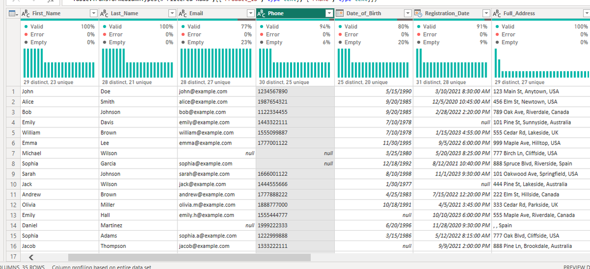
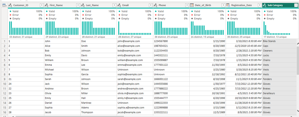
Today I spent some time getting more comfortable with cleaning and shaping text data.
Turns out a lot of the mess comes down to simple things: extra spaces, inconsistent capitalization, and weird special characters that sneak in from copies and pastes. Fixing those feels small, but it makes everything downstream so much cleaner.
Dates were another story. Changing formats, extracting the right parts, and making them usable reminded me that time data isn’t always as straightforward as it looks.
I also explored pivoting and unpivoting columns. It took a bit to wrap my head around when to reshape wide data into long format (and back again), but now I see it as simply changing the question you’re asking the data, depending on what calculation you need.
Merging and appending tables is starting to feel more natural, too. Merging when I need to match records on a key, and appending when I want to stack similar data on top of each other. Getting the “how” and the “when” clearer has made combining sources less stressful.
It’s satisfying to look at a dataset that once felt chaotic and see it become orderly after a few deliberate steps.
Still a long way to go, but these pieces are clicking together more than ever. Progress, even the quiet kind, feels good.
#DataAnalyticsLockedIn #LearningPowerBI #120DaysOfDataWithTina
2
5
56
Mar 17
DAY 37/120
Today I spent time getting more comfortable with cleaning and preparing data in Power BI.
I’m beginning to see how messy data can quietly affect everything that comes after. Fixing column types, handling blanks, and removing duplicates. It's not the most exciting part, but it’s where the real work begins.
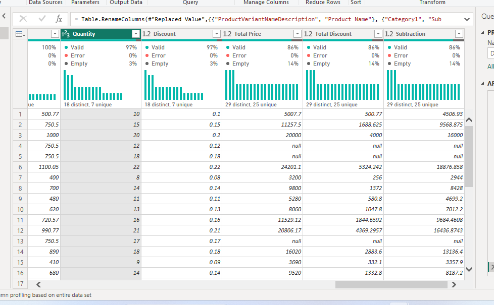
I also explored simple numerical transformations like changing how numbers behave, creating new columns, and making the data a bit more meaningful. They're small changes, but they start to shape better insights.
Still learning, but things are slowly clicking. It makes me wonder how much of good analysis is really just good preparation.
#DataAnalyticsLockedIn #LearningPowerBI #120DaysOfDataWithTina
1
7
56

24 Jul 2025
If you are still stalling on learning PowerBI, this is your time to take the cue!
Let's learn together.
#LearningPowerBI
#VAjourney
17

5 Jul 2025
PL-300 Study Guide – Prepara-te para a Certificação Power BI clico.pt/2025/04/13/pl-300-s…
#PL300 #PL300StudyGuide #PowerBI #MicrosoftCertification #DataAnalytics #PowerBIExam #StudyGuide #BusinessIntelligence #LearningPowerBI #TechCareers
19

14 May 2025
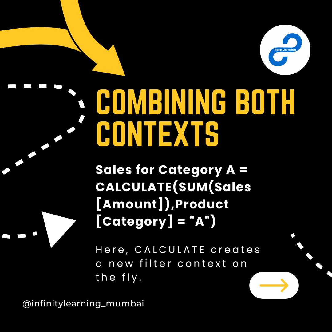
And then there’s Context Transition, which makes CALCULATE() so powerful by turning row context into filter context.
Infinity Learning by @aweshbhornya
#keeplearning #InfinityLearning #PowerBI #DAX #ContextTransition #BusinessIntelligence #PowerBIModel #LearningPowerBI


1
3
20


18 Oct 2024
#LearningPowerBI Conditional Column lets you create new columns by setting rules, like "if this, then that," without writing any code.
Custom Column gives more control by letting you write formulas. Bit more advanced but allows for more advanced expressions.
5
171

4 Oct 2024
Let Complete our thread wrapping up :Time intelligence Dax Focusing on the important numbers .Also the use of canvas and power point slide ,Overall Dashboard story telling You can read this thread on more . Dashboard posting soon
#PowerBI #PowerBImarathon #learningPowerBI
1
3,110
15 Sep 2024
Day 8 update :Data Transformation and Modelling in Power BI
I learnt a lot in this session.
Data Modelling is a lot one topic that every data analyst should know very essential.
Here are things i note down step to create Data model
#learningpowerbi #datamodeling
1
2
1
126
9 Sep 2024
Okay we are back on Another things learnt from @Rita_tyna Power Bi Bootcamp , Now I know that understanding data modelling really matters it helps to reduce redundancy imagine a scenario with large data
So make sure you understand data modeling
#powerbi #learningpowerbi
1
1
3
271