
May 18
New project, new approach! I'm building a dynamic workflow to process NASADEM in #QGIS and directly render a shaded relief in #Blender. The secret is to simplify and smooth for the given #map scale. Commissioned project, work in progress. #cARTography #MakingMapsPretty

2
47
3,835
Color Sampling in #QGIS is my new blog post about how to bridge the gap between vintage cartography and modern GIS, using a custom model to reverse-engineer and automate professional color palettes from historical maps! #cARTograpy #MakingMapsPretty
staridasgeography.gr/blog/co…
3
20
144
13,025
Jan 27
#MakingMapsPretty
After all, a shaded relief is an 8-bit image, so I can style it with suitable classes, ranging from 0 to 255, essentially quantizing the tonal range, which is exactly what I am doing here, to give it a more simplified, painterly look.

Jan 27

#MakingMapsPretty
I’m developing a #QGIS tool to generalize and smooth a DEM, then generate a shaded relief and matching contour lines, all adapted to the selected level of generalization. Azimuth, height, Z-factor, and contour interval are controlled with a single click.
5
64
3,093
Jan 27
#MakingMapsPretty
I’m developing a #QGIS tool to generalize and smooth a DEM, then generate a shaded relief and matching contour lines, all adapted to the selected level of generalization. Azimuth, height, Z-factor, and contour interval are controlled with a single click.
6
23
220
15,420
18 Dec 2025
Here staridasgeography.gr/portfol… is a #hikingmap I designed a few months ago for the #hiking trails on #Ithaca island in Ionian Sea, Greece, Odysseus' realm from Homer's epic poems. Read the story, tell me your opinion, be kind!
#cARTography #MakingMapsPretty
2
11
869
17 Dec 2025
Here I share an article I wrote about designing the paper map for #Spinalonga islet, a small island with a dense history. This commissioned project was about turning that complexity into something clear, usable and intuitive. #cARTography #MakingMapsPretty staridasgeography.gr/portfol…
1
1
8
782
9 Oct 2025
Three concentric map frames, three scales, and three datasets (NASADEM, EMODnet, GEBCO) come together for a seamless zoom into Eastern Mediterranean topobathymetry. Elevation processed in #ArcGISPro, shaded in #Blender, and colored in #Photoshop. #cARTography #MakingMapsPretty
3 Oct 2025
Assembling the topobathymetry of the Eastern Mediterranean Sea with data from NASADEM and EMODnet, processed in #ArcGISPro, shaded in #Blender, and colored in #Photoshop. Commissioned project, work in progress. More soon. #cARTography #MakingMapsPretty
1
7
52
6,339
6 Oct 2025
I'm using the Color Vision Deficiency Simulator tool in #ArcGISPro to assess whether the colors on my map are accessible to people with color vision deficiencies or blindness! Strong value (brightness) contrast is essential for inclusive map design! #cARTography #MakingMapsPretty
1
6
45
1,537
3 Oct 2025
Assembling the topobathymetry of the Eastern Mediterranean Sea with data from NASADEM and EMODnet, processed in #ArcGISPro, shaded in #Blender, and colored in #Photoshop. Commissioned project, work in progress. More soon. #cARTography #MakingMapsPretty
1
3
33
5,166
2 Oct 2025
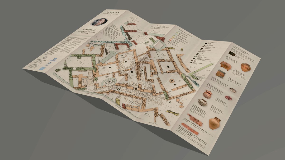
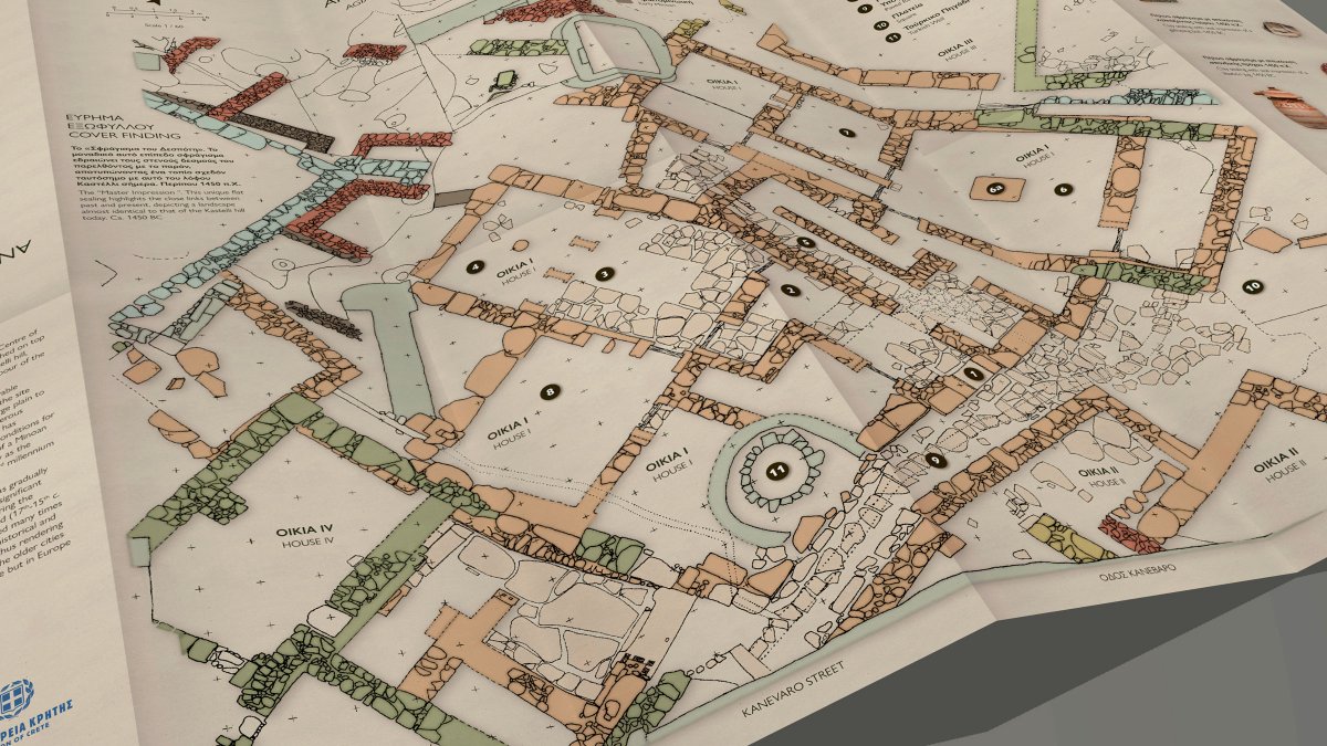
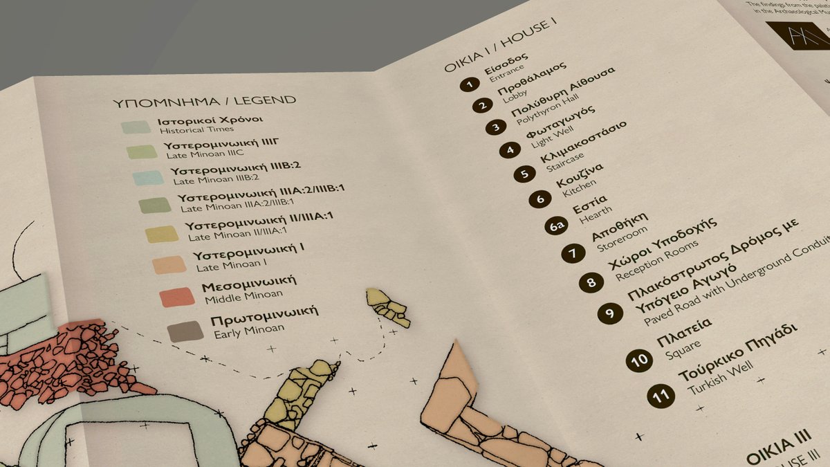
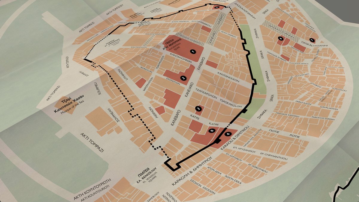
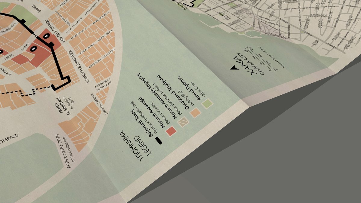
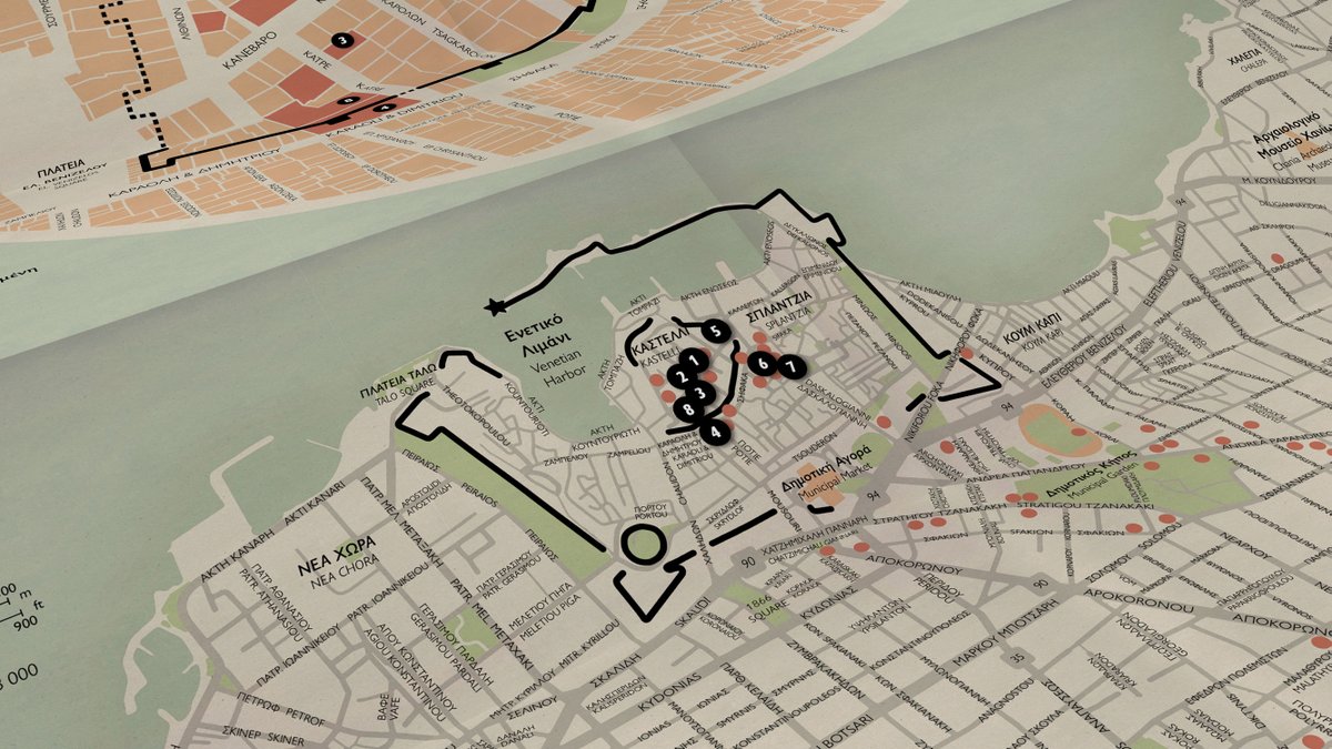
Following up on my earlier post, here is Side B of my folded paper map: the main Kasteli Hill excavation of #Minoan #Kydonia, reimagined with cartographic clarity and paired with artifacts from the Archaeological Museum of #Chania.
#cARTography #MakingMapsPretty
1 Oct 2025
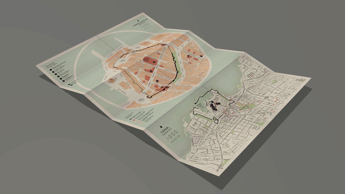
Side A of my folded paper map brings #Minoan Kydonia to life: a close-up of #Kasteli Hill’s excavations paired with a city-scale view of #Chania #Crete #Greece. A thematic map that reveals the Bronze Age beneath the modern city. #cARTography #MakingMapsPretty
1
10
985
1 Oct 2025
Side A of my folded paper map brings #Minoan Kydonia to life: a close-up of #Kasteli Hill’s excavations paired with a city-scale view of #Chania #Crete #Greece. A thematic map that reveals the Bronze Age beneath the modern city. #cARTography #MakingMapsPretty
3
48
3,022
23 Sep 2025
User defined projections and the geometry generator allow me to replicate the classic hemispheres World map in #QGIS Not bad for first attempt, I think! #cARTography #MakingMapsPretty

1
2
6
1,611
21 Aug 2025
The secret sauce to creating a truly realistic 3D terrain scene in #ArcGISPro is the Curvature layer! Placing it on top of the Shaded Relief layer, it enhances the details. Notice the difference with and without it as I rotate the view. #cARTography #MakingMapsPretty
2
17
109
12,793
11 Aug 2025
Spending the afternoon exploring different combinations of surface raster layers & light source settings to design this diorama in #ArcGISPro. Curvature & raster generalization are key to success. Commissioned project, about to kick off soon. #cARTography #MakingMapsPretty
9
91
3,542
11 Aug 2025
Continuing to fold my #maps digitally in the browser, getting them ready to showcase in my online portfolio. Here I’m simulating both sides of a paper map I designed for one of the top luxury resorts in Santorini. #HTML #CSS #MakingMapsPretty
6
479
18 Jul 2025
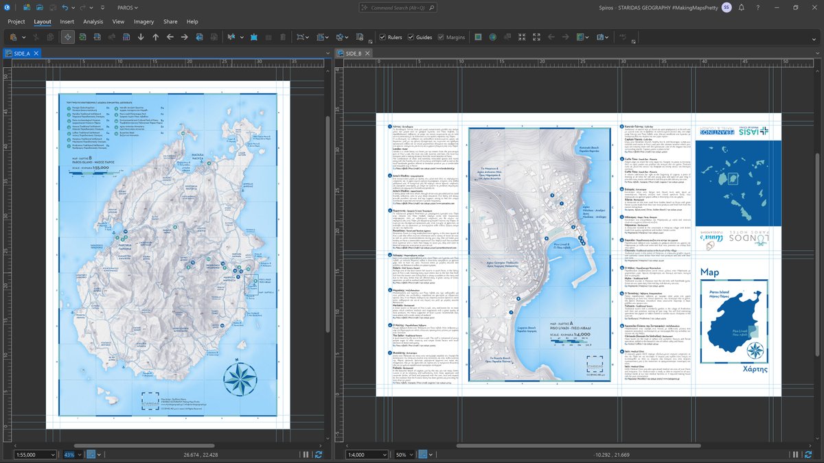
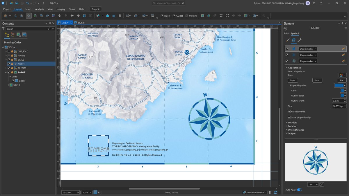
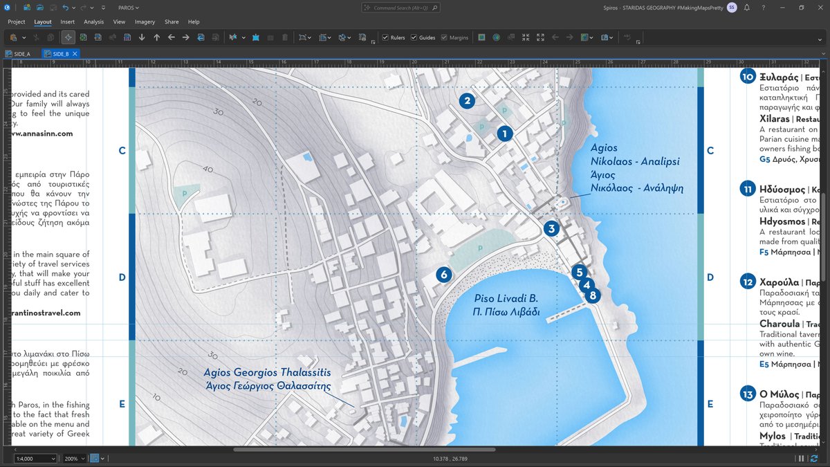
Rewriting my old project pages for my upcoming portfolio is a thoughtful process; looking back at past work brings back a lot; as this project from #Paros Island in the heart of #Cyclades archipelago in the #Aegean Sea created entirely in #ArcGISPro
#cARTography #MakingMapsPretty

1
8
88
3,816
14 Jul 2025
Currently developing an interactive widget that lets users shift the map perspective and fold it like paper in real time. I can’t think of a better way to showcase my work in the portfolio on my upcoming personal website. #HTML #CSS #JavaScript #cARTography #MakingMapsPretty
6
105
3,218
10 Jul 2025
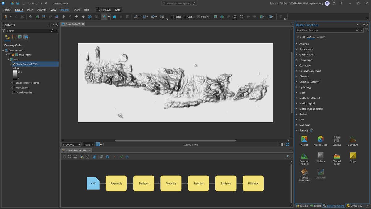
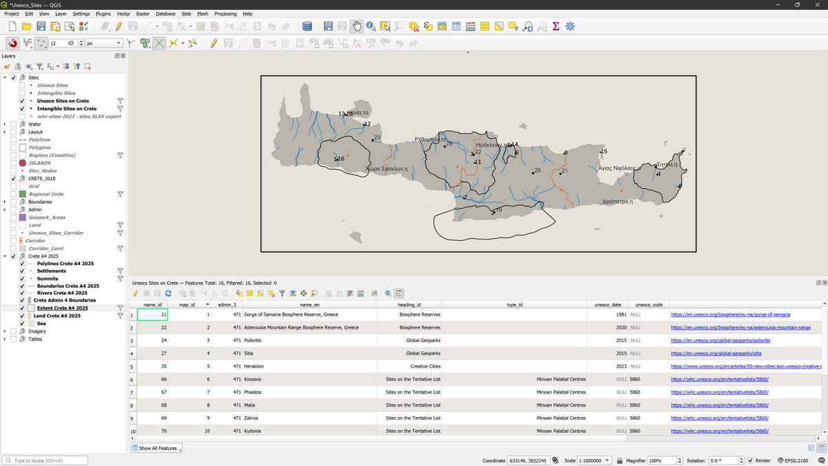
Just finished redesigning an old map showing the #UNESCO sites on #Crete, at a 1:1,000,000 scale to fit on A4 paper. Shaded relief made in ArcGIS Pro, all vector data processed in QGIS, and the final layout and styling done in Adobe Illustrator. #cARTography #MakingMapsPretty

3
18
124
7,545
8 Jul 2025
Writing a Geometry Generator expression in #QGIS to simplify and smooth coastlines by adding equally spaced virtual segments. One parameter controls the level of generalization — perfect for adapting features to different map scales! #cARTography #MakingMapsPretty
1
38
1,493
26 Apr 2025
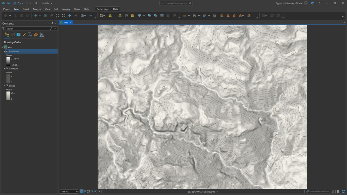
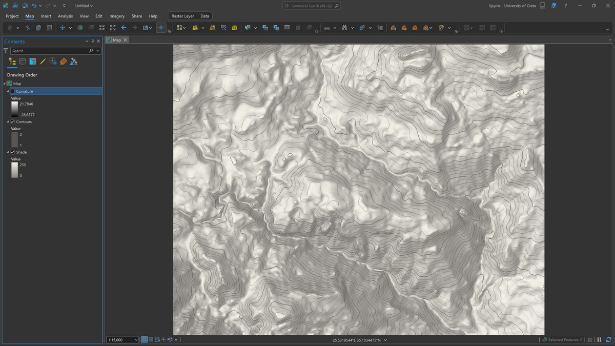
Here's the shaded relief enhanced with a curvature layer (left) and the original shaded relief by itself (right).
Personal project — still a work in progress.
#cARTography #MakingMapsPretty #ArcGISPro
26 Apr 2025
Pro tip: Want to make your terrain details pop? Add a curvature layer on top of your shaded relief!
Personal project — still a work in progress.
#cARTography #MakingMapsPretty #ArcGISPro
3
31
2,319