
{
"style": "logo_design",
"style_parameters": {
"design_principles": {
"simplicity": "clean, uncluttered design achieving maximum impact with minimal elements",
"memorability": "distinctive visual characteristics creating lasting brand recognition",
"versatility": "effective performance across all media, sizes, and applications",
"appropriateness": "visual alignment with brand values and target audience expectations",
"timelessness": "avoiding trendy elements in favor of enduring design solutions"
},
"visual_elements": {
"geometric_precision": "mathematical accuracy and consistent proportional relationships",
"symbolic_iconography": "meaningful visual symbols representing brand essence",
"typographic_integration": "harmonious relationship between text and graphic elements",
"negative_space_utilization": "strategic use of empty areas as active design components",
"color_psychology": "deliberate color choices supporting brand messaging and emotional response"
},
"technical_requirements": {
"scalability": "vector-based construction maintaining clarity from business card to billboard",
"reproduction_quality": "consistent appearance across digital and print media",
"single_color_versions": "effective monochrome variants for cost-effective reproduction",
"reverse_applications": "clear performance on both light and dark backgrounds",
"file_format_compatibility": "appropriate formats for various professional applications"
},
"brand_communication": {
"visual_identity": "immediate recognition and brand association",
"personality_expression": "conveying brand character through visual language",
"differentiation": "distinctive appearance separating brand from competitors",
"professional_credibility": "polished execution supporting business legitimacy",
"emotional_connection": "psychological impact fostering customer loyalty and trust"
},
"construction_methodology": {
"grid_systems": "underlying geometric structure ensuring proportional accuracy",
"golden_ratio": "mathematical proportions creating naturally pleasing relationships",
"modular_construction": "systematic building from basic geometric components",
"optical_corrections": "visual adjustments compensating for perceptual anomalies",
"refinement_process": "iterative development achieving perfect balance and clarity"
}
},
"logo_categories": {
"wordmarks": "stylized company name as primary graphic element",
"lettermarks": "monogram or initials-based identification systems",
"brandmarks": "purely graphic symbols without text integration",
"combination_marks": "integrated text and symbol working as unified system",
"emblems": "text contained within graphic framework or badge structure"
},
"industry_considerations": {
"corporate_identity": "professional, trustworthy, and established business communication",
"tech_branding": "innovation, efficiency, and forward-thinking visual language",
"creative_services": "artistic flair balanced with professional credibility",
"healthcare_identity": "trust, care, and professional competence messaging",
"nonprofit_branding": "mission-driven, authentic, and community-focused communication"
},
"color_strategy": {
"primary_colors": "main brand colors carrying core identity and recognition",
"secondary_palette": "supporting colors extending brand flexibility and application range",
"monochrome_effectiveness": "strong performance in single-color reproduction",
"cultural_sensitivity": "appropriate color meanings across target demographics",
"competitive_differentiation": "distinctive color choices separating from industry standards"
},
"typography_integration": {
"font_selection": "typeface choices supporting brand personality and readability",
"custom_lettering": "unique typographic solutions creating distinctive brand voice",
"hierarchy_establishment": "clear information organization through typographic treatment",
"legibility_optimization": "reading clarity across all sizes and viewing conditions",
"brand_voice_consistency": "typographic choices reinforcing overall brand messaging"
},
"application_planning": {
"digital_optimization": "web, social media, and screen-based performance requirements",
"print_specifications": "business cards, letterhead, and promotional material needs",
"signage_considerations": "architectural applications and environmental integration",
"merchandise_applications": "apparel, promotional items, and product integration",
"packaging_requirements": "product packaging and retail display effectiveness"
},
"inspiration_references": [
"Paul Rand's IBM and ABC logo design methodology",
"Saul Bass's corporate identity and film title design",
"Milton Glaser's I ❤ NY and innovative symbol creation",
"Massimo Vignelli's systematic design approach and grid usage",
"Contemporary masters like Michael Bierut and Paula Scher"
],
"avoid": [
"overly complex designs that lose clarity at small sizes",
"trendy elements that will quickly become dated",
"poor typography integration creating visual discord",
"inappropriate color psychology for target audience",
"designs dependent on specific reproduction conditions",
"generic symbols lacking distinctive brand character"
],
"enhancement_keywords": [
"professional",
"memorable",
"scalable",
"distinctive",
"strategic",
"timeless",
"versatile",
"precise",
"impactful",
"cohesive",
"authentic",
"recognizable"
]
}

1
1
19
4,282

4 Jul 2024
Global #Modular_Construction Market is Expected to reach USD 277.76 Billion by 2030, at a CAGR of 8.1% during the forecast period 2022 to 2030.
Read More: tinyurl.com/46jde3d4
#construction #manufacturing #modular #modularconstruction #reports #sphericalinsights #statistics

2
23

12 Apr 2021
#Modular_Construction contributes to #fast, #cost-effective and #sustainable solutions
For more please read: hubs.ly/H0KSj5C0
#modulek #mmc #offsite

2
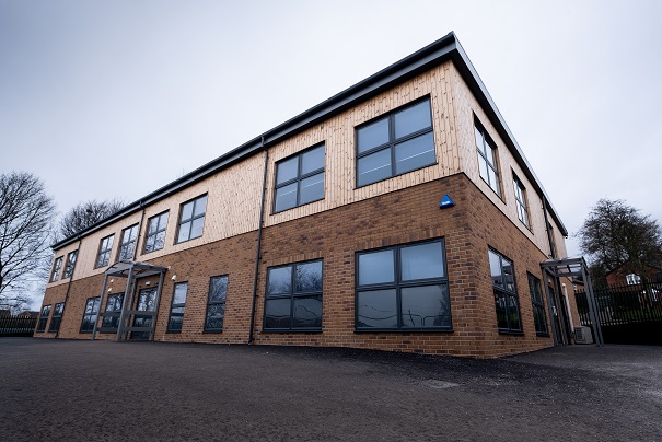
9 Apr 2021
Great progress on the Fred Longworth High School project this week! Love the way that the blue cladding blends in perfectly with the brilliant blue of the sky!
#modulek #modular #modular_construction #offsite_construction

4
24 Mar 2021
Learning by design: How #modular_construction is reshaping #school infrastructure
for more please read: hubs.ly/H0JHbGT0
#modulek #offsite #mmc
2

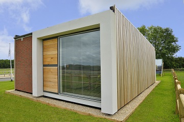
2 Feb 2021
𝗶𝗻𝗱𝘂𝗼® modular construction
#modular_construction #architecture #woodenArchitecture #HolzArchitektur #patent #madeingermany #HolzModule #TimberModules #modul
2
2 Feb 2021
Are you wondering how #modular_construction can benefit your next building project?
Watch our short video to find out more!
#modulek #offsite_construction #mmc
1
2
19 Jan 2021
#Modular_construction meets changing needs
With #modular_construction, we can build more quickly and have better quality control, while reducing waste and our carbon footprint
#offsite #modulek #mmc

1
1 Oct 2020
#Modular_Construction: The Future of the Construction Industry
For more please read: hubs.ly/H0xfShl0
#modulek #mmc #offsite #prefabricated
1
2

16 Sep 2020
With #NewDeal there are plenty of #modular, #offsite and #education builds being planned. vimeo.com/164179276. For more details on offsite construction see: time-lapse-systems.co.uk/202… #constructiontimelapse #modular_construction #off_siteconstruction @AdstonConstruct
1
2
7 Sep 2020
Time to watch the speedy #modular build at Solihull Sixth Form College: youtube.com/watch?v=Ud5UNJq5… . For more details on the project see: time-lapse-systems.co.uk/202… @ModulekUK #constructiontimelapse #education #offsite #offsite_construction #modular_construction #school_buildings
2
27 Aug 2020
Another busy day onsite for #Modulek...today we are delivering a state-of-the-art community building for a local UK Parish Council.
#modulek #offsite_construction #modular_construction

1
7
19 Aug 2020
Is #modular_construction just a phase or here to stay?
For more please read: hubs.ly/H0tPVlJ0
#modulek #mmc #offsite

4
13 Aug 2020
# Modular_construction offers a fast, efficient way to build structures in a controlled factory setting using fewer workers, who can more easily comply with social distancing and personal protective equipment (PPE) protocols
For more please read: hubs.ly/H0tBmJy0

2
16 Jun 2020
#Modular_construction: Has its moment arrived?
For more please read: hubs.ly/H0rtG9K0
#modulek #offsite #mmc
2
1 Jun 2020
Standardisation can help us gain control of what we build, especially during a severe disruption like the current pandemic.
For more please read: hubs.ly/H0q-WCV0
#offsite #modular #mmc #modular_construction

1
2
6 Jan 2020
Offsite agenda is key to the growth of regional economies
For more please read: building.co.uk/communities/o…
#modular #offsite #modular_construction
1
27 Nov 2019
The UK’s first dedicated post-graduate architecture course covering modern methods of construction (MMC) is being developed by Oxford Brookes.
For more please read: building.co.uk/news/architec…
#modulek #offsite #mmc #modular_construction
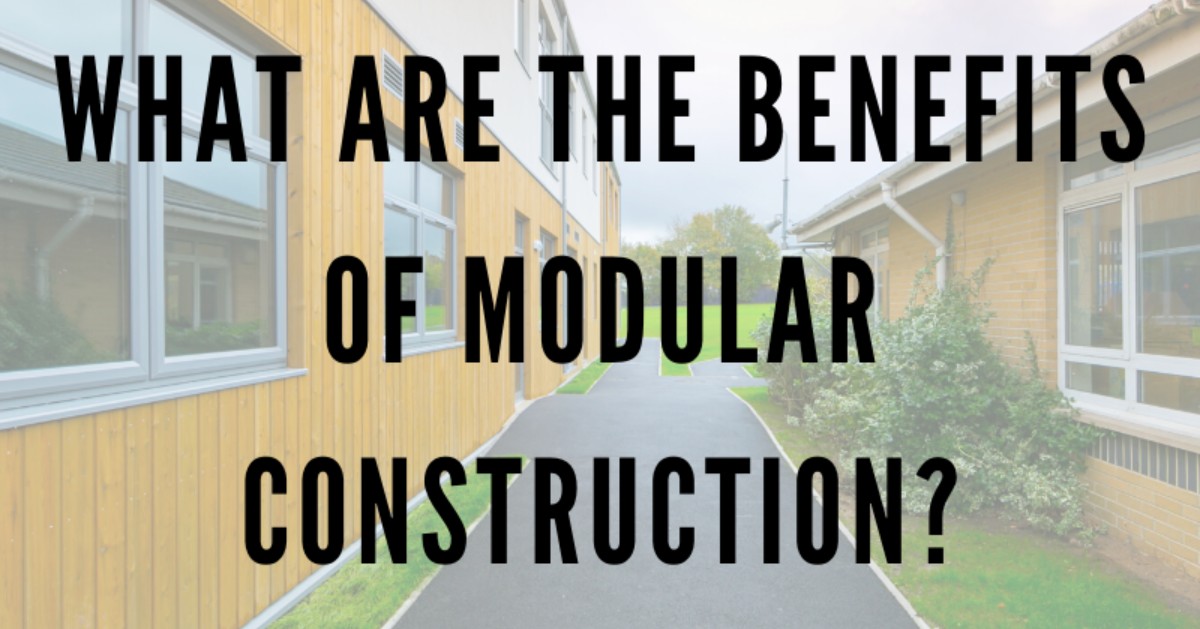
4
25 Nov 2019
What are the benefits of Modular Construction?
For more please read - share & like our latest infographic: modulek.co.uk/what-are-the-b…
#modulek #modular_construction #mmc #modular_buildings
1
1
15 Nov 2019
Worldwide modular market to hit £165bn
For more please read: planningresource.co.uk/artic…
#modulek #modular #modular_construction #offsite

2