
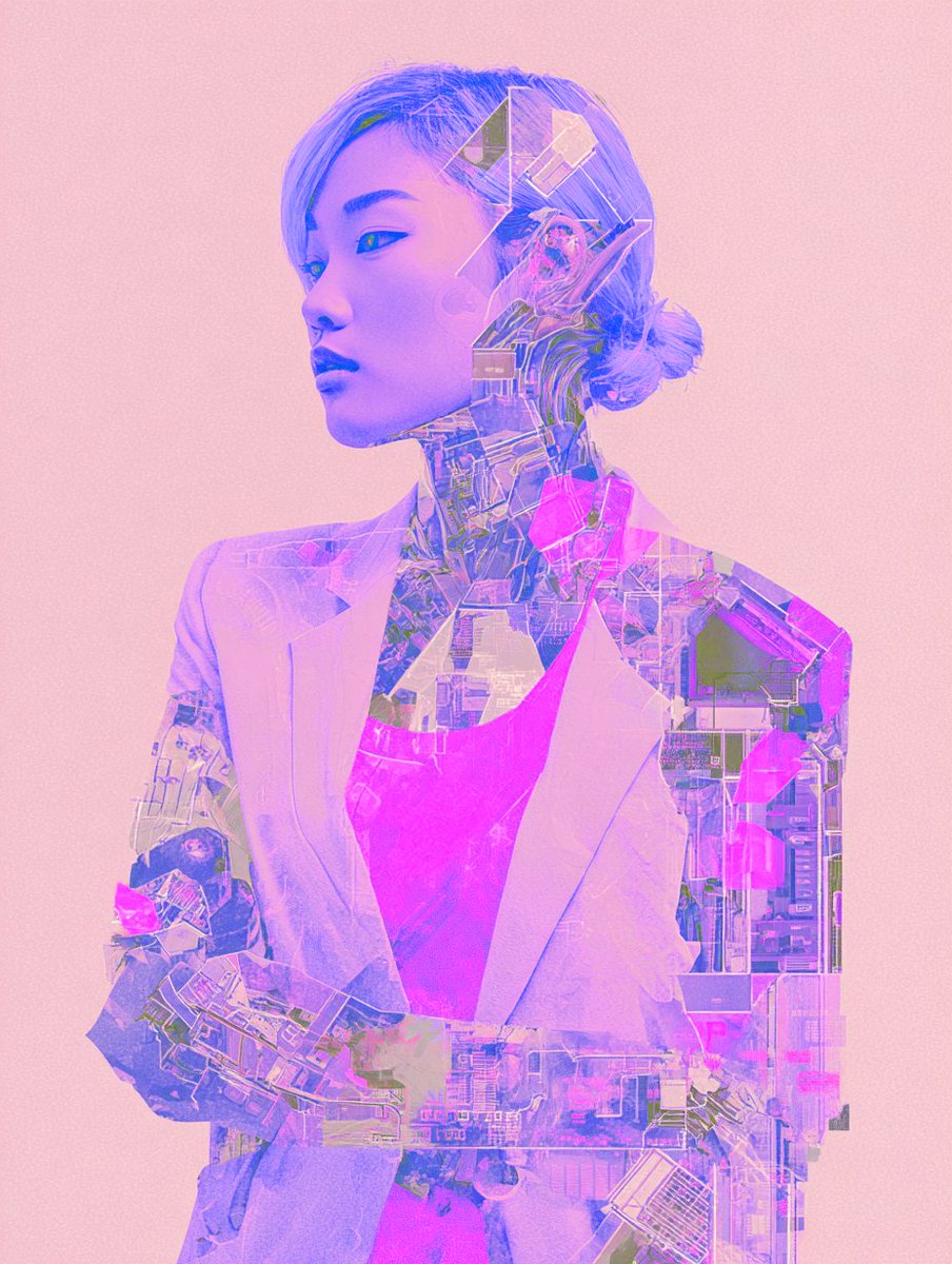
A quiet android dream wrapped in pastel light and intricate neon circuitry. #Risograph #FuturisticAesthetics #CyborgPortraits
3
37
119

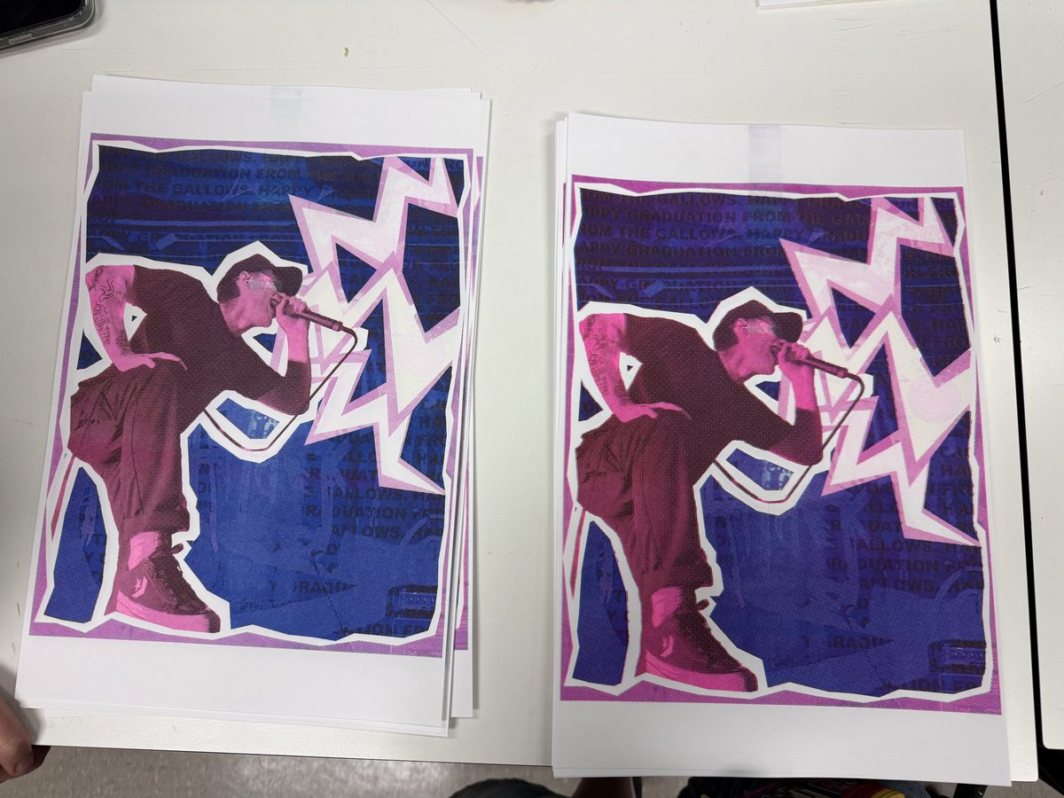
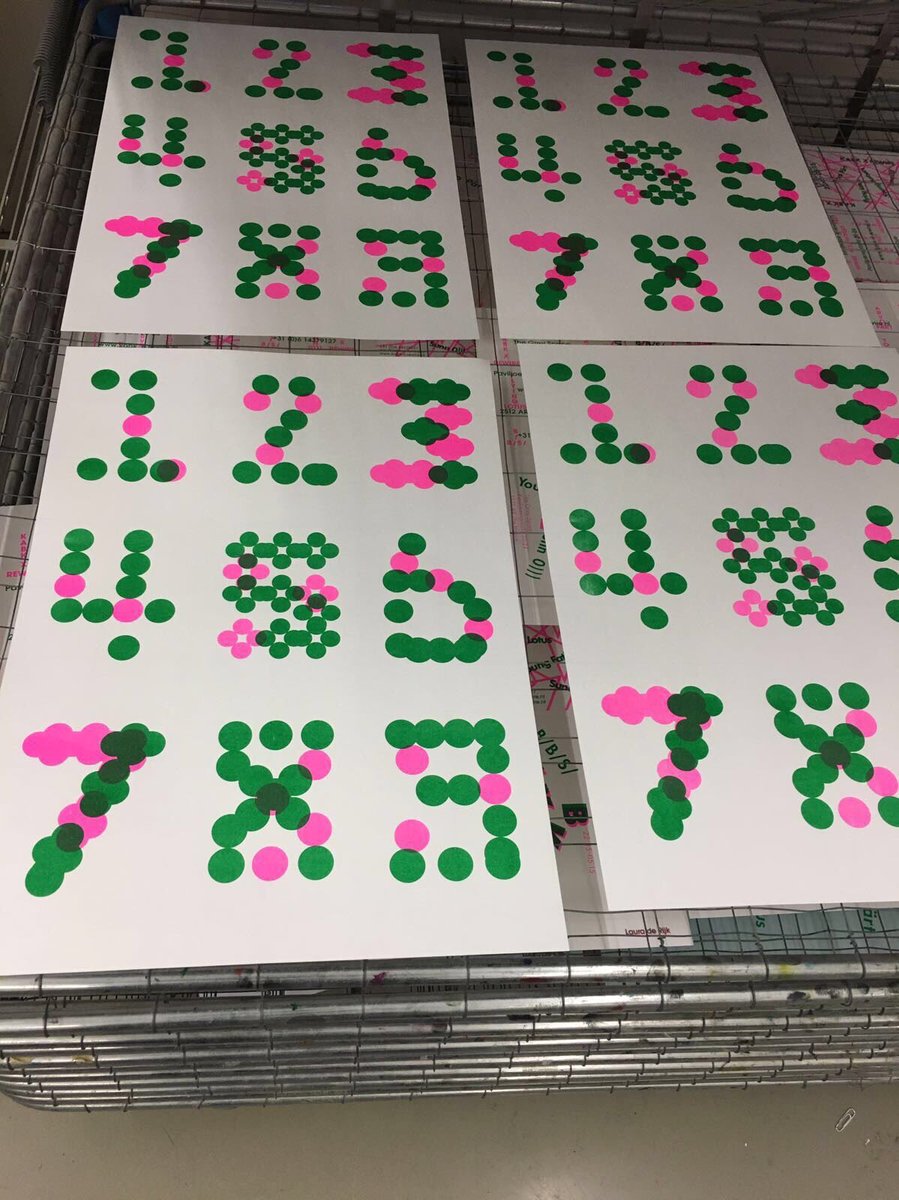
guess who's learning how to use a risograph 😛😛😛


33

New bundles and special deals are live on the site right now. ✍️✨
2 Shirts for $50
BOGO 1/2 Off on all fine art prints
1 Shirt 2 Risograph Prints for $40
📦 Free Shipping on all orders!
Support independent art and grab yours here: 👇 mathewhumphries.com
#art #apparel
1
3
Fred retweeted

15 Apr 2025
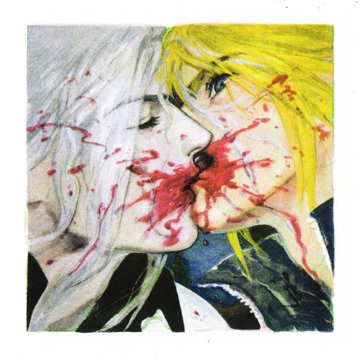
"The Smallest Explosion on This Planet" #sefikura
(5 color risograph)
8
412
1,315
31,705

11h
02|瑞士国际主义风格球星编辑海报
这一组的关键词是 Swiss International Style Bauhaus 网格系统 高颗粒胶片质感。属于偏杂志编辑设计的方向,落地后非常适合做封面图、专栏头图,气质冷峻克制。
提示词:
Subject and Action
A multi-layered Swiss International Style editorial poster featuring PERSONE. The composition includes a dominant high-grain portrait in the top-left quadrant, a zoomed-in detail shot of the eyes in the center-right, and a full-body shot of the subject in a powerful, relaxed pose on a geometric podium at the bottom.
Composition and Framing
Grid-based layout utilizing Bauhaus functionalism. Large, bold outlined initials of the subject placed in opposing corners. A vertical color ribbon running through the center containing the text WORLD CHAMPIONSHIP LEADER. Integrated data blocks featuring statistics and rank identifiers in a clean, bold sans-serif typeface.
Lighting and Atmosphere
Professional studio lighting with high dynamic range, processed through a heavy risograph and halftone filter. The atmosphere is sharp and clinical, characterized by the Swiss Modernism aesthetic with a tactile, gritty, and grainy film texture overlaid across the entire frame.
Graphic Elements
A minimalist palette featuring light gray backgrounds contrasted by a signature Iconic Accent Color. Scattered geometric elements including solid squares, dotted circles, and precise typographic asterisks to maintain visual complexity and hierarchy.
Visual Style
Swiss International Style, flat vector shapes combined with hyper-realistic photography, high-end editorial design, gritty 35mm film grain, sharp typographical precision, clean grid systems.
Constraints
No blurry or distorted faces, no low-quality pixelation, no messy or cluttered edges, no unnecessary shadows, no logos or watermarks, no oversaturated plastic textures. Text must be sharp and legible, maintaining a professional graphic design standard.

608

12h
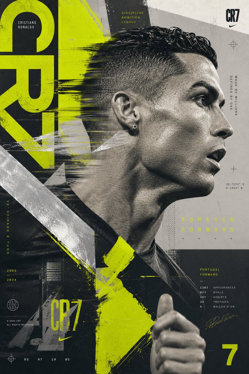
GPT Image 2 on ChatGPT.
Prompt: Create an experimental Cristiano Ronaldo poster built around a striking side-profile portrait captured during motion. Ronaldo appears to be moving through the frame while the design language follows his movement. The composition should feel energetic, youthful, and highly contemporary.
The color palette is built around graphite grey, metallic silver, fluorescent acid lime, and clean white. Acid lime functions as the visual identity of the poster, appearing through oversized graphic shapes, editorial highlights, abstract typography, and design interventions. Large asymmetrical structures cut across the composition, creating visual tension and movement.
The portrait should be integrated with risograph-inspired textures, offset-print imperfections, layered transparency effects, and premium editorial treatments. The final artwork should feel like a future-facing sports campaign created for a luxury streetwear collaboration rather than a football poster. Bold, experimental, and instantly recognizable.

16h

GPT Image 2 on ChatGPT.
Prompt Share: Christiano Ronaldo
Prompt: Create an iconic Cristiano Ronaldo poster inspired by modern fine art, luxury fashion editorials, and large-scale contemporary painting. The composition is built around an enormous portrait emerging from vast fields of pure color. Instead of detailed backgrounds, the image uses massive blocks of carefully chosen color to create emotional impact and visual hierarchy.
The portrait should transition seamlessly between realism and painterly abstraction. Certain sections remain photographically detailed while others dissolve into expressive brushwork, texture, and color. The design should feel intentional, sophisticated, and emotionally powerful rather than chaotic.
Experiment with unexpected color combinations rarely seen in football design, such as terracotta and pale blue, emerald and ivory, lavender and charcoal, or burnt orange and cream. The colors should feel curated by a luxury fashion art director rather than a sports designer.
The final artwork should resemble a gallery-quality art print, a contemporary fashion campaign, and a collectible football poster all at once. Elegant, memorable, highly artistic, and impossible to confuse with traditional sports design.

7
3
34
1,216


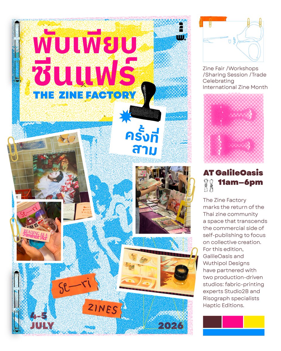
Se—ri will be at พับเพียบซีนแฟร์ 3: The Zine Factory!
พบกับพวกเราได้ที่งานทั้งสองวัน ขนไปทั้งซีนจากหลากหลายศิลปิน รวมถึงงานพิมพ์ งานสติกเกอร์ Riso ล่าสุดจากพวกเรา และตู้ Gashapon สุ่มสติกเกอร์ ใครอยากลุ้นมาเล่นได้ที่โต๊ะเราเลยจ้า หรือจะแวะมาถามเรื่องพิมพ์ Risograph ก็ได้เช่นกัน
1
12
6
380

Origami cities with GPT Image 2. This prompt essentially generates new hybrid styles every time you run it.
2x2 grid, do this for 4 lesser known, hidden Asian cities , 16:9 FunctionDraw($ subject) {<instruction> Input A is subject. You are a god-tier poster designer, art director, and print-production specialist. Phase 1: Dual Poster Synthesis Randomly select TWO Poster Movements and TWO Graphic Systems from the pools below. Blend them into a cohesive poster identity. Poster Movements: [Swiss International Style, Soviet Constructivism, Psychedelic 1960s Rock Poster, Japanese City Pop Advertising, Bauhaus Exhibition Poster, Art Nouveau Lithograph, Brutalist Typography Poster, 1980s Cyberpunk Flyer, Italian Futurist Manifesto, Minimalist Museum Poster, French New Wave Cinema Poster, Punk Xerox Flyer, Memphis Design, Vintage Travel Poster, Contemporary Fashion Campaign] Graphic Systems: [Oversized Grid Typography, Torn Paper Collage, Airbrushed Gradient Field, Risograph Halftone, Screenprint Misregistration, Photocopy Distortion, Editorial Magazine Layout, Modular Type Blocks, Diagonal Constructivist Geometry, Neon Signage Layering, Hand-Lettered Ornament, Archival Stamp System, Folded Brochure Logic, Ticket Stub Composition, Billboard Cropping] Phase 2: Visual Rendering 16:9 one image Transform Input A into a finished poster design </instruction> Return $ draw; } [FunctionDraw($ subject)]::4 Morphology: the subject's defining silhouette, structure, surface details, and functional parts reinterpreted as a folded origami paper sculpture; hard edges become crisp mountain and valley folds, rigid components become modular paper units, small details become reverse folds, petal folds, bird bases, and tessellated patterns::3 Material Physics: hand-folded mulberry paper, washi texture, exposed white paper core on cut edges, sharp crease lines, gold leaf accents, single-sheet uncut kirigami, slight paper translucency, foxing age spots::3 Illumination: Japanese paper lantern backlight, soft diffused glow through translucent paper, warm interior light, paper-craft museum vitrine lighting, even and shadowless, indirect overhead::2 Render Stack: still life Hasselblad photography, museum catalog aesthetic, slight overhead angle, focus-stacked, neutral grey seamless backdrop, f/11, 80mm lens::1 rigid solid 3D object, photorealistic CG render, painted illustration, digital art, thick materials, fabric, soft texture, glossy surface, chrome, glass, metal, plastic, plush, textile, wool::-0.7

2
1
14
460

17h
我特别喜欢的一个效果
# 模板:柔性自然疗愈品牌视觉效果
请根据以下要求生成一张完整的品牌视觉图。
## 主题信息
品牌或项目主题:[填写主题,例如 森林冥想 App / 湖边民宿 / 山间茶品牌 / 香薰蜡烛 / 有机护肤品]
核心物品或主体:[填写物品,例如 茶罐 / 香薰瓶 / 民宿小屋 / 手机 App 界面 / 咖啡杯 / 书本 / 包装盒]
使用场景:[填写场景,例如 品牌海报 / 包装设计 / 网站首页 / 社媒封面 / 3×3 品牌视觉板 / App 启动页 / 品牌物料平铺]
目标气质:[填写情绪,例如 安静 / 疗愈 / 自然 / 慢生活 / 精品感 / 温暖 / 森林感 / 湖边感]
目标受众:[填写受众,例如 年轻女性 / 城市白领 / 旅行者 / 冥想用户 / 精品民宿客人 / 自然生活方式人群]
画面比例:[填写比例,例如 1:1 / 4:5 / 3:2 / 16:9 / 9:16]
是否需要文字:[填写 是 或 否。如果是,文字内容为:[填写短文案]]
## 核心创作要求
为「[品牌或项目主题]」创作一张柔和自然疗愈风格的品牌视觉图。画面需要具有精品生活方式品牌的编辑感,整体安静、缓慢、自然、柔软、有呼吸感。
画面主体是「[核心物品或主体]」,请将它放入一个抽象自然场景中。场景可以包含圆润的山丘、湖泊、森林、云朵、月亮、星星、拱形窗户、水波、小路、树影和自然符号。所有自然元素都需要抽象化、符号化、品牌化,看起来像一套统一的视觉识别系统。
整体画面要像高端自然疗愈品牌、精品民宿品牌、慢生活品牌的视觉系统。不要做成普通风景插画,也不要做成真实照片。
## 视觉风格
使用抽象有机插画风格。
所有形状必须圆润、柔软、不规则、有手工感。
图形边缘要像柔和剪纸、软陶块面、低饱和拼贴插画。
画面需要平面化,但要有轻微纸张质感。
不要使用尖锐几何形。
不要使用强黑描边。
不要使用复杂透视。
不要使用写实细节。
不要使用夸张卡通表情。
## 色彩要求
整体配色必须低饱和、自然、安静。
主要颜色使用:
深森林绿
苔藓绿
湖蓝
雾蓝
沙米色
奶油白
可以少量加入暖土橙作为点缀。
色彩比例要求:
绿色系占主要面积。
湖蓝用于水面、天空、远景或辅助块面。
米白和奶油白用于留白、纸张底色、云朵和光感。
暖橙只能作为小面积点缀。
禁止使用高饱和色、荧光色、霓虹色、纯黑大背景、黑金奢华配色、科技蓝、亮红色、亮紫色。
## 构图要求
画面需要有高级留白。
主体和自然元素之间要有呼吸感。
构图要稳定、安静、平衡。
不要把元素塞满。
不要让画面杂乱。
视觉中心要清晰。
整体需要像品牌海报、包装、网站首页或品牌视觉板中的一部分。
如果使用场景是品牌海报:请使用中心构图,主体居中,周围用山、水、云、星点、树影包围。
如果使用场景是网站首页:请使用左侧标题区域,右侧自然抽象插画的结构。
如果使用场景是包装设计:请让主体物品像精品品牌包装,表面带有抽象山水图形和柔和纸张质感。
如果使用场景是 3×3 品牌视觉板:请把画面做成九宫格品牌系统展示,包括主视觉、色板、字体区、图案区、物料区、网页区、社媒区和细节符号区。
如果使用场景是品牌物料平铺:请展示卡片、吊牌、贴纸、包装标签、明信片等纸质物料,整体有统一品牌感。
## 纹理要求
画面必须有轻微纸张颗粒。
需要哑光印刷质感。
可以带有柔和 Risograph 印刷感。
颗粒要细腻,不能显脏。
质感要温柔、克制、有手工温度。
不要做成油画、水彩、厚涂、3D、塑料光泽或金属质感。
## 字体和文案要求
如果需要文字,只使用短句。
文字需要像精品生活方式品牌文案。
标题可以使用优雅衬线字体风格。
正文可以使用干净无衬线字体风格。
字距稍微拉开。
排版要克制。
文字不能太多。
不要出现促销广告感。
不要出现复杂长句。
可参考文案气质:
Slow down
Breathe deep
Stay awhile
Find stillness
Escape to nature
Rest is part of the journey
慢下来
回到自然
给自己一点安静
住进风里
把心放慢
## 最终画面感觉
最终图像应该像一个完整品牌视觉系统中的高质量设计图。
它应该适合继续延展成品牌海报、包装设计、网站首页、社媒模板、App 启动页、品牌物料、图案系统和视觉识别系统。
整体感觉要安静、自然、疗愈、柔软、低刺激、有精品感、有生活方式品牌气质。
## 避免内容
请避免以下效果:
写实照片
真实风景摄影
3D 渲染
高饱和颜色
霓虹色
强烈阴影
强烈高光
塑料质感
金属质感
儿童卡通
可爱贴纸风
日漫风
厚重水彩
油画笔触
复杂线稿
强黑描边
杂乱拼贴
廉价旅游海报
科技风界面
黑金奢华风
错误文字
水印
logo 伪影
变形字体
过度装饰
过度写实细节
## 输出要求
请生成一张高完成度的视觉作品。
画面要干净、统一、可商用、可作为品牌视觉方向参考。
请严格保持低饱和自然色、圆润有机图形、纸张颗粒质感、慢生活情绪和精品品牌感。注意保证颜色不要暗淡,显得很脏

1
2
24
1,060

91:
Design Style:
Name: "Underground Comic"
Concept: >
80〜90年代のインディーコミック、
アンダーグラウンドZINE、
リソグラフ印刷、
オルタナティブ新聞、
DIYコミックフェス文化から着想を得た
実験的ナラティブエディトリアルデザイン。
物語、落書き、奇妙なユーモア、
詩的な断片をコマ割りの中に閉じ込め、
「読む」と「眺める」の中間にある体験をつくる。
完成されたストーリーではなく、
夢の断片や都市伝説のような曖昧さを残すことを重視する。
Canvas:
Ratio: "16:9"
Mood:
- Playful
- Surreal
- Experimental
- Handmade
- Narrative
- Mysterious
- Youthful
- Independent
Temperature:
Overall: Warm-Cool Contrast
Color Palette:
Background:
PaperWhite: "#F7F4EF"
Primary:
Vermilion: "#F14A2B"
Secondary:
NeonPink: "#E95DFF"
DeepCharcoal: "#1E1E1E"
Accent:
White: "#FFFFFF"
LavenderGray: "#D7D2E3"
Typography:
Headlines:
Style: >
手描きレタリング、
コミックタイトル、
ラフな筆記体を組み合わせる。
タイトルはページ上部を横断し、
雑誌の表紙のような存在感を持たせる。
Weight: Variable
Tracking: Organic
Scale: Oversized
Secondary:
Style: >
タイプライター風の文字や、
細いサンセリフを使用する。
吹き出し、キャプション、
モノローグとして扱う。
Weight: 300-500
Body:
Weight: 400
LineHeight: 1.3-1.5
Layout:
Structure: >
コミックのコマ割りをベースにした
モジュラーエディトリアル。
各コマは独立した小宇宙として機能しながら、
ページ全体では一つの視覚的リズムを形成する。
Composition:
- Comic panel grids
- Narrative sequences
- Caption blocks
- Handwritten interruptions
- Asymmetrical panels
- Editorial storytelling
- Poster-like title areas
- Mixed visual density
Alignment:
Preference: Panel-based
ControlledChaos: Medium
Graphic Elements:
Shapes:
- Comic frames
- Speech bubbles
- Starburst panels
- Rounded captions
- Rough rectangles
- Hand-drawn borders
- Abstract blobs
- Halftone fields
Symbols:
- Eyes
- Moons
- Flames
- Tiny figures
- Masks
- Abstract creatures
- Scribbles
- Arrows
Decorative Rules:
- Embrace narrative ambiguity.
- Allow each panel its own mood.
- Alternate between calm and intensity.
- Preserve a handmade feeling.
Patterns:
Style:
- Halftone dots
- Photocopy textures
- Dense stippling
- Woodcut-inspired fills
- Repeated linework
Imagery:
Style: >
奇妙なキャラクター、
仮面を被った人物、
神話的存在、
日常の断片を
モノクロイラストとして描く。
子どもの絵のような素朴さと、
アートコミックの不穏さを共存させる。
Treatment:
- High contrast black-and-white drawings
- Risograph overlays
- Rough brush textures
- Hand-drawn irregularity
- Minimal shadows
- Visible imperfections
Subjects:
- Masked figures
- Tiny humans
- Strange creatures
- Symbolic objects
- Celestial motifs
- Everyday rituals
- Dreamlike landscapes
Background:
Style: >
オフホワイトの紙面を基本とし、
コマごとに赤、ピンク、黒の色面を切り替える。
ページ全体は新聞やZINEのような
印刷物としての統一感を保つ。
Effects:
Texture:
Risograph grain
Halftone dots
Photocopy noise
Offset print imperfections
Dry ink textures
Shadow:
None
Depth:
Flat narrative layering
Distortion:
Slight print misregistration
Hand-cut irregularity
Organic line wobble
Visual Rules:
- Treat every slide as a comic page.
- Use halftones to create atmosphere.
- Balance humor and unease.
- Let handwritten elements interrupt structure.
- Restrict the palette to red, pink, black, and paper white.
- Alternate dense and sparse panels.
- Preserve visual storytelling over decoration.
- Encourage mystery rather than explanation.
Exclusions:
- Corporate presentation aesthetics
- Luxury minimalism
- Glassmorphism
- Smooth gradients
- Photorealistic illustrations
- Complex 3D rendering
- Cute mascot styles
- Highly polished vector graphics
- Excessive information density
1
2
1,122


Jun 17
so something ive always done in Claude Design is describe what i need, provide a spectrum of references, then after one turn of generated concepts of whatever kind im asking for, i ask claude design to suggest references, brands, websites, anything i can go browse to find more inspiration that has the look or feel im going for. and Claude *absolutely crushes it* when you ask them for references or recommendations on where to look for ideas. like they suggest websites and brands i would literally never know existed otherwise, and are always incredible resources.
so i asked them for a basic guide in how to best approach logo design with them. here is what they said:
1. Feed me inputs, not instructions
The best concept sheets come when you give me raw material and a problem, then let me interpret. You already did this well — you gave me a brand, references, and "show me a spectrum." The mistake would be over-specifying ("make a grid logo with a red dot at 30% from the left"). That just turns me into a rendering engine. Give me the why and the constraints, and let me bring the what.
A good brief has four parts:
- The thing & its soul — "topologie, an autonomous art studio about identity surviving transformation." One sentence of meaning beats a page of specs.
- Hard constraints — what's fixed (the name, the vermilion, "must work as a favicon," "must read at 16px").
- The spectrum you want — "from safe/refined to weird/experimental," or "anchor it in one of these three moods."
- What you're reacting to — references with a verb: "I like the banding in this," "I want the tension of that poster, not its colors."
2. References: bring "stealable qualities," not "things to copy"
Where to look:
- Logo-specific: Logobook, Brand New (underconsideration.com), Logoarchive, SAGmeister/Pentagram project pages, fonts-in-use.
- Movements & eras (great for "retro" — name the decade/school): Swiss/International Typographic, 70s corporate (Polaroid, NASA worm, Bauhaus), Memphis, Y2K/frutiger aero, brutalist web, vaporwave, risograph, ASCII/demoscene.
- Adjacent, non-logo sources — this is where original ideas come from: scientific diagrams, topographic maps, oscilloscope traces, knot theory illustrations, transit maps, old computer manuals, textile patterns. For "topologie" specifically, math/physics visualization is a goldmine.
Physical/tactile:
channels, vintage matchbooks, book spines, ski-resort badges, license plates.
The key move: when you paste a reference, tell me the one property you want, not the whole thing. "Steal the eccentric nested rings," "I want the halftone-resolving-into-an-image trick," "the banded sun but in our palette." That lets me lift the idea and recombine it instead of cloning the source.
3. Give me an axis to explore, and I'll fill it
The single most productive prompt shape is: "Show me N options that vary along [axis], holding [everything else] constant." Axes I can sweep:
- Literal ↔ abstract (a recognizable "t" → pure geometry)
- Geometric ↔ organic
- Minimal ↔ maximal/ornamental
- Safe/timeless ↔ weird/of-the-moment
- Conceptual angle ("the deformation" vs "the point" vs "the grid" vs "the name")
- Era (Swiss / 70s / Y2K / now)
When you say "broaden the spectrum," what helps most is naming which axis felt too narrow last time. E.g. "these were all line-based and quiet — push toward solid/heavy and toward playful."
4. React, don't redirect
The fastest way to great work is iterative reaction. After a sheet, the gold is in responses like:
"B2 and C3 are the energy. More like those, weirder."
"Everything's too refined — give me the ugly/raw cousins."
"Kill the wordmarks, go deeper on marks only."
"What would the opposite of A0 look like?"
You don't need to design — you just need to point and judge. I'll generate; you curate. That division of labor is where the range comes from.
5. Concrete prompts you could send me next
To go broader without specifying designs:
"Generate a second sheet — same brand, but break the patterns from sheet 1. I want to push three axes I didn't see enough of: solid/heavy marks (sheet 1 was mostly thin line), literal type/monogram play, and genuinely weird/experimental. Pull from Swiss design, 70s broadcast idents, and scientific knot-theory diagrams. Surprise me — 12–16 concepts, grouped by the idea each explores."
Or, to deliberately get out there:
"Give me a 'risk' sheet — concepts you'd normally consider too strange to show. The only rule is the name has to be legible and it has to survive at favicon size."
One more lever: ask me to caption each concept with the idea it's exploring (I already did some of this). Then you can react to the thinking, not just the picture — which tightens the next round fast.
1
9
707
DoseItReallyMatter retweeted

30 Oct 2025
🚨PromptShare🚨
RISOGRAPH PRINT
[Character name action or iconic pose], risograph print in the style of vintage anime, flat illustration, [ink color] ink on [paper color], [background element or graphic effect]. Vector t-shirt design graphic, contour cut, white background, centered, riso print, limited color palette, vector graphics, flat design, simple shapes, clean line work, high contrast.


16
70
700
30,239

Jun 16
Ai Art Prompt Share Party 🎨👇🏻
A raccoon wearing a tiny backpack exploring a nighttime city park after a summer rain, layered textures, limited color printing effect, playful grain, bold shapes, vintage Risograph poster style.

1
15
93

Jun 16
Dither is finally here to Ascii Magic✨
• 15 algorithms — Bayer grids, Floyd–Steinberg, Atkinson, Blue Noise, Halftone, Lines, Radial & more
• 17 palettes — Game Boy, CGA, Pico-8, C64, Risograph, Sepia, or build your own
• pixel size, strength, contrast, threshold, cell size & angle — all tunable
• chroma mode: standard, luminance-only, or per-channel R/G/B
• animate the matrix — 8 directions shimmer, with speed control
Jun 16

ASCII Magic v1.0 is live⚡
Here's what go shipped in this massive update:
◆ Dither engine - 11 algorithms 16 palettes (C64, Game Boy, PICO-8, Cyberpunk…)
◆ Recipes - one-click presets, with copy-paste effect codes to share instantly
◆ Color controls custom palettes blending modes
◆ Advanced blur - tilt-shift, lens, radial & directional
◆ 70 backgrounds
◆ Crop & rotate aspect ratios
Free, in-browser → ascii-magic.com
3
3
32
6,098