

Jun 14
Bye-bye, creepy crawlies! 🐦✨ Scalex Mite & Lice Spray for Birds, 8 oz. keeps your feathered friends happy & itch-free. Tap the link to give your birds the TLC they deserve: pollysparadise.jbachbrands.c…

2
3

Jun 14
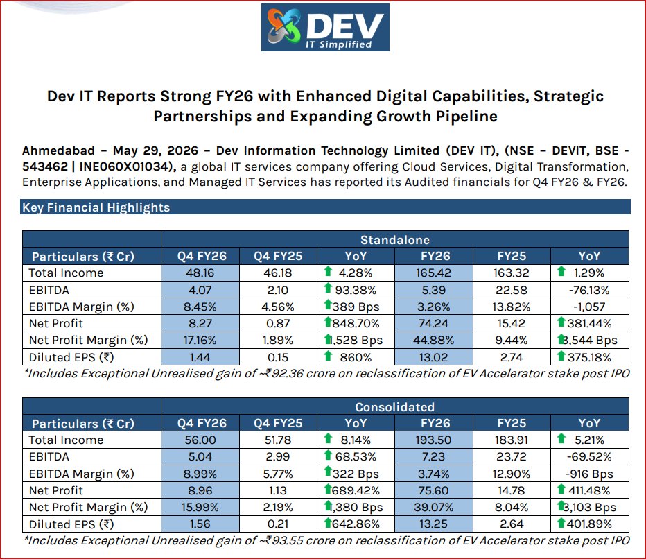
Dev Information Technology Ltd Concall Summary for Q4FY26
MANAGEMENT COMMENTARY
- Focused on strengthening strategic position.
- Shift from SMB to enterprise clients.
- India market prioritized amid global uncertainty.
- Building North America on-site presence.
GUIDANCE & OUTLOOK
- FY27 revenue target: ~₹200 Cr.
- Long-term growth guidance: 15-20%.
- XDS partnership to contribute $1-2 Mn in FY27.
- Order book stands at ₹50-60 Cr.
- Focus on XDS & UCI integration.
INDUSTRY & MACRO
- Strong demand for Cloud, Cybersecurity & AI.
- Enterprises seeking trusted digital partners.
- Geopolitical risks impacting exports.
- India digital economy remains a strong tailwind.
COMPETITIVE POSITIONING
- Among few Microsoft partners with all 6 designations.
- Holds CMMI Level 5 certification.
- ABCD model: AI, BI, Blockchain, Cybersecurity & Cloud.
- Strong hybrid onsite-offshore delivery capability.
RISKS & CONCERNS
- Geopolitical uncertainty impacting exports.
- Lower margins from India-heavy revenue mix.
- Dependence on outsourcing in some segments.
- Blockchain business scaling slower than expected.
GROWTH DRIVERS
- Strategic alliances with XDS & UCI New York.
- Launch of ScaleX GCC platform.
- AI platform distribution partnership with A21.
- Divestment of non-core products to sharpen focus.
PRODUCT MIX
- India contributes 67% of revenue.
- Export business revenue: ₹45 Cr.
- Managed Services now 27% of revenue.
- Cloud, Cybersecurity and Government segments
growing.
FINANCIAL SNAPSHOT
FY26:
- Revenue: ₹190.35 Cr
- EBITDA: ₹7.23 Cr
- PAT: ₹75.60 Cr*
- EBITDA Margin: 3.74%
Q4FY26:
- Revenue: ₹56 Cr ( 8.1%)
- EBITDA: ₹5.04 Cr
- EBITDA Margin: 8.99%
- PAT: ₹8.96 Cr
CONCLUSION
- Enterprise-focused transformation progressing well.
- Q4 margins recovered sharply.
- North America partnerships strengthen export pipeline.
- Managed services share continues to rise.
- Export-led margin expansion remains key monitorable.
Investment Stance: Bullish on certifications, strategic partnerships and enterprise positioning, with margin recovery and export growth as key triggers.
#Q4results #stockmaket #sharemarket #DevInformation


1
7
501

Jun 13
Otsu Grey ScaleX, thanks for the Watchalong. It was not a movie I ever thought I would watch, but here we are lol. I found it funny that Zeta did not even know what it was about also. #ShiorinOnAir #ZecretLive

16
166
Jun 12
Say bye-bye to pesky mites & lice! 🐦 Scalex Mite & Lice Spray for Birds, 8 oz. keeps your feathered friends happy & healthy. Ready for a comfy, itch-free home?

1

Jun 12
🟢#Local4Action #UCLGCongress
Cities are engines of industrial transformation.
Discover how initiatives like Bridge for Cities and the ScaleX Alliance are helping cities scale innovation, build partnerships and accelerate sustainable development.
🗓️ 24.06 | 12pm

8
111

Last week, we hosted our annual Welcome Summer gathering with the ScaleX community. Founders, investors, and ecosystem partners filled the room for an evening of good conversations.
Thanks to @ParibuCom, @endeavor_turkey, and Exposure for joining us.
More of these to come!
1
95

Jun 11
Pretty much yeah
I don’t really know what else you could do with ultima death battle wise besides have him fight an actual reality warper
Bill is a thing but thats a horrible stomp based on where they scalex him in billcord
1
1
15

Jun 11
🐶🥣on my MSDF Text Phaser plugin, v0.3 released, added per-glyph alpha/outline and scaleX/Y control.
antriel.github.io/phaser4-ms…
#phaserjs #webdev
3
40

You are an expert Three.js 3D developer and character artist. Your task is to build a single self-contained index.html file featuring an original 3D psychic cat creature — a small, light-pink floating being with prominent pointed cat ears, large expressive blue eyes, a very long gracefully curved tail ending in an oval tip, short chubby visible legs, and tiny stub-like arms. This is a fully original character design, not based on any existing IP. Character anatomy (build with Three.js primitives or separate meshes): HEAD: Large round sphere, soft pink (F9A8D4), radius ~1.0. This is the dominant mass. Slightly larger than you think. BODY: NOT a sphere — NOT a snowman. Use SphereGeometry scaled into a tall oval/teardrop: scaleY ~1.35, scaleX ~0.8, scaleZ ~0.8. Wider at hips/bottom, narrower at chest. Base radius ~0.6 before scaling. Position directly below head with almost NO gap — head and body flow together as one continuous form. EARS: MAKE THEM BIG AND PROMINENT. Each ear: ConeGeometry height ~0.55, radius ~0.28. Positioned on TOP of head, angled slightly outward (~15 degrees). They must be clearly tall and visible — like real cat ears, not tiny nubs. Outer surface matches body pink (F9A8D4). Inner face: add a second slightly smaller cone (height ~0.4, radius ~0.18) inset forward by 0.06 on Z, color deeper pink (F472B6) with emissive 0.2. Both ear cones cast shadows. From the front view, ears should extend noticeably above the head silhouette. EYES: Two large oval shapes — dominant facial feature. SphereGeometry scaleX ~1.15, scaleY ~1.25, radius ~0.32. Vivid sky blue (38BDF8) iris, emissive 0.3. Small dark pupil sphere (1C1C2E) inset. Two white highlight dots. Wide, bright, magical. Positioned on front-upper face. NOSE: MAKE IT VISIBLE AND PROMINENT. Not a tiny dot — a clearly readable nose. Use a SphereGeometry scaleX ~1.6, scaleY ~1.0, scaleZ ~0.7, radius ~0.1 (so it becomes a wide flat oval). Color E8829A (medium pink, clearly visible against face). Position it centered between the eyes, slightly below midface. Add subtle emissive F472B6 at intensity 0.1 so it catches light. It should look like a cute cat nose, not a pixel. MOUTH: Tiny curved smile just below nose. Three small BoxGeometry pieces arranged in a gentle upward arc, color DB7093. TAIL: MAKE IT VERY LONG AND DOMINANT — this is the most iconic feature. TubeGeometry along a CatmullRomCurve3 with 8 control points. The tail must be as long as 1.5× the full character height. Starts at lower-back of body, sweeps DOWN past the feet level, curves BACK and then gracefully UP, ending well above the body. Suggested control points relative to character center: (0.15, -0.6, -0.4), (0.0, -1.1, -0.9), (-0.2, -1.7, -1.0), (-0.1, -2.1, -0.7), (0.2, -2.0, -0.2), (0.5, -1.6, 0.3), (0.7, -1.0, 0.5), (0.6, -0.4, 0.4) — adjust to form a sweeping graceful J/S arc that is clearly visible from the front. Tube segments: 64. Tube radius: 0.08 at base, use TubeGeometry with a custom radius that tapers — or just 0.07 uniform. At the very tip: SphereGeometry radius ~0.18, scaleY ~1.3 (oval bulb), color FDA4AF, emissive 0.25. Tail color FDA4AF throughout. The tail must dominate the right/back side of the character silhouette. ARMS: Two short rounded stub arms. SphereGeometry scaleX ~1.7, scaleY ~0.85, scaleZ ~1.0, radius ~0.22. Positioned at mid-body sides angled slightly forward-downward. Tiny paw-like rounded ends. LEGS: MAKE THEM LIKE THE REFERENCE — short, chubby, clearly visible, not hidden under the body. Two leg segments: upper leg: SphereGeometry scaleY ~1.4, radius ~0.28, positioned at lower-body left/right, extending downward. Lower leg/shin: SphereGeometry scaleY ~1.2, radius ~0.24, continuing downward. The legs must visibly extend below the body — character should look like it has proper stubby cat legs, not like it's floating with nothing below. Total leg length ~0.7 units. Color matches body F9A8D4. FEET: Clearly visible rounded oval feet at bottom of each leg. SphereGeometry scaleX ~1.5, scaleY ~0.55, scaleZ ~1.1, radius ~0.26. Three small toe-bump SphereGeometry (radius ~0.08) along front edge of each foot. Color slightly darker pink (F0A0BC). Feet should stick out forward visibly — like cartoon cat paws. OVERALL SILHOUETTE: Big round head → smooth flow into smaller teardrop body → visible chubby legs → round paw feet → long sweeping tail arcing behind. Character looks light and floating. If legs are hidden or tail is short, it's wrong. Materials: Body/head: MeshPhongMaterial, F9A8D4, shininess 90, specular FFE4EF Inner ears: F472B6, emissive F472B6, emissiveIntensity 0.2 Eye iris: 38BDF8, emissive 38BDF8, emissiveIntensity 0.3 Eye pupils: 1C1C2E Highlights: FFFFFF Nose: E8829A, emissive F472B6, emissiveIntensity 0.1 Tail tip: FDA4AF, tip emissive 0.25 Feet: F0A0BC All meshes castShadow = true, receiveShadow = true Lighting: AmbientLight FFF5F7, intensity 0.8 DirectionalLight top-right, castShadow, intensity 1.5, color FFFFFF PointLight near character, FFE4EF, intensity 1.2, distance 6, pulsing Math.sin(t*2) between 0.8 and 1.6 RimLight DirectionalLight from behind, C4B5FD lavender, intensity 0.8 Background — BLUE STARRY pixel-art retro battle backdrop: Rendered on PlaneGeometry using programmatically generated CanvasTexture on offscreen canvas 320×200px. ctx.fillRect() ONLY — no arc, no stroke, no drawImage. NearestFilter for pixel crispness. MeshBasicMaterial (unlit). COLOR PALETTE: Sky upper: 1E3A8A — Sky mid: 1D4ED8 — Sky lower: 2563EB Stars: FFFFFF and BFDBFE Horizon: 60A5FA Ground far: 1E40AF — Ground near: 3B82F6 Accent: F9A8D4 LAYERS: Sky top 55%: three horizontal bands top-to-bottom (1E3A8A, 1D4ED8, 2563EB). Scatter 25 pixel stars in upper two bands — mix of 3×3 (FFFFFF) and 2×2 (BFDBFE) fillRect squares, grid-snapped, irregular spacing. Mountains: 3–4 stepped pixel silhouette peaks in 1E40AF, stacked fillRect rows decreasing width. Horizon stripe: 4px band 60A5FA. Ground bottom 45%: alternating 1E40AF and 3B82F6 bands every 8px. Perspective lines: 5 vertical pixel lines 60A5FA converging to horizon center. Platform: 3 stacked fillRect rows tapering inward, 60A5FA body, top border row F9A8D4. texture.magFilter = THREE.NearestFilter texture.minFilter = THREE.NearestFilter Scene: backgroundPlane behind character, scaled to fill viewport, outside characterGroup Shadow blob: flat ellipse plane beneath character, dark semi-transparent (#000033, opacity 0.3), scales with bob 80 aura particles: tiny quads drifting upward, colors F9A8D4 / C4B5FD / FFFFFF, loop from bottom when reaching top FogExp2 in scene — backgroundPlane uses MeshBasicMaterial so it ignores fog Idle animation: Float bob: characterGroup.position.y = Math.sin(t * 1.4) * 0.15 Tail sway: tailGroup rotates Z: Math.sin(t * 1.6) * 0.18, Y: Math.sin(t * 0.9) * 0.1 Eye blink: every ~4s, scaleY 1.0 → 0.05 → 1.0 over 120ms Ear wiggle: each ear ±0.06 rad on Z with slight phase offset Aura pulse: pink PointLight oscillates [0.8, 1.6] Ground scroll: texture.offset.y -= 0.0008 per frame User interaction: Drag: rotate characterGroup on Y X (lerp 0.08, inertia decay 0.95) Scroll/pinch: zoom camera.position.z (clamp 3–12) Double-click: tween rotation to (0,0,0) and zoom to z=6 over 0.5s Single click: psychic burst — 24 particles explode from character center, colors F9A8D4 and C4B5FD, random outward velocity, gravity, fade over 0.8s Technical: Single index.html, no external assets Three.js r128 from cdnjs.cloudflare.com ONLY No OrbitControls — manual drag via mousedown/mousemove/mouseup touch requestAnimationFrame with clock.getDelta() Pixel ratio: Math.min(window.devicePixelRatio, 2) renderer.toneMapping = THREE.ACESFilmicToneMapping, exposure 1.1 Resize handler updates camera.aspect renderer.setSize All character meshes in: const characterGroup = new THREE.Group() Sections: // --- BACKGROUND --- // --- CHARACTER --- // --- LIGHTS --- // --- PARTICLES --- // --- ANIMATION --- // --- INTERACTION --- Quality bar: Ears must be tall and cat-like, clearly visible above the head. Nose must be a readable pink oval on the face — not microscopic. Tail must be very long, sweeping, and dominate the background silhouette. Legs must be short chubby visible stumps with round paw feet extending below the body. The overall character reads as a round magical floating pink cat. Output only the complete HTML file, no explanation.
650


Jun 7
Design Engineering Tip:
Separate the object from its shadow.
When an element lifts away from a surface, the shadow doesn't always need to move with it. Keeping the shadow grounded and fading it based on distance can create a stronger sense of depth and physicality.
Used carefully, this can make interfaces feel more tangible and less like layers floating on a screen. It's not something I'd apply everywhere, but for moments that need extra emphasis, it can be surprisingly effective.
js
const card = document.querySelector(".notification"); const shadow = document.querySelector(".shadow"); card.animate( [ { transform: "translateY(0)" }, { transform: "translateY(-160px)" }, ], { duration: 900, easing: "cubic-bezier(.64,0,.78,0)" } ); shadow.animate( [ { opacity: 0.5, transform: "scaleX(1)" }, { opacity: 0, transform: "scaleX(.35)" }, ], { duration: 700, easing: "ease-out" } );
17
36
1,042
64,191
Jun 3
Design Engineering Tip:
Use cursor velocity, not just cursor position. A fast movement can add more rotation, stretch, or blur for a split second. The interface suddenly feels more physical, because it reacts to motion, not just location.
JS
let x = 0, t = performance. now();
addEventListener("pointermove", e => {
let now = performance. now();
let v = (e.clientX - x) / (now - t);
card. style.transform =
`rotate(${v * 6}deg) scaleX(${1 Math.abs(v) * .08})`;
x = e.clientX;
t = now;
});
CSS
.card { transition: transform .25s cubic-bezier(.22,1,.36,1); }
27
21
696
20,260

It flips the entire element, including everything inside it
(text, buttons, layout.. everything)
The better solution's to use a pseudo-element for the background:
body::before {
content: "";
position: fixed;
inset: 0;
background: your-image-or-gradient;
transform: scaleX(-1);
}
2
11

<!DOCTYPE html>
<html lang="ja">
<head>
<meta charset="UTF-8">
<meta name="viewport" content="width=device-width, initial-scale=1.0">
<title>月の満ち欠け立体シミュレーター</title>
<style>
* {
box-sizing: border-box;
margin: 0;
padding: 0;
font-family: 'Helvetica Neue', Arial, 'Hiragino Kaku Gothic ProN', 'Hiragino Sans', Meiryo, sans-serif;
user-select: none;
}
body {
display: flex;
flex-direction: column;
height: 100vh;
overflow: hidden;
background-color: #0b0f19;
color: white;
}
header {
background-color: #161d31;
padding: 12px 20px;
display: flex;
justify-content: space-between;
align-items: center;
border-bottom: 2px solid #25314f;
z-index: 10;
}
header h1 {
font-size: 20px;
color: #f1c40f;
display: flex;
align-items: center;
gap: 8px;
}
.main-container {
display: flex;
flex: 1;
position: relative;
overflow: hidden;
}
/* 左画面:地球から見た空(地上視点) */
.earth-view {
flex: 1;
border-right: 2px solid #25314f;
position: relative;
display: flex;
flex-direction: column;
background: linear-gradient(to bottom, #050811 0%, #0a1128 70%, #1a2a6c 100%);
}
/* 右画面:宇宙から見た配置(俯瞰視点) */
.space-view {
flex: 1;
position: relative;
background-color: #05070f;
}
.view-title {
position: absolute;
top: 15px;
left: 20px;
background: rgba(22, 29, 49, 0.85);
padding: 6px 14px;
border-radius: 20px;
font-size: 14px;
font-weight: bold;
border: 1px solid #34495e;
pointer-events: none;
z-index: 5;
}
#canvas-space {
width: 100%;
height: 100%;
}
/* 地上視点の夜空表現 */
.sky-display {
flex: 1;
display: flex;
justify-content: center;
align-items: center;
position: relative;
}
.moon-look-container {
width: 260px;
height: 260px;
background: rgba(0, 0, 0, 0.6);
border-radius: 50%;
border: 4px solid #34495e;
position: relative;
overflow: hidden;
box-shadow: 0 0 30px rgba(241, 196, 15, 0.1);
}
/* 月の満ち欠けを2Dマスクで表現(小学生に一番わかりやすい影絵方式) */
.moon-look-bg {
width: 100%;
height: 100%;
background-color: #2c3e50; /* 影の部分 */
position: relative;
}
.moon-look-light {
width: 100%;
height: 100%;
background-color: #f1c40f; /* 光の部分 */
position: absolute;
top: 0;
left: 0;
border-radius: 50%;
box-shadow: 0 0 20px #f1c40f;
}
.moon-look-shadow {
width: 100%;
height: 100%;
background-color: #2c3e50;
position: absolute;
top: 0;
border-radius: 50%;
}
.direction-label {
position: absolute;
bottom: 20px;
font-size: 18px;
font-weight: bold;
background: #e74c3c;
padding: 4px 15px;
border-radius: 4px;
}
/* 下部コントロールエリア */
.control-panel {
background-color: #161d31;
padding: 15px 20px;
display: flex;
flex-direction: column;
gap: 12px;
border-top: 2px solid #25314f;
z-index: 10;
}
.button-row {
display: flex;
justify-content: center;
gap: 10px;
flex-wrap: wrap;
}
.btn {
background-color: #232d4b;
color: white;
border: 2px solid #34495e;
padding: 10px 18px;
border-radius: 8px;
font-size: 14px;
font-weight: bold;
cursor: pointer;
transition: all 0.2s ease;
display: flex;
flex-direction: column;
align-items: center;
gap: 4px;
}
.btn:hover {
background-color: #2e3c64;
border-color: #f1c40f;
}
.btn.active {
background-color: #f1c40f;
color: #161d31;
border-color: #f39c12;
}
.btn-icon {
font-size: 18px;
}
.slider-row {
display: flex;
align-items: center;
justify-content: center;
gap: 15px;
background: rgba(0,0,0,0.2);
padding: 8px 20px;
border-radius: 30px;
max-width: 600px;
margin: 0 auto;
width: 100%;
}
.slider-row label {
font-size: 14px;
font-weight: bold;
color: #a3b1cc;
white-space: nowrap;
}
.moon-slider {
flex: 1;
-webkit-appearance: none;
background: #25314f;
height: 8px;
border-radius: 4px;
outline: none;
}
.moon-slider::-webkit-slider-thumb {
-webkit-appearance: none;
width: 20px;
height: 20px;
border-radius: 50%;
background: #f1c40f;
cursor: pointer;
box-shadow: 0 0 8px #f1c40f;
}
/* 太陽光のガイダンス矢印表示 */
.sun-light-guide {
position: absolute;
right: 20px;
top: 50%;
transform: translateY(-50%);
display: flex;
flex-direction: column;
align-items: center;
gap: 5px;
color: #f39c12;
font-weight: bold;
font-size: 12px;
pointer-events: none;
background: rgba(0,0,0,0.4);
padding: 10px;
border-radius: 6px;
}
.sun-arrow {
font-size: 20px;
animation: blink 1.5s infinite;
}
@keyframes blink {
0% { opacity: 0.3; }
50% { opacity: 1; }
100% { opacity: 0.3; }
}
</style>
<!-- Three.js via CDN -->
<script src="cdnjs.cloudflare.com/ajax/li…"></script>
</head>
<body>
<header>
<h1>🌙 月の満ち欠け(みちかけ)シミュレーター</h1>
</header>
<div class="main-container">
<!-- 左画面:地球からの見え方 -->
<div class="earth-view">
<div class="view-title" style="color: #f1c40f;">① 地球(まんなか)から見た月の形</div>
<div class="sky-display">
<div class="moon-look-container">
<div class="moon-look-bg">
<div class="moon-look-light" id="moon-light"></div>
<div class="moon-look-shadow" id="moon-shadow"></div>
</div>
</div>
<div class="direction-label">みなみの空</div>
</div>
</div>
<!-- 右画面:宇宙からの配置 -->
<div class="space-view">
<div class="view-title" style="color: #3498db;">② 宇宙から見た「地球」と「月」のならび</div>
<div id="canvas-space"></div>
<div class="sun-light-guide">
<span>たいようの光</span>
<span class="sun-arrow">⬅</span>
<span class="sun-arrow">⬅</span>
<span class="sun-arrow">⬅</span>
</div>
</div>
</div>
<!-- コントロールパネル -->
<div class="control-panel">
<!-- スライダー操作 -->
<div class="slider-row">
<label>月をうごかす:</label>
<input type="range" id="moon-orbit-slider" class="moon-slider" min="0" max="360" value="180">
</div>
<!-- かんたんボタン -->
<div class="button-row">
<button class="btn" id="btn-new" onclick="setMoonPhase(0)">
<span class="btn-icon">🌑</span><span>新月(しんげつ)</span>
</button>
<button class="btn" id="btn-crescent" onclick="setMoonPhase(45)">
<span class="btn-icon">🌙</span><span>三日月(みかづき)</span>
</button>
<button class="btn" id="btn-half1" onclick="setMoonPhase(90)">
<span class="btn-icon">🌓</span><span>上弦の月(じょうげん)</span>
</button>
<button class="btn" id="btn-full" onclick="setMoonPhase(180)">
<span class="btn-icon">🌕</span><span>満月(まんげつ)</span>
</button>
<button class="btn" id="btn-half2" onclick="setMoonPhase(270)">
<span class="btn-icon">🌗</span><span>下弦の月(かげん)</span>
</button>
</div>
</div>
<script>
// --- Three.js 宇宙視点のセットアップ ---
let scene, camera, renderer;
let earth, moon, moonOrbitGroup;
let currentAngle = 180; // 初期状態は満月位置
const container = document.getElementById('canvas-space');
init3D();
updateSimulation();
function init3D() {
scene = new THREE.Scene();
// 宇宙のカメラ(真上から見下ろす)
camera = new THREE.PerspectiveCamera(40, container.clientWidth / container.clientHeight, 0.1, 1000);
camera.position.set(0, 45, 0);
camera.lookAt(0, 0, 0);
renderer = new THREE.WebGLRenderer({ antialias: true });
renderer.setSize(container.clientWidth, container.clientHeight);
container.appendChild(renderer.domElement);
// ライト(太陽光:右側から左側へ平行に照らす)
const sunLight = new THREE.DirectionalLight(0xffffff, 1.2);
sunLight.position.set(100, 0, 0); // 右から
scene.add(sunLight);
// 宇宙のうっすらとした全体光
const ambientLight = new THREE.AmbientLight(0x222222);
scene.add(ambientLight);
// --- 地球の作成 ---
const earthGeom = new THREE.SphereGeometry(3.5, 32, 32);
const earthMat = new THREE.MeshStandardMaterial({
color: 0x3498db,
roughness: 0.5,
flatShading: false
});
earth = new THREE.Mesh(earthGeom, earthMat);
scene.add(earth);
// 地球の「昼(太陽側)」と「夜(かげ)」をわかりやすく
// (Three.jsのライトが自動で陰影を作ってくれます)
// --- 月の公転グループ(回転の軸) ---
moonOrbitGroup = new THREE.Group();
scene.add(moonOrbitGroup);
// --- 月の作成 ---
const moonGeom = new THREE.SphereGeometry(1.2, 32, 32);
const moonMat = new THREE.MeshStandardMaterial({
color: 0xf1c40f,
emissive: 0x332200,
roughness: 0.8
});
moon = new THREE.Mesh(moonGeom, moonMat);
// 軌道半径14のところに配置
moon.position.set(14, 0, 0);
moonOrbitGroup.add(moon);
// 公転の軌道線(ガイド)
const ringGeom = new THREE.RingGeometry(13.9, 14.1, 64);
ringGeom.rotateX(Math.PI / 2);
const ringMat = new THREE.MeshBasicMaterial({ color: 0x25314f, side: THREE.DoubleSide });
const orbitLine = new THREE.Mesh(ringGeom, ringMat);
scene.add(orbitLine);
// イベント登録
document.getElementById('moon-orbit-slider').addEventListener('input', onSliderMove);
window.addEventListener('resize', onWindowResize);
}
// --- シミュレーションの連動処理 ---
function onSliderMove(e) {
currentAngle = parseInt(e.target.value);
updateSimulation();
}
function setMoonPhase(angle) {
currentAngle = angle;
document.getElementById('moon-orbit-slider').value = angle;
updateSimulation();
}
function updateSimulation() {
// 1. 3D空間の月を動かす(ラジアンに変換)
// 太陽光が「右(東)」から来ているため、角度計算を合わせます
const rad = (currentAngle * Math.PI) / 180;
moonOrbitGroup.rotation.y = rad;
// 2. 左画面の「地球から見た形」を2D影絵マスクで計算・反映
const shadow = document.getElementById('moon-shadow');
const light = document.getElementById('moon-light');
// ボタンのハイライト更新
document.querySelectorAll('.btn').forEach(b => b.classList.remove('active'));
if (currentAngle === 0) document.getElementById('btn-new').classList.add('active');
if (currentAngle === 45) document.getElementById('btn-crescent').classList.add('active');
if (currentAngle === 90) document.getElementById('btn-half1').classList.add('active');
if (currentAngle === 180) document.getElementById('btn-full').classList.add('active');
if (currentAngle === 270) document.getElementById('btn-half2').classList.add('active');
// 満ち欠けビジュアルロジック(CSSマスク・変形による滑らかな表現)
// 角度(0=新月, 90=上弦, 180=満月, 270=下弦)
let percent = (currentAngle % 360);
if (percent >= 0 && percent < 90) {
// 新月 〜 上弦(右側が少しずつ満ちていく三日月)
let factor = percent / 90; // 0 -> 1
light.style.transform = 'scaleX(1)';
shadow.style.transform = `scaleX(${1 - factor})`;
shadow.style.left = '0';
shadow.style.borderRadius = '0 50% 50% 0 / 0 50% 50% 0';
if(percent === 0) {
shadow.style.width = '100%';
shadow.style.borderRadius = '50%';
} else {
shadow.style.width = '50%';
}
}
else if (percent >= 90 && percent <= 180) {
// 上弦 〜 満月(右側がふくらんでいく)
let factor = (percent - 90) / 90; // 0 -> 1
light.style.transform = 'scaleX(1)';
shadow.style.transform = `scaleX(${factor})`;
shadow.style.left = '0';
shadow.style.width = '50%';
shadow.style.borderRadius = '50% 0 0 50% / 50% 0 0 50%';
// 影を反転させて光を太らせる
shadow.style.backgroundColor = '#f1c40f';
if (percent === 180) {
shadow.style.transform = 'scaleX(0)';
}
}
else if (percent > 180 && percent <= 270) {
// 満月 〜 下弦(右側から欠けていく)
let factor = (percent - 180) / 90; // 0 -> 1
light.style.transform = 'scaleX(1)';
shadow.style.backgroundColor = '#2c3e50'; // 影に戻す
shadow.style.transform = `scaleX(${factor})`;
shadow.style.left = '0';
shadow.style.width = '50%';
shadow.style.borderRadius = '50% 0 0 50% / 50% 0 0 50%';
}
else if (percent > 270 && percent < 360) {
// 下弦 〜 新月(左側の細い月になって消えていく)
let factor = (percent - 270) / 90; // 0 -> 1
light.style.transform = 'scaleX(1)';
shadow.style.backgroundColor = '#2c3e50';
shadow.style.transform = `scaleX(${1 - factor})`;
shadow.style.left = '50%';
shadow.style.width = '50%';
shadow.style.borderRadius = '0 50% 50% 0 / 0 50% 50% 0';
}
// 描画実行
renderer.render(scene, camera);
}
function onWindowResize() {
camera.aspect = container.clientWidth / container.clientHeight;
camera.updateProjectionMatrix();
renderer.setSize(container.clientWidth, container.clientHeight);
updateSimulation();
}
// ループアニメーション(地球の自転をうっすら表現)
function animate() {
requestAnimationFrame(animate);
if (earth) earth.rotation.y = 0.002;
renderer.render(scene, camera);
}
animate();
</script>
</body>
</html>
1
215

May 22
018/100 Buttons.
Total time so far: 152h
I see quite often that when using scale on button hovers, it’s mostly something like transform: scale(1.1). That works with small buttons.
But as we don’t always have the same height and width, the button looks weird with a 1.1 scale when it gets too long. That’s why a lot of people (me included) use something more like scale: 1.035 1.075; so it looks visually correct.
On this button, I used another solution. We have two data attributes where we can add pixel values, one for width and one for height. For height I use 8 and for width 16. We then use JavaScript to calculate the correct scale from those values. It sets the correct scaleX and scaleY as CSS variables that we can use in the animation.
With that, you can dynamically define how much bigger you want your button to be, while still keeping it visually correct.
One small detail is that I animate the background separately from the rest. So the background has its own animation, while the inner part with the text has a slightly smaller animation. That makes the button feel more snappy.
On the “Boost” tab, I added bigger values to the data attributes.
Crafted 100 Buttons with @osmosupply
Available on Osmo
3
3
45
1,826


May 11
🔑 #DFFull | Compañía de software para minería Workmate prepara salida a la Bolsa de Santiago a través de ScaleX
df.cl/mercados/bolsa-monedas…
8
10
1,015