
May 30
Access ALL prompts for stunning animated websites in one click: motionsites.ai
Prompt:
Build a full-screen hero landing page for a creative agency called "Mainframe" using React, TypeScript, Vite, and Tailwind CSS. Here is every detail:
---
FONTS
Load two fonts in `index.html` via these stylesheet links:
- Heading: `db.onlinewebfonts.com/c/5ac3…`
- Body: `db.onlinewebfonts.com/c/1aa3…`
In `index.css`, define CSS variables:
```css
:root {
--font-heading: 'HelveticaNowDisplay-Medium', 'Helvetica Neue', Arial, sans-serif;
--font-body: 'HelveticaNowDisplayW01-Rg', 'Helvetica Neue', Arial, sans-serif;
}
body {
font-family: var(--font-body);
}
```
The entire page uses `var(--font-body)` except the logo text which uses `var(--font-heading)`.
---
BACKGROUND VIDEO (mouse-scrub controlled)
- A full-screen `` element is `position: fixed; inset: 0; z-index: 0; object-fit: cover; object-position: 70% center;`.
- Video source URL: `d8j0ntlcm91z4.cloudfront.net…`
- The video is `muted`, `playsInline`, `preload="auto"`. It does NOT autoplay.
- The video scrubs forward/backward based on horizontal mouse movement. Use a `mousemove` event listener on `window`. Track `prevX`, compute `delta = currentX - prevX`, convert to a time offset: `(delta / window.innerWidth) SENSITIVITY video.duration` where `SENSITIVITY = 0.8`. Clamp `targetTime` between 0 and `video.duration`. Use `video.currentTime` to seek, and an `onSeeked` handler to queue the next seek if `targetTime` has moved, preventing seek-flooding.
---
**NAVBAR (fixed, z-index: 10)**
- Fixed to top, full width. Padding: `px-5 sm:px-8 py-4 sm:py-5`. Flex row, `justify-between`, `items-center`.
- **Logo (left):** Flex row with `gap-3`. Text "Mainframe(R)" (use the registered trademark symbol) at `text-[21px] sm:text-[26px]`, `tracking-tight`, black, using `var(--font-heading)`. Beside it, a decorative asterisk character `✳︎` at `text-[25px] sm:text-[30px]`, black, `select-none`, `letter-spacing: -0.02em`.
- **Desktop nav links (center, hidden below md):** Flex row, `text-[23px]`, black. Links: "Labs", "Studio", "Openings", "Shop" separated by commas rendered as `, `. Each link has `hover:opacity-60 transition-opacity`.
- **Desktop CTA (right, hidden below md):** An anchor "Get in touch" at `text-[23px]`, black, `underline underline-offset-2`, `hover:opacity-60 transition-opacity`.
- **Mobile hamburger (visible below md):** A button with 3 horizontal bars (each `w-6 h-[2px] bg-black`), spaced with `gap-[5px]`. On toggle, the top bar rotates 45deg and translates down 7px, middle bar fades to opacity 0, bottom bar rotates -45deg and translates up 7px. All transitions are `duration-300`.
- **Mobile overlay (z-index: 9):** `fixed inset-0 bg-white/95 backdrop-blur-sm`, flex column, vertically centered, left-aligned with `px-8 gap-8`. Same links at `text-[32px] font-medium`, plus "Get in touch" underlined. Fades in/out with `opacity` and `pointerEvents` toggled. Hidden on md .
---
**HERO SECTION (z-index: 1)**
- Full `h-screen`, flex column. On mobile: `justify-end pb-12`. On `md:`: `justify-center pb-0`. Horizontal padding: `px-5 sm:px-8 md:px-10`. `overflow-hidden`.
- Content container: `max-w-xl`, `relative z-10`.
**1. Blurred intro label:**
- `pointer-events-none`, `select-none`, `mb-5 sm:mb-6`.
- Font size: `clamp(18px, 4vw, 26px)`, `line-height: 1.3`, `font-weight: 400`, `color: #000`, `filter: blur(4px)`.
- Two lines of text:
- Line 1: "Hey there, meet A.R.I.A,"
- Line 2: "Mainframe's Adaptive Response Interface Agent"
- Separated by a `
`.
**2. Typewriter text:**
- Text: `"Glad you stopped in. Good taste tends to find us. Now, what are we building?"`
- Custom `useTypewriter` hook: takes `text`, `speed` (default 38ms per character), `startDelay` (default 600ms). After the delay, an interval reveals one character at a time. Returns `{ displayed, done }`.
- Rendered in a `
` tag, black, `mb-5 sm:mb-6`, font size `clamp(18px, 4vw, 26px)`, `line-height: 1.35`, `font-weight: 400`, `min-height: 54px`.
- While typing, show a blinking cursor: `inline-block w-[2px] h-[1.1em] bg-black align-middle ml-[2px]` with CSS animation `blink 1s step-end infinite` (`opacity: 1 at 0%/100%, 0 at 50%`). Cursor disappears when `done` is true.
**3. Action pill buttons:**
- Appear with a fade-in slide-up animation (`opacity 0->1`, `translateY(8px)->0`, `transition: opacity 0.4s ease, transform 0.4s ease`). They become visible 400ms after page load, independent of the typewriter animation (do NOT wait for typing to finish).
- Container: `flex flex-wrap gap-y-1`.
- **4 white pill buttons:** Labels: "Pitch us an idea", "Come work here", "Send a brief hello", "See how we operate". Each is `inline-flex items-center justify-center bg-white text-black border border-black/10 rounded-full text-[13px] sm:text-[15px] px-4 sm:px-5 py-[0.3em] mx-[0.2em] mb-[0.4em] white-space: nowrap`. Hover: `bg-black text-white`, `transition-colors duration-200`.
- **1 outline pill button:** Text "Reach us: hello@mainframe.co" (email is underlined with `underline-offset-1`), followed by a small 12x12 copy icon (inline SVG of two overlapping rectangles). Styled: `text-white bg-transparent border border-white rounded-full`, same sizing as above, with `gap-2 sm:gap-3` between text and icon. Hover: `bg-white text-black`. On click, copies "hello@mainframe.co" to clipboard via `navigator.clipboard.writeText()`.
---
DEPENDENCIES
Only React, ReactDOM, Tailwind CSS, and Vite. No other UI libraries. Lucide-react is available but not used in this component.
5
9
102
10,180
May 25
Access ALL prompts for stunning animated websites in one click: motionsites.ai
## Prompt
Build a fullscreen hero section for a site called "Orbis.Nft" using React, TypeScript, Tailwind CSS, and Vite. Recreate every detail below precisely.
---
### Video Background with Mouse-Scrub Effect
Use this video as the fullscreen background:
```
d8j0ntlcm91z4.cloudfront.net…
```
The video does NOT autoplay. Instead, implement a **mouse-scrub interaction**: as the user moves their mouse left/right across the viewport, the video scrubs forward/backward through its timeline. Implementation details:
- The video is paused on load at `currentTime = 0`.
- Track the mouse's horizontal position as a normalized value (0 to 1) across `window.innerWidth`.
- On each `mousemove`, compute the delta from the previous X position. Multiply that delta by a `SENSITIVITY` constant of `0.8` and by the video's `duration` to get a time offset.
- Maintain a `targetTime` that accumulates these offsets, clamped between 0 and `duration`.
- Use the video's `seeked` event to chain seeks: when a seek completes, if `targetTime` has diverged from `currentTime` by more than 0.01s, seek again. This prevents dropped seeks since the browser can only process one seek at a time.
- Use a `useRef` to store mutable state (`targetTime`, `isSeeking` flag, `prevX`) to avoid re-renders.
- The `<video>` element has attributes: `muted`, `playsInline`, `preload="auto"`, and is styled `absolute inset-0 h-full w-full object-cover`.
---
### Google Fonts
Load two Google Fonts in `index.html` via `<link>`:
```
fonts.googleapis.com/css2?fa…
```
- **Anton** -- used for the hero heading (mapped to Tailwind as `font-grotesk`).
- **Condiment** -- a cursive script used for the accent text (mapped as `font-condiment`).
Include `<link rel="preconnect">` tags for `fonts.googleapis.com` and `fonts.gstatic.com` (with `crossorigin`).
---
### Tailwind Config
Extend the default Tailwind theme with:
- **Colors:**
- `background`: `#010828` (deep navy)
- `cream`: `#EFF4FF` (off-white for heading text)
- `neon`: `#6FFF00` (bright green for the cursive accent)
- **Font families:**
- `grotesk`: `['Anton', 'sans-serif']`
- `condiment`: `['Condiment', 'cursive']`
---
### Global CSS (`index.css`)
```css
body {
background-color: #010828;
color: #EFF4FF;
margin: 0;
overflow-x: hidden;
}
```
Also include a `.liquid-glass` utility class (not used in the hero itself, but part of the design system):
- `background: rgba(255, 255, 255, 0.01)` with `background-blend-mode: luminosity`
- `backdrop-filter: blur(4px)` (with `-webkit-` prefix)
- `border: none`
- `box-shadow: inset 0 1px 1px rgba(255, 255, 255, 0.1)`
- A `::before` pseudo-element creating a gradient border effect using a `mask-composite: exclude` technique. The gradient goes from `rgba(255,255,255,0.45)` at top/bottom to transparent in the middle, with `padding: 1.4px`.
---
### Navbar
A `<nav>` fixed to the top (`fixed top-0 left-0 right-0 z-50`), using `flex items-center justify-between`, with padding `px-5 sm:px-8 py-4 sm:py-5`.
**Left: Logo (inline SVG)**
A custom geometric SVG logo, 28x28, viewBox `0 0 256 256`, filled `#111111`:
```
M 256 64 L 256 128 L 192.5 128 L 160 95 L 128 64 L 96 95 L 63.5 128 L 64 128 L 128 192 L 128 256 L 64.5 256 L 32 223 L 0 192 L 0 64 L 64 0 L 192 0 Z M 256 192 L 256 256 L 192.5 256 L 160 223 L 128 192 L 128 128 L 192 128 Z
```
**Center: Desktop pill navigation (hidden on mobile, `hidden md:flex`)**
Absolutely centered with `absolute left-1/2 -translate-x-1/2`. Dark pill container: `bg-gray-900 rounded-full px-2 py-1.5`. Contains 5 nav items: `['Device', 'Real Stories', 'Science', 'Plans', 'Reach Us']`. The first item is the active state: `bg-white text-gray-900 text-sm font-medium px-4 py-1.5 rounded-full`. All others: `text-gray-300 text-sm font-medium px-4 py-1.5 rounded-full hover:text-white transition-colors`.
**Right: Desktop CTA button (hidden on mobile, `hidden md:flex`)**
`bg-gray-900 text-white text-sm font-medium px-5 py-2 rounded-full` with `hover:bg-gray-700 transition-colors`. Contains a small green dot (`w-2 h-2 rounded-full bg-green-400`) followed by text "Reserve Yours".
**Mobile: Hamburger toggle (`md:hidden`)**
Uses `Menu` and `X` icons from `lucide-react` at `size={22}`, colored `text-gray-900`. Toggles a dropdown.
**Mobile dropdown menu**
When open: `fixed top-0 left-0 right-0 z-40 bg-white pt-16 pb-6 px-5 shadow-lg flex flex-col gap-1 md:hidden`. Each nav item is a full-width button: `text-gray-800 text-base font-medium py-3 border-b border-gray-100 text-left hover:text-gray-500 transition-colors`. Includes the same "Reserve Yours" CTA at the bottom with `mt-4`, centered, `rounded-full`.
---
### Hero Text (Bottom-Left)
Positioned inside a `relative z-10 flex flex-col h-full` container. The text block is anchored to the bottom: `flex-1 flex items-end pb-16 sm:pb-20 lg:pb-24 px-6 lg:px-12`. Inner wrapper: `relative lg:ml-12 max-w-[780px]`.
**Main heading `<h1>`:**
- Font: `font-grotesk` (Anton)
- Size: `text-[40px] sm:text-[60px] md:text-[75px] lg:text-[90px]`
- `uppercase`, color `text-cream` (#EFF4FF)
- Line height: `leading-[1.05] sm:leading-[1] md:leading-[1] lg:leading-[1]`
- Text content (with line breaks):
```
Beyond earth
and ( its ) familiar
boundaries
```
The parentheses around "its" have spaces inside them: `{'( '}its{' )'}`.
**Cursive accent `<span>`:**
- Absolutely positioned relative to the heading wrapper: `absolute -right-4 sm:right-0 md:right-4 top-0 sm:top-2 md:top-4`
- Font: `font-condiment` (Condiment cursive)
- Size: `text-[24px] sm:text-[32px] md:text-[40px] lg:text-[48px]`
- Color: `text-neon` (#6FFF00)
- Slight rotation: `-rotate-1`
- `opacity-90`
- Inline style: `mixBlendMode: 'exclusion'`
- Text: "Nft collection"
---
### Overall Layout
The root `<section>` is `relative h-screen w-full overflow-hidden bg-background`. The video sits at `absolute inset-0` behind everything. The content layer sits at `relative z-10`. The nav is `fixed z-50`.
The page title in `index.html` is "Orbis.Nft".
---
### Dependencies
- `react`, `react-dom` (v18)
- `lucide-react` (for Menu and X icons)
- Tailwind CSS 3, PostCSS, Autoprefixer
- Vite with `@vitejs/plugin-react`
- TypeScript
No other UI libraries needed.
6
41
7,256
Apr 19
Access ALL prompts for stunning animated websites in one click: motionsites.ai
System Role & Objective:
You are an expert Frontend Engineer and UI/UX Developer. Your goal is to build a flawless, highly polished, premium dark-themed commercial space exploration landing page. You will use React (with standard functional components and hooks), TypeScript, Vite, Tailwind CSS, motion/react (Framer Motion), and lucide-react for icons.
The core centerpiece of this website is a background video that does NOT play automatically with time, but instead scrubs back and forth perfectly in sync with the user's scroll position.
1. The Core Architecture & Custom Components
Before building the page layouts, you must define several critical reusable pieces:
A. CSS Keyframe Animations (in your global CSS/Tailwind config):
Define custom animations for text hover effects on buttons and nav items.
@keyframes fly-out-up: Translates text to translateY(-100%) while fading opacity to 0.
@keyframes fly-in-up: Translates text from translateY(100%) fading opacity from 0 to 1 to translateY(0).
B. The <Reveal> Component:
Create a reusable Framer Motion wrapper component named <Reveal>.
It takes children, an optional delay (default 0), and a className.
Initial state: opacity: 0, y: 30.
whileInView state: opacity: 1, y: 0.
Viewport config: { once: true, margin: "-50px" }.
Transition config: duration: 0.8, ease: [0.16, 1, 0.3, 1], plus the passed delay.
C. The Navigation Hover Component (<NavItem>):
A link component that uses React state (cycle) incremented onMouseEnter and onMouseLeave. When the cycle changes, it triggers a staggered Framer Motion or CSS animation where the old text flies up and fades out (animate-fly-out-up), while a duplicate span of the text flies in from the bottom (animate-fly-in-up). Text is text-white/64 transitioning to text-white.
2. The Scroll-Scrubbing Background Video Logic (CRITICAL)
Behind all content, there must be a fixed z-0 heavily optimized background video.
Target URL: d8j0ntlcm91z4.cloudfront.net….
Styling: fixed inset-0 z-0 bg-black. The <video> itself must have w-full h-full object-cover scale-105 opacity-80. Underneath the video, overlay a gradient: absolute inset-0 bg-gradient-to-b from-black/60 via-black/30 to-black/80 pointer-events-none.
The Engine: You must build an incredibly optimized useEffect hook to tie the scroll position to the video's current time.
Capture a videoRef. Listen for loadedmetadata to grab the video.duration. Always video.pause() it.
Create a handleScroll function that calculates the fraction of the page scrolled: scrollFraction = window.scrollY / (document.documentElement.scrollHeight - window.innerHeight). The projected time is targetTime = scrollFraction * duration.
The Optimization Check: To prevent massive scroll lag, do NOT update video.currentTime directly in the scroll event. Instead, run a continuous requestAnimationFrame loop named updateVideo. Inside this loop, you MUST implement this precise logic:codeJavaScriptif (video && !video.seeking) {
// Only update if the difference is meaningful to prevent micro-stutters
if (Math.abs(video.currentTime - targetTime) > 0.05) {
video.currentTime = targetTime;
}
}
requestRef = requestAnimationFrame(updateVideo);
Implementation Note: This logic implements the rule `"if (!video.seeking)": We tell the browser: "Only update the video frame when you have completely finished painting/seeking to the previous one"*. This ensures a buttery smooth, zero-jank scroll experience.
3. Page Assembly: Section By Section
The entire page operates over a dark theme (bg-black text-white font-sans overflow-hidden). Everything floats over the fixed video.
Header (Fixed & Animated):
Wrap in a <motion.header> that fades in (opacity: 0, y: 20 to opacity: 1) on load.
Tie its Y-axis position to a useTransform hooked to scrollY mapping [0, 500, 800] to [0, 0, -150]. This makes it parallax map out of view as you scroll deep into the page.
Layout: 90% width, flex between.
Left: Include a complex geometric space-tech SVG logo.
Middle: A <nav> hidden on mobile, composed of NavItem wrappers (COMPANY, STATIONS, SERVICES, APPLICATIONS, CAREERS) resting inside a glassmorphic pill: bg-[#1A1A1A]/40 backdrop-blur-[80px] px-6 font-mono text-xs.
Right: A stark button bg-white text-black px-6 py-5 font-mono text-xs font-bold hover:bg-gray-200. Text: CREATE MISSION.
Section 1: The Hero (height: 100vh):
Provide an overarching wrapper w-[90%] mx-auto h-screen flex flex-col.
The inner <main> should be a CSS grid on desktop: md:grid md:grid-cols-12 md:grid-rows-[1fr_auto].
Top Left (Spanning 12 cols, row 1): Title "Engineering [br] The Orbital Frontier". Styling: text-[clamp(2.5rem,6vw,5rem)] leading-[1.05] font-medium tracking-tight whitespace-nowrap. Wrap in <Reveal delay={0.2}>.
Center-Right (Col 7-12, row 1): A description paragraph aligning strictly to the left but positioned in the right-hand visual grid constraint. Text: "Reliable construction and launch of commercial space stations...". Styling: text-white/64 max-w-[460px].
Bottom Right (Col 8-12, row 2): A segmented CTA button. Two parts locked together on flex row. The left is a text block ("EXPLORE OUR STATIONS"), the right is an <ArrowRight /> block. Both share a base of bg-white/8 backdrop-blur-[80px] transition-colors. Make them group-hover into a solid bg-white with black text/icons.
Spacer Component:
Between every single section below, insert a 200px vertical gap spacer: <div className="h-[200px] w-full"></div>.
Section 2: Turnkey Solutions:
Wrap in a container w-[90%] mx-auto min-h-screen.
Top: An animated text block (ScrollReveal style) that blurs and unblurs words as they scroll into view. Text: "Turnkey Orbital Solutions For Commercial Space Exploration..." Use text-[clamp(2rem,4.5vw,4rem)].
Bottom grid: A 12-column grid (mt-24).
Left (4 cols): Small SVG aesthetic shapes and a mono-spaced text label "Shaping the future in orbit" (text-white/60 tracking-widest uppercase).
Middle (4 cols): H3 "Microgravity Research Facilities". Paragraph: "Unlock new possibilities for your R&D...".
Right (4 cols): H3 "Commercial Space Tourism Habitats". Paragraph: "Experience the ultimate journey...".
Section 3: Precision Engineering:
Wrapper: Add a subtle separator: border-t border-white/10 mt-16.
Top half (Grid split 7 left / 5 right):
Left: "Precision engineering for the harshest environments." in giant scroll-reveal text.
Right flex-col: A paragraph "We prioritize safety, scalability, and modularity..." followed by a glassmorphic button "SEE SPECIFICATIONS".
Bottom half (mt-32, 3 equal columns):
3 feature boxes: "01 Advanced Life Support", "02 Modular Architecture", "03 Autonomous Operations".
Each box has a top border: border-t border-white/20 pt-8. The numbers should be text-3xl font-light text-white mb-2. Wrap each in <Reveal> with staggered delays (0.1, 0.2, 0.3).
Section 4: Call to Action & Footer:
Wrapper: border-t border-white/10 text-center flex flex-col items-center.
Centered Title: "Ready to take your business into orbit?" (max-w-[800px]).
Button Array (mt-20 flex gap-6): Side-by-side buttons. START YOUR MISSION (Solid white, black text) and Contact Sales (Glassmorphic bg-white/8, mono font).
Footer (mt-40 pt-8 border-t border-white/10 flex justify-between): Left side copyright "© 2026 Cosmo Orbital Limited. All Rights Reserved." Right side links: "Privacy Policy", "Terms of Service". Styled text-[13px] font-mono text-white/50.
Apply rigorous attention to precise spacing, paddings, responsive text clamping, and grid spans exactly as described to achieve a high-end, award-winning studio aesthetic. Ensure every single text block is properly animated into view using the <Reveal> wrapper.
2
11
61
15,320
Apr 3
Access ALL prompts for stunning animated websites in one click: motionsites.ai
Build a scroll-driven hero section landing page using React 19, Vite, Tailwind CSS v4 (using @tailwindcss/vite plugin), GSAP (with ScrollTrigger ScrollToPlugin), hls.js, and react-router-dom (BrowserRouter). The page body is black with white text. The root container is 500vh tall.
SETUP
Dependencies (package.json):
react, react-dom, react-router-dom, gsap, hls.js, lucide-react, motion, tailwindcss v4, @tailwindcss/vite, @vitejs/plugin-react, vite
Vite config: Use @tailwindcss/vite and @vitejs/plugin-react plugins.
Entry point (main.tsx): Wrap <App /> in <StrictMode> and <BrowserRouter>.
Custom headline font: Download the font file from dirtylinestudio.com/wp-conte… and save it to the public/ directory as Dirtyline-36daysoftype-2022.woff2. Then register it via @font-face in CSS.
Google Fonts (loaded via CSS @import): Manrope:wght@400;500;600;700 and Instrument Serif:ital@0;1
Tailwind v4 theme (index.css):
@import url('fonts.googleapis.com/css2?fa…');
@import "tailwindcss";
@theme {
--font-sans: "Manrope", ui-sans-serif, system-ui, sans-serif, "Apple Color Emoji", "Segoe UI Emoji", "Segoe UI Symbol", "Noto Color Emoji";
--font-serif: "Instrument Serif", ui-serif, Georgia, Cambria, "Times New Roman", Times, serif;
--font-dirtyline: "Dirtyline36Daysoftype2022", sans-serif;
--animate-marquee: marquee 20s linear infinite;
@keyframes marquee {
100% { transform: translateX(-50%); }
}
}
@font-face {
font-family: 'Dirtyline36Daysoftype2022';
src: url('/Dirtyline-36daysoftype-2022.woff2') format('woff2');
font-style: normal;
font-weight: normal;
text-rendering: optimizeLegibility;
font-display: swap;
}
body {
background-color: black;
color: white;
}
LAYER 1: BACKGROUND -- ScrollVideo Component
A full-screen fixed video background that scrubs its playback position based on scroll progress (scroll at top = frame 0, scroll at bottom = last frame).
Video source (Mux HLS stream):
stream.mux.com/43NlHXsaMrmyz…
Props: src (string), className (string)
Implementation:
Use hls.js. On MANIFEST_PARSED, force the highest quality level: hls.currentLevel = maxLevel; hls.startLevel = maxLevel. Config: maxBufferLength: 120, maxMaxBufferLength: 600, maxBufferSize: 200 * 1024 * 1024, startPosition: 0, capLevelToPlayerSize: false, startLevel: -1, autoStartLoad: true.
For Safari (native HLS), set video.src = src directly.
Track buffer progress via FRAG_BUFFERED event, calculating (bufferedEnd / duration) * 100.
The <video> element is rendered directly (no canvas). Classes: w-full h-full object-cover scale-[1.35]. Attributes: muted, playsInline, crossOrigin="anonymous".
Scroll-to-seek: Use GSAP ScrollTrigger.create with trigger: document.documentElement, start: 'top top', end: 'bottom bottom', scrub: true. On onUpdate, calculate targetTime = self.progress * duration. Throttle seeking: track a currentTarget variable. If video.seeking is true, set seekPending = true. On the seeked event, if seekPending, call doSeek() again with the latest currentTarget. This prevents hammering the decoder.
Mouse parallax on video wrapper: On mousemove, GSAP tweens the wrapper's x/y by moveX * -30 and moveY * -30, where moveX/moveY are normalized mouse offset from center (-1 to 1). Duration: 1.5, ease: power2.out.
Loading overlay: Show a fixed, z-50, centered black overlay with "Loading... {progress}%" in white, text-2xl font-sans. Hide once canplay fires.
Wrapper div classes: fixed top-0 left-0 w-full h-full z-0 scale-[1.05] origin-center
LAYER 2: HERO TEXT -- ScrollFloat Component
A fixed overlay at z-10, positioned at the bottom of the viewport: fixed inset-0 flex flex-col justify-end p-4 md:p-8 pointer-events-none.
Text content: "Unleash The\nFull Power" (literal newline between the two lines).
ScrollFloat component implementation:
Splits the text string by \n into lines, then by spaces into words, then into individual characters.
Each line is wrapped in <span style="display: block">.
Each word is wrapped in <span style="display: inline-block; white-space: nowrap">.
Each character is wrapped in <span class="char">.
Word separators: between words.
Animation: Uses gsap.fromTo on all .char elements. FROM: {opacity: 1, yPercent: 0, scaleY: 1, scaleX: 1, transformOrigin: '50% 0%'}. TO: {opacity: 0, yPercent: 250, scaleY: 1.2, scaleX: 0.9}. So the text starts fully visible and animates away as you scroll down.
ScrollTrigger config: trigger: document.body, start: 'top top', end: ' =1000', scrub: 1.5.
Stagger: 0.05, ease: power2.inOut, duration: 1.
Typography: Font family: font-dirtyline (the Dirtyline custom font). Font size: clamp(4rem, 15vw, 317px). Line height: 0.85. Letter spacing: 0%. Color: white.
ScrollFloat.css:
.scroll-float-text { display: inline-block; }
.char { display: inline-block; }
LAYER 3: GLASS PANEL -- GlassPanel Component (About Us section)
Positioned absolutely at the bottom of the 500vh container: absolute bottom-0 left-0 w-full h-screen. It slides up from below as you scroll to the bottom.
Slide-up animation: gsap.fromTo on the panel wrapper: from {y: '100%'} to {y: '0%'}, ease: none. ScrollTrigger: trigger is the container div, start: 'top bottom', end: 'bottom bottom', scrub: 1.5.
Panel wrapper: w-full max-w-[1250px] h-[900px] max-h-[85vh] pointer-events-auto with perspective: 1000px inline style.
Panel itself: w-full h-full flex flex-col justify-between rounded-3xl relative overflow-hidden with inline styles:
backgroundColor: 'rgba(0, 0, 0, 0.16)'
backdropFilter: 'blur(160px)'
WebkitBackdropFilter: 'blur(160px)'
border: '1px solid rgba(255, 255, 255, 0.1)'
transformStyle: 'preserve-3d'
willChange: 'transform'
3D mouse parallax on panel: On mousemove, GSAP tweens: x: moveX * 20, y: moveY * 20, rotationY: moveX * 4, rotationX: -moveY * 4. Ease: power3.out, duration: 1.
Content (all centered text):
Subtitle: <p> with font-serif italic text-white/70 text-base md:text-lg mb-4 md:mb-6 -- text: "About Us"
Main heading: <h2> with font-serif text-white text-4xl md:text-6xl lg:text-[96px] leading-[1.1] lg:leading-[92.6px] tracking-tight w-full max-w-[1000px] mx-auto -- text: "We transform sterile concrete into thriving urban jungles. Our innovative designs bring wild nature back to modern cities. Experience the bloom" where the italic words (urban, nature, bloom) are wrapped in <span className="italic">.
All text is centered: the content area uses flex flex-col items-center justify-center px-6 md:px-12 text-center.
Bottom marquee (text-based logos, not images):
Instead of image logos, use text brand names as the marquee items. Use names like "VOICEFLOW", "ZENDESK", "PENDO", "GLIDE", "CANVA". Each name is rendered as white text, opacity-40 hover:opacity-100 transition-opacity duration-300, uppercase, font-sans font-semibold text-sm tracking-widest. The marquee row is duplicated 4x for seamless infinite scroll, using the CSS animate-marquee keyframe (translateX(-50%) over 20s linear infinite). The marquee sits at the bottom of the glass panel, separated by a border-t border-white/10 py-6.
LAYER 4: PILL NAVIGATION -- PillNav Component
Fixed at top center of viewport (position: fixed; top: 24px; left: 50%; transform: translateX(-50%); z-index: 100). Font: Manrope, 600 weight, 14px, uppercase, 0.05em letter-spacing.
Structure:
A circular black logo button (48x48px, border-radius: 50%) containing a 4-petal SVG icon (white fill, 24x24). The SVG paths:
m50,50c0,18.2,14.77,32.98,32.97,32.98,0-18.2-14.77-32.98-32.97-32.98Z
m17.02,82.98c18.2,0,32.98-14.77,32.98-32.98-18.2,0-32.98,14.77-32.98,32.98Z
m82.98,17.02c-18.2,0-32.97,14.77-32.97,32.97,18.2,0,32.97-14.77,32.97-32.97Z
m17.02,17.02c0,18.2,14.77,32.97,32.98,32.97,0-18.2-14.77-32.97-32.98-32.97Z
viewBox: 0 0 100 100. On hover, the SVG container rotates 360deg via GSAP (duration: 0.2).
Nav items container: black background, border-radius: 50px, padding: 4px, border: 2px solid #000. Contains a <ul> with flex layout, gap: 4px.
Each nav pill: padding: 8px 24px, border-radius: 50px, background-color: #f0f0f0, color: #000, font-weight: 600, font-size: 14px, letter-spacing: 0.05em, text-transform: uppercase, overflow: hidden, position: relative.
Pill hover effect (GSAP-powered liquid fill):
Each pill contains a hidden .hover-circle element (absolute, black, border-radius: 50%, scale: 0).
The circle's size is calculated dynamically: R = (w*w/4 h*h) / (2*h), D = 2*R 2, positioned at bottom: -delta where delta = R - sqrt(R*R - w*w/4) 1. Transform origin: 50% ${D - delta}px.
A .label-stack contains two labels: .pill-label (dark text, visible) and .pill-label-hover (white text, hidden below).
On hover enter: a GSAP timeline plays forward -- circle scales to 3, pill-label slides up out of view, pill-label-hover slides up into view (white text over black circle). Timeline tweened to end in 0.3s.
On hover leave: timeline tweened back to 0 in 0.2s.
Nav items: HOME, ABOUT, SERVICES, CONTACT.
HOME onClick: gsap.to(window, { duration: 3, scrollTo: 0, ease: 'power3.inOut' })
ABOUT onClick: gsap.to(window, { duration: 3, scrollTo: document.body.scrollHeight, ease: 'power3.inOut' })
Initial load animation: Logo scales from 0 to 1 (duration 0.6). Nav items container width animates from 0 to auto (duration 0.6).
Responsive: At 768px breakpoint, desktop nav items are hidden and replaced with a hamburger button (two 24x2px lines, gap 4px). On toggle, lines animate to X shape (rotation /-45deg, y /-3px). A popover menu appears below with fade slide animation.
PillNav.css (full):
.pill-nav-container { position: fixed; top: 24px; left: 50%; transform: translateX(-50%); z-index: 100; font-family: 'Manrope', sans-serif; }
.pill-nav { display: flex; align-items: center; background-color: transparent; padding: 0; gap: 0; }
.pill-logo { display: flex; align-items: center; justify-content: center; border-radius: 50%; background-color: #000; width: 48px; height: 48px; flex-shrink: 0; }
.logo-svg-container { display: flex; align-items: center; justify-content: center; }
.pill-nav-items { background-color: #000; border-radius: 50px; padding: 4px; border: 2px solid #000; }
.pill-list { display: flex; align-items: center; gap: 4px; list-style: none; margin: 0; padding: 0; }
.pill { position: relative; display: block; padding: 8px 24px; border-radius: 50px; text-decoration: none; color: #000; font-weight: 600; font-size: 14px; letter-spacing: 0.05em; text-transform: uppercase; overflow: hidden; background-color: #f0f0f0; transition: background-color 0.3s ease; }
.pill.is-active { background-color: #e0e0e0; }
.hover-circle { position: absolute; background-color: #000; border-radius: 50%; pointer-events: none; z-index: 0; transform: scale(0); }
.label-stack { position: relative; display: block; z-index: 1; overflow: hidden; height: 1.2em; }
.pill-label, .pill-label-hover { display: block; line-height: 1.2em; text-align: center; }
.pill-label-hover { position: absolute; top: 0; left: 0; width: 100%; color: #fff; }
.mobile-menu-button { background: none; border: none; cursor: pointer; display: flex; flex-direction: column; gap: 4px; padding: 8px; }
.hamburger-line { width: 24px; height: 2px; background-color: var(--pill-text); display: block; }
.mobile-menu-popover { position: absolute; top: 100%; left: 0; right: 0; margin-top: 8px; background-color: var(--pill-bg); border-radius: 16px; padding: 16px; visibility: hidden; }
.mobile-menu-list { list-style: none; margin: 0; padding: 0; display: flex; flex-direction: column; gap: 12px; }
.mobile-menu-link { color: var(--pill-text); text-decoration: none; font-size: 1.1rem; display: block; text-align: center; }
@media (min-width: 769px) { .mobile-only { display: none !important; } }
@media (max-width: 768px) { .desktop-only { display: none !important; } }
APP COMPONENT ASSEMBLY
<ScrollVideo src="stream.mux.com/43NlHXsaMrmyz…" />
<PillNav />
<div style={{ position: "relative", height: "500vh" }}>
<ScrollFloat>{`Unleash The\nFull Power`}</ScrollFloat>
<GlassPanel />
</div>
1
2
39
5,219

30 Dec 2025
How to mask masks from your cracked passwords with PACK github.com/Hydraze/pack
# Get the passwords from your pot file. For simplicity I skip the HEX passwords (which have a : in them).
awk -F ':' '{print $NF}' ~/.hashcat/hashcat.potfile > /tmp/pot.plain
# Make a CSV file, you can use any plaintext password file as input, like rockyou.
python3 statsgen.py --hiderare --maxlength=14 -o pot.csv /tmp/pot.plain
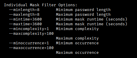
# Make the mask from the CSV file. pps = passwords per second, you can also leave this out. -t / --targettime is time in seconds, 86400 is 1 day. Minlenght is minimal length you want the masks.
python3 maskgen.py -t 86400 -o pot_min8.hcmask --pps=100000000000 --minlength=8 pot.csv
# You can also generate masks with policygen. Set a policy like minimal 1 special in the masks, max 4 digits and length. The following will create a huge mask file:
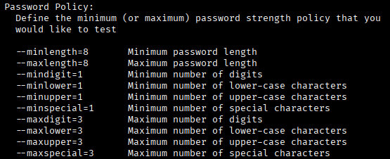
python3 policygen.py -o generated_masks.hcmask --minlength=8 --maxlength=12 --mindigit=1 --maxdigit=4 --minlower=1 --minupper=1 --minspecial=1
1
3
12
1,027

20 Jun 2025
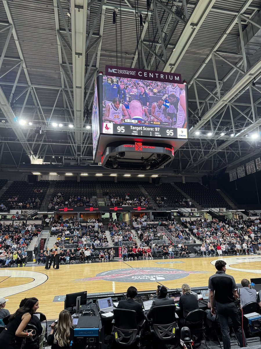
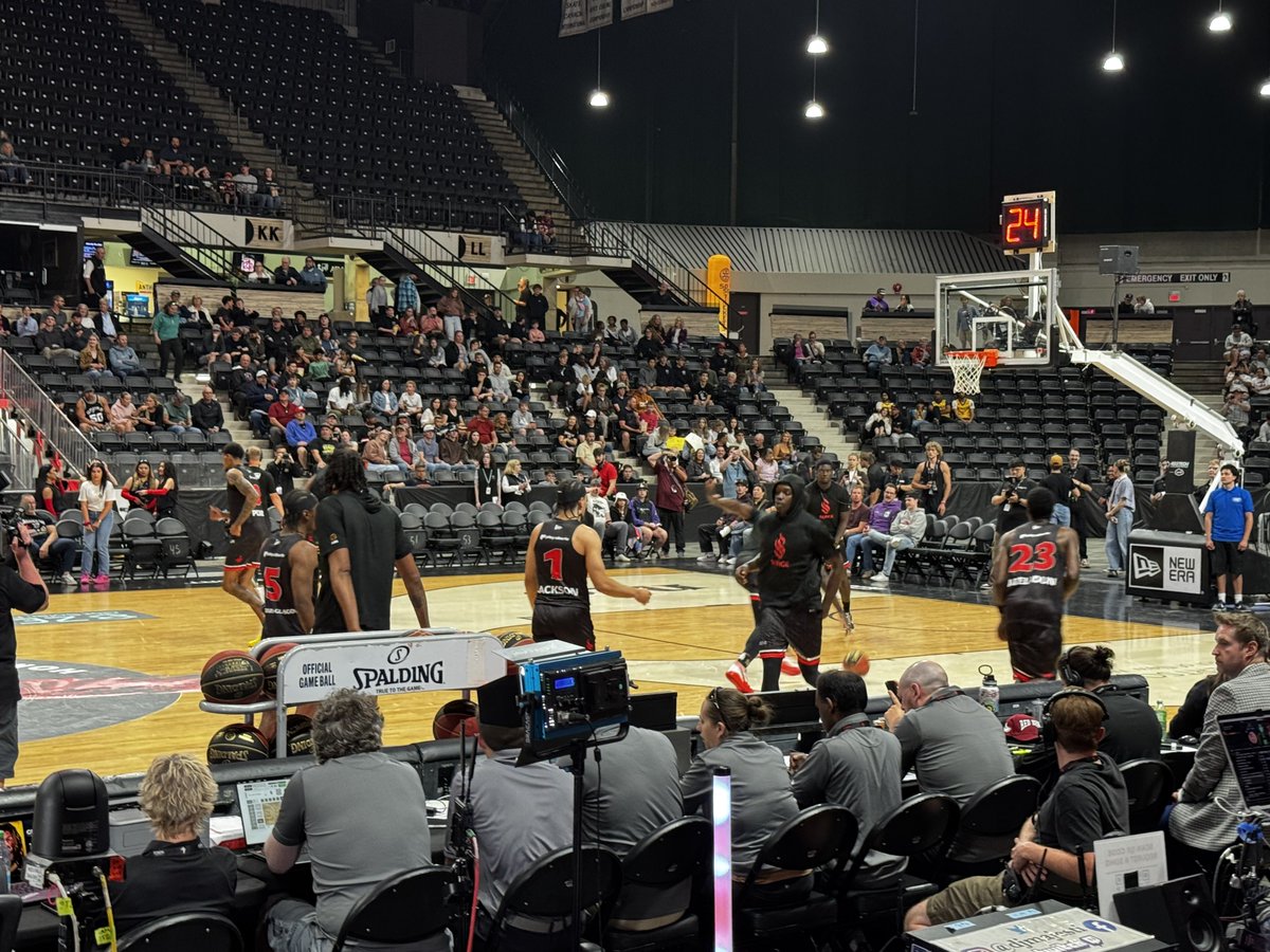
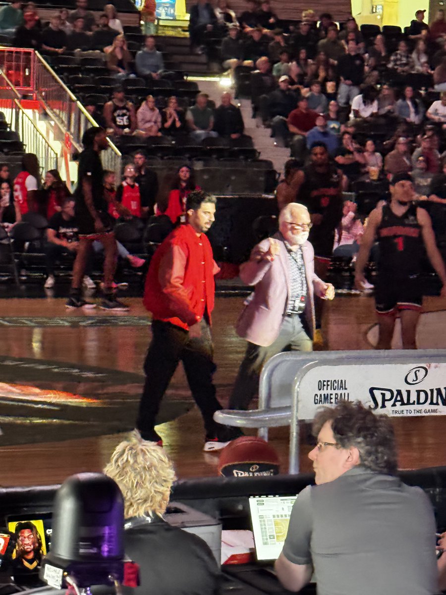
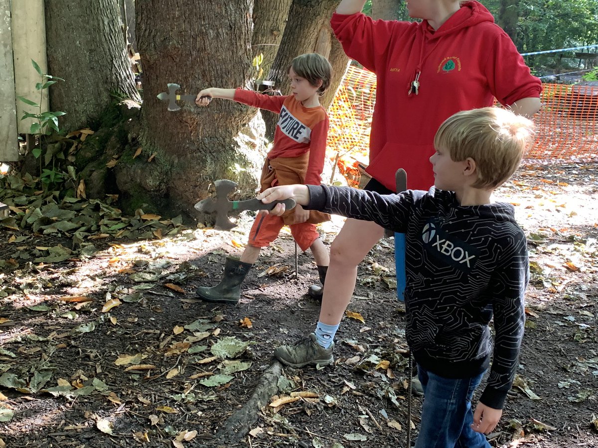
Had a lot of fun last night at the Surge 2 basketball game at the #MarchantcraneCentrium
The format for the end of the game with #targettime is very exciting and innovative. Last nights target score was 97. Final score was 98 Stingers 95 Surge.
If you have the opportunity I would highly recommend going to a game or 3.
@CalgarySurge @ED_Stingers
3
3
470

12 Apr 2025
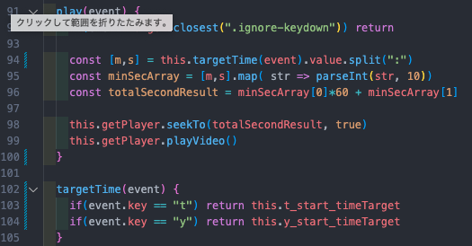
すっきりした形にリファクタリング出来てめっちゃ嬉しい。初めてのリファクタリング記念日達成🎉
targetTime内で分岐して該当のターゲットを返してやることでplay()の中で合計9回発生の冗長的な繰り返しを事前に避けました。
9
361

21 Sep 2024
Just a stable autogenerated id. Clips move around in the x direction by calling clip.moveStartTo(targetTime) and they move around in the y direction by calling clip.setTrackId(targetTrack.id)
4
1,675

8 Sep 2022
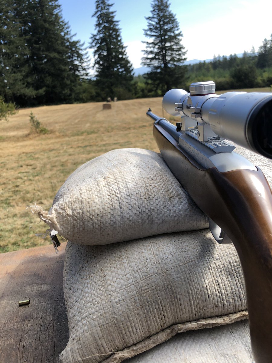
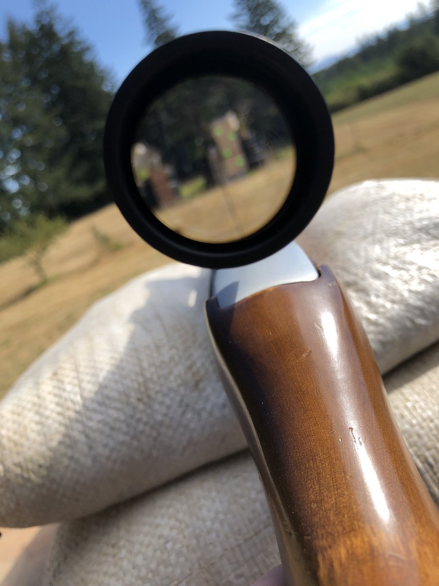
Working on sighting in my new scope. For some reason it got worse from the last sight in session. It was so freaking annoying!
Hopefully I’ll have better luck next time.
#shooting #targettime
2

30 Jun 2022
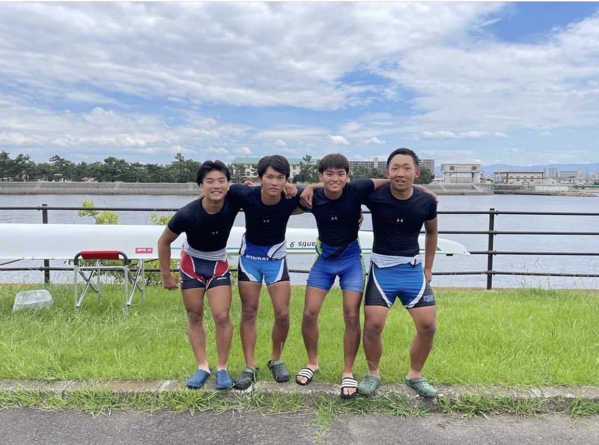
【関西選手権】クルー紹介①
男子舵手無しクォドルプル
S:松本(経営4)
3:髙島(生物理工1)
2:有安(経営2)
B:岸田(理工2)
TargetTime 6:30
目標 もちろんメダル狙いますんで!🔥
※撮影時のみマスクを外しています。
2
2
7

9 May 2022
Lots of hard work during target time in Dosbarth Koala this morning #Y3SMR #Y4SMR #MondayMorning #TargetTime
3

8 May 2022
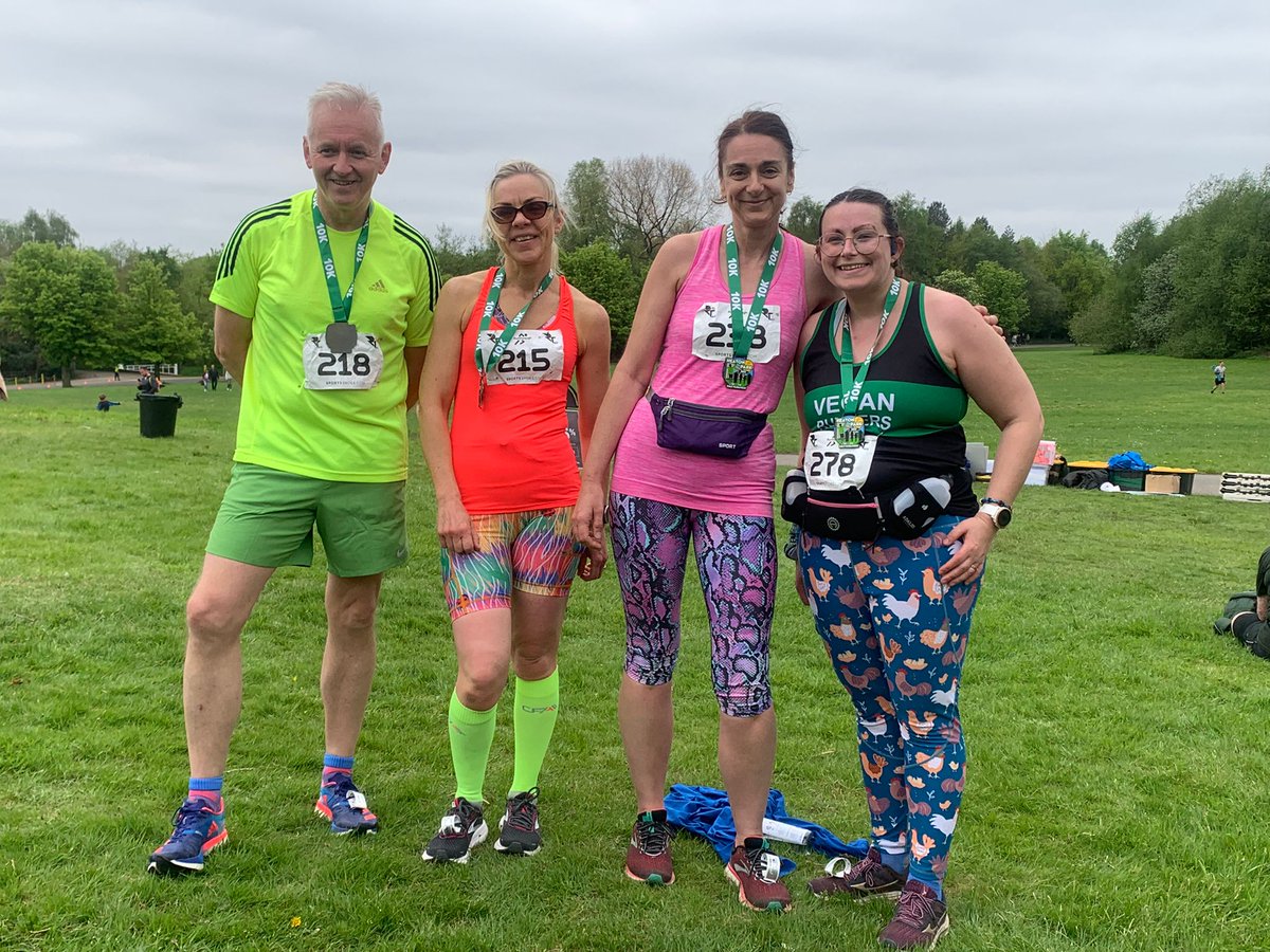
I did it! First ever #10k And smashed my #targettime and while I may not work for @BuryCouncil anymore it was still great to be an honourary member of #teambury
Thanks to all the Marshalls at @RunThroughUK #heatonpark #running #raceday #veganrunners @VeganRunnersUK
2
5

27 Apr 2022
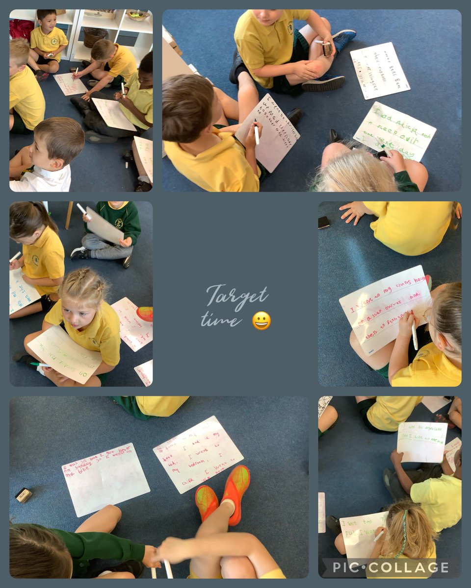
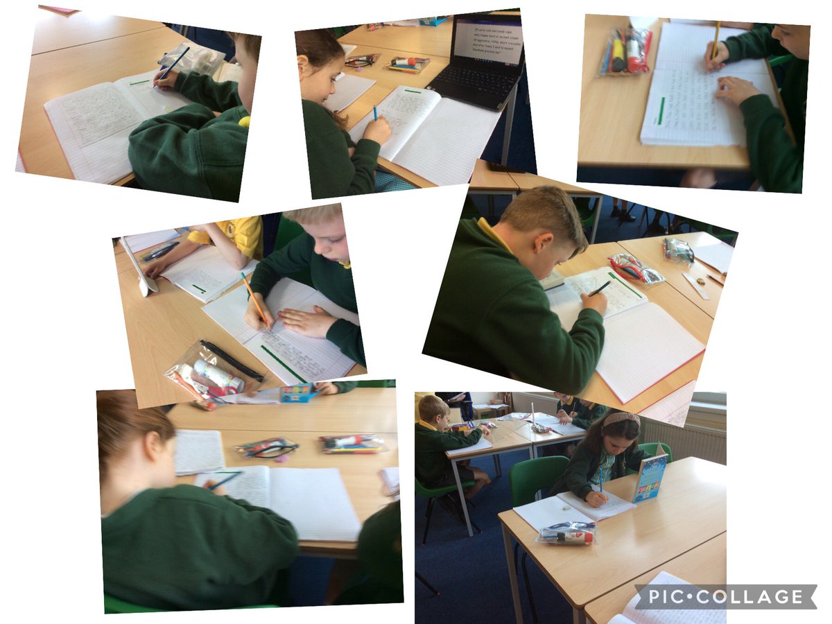
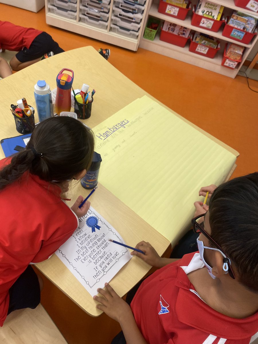
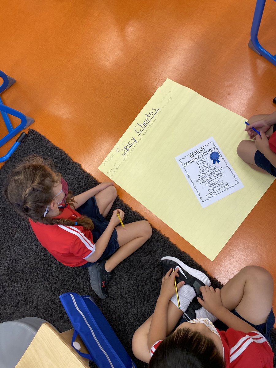
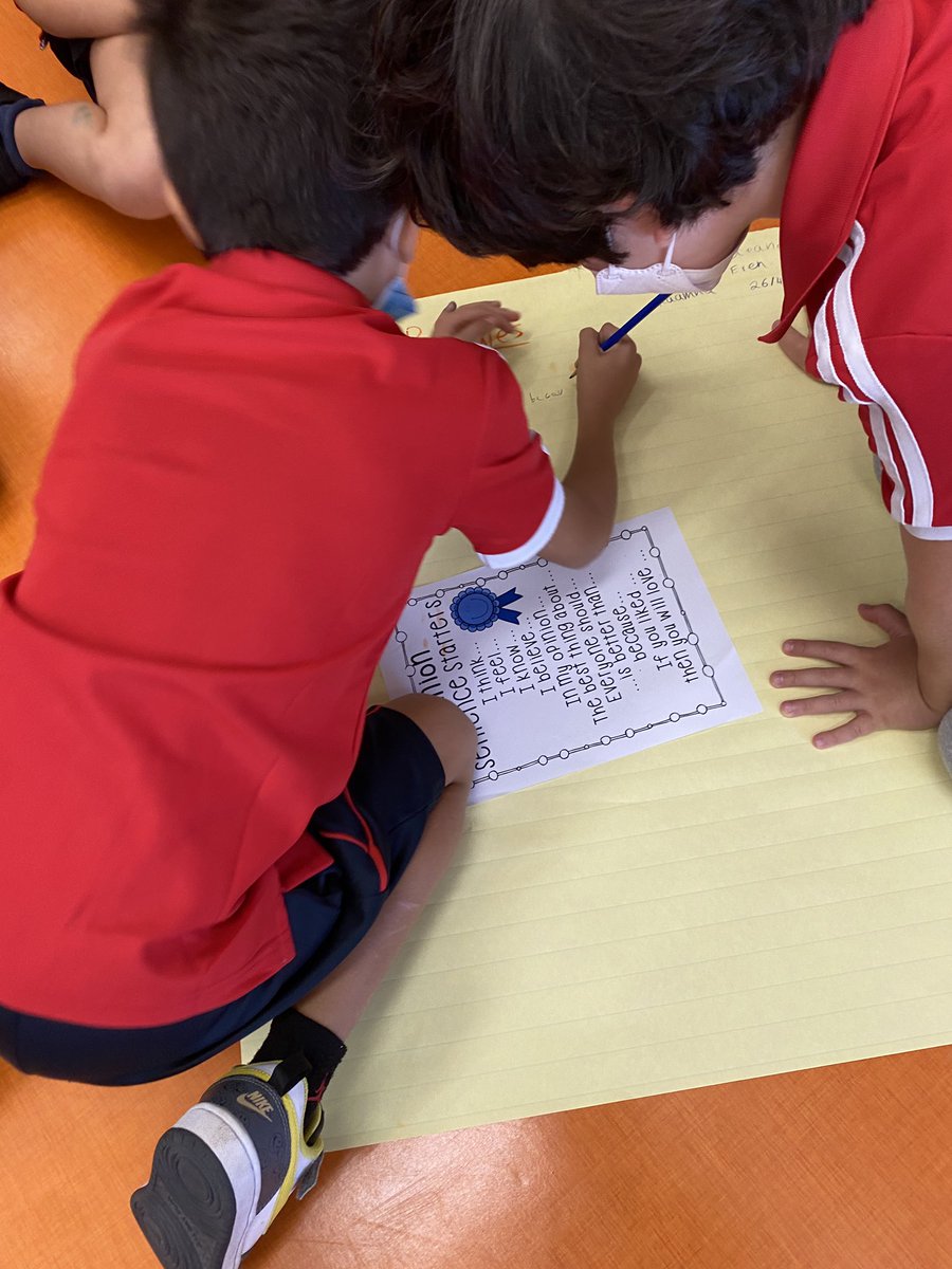
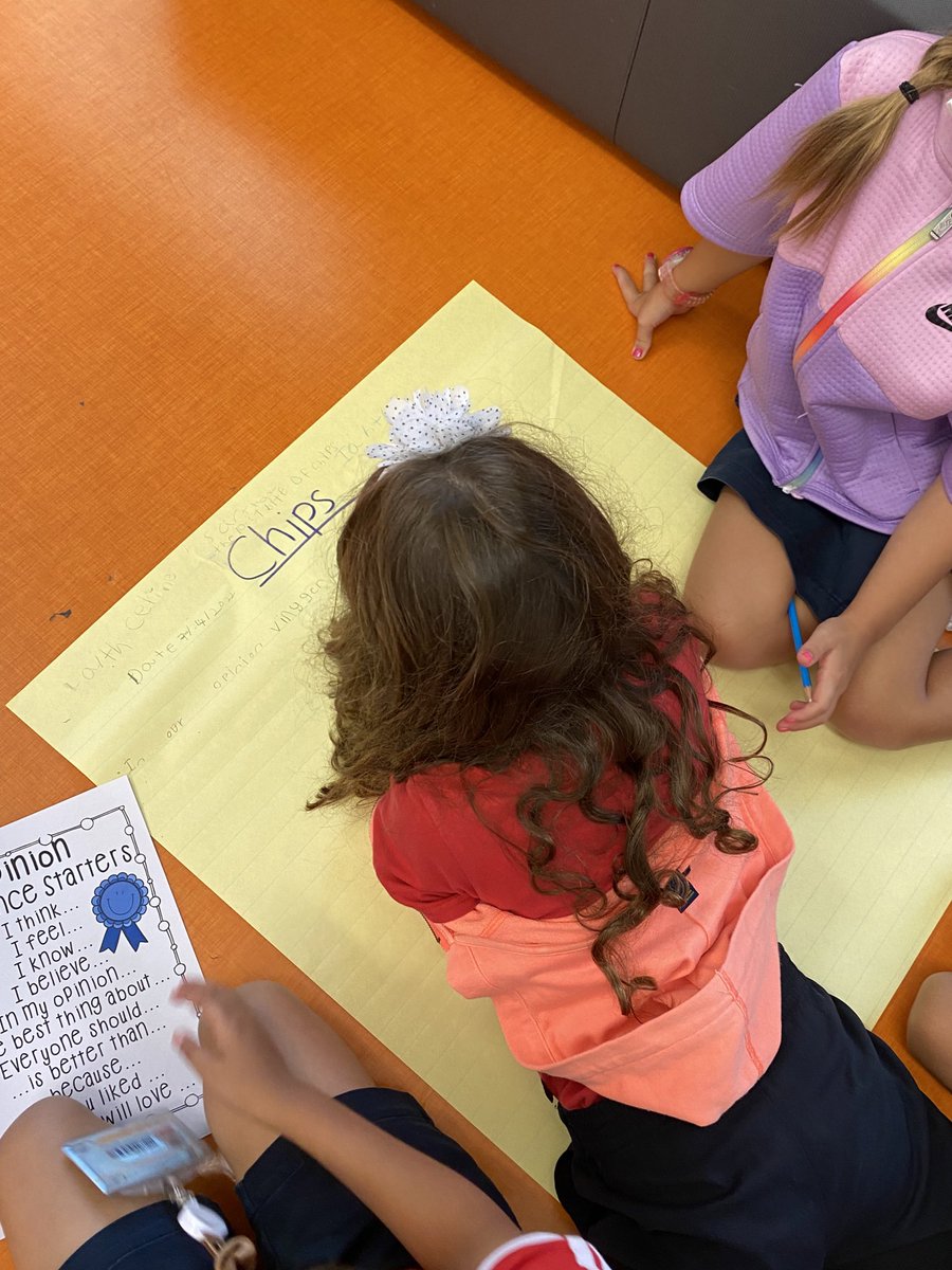
The power of #sharedwriting experiences… 1NJ and 1LB Ss came together to persuade us of the best food! Who will convince us of their opinions by sharing the most convincing reasons?! 🤔 #targettime #opinionwriting #writersworkshop #collaboration
10


6 Jul 2021
#関東学生網走夏季記録挑戦競技会
名前-学校-TargetTime
5000m
村上 太一 東洋大学 14'00''00
10000m
藤本 竜 國學院大學 28'50"00
3
23

11 Jan 2021
Today we collected data to start to make our first partner pictographs! We got up and moving and played #targettime to collect our data! #maththroughmovement #mathgames #virtualgrade3 @VEWhdsb
1
1
2


9 Dec 2020
#FX
朝のchart巡回
GBPUSD
京都会議の都合がありM15狩りセットは出来なかったがココはキッチリ日足迄。
“狩り”なら22:15がtargettimeでピッタシ。
続/混戦模様。
今朝はEURUSDに興味。
麻雀大会の予定ながら辞退か、とも。
欧米事情。
上手く纏めたい。
🍳🍞🍺🚬💨
8:52
8

18 Oct 2020
Colorful New Non-Explosive Reactive Targets from Spüt Targets bit.ly/3dyeBOK via @firearmblog #SundayGunday #RangeDay #TargetTime
1