
Feb 5
Day 4 of the Video Studio journey: backgrounds that don’t look like a placeholder.
Up until now I was basically throwing the phone on top of a flat color just to keep moving. It worked, but it always had that “default template” feel. The goal today was to stop shipping boring solid backgrounds and give the video a little depth without turning it into a design project.
So I built a background system and started with 9 gradient presets.
Nothing fancy or overly artistic—just clean, reliable options that make the phone look like it belongs there. Stuff like lightGray and darkMode for the safe defaults, and a handful of more stylized ones like sunset, ocean, forest, purple, midnight, warmGradient, and coolGradient.
The main reason I went with gradients is simple: flat colors look cheap. A subtle gradient adds polish immediately, and it doesn’t fight the actual content on the phone.
This was one of those changes where the output looks better with almost no extra effort, which is exactly the point of this whole studio. I don’t want to “design” a new promo video every time. I want to pick a preset and move on.
Tomorrow I’m working on lighting/shadows so the phone doesn’t look like it’s floating in empty space.
1
7
146

9 Apr 2025
@VEIR_Grid #EarthDataInsightbyLatitudo40 #Coolgradient #IncoolingB.V. #CarbonPowerMexico #Mitico,Inc. #Amperon #Aispex #MetOx International,Inc. #EnergyTechNexus #BAT #Osmoses
1
49

15 May 2024
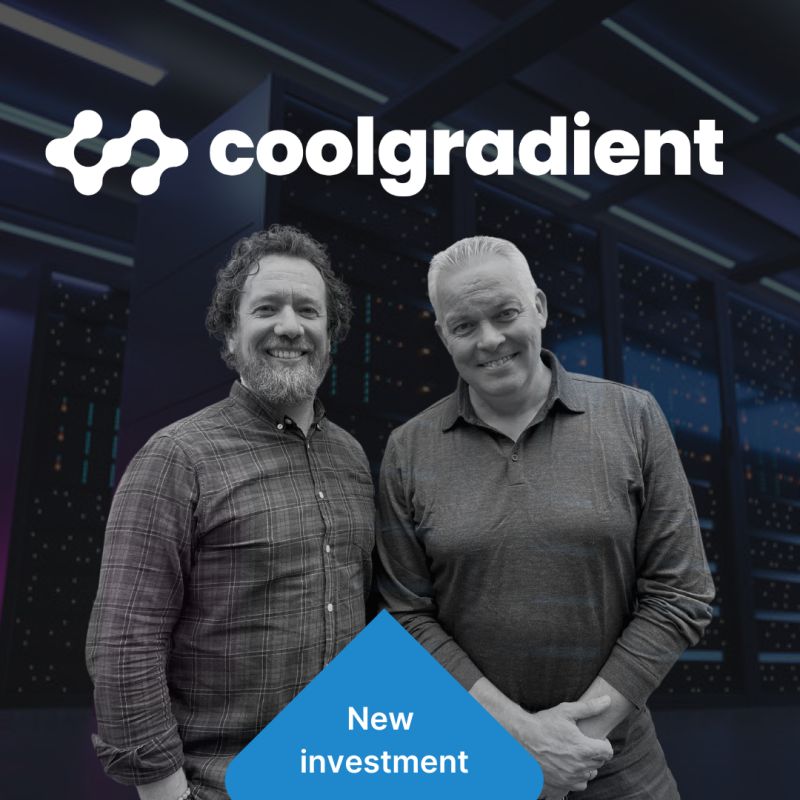
Thrilled to announce our latest investment in coolgradient.com! Coolgradient makes data centers intelligent by converting existing data into actionable recommendations and improved visibility, delivering increased reliability and improved sustainability by reducing data center infrastructure energy by up to 40%.
More on 4impact.vc/articles/4impact-…
33

12 Apr 2023
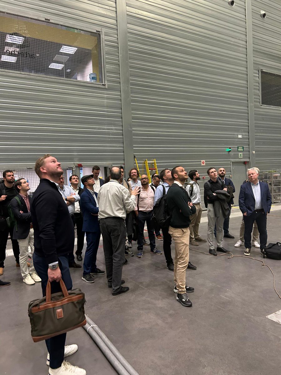
Fantastic to see @Scalenl_usa, @StartupAcademic and #CES alumni being nominated for the @Rabobank Sustainable Innovation Award.
You can vote now: rabobank.nl/bedrijven/groei/…
#Orbisk #Sensipdx #MantiSpectra #easee #coolgradient
2
728