
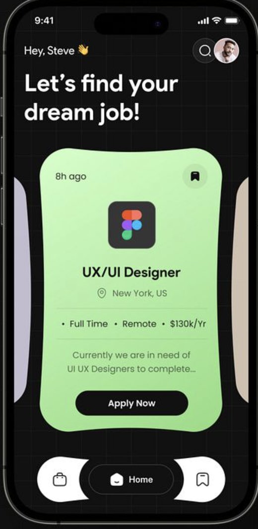
May 8
Prompt
You are a senior iOS engineer elite UI developer.
Your task is to recreate the provided job finder app UI EXACTLY as shown, using SwiftUI.
This is not “close enough.”
This must be pixel-perfect, matching:
layout
spacing
typography
shapes
curves
shadows
gradients
layering
If something is even slightly off — fix it.
🎯 CORE REQUIREMENTS
Language: Swift
Framework: SwiftUI ONLY
Architecture: MVVM
Use modular reusable components
Must support modern iPhones (safe areas, dynamic island, etc.)
UI must feel like a premium App Store feature app
🧠 DESIGN DNA (CRITICAL)
This UI is:
Dark mode first
Grid-based background
Organic curved cards (NOT standard rectangles)
Soft neon gradients
Highly modern, almost futuristic
Minimal but expressive
Think:
“Figma Linear Apple Design Awards energy”
🧱 SCREEN STRUCTURE (TOP → BOTTOM)
🔝 1. STATUS HEADER
Top Left:
Time (system)
Below:
Greeting:
Hey, Steve 👋
Main Heading:
Let’s find your dream job!
Typography:
Greeting → medium weight
Heading → large, bold, multi-line
Tight line height, strong presence
Top Right:
Circular search button
Circular profile avatar
Both:
Glass / subtle dark background
Soft border
🟦 2. BACKGROUND GRID
This is IMPORTANT.
Full screen dark background
Subtle grid pattern overlay
Implementation:
Use:
Canvas OR
repeated Path OR
tiled SVG
Grid lines:
very low opacity
thin strokes
evenly spaced
🟩 3. MAIN JOB CARD (CENTERPIECE)
This is the heart of the UI.
⚠️ SHAPE (VERY IMPORTANT)
This is NOT a rectangle.
It’s an organic blob-like rounded shape:
uneven curves
soft inward/outward edges
looks fluid
Implementation Options:
Use SVG path
OR CustomShape in SwiftUI
OR import vector path
DO NOT approximate with RoundedRectangle.
🎨 CARD BACKGROUND
Gradient: light green → soft mint
Smooth, subtle
Slight glow feel
🧩 CARD CONTENT
🕒 Top Left:
8h ago
🔖 Top Right:
Bookmark icon
Circular background
🏢 Center Icon:
App/company logo (e.g. Figma)
Requirement:
Fetch from:
favicon APIs OR
vector assets OR
fallback to generated SVG
💼 Job Title:
UX/UI Designer
Bold
Prominent
📍 Location:
New York, US
With location icon
📊 Job Meta:
• Full Time • Remote • $130k/Yr
Inline bullet-separated
Muted text
📝 Description:
Short paragraph (truncate with ellipsis)
🔘 CTA BUTTON:
Apply Now
Button Style:
Black background
White text
Fully rounded (pill)
Slight elevation
🧠 DEPTH & LAYERING
Card floats above background
Use:
soft shadows
slight scaling illusion
🧭 4. SIDE CARDS (PEEKING)
Left & right edges:
partially visible cards
Purpose:
indicate horizontal scroll
Implementation:
Horizontal ScrollView
Center card is focused
Side cards slightly scaled down
🔻 5. BOTTOM NAVIGATION BAR
Shape:
Curved, organic container
NOT a straight rectangle
Layout:
3 icons:
Left: briefcase
Center: Home (ACTIVE)
Right: bookmark
Active State:
Center tab highlighted
Dark pill background
Style:
Light surface against dark bg
Smooth curves
Floating effect
🎨 COLOR SYSTEM
Base:
Background: near black (#0B0B0F)
Grid:
White with ~5–8% opacity
Card:
Green gradient (mint tones)
Text:
White (primary)
Gray (secondary)
Accent:
Subtle neon green glow
🔤 TYPOGRAPHY
Font: SF Pro (system)
Large hero heading
Clear hierarchy:
H1 (hero)
H2 (job title)
Body
Caption
🧩 COMPONENTS (MANDATORY)
Create reusable components:
HeaderView
GridBackgroundView
JobCardShape (custom path)
JobCardView
JobMetaRow
ApplyButton
BottomNavBar
NavItem
🖼️ IMAGE ICON SOURCES
Use real assets:
Logos:
favicon APIs OR
vector SVGs
Images:
Unsplash (if needed)
Fallback:
Generate clean SVG placeholders
📐 LAYOUT PRECISION
Match:
padding
spacing
alignment
Use consistent spacing system (8pt grid)
⚡ MICRO-INTERACTIONS
Card swipe → smooth snapping
Button tap → scale opacity feedback
Bookmark toggle → animated
Nav switch → smooth transition
📱 RESPONSIVENESS
Works on all modern iPhones
Handles safe areas perfectly
Maintains proportions
🧪 MOCK DATA
struct Job {
let title: String
let company: String
let location: String
let salary: String
let type: String
let isRemote: Bool
}
🧼 QUALITY BAR
This must look like:
A Dribbble-winning concept brought to life
Not a dev prototype
Not “close enough”
🚫 DO NOT
Use standard rectangles for main card
Ignore custom shapes
Use default SwiftUI buttons
Skip grid background
Approximate gradients
Ignore spacing precision
✅ FINAL OUTPUT
Pixel-perfect SwiftUI screen
Clean architecture (MVVM)
Custom shapes implemented correctly
Smooth animations
Production-quality UI
3
22
1,587

Class demo - fantasy mystical tree using customshape brushes
1
67
874

18 Dec 2025
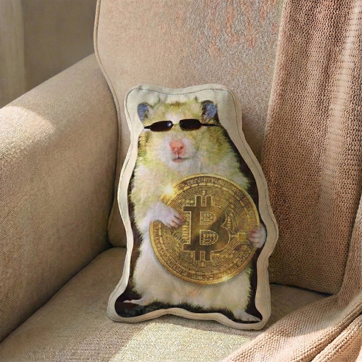
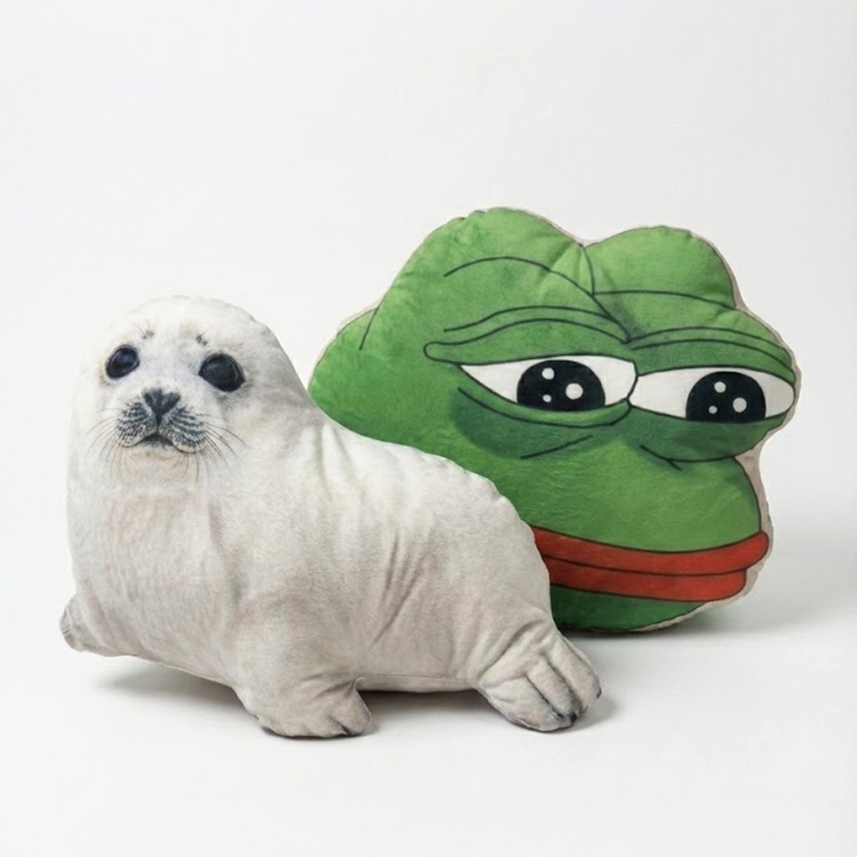
🔥 New drop is live. 🔥
Custom Shape Sublimation Cushion :
Turn Your Brand into Something You Can Feel.
Bring flat logos and characters to life,
not on a screen, but in real space.
From team logos to mascots and custom artwork,
we transform your ideas into bold, high-quality cushions with vibrant sublimation printing.
Perfect for Web3 communities, team swag, booths, and brand moments that actually stick.
Link 👉👉 o-sean.io/t/20251218-01
#Web3Merch #CustomCushion #EventSwag #IRLBranding #CustomShape

1
6
110

16 Jul 2025
Check the BTracer CustomShape Tool documentation in B4D Tools 1.4.3.
Get it:
superhivemarket.com/products…
byfenix.gumroad.com/l/b4d-to…
youtube.com/watch?v=fz38rzXo…
#blender初心者 #b3d #blender3d #blender #blender36 #blendercommunity #motiongraphics #c4d #blender43 #mograph #cinema4d
2
212

21 Dec 2024
PC起動したらいきなり変な画面が出てきて、右下にはクリスマスリース(輪っか)が表示されてて、マジで何事!?と思ったけど、調べたらこれだったw
タスクマネージャーでも「customshape」としか表示されないし、ロゴ表示もないし、マジで怪しすぎたから完全に逆効果だろ😅
detail.chiebukuro.yahoo.co.j…
3
320

9 Oct 2023
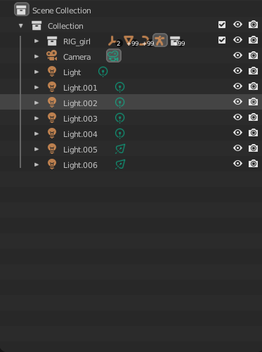
の順番でシーンに呼び出します。
スムーズに行うためには元のリグのファイルのアウトライナで、このようにリグのコレクションを作りその中にメッシュ、ジョイント、コントローラー(CustomShapeと呼ばれる)情報を入れておくといいと思います。Linkはコレクション単位でできるので他のカメラやライトが
1
3
15
4,901

24 Jun 2023
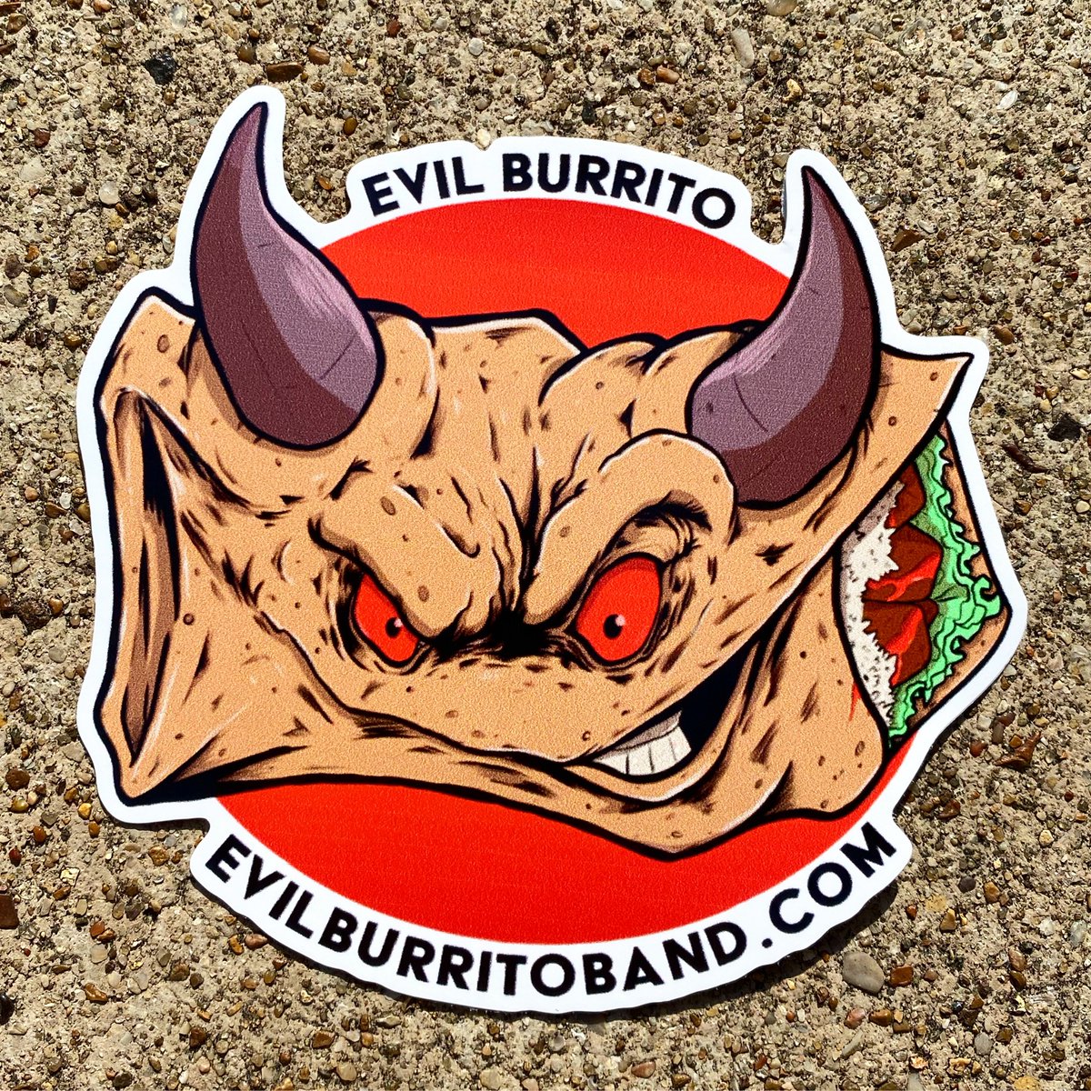
Sticker of the Day! EVIL BURRITO! 4” x 4”Custom Shape! Full Color Decals! CMYK on White Vinyl! Digital Printing!
#stickeroftheday #stickinittothemansince93 #stickerguy #customshape #fullcolor #digitalprinting #decals #shoplocal #renonevada #sticker #vinyl
1
2
184
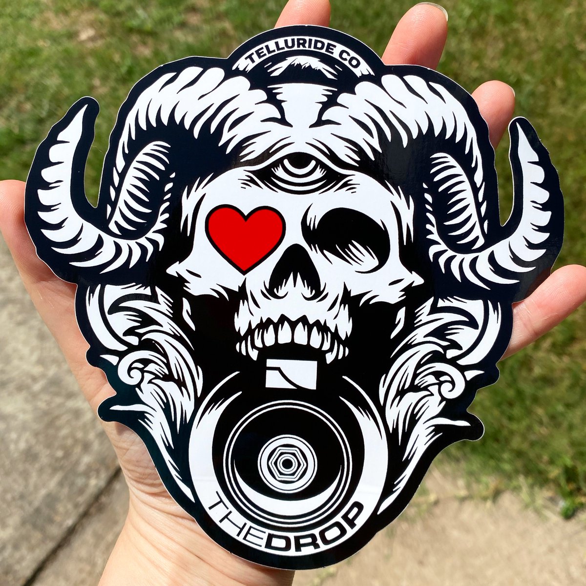
2 Jun 2023
Sticker of the Day! THE DROP! 5.8” x 6” Custom-Shape Die-Cut! Black & Red Ink on White Vinyl! Screenprinted! Bulk!
#stickinittothemansince93 #stickerguy #custom #screenprinting #vinyl #serigrafia #silkscreen #shoplocal #renonevada #sticker #customshape #diecut #bulk
3
100

29 May 2023
3DImageView in SwiftUI
#swiftui #swift #product #3Dimage #scn #mvvm #customshape #navigationview #animation
4
909

20 Apr 2023
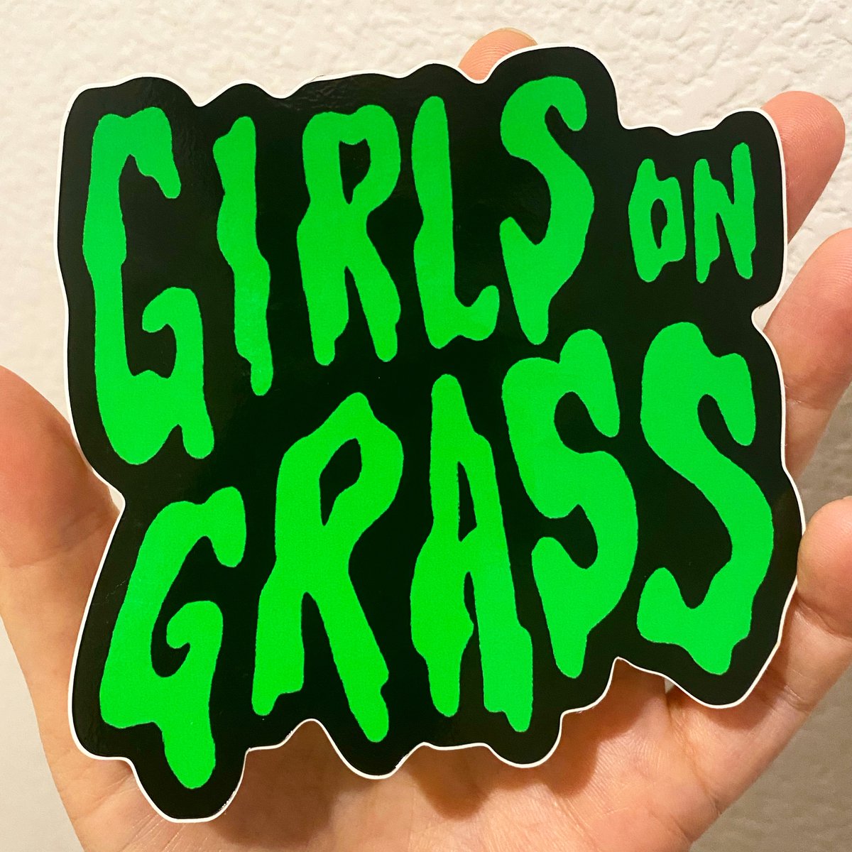
Sticker of the Day! GIRLS ON GRASS! 4” x 4” Custom Shape! Full Color Decals! CMYK on White Vinyl! Digital Printing!
#stickeroftheday #stickinittothemansince93 #stickerguy #customshape #fullcolor #digitalprinting #decals #glossyvinyl #shoplocal #renonevada #sticker #vinyl
2
110
17 Apr 2023
Stickers of the Day! RACCOON CAN! 10” x 6.25” Custom-Shape Die-Cuts! Black Ink on White Vinyl! Screenprinted! Bulk Only!
#stickinittothemansince93 #stickerguy #custom #screenprinting #vinyl #silkscreen #shoplocal #renonevada #sticker #customshape #diecut #bulk

1
3
107
18 Jan 2023
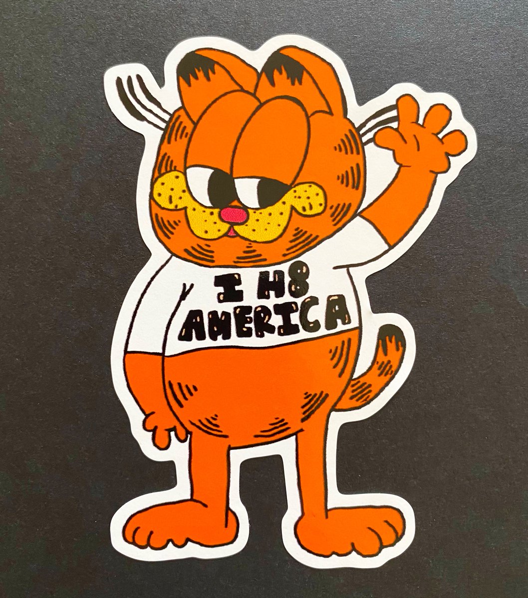
Sticker of the Day! I H8 AMERICA! 4” x 4” Custom Shape! Full Color Decals! CMYK on White Vinyl! Digital Printing!
#stickeroftheday #stickinittothemansince93 #stickerguy #customshape #fullcolor #digitalprinting #decals #glossyvinyl #shoplocal #renonevada #sticker #vinyl
4
155

6 Dec 2022
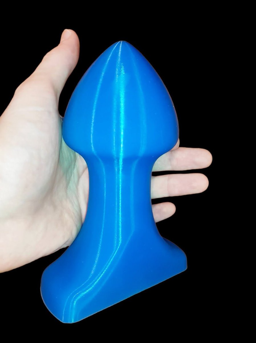
🇨🇿 Anální kolík v2 na dlouhodobé nošení navržený na zakázku. Použitelný rozměr 15x8 cm.
🇬🇧 Custom designed anal plug v2 for long term wear. Usable size 15x8 cm.
#sextoy #customshape #anal #analplay #analplug #platinumsilicone
1
14
28 Nov 2022
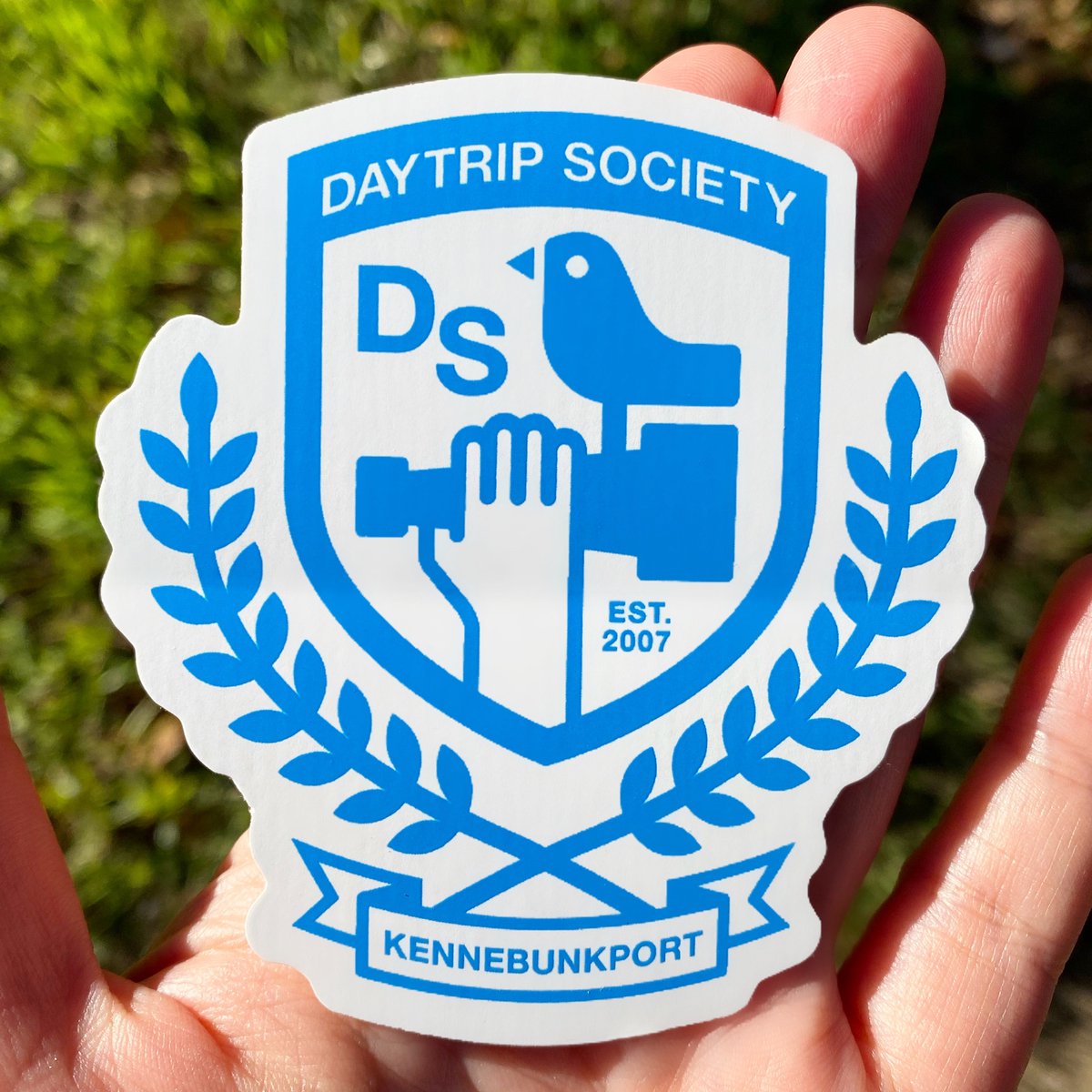
Sticker of the Day! DAYTRIP SOCIETY! 3.25” x 3” Custom-Shape Die-Cut! PMS 2925 on White Vinyl! Screenprinted! Bulk!
#stickinittothemansince93 #stickerguy #custom #screenprinting #vinyl #serigrafia #silkscreen #shoplocal #renonevada #sticker #customshape #diecut #bulk
4
19 Oct 2022
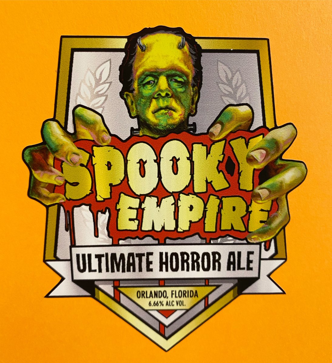
Sticker of the Day! SPOOKY EMPIRE! 4” x 4” Custom Shape! Full Color Decals! CMYK on White Vinyl! Digital Printing! Kiss-Cut!
#stickeroftheday #stickinittothemansince93 #stickerguy #customshape #fullcolor #digitalprinting #decals #shoplocal #renonevada #sticker #vinyl #kisscut
2
25 Aug 2022
Sticker of the Day! MAC SABBATH! 6.25” x 2.625” Custom-Shape Die-Cut! Red & Black Ink on Yellow Vinyl! Screenprinted! Bulk Only!
#stickinittothemansince93 #stickerguy #custom #screenprinting #vinyl #silkscreen #shoplocal #renonevada #sticker #customshape #diecut #bulk

4
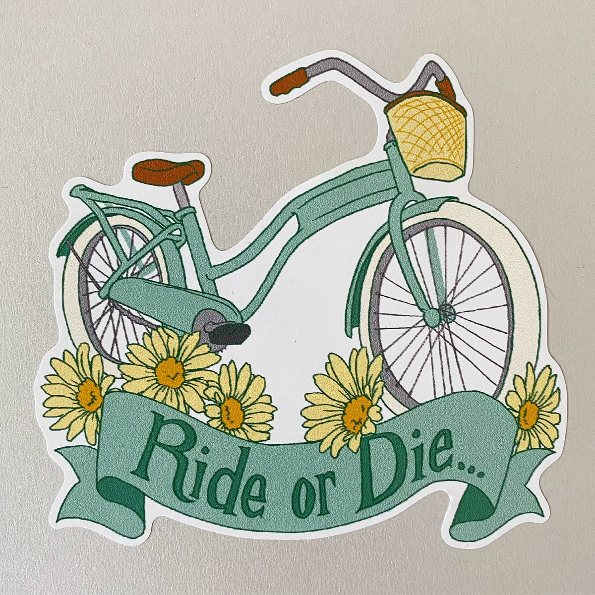
7 Aug 2022
Sticker of the Day! RIDE OR DIE! 4” x 4” Custom Shape! Full Color Decals! CMYK on White Vinyl! Digital Printing! Kiss-Cut!
#stickeroftheday #stickinittothemansince93 #stickerguy #customshape #fullcolor #digitalprinting #decals #shoplocal #renonevada #sticker #vinyl #kisscut
3

23 Jul 2022
envyさんと一緒に作品作りました!
めっちゃいいのできたありがとうございます🌱
customshape - envy and me
3dcg - me
graphics - envy


1
9

10 May 2022
Li and Yin: Model2SAS: software for small-angle scattering data calculation from custom shapes #SmallAngleScattering #CustomShape #ThreeDimensionalModels ... #IUCr scripts.iucr.org/cgi-bin/pap…
1