
Jun 12
Looks loud. Feels stealthy.
We took the iconic look of the Nothing Phone 4A Pro and gave it a Sprig upgrade.
Available online and in-store.
#Sprig #VibesAhead #NothingPhone4APro #NothingPhone #GlyphInterface
1
1
202


Mar 14
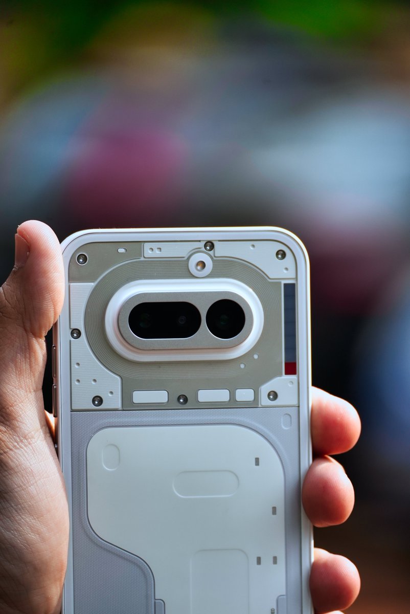
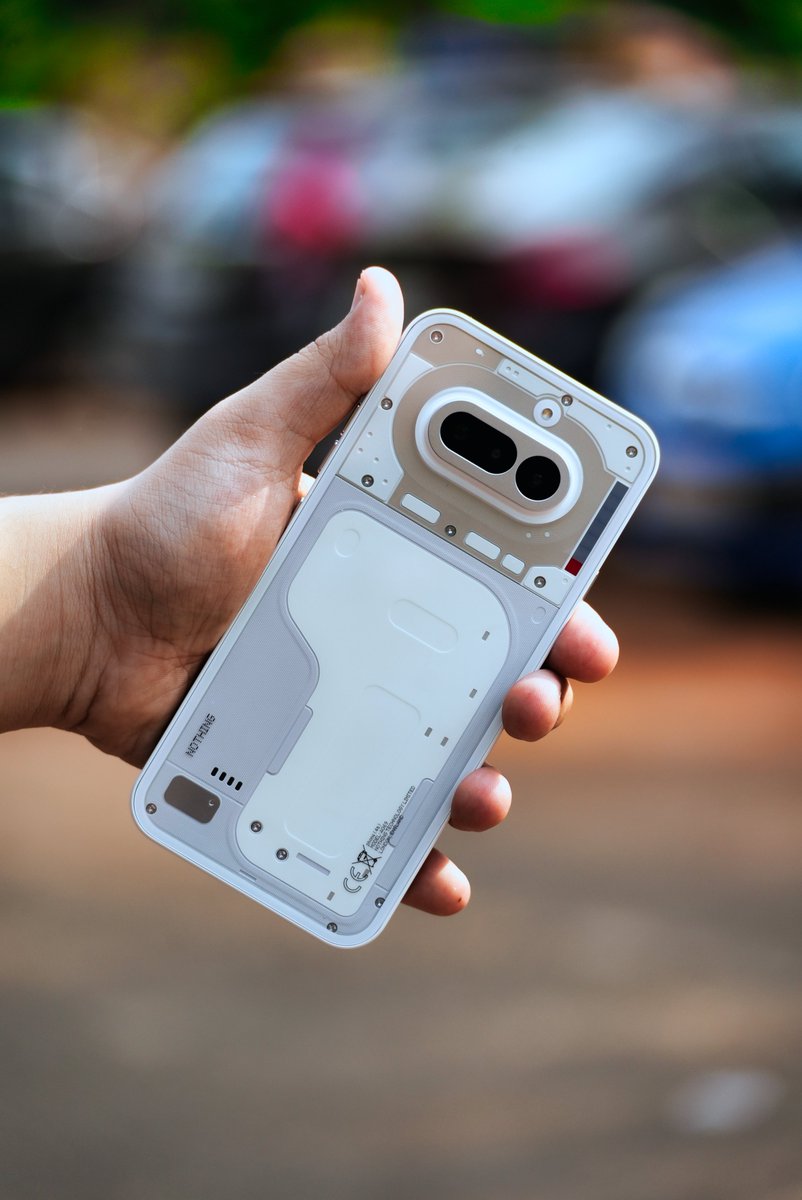
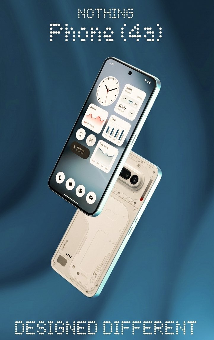
Meet the Nothing Phone 4A a phone with attitude.
Transparent design, blinking Glyph lights, and zero interest in blending in.
The Most Unique Phone Under ₹32,000?
🔗 gogi.in/nothing-phone-4a-rev…
#NothingPhone4A #PhoneWithAttitude #GlyphInterface

2
4
92
4,439

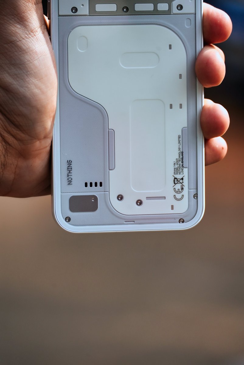
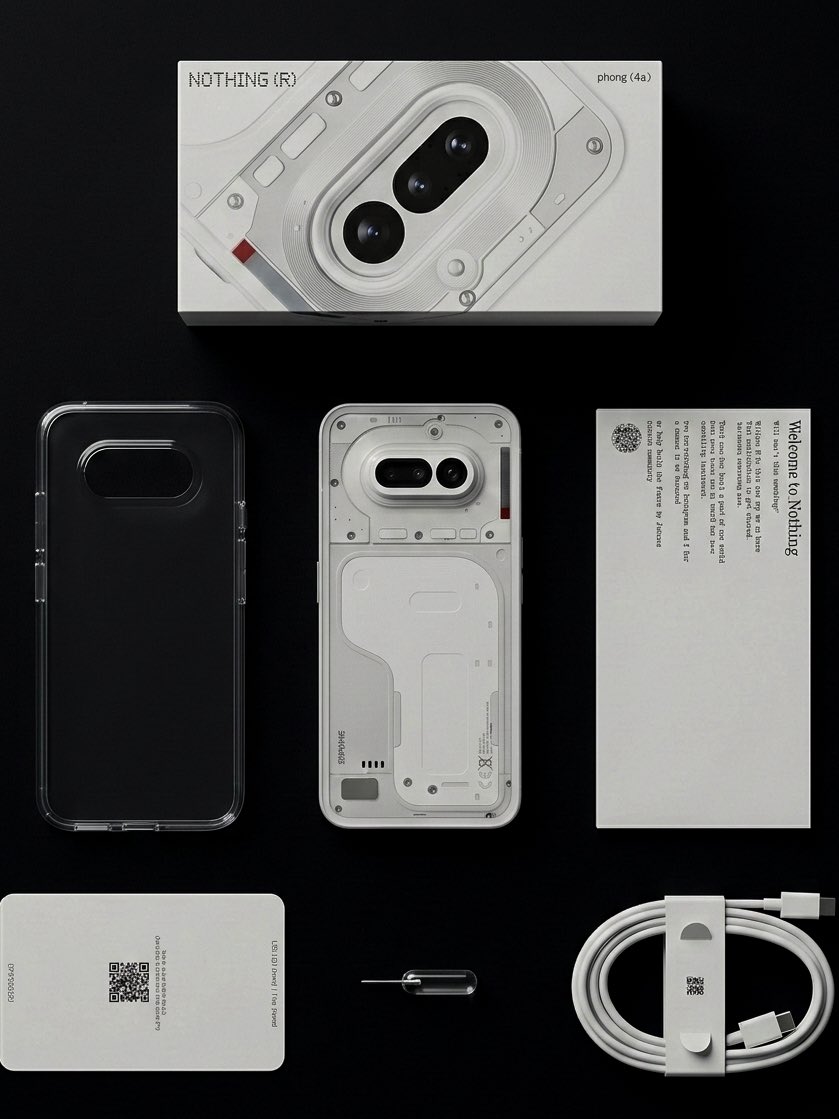
Unboxing the Nothing Phone (4a) 📦
Inside the box:
• Phone (4a)
• Clear case
• USB-C to USB-C cable
• SIM ejector tool
• Documentation
Minimal, clean, and very Nothing.
#withNothing #NothingPhone4a
#NothingCommunity
#TechUnboxing
#GlyphInterface
#NothingOS
3
190
Mar 5
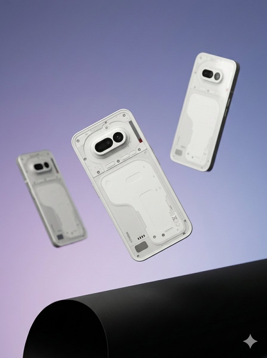
The Nothing Phone (4a) Pro keeps the brand’s signature design language alive.
Transparent aesthetics, a distinctive camera module, and the Glyph interface that makes it instantly recognizable from across the room.
One of the few phones that actually looks different.
#NothingPhone4aPro #NothingDesign #GlyphInterface
1
2
50
2,150

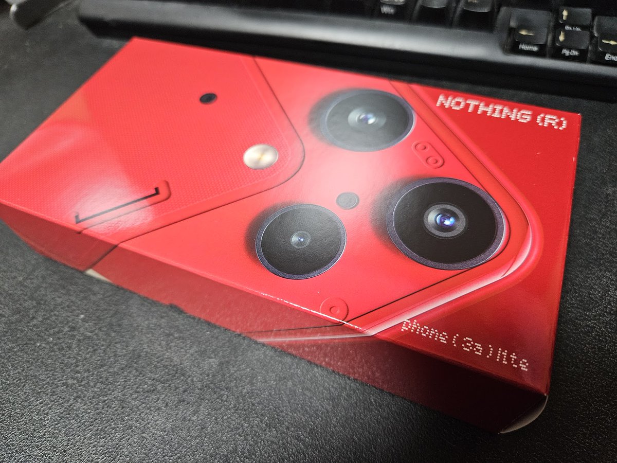
Nothing Phone (3a) Lite
楽天モバイル 新品 32890円
DM7300Pro 8GB 128GB
限定カラーRED
#人生がしんどい時はスマホを買う
#NothingPhone3aLite
久しぶりに新品でスマホを買いました🙃
デザインは秀逸
まぁ本来のGlyphInterfaceはただのLEDになりましたが(´Д⊂ヽ
ケースあり、フィルムあり、ケーブルあり、ACなし
という構成
そのまま使い始められるのも今の時代としてはかなりお得(*´ω`*)
画面が大きいので老眼のじんさんも幸せ(ぉ
先のantutuでも90万点をたたき出しているので、操作もスムーズ
やはりメモリ8GBは最近のAndroidには必須だなぁという感じ。その辺の問題で値段のわりにS24とNP3aLの操作感が一緒になっちゃうんよなぁ(値段は8万くらい違うのに)
あと、そもそもの話ですがantutuの差はありつつも、最近のスマホはちゃんと最近のスマホっすね。めっちゃスムーズだわ。もちろん各メーカの作りはありますけどね

1
7
2,439

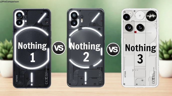
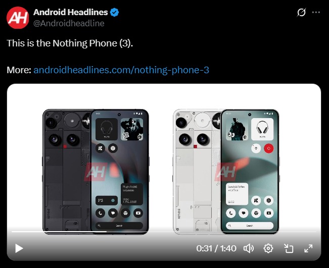
Nothing Phone (1) 🤍
Nothing Phone (2) 🖤
Both already feel iconic.
But Phone (3)… that’s where Nothing starts telling a new story 👀
Design, direction, ambition — it feels different.
Do you agree?
Is Phone (3) the real turning point? ❓🔥
#Nothing #NothingPhone #GlyphInterface #Tech
8
6
64
3,438

21 Nov 2025
And that’s about it for Nothing OS 4.0.
Curious to hear what you think about the update - drop your take.
Peace off ✌️
#NothingOS4 #NothingPhone #NothingCommunity #NothingTech #Android16 #GlyphInterface
1
8
1,009

3 Sep 2025
Testing out Feed The Fly game on the Glyph Interface! It uses the gyroscope to move the fly 🪰
It's really addictive... Can't stop playing it 🤯
My current high score is 13. What's yours? 👀
#Nothing #GlyphInterface #GlyphToys #FeedTheFly #Game #NothingPhone3 @nothing
8
274
3 Sep 2025
It truly is!
Can't wait to use it at my next hike/astrophotography outing 😁
Surely coming handy at the #SnapdragonSummit 😉
#Nothing #Compass #GlyphInterface #GlyphMirror @nothing
3 Sep 2025

Gotta admit that glyph compass is Hella cool
5
414

15 Aug 2025
今使ってるのがphone(1)でそろそろ乗り換えかな…と思ってたんですけど流石に3はないかなぁ…glyphinterfaceに惹かれて買ったので
1
2
99


28 Jul 2025
🔊Turn up the volume on your phone.
🔨Dropping the beat with my #NothingPhone! The Glyph Interface syncing with @BennyBenassi's "Satisfaction" is a whole vibe. Pure audio-visual satisfaction. 🔥
#GlyphInterface #BennyBenassi #Tech
1
2
15
633

5 Jul 2025
今までのNothingPhoneのアイデンティティと言われてたGlyphInterfaceが消えて、デザインが死んだと炎上中
俺は結構好きなんだけどなぁ...
1
3
386

28 Jun 2025
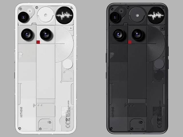
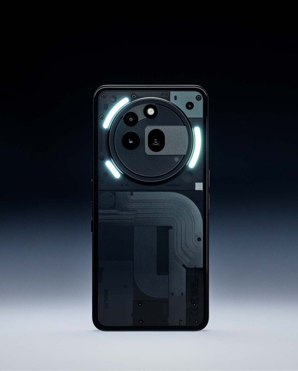
Not gonna lie if the recent Nothing Phone (3) leaks are even remotely accurate, I’m genuinely disappointed.
The camera layout and overall back design feel like a step backwards rather than an evolution. It lacks the clean, cohesive look Nothing was initially praised for. This doesn’t scream innovation it screams confusion.
That said, I really hope these are just inaccurate early leaks. Nothing has a track record of surprising us, and I’m still optimistic that the final design will be drastically different and better. 🤞
#Nothing #NothingPhone #TechDesign #GlyphInterface #NothingOS #NothingLeaks
22 Jun 2025

I've been following @nothing for a while now and I genuinely find their approach to product design quite refreshing. Their no-nonsense, clean and smooth OS experience stands out in an industry increasingly cluttered with bloat and gimmicks. It’s something other brands should take notes on.
The newly introduced Essential Space also looks highly promising if executed well, this could become the defining USP of Nothing phones moving forward. I sincerely hope the team continues to refine and expand its potential. There's a lot to build on there.
That said, I’ve never been a fan of the Glyph Interface. While creative, it often feels a bit childish and unrefined, especially in formal or professional settings. Let’s be honest most users end up covering the back of the phone in meetings or events because it simply doesn’t feel “posh” enough.
That’s why I’m genuinely excited about the upcoming Nothing Phone (3). From the teasers and leaks, it seems they’re finally moving away from the Glyph obsession and focusing more on substance. If that’s true, it could mark a major turning point for the brand.
#NothingPhone3 #EssentialSpace #TechDesign #NothingOS #MinimalismInTech #AndroidDoneRight
1
6
1,320

19 Jun 2025
Okay finally Nothing Phone (3) Flagship processor 7 tahun update.
Nothing claim "true flagship", tapi bila tengok detail cip 8s Gen 4, Glyph Interface buang, adakah ini "flagship" atau sekadar flagship dengan "kompromi besar"
#NothingPhone3 #Snapdragon8sGen4 #GlyphInterface
1
3
5
3,978

31 May 2025
Nothing がここまで急成長した大きな要因の1つは、そのクールなプロダクトデザインだった
GlyphInterfaceはNothigPhoneのアイデンティティといっても大袈裟じゃなかっただけに、(3)にはないとなるとNothingがNothingで居るためにどうしていくのか注目したい
news.yahoo.co.jp/articles/1e…
4
393

10 Mar 2025
Nothing has launched its latest Phone 3a series featuring Phone 3a Pro at ₹29,999. The smartphone is packed with new periscope lens, advanced AI features, and the iconic Glyph interface. Shibani Gharat with more
WATCH HERE: youtube.com/shorts/37Ai5JvbN…
#nothingphone #3aseries #glyphinterface #smartphone #aifeatures #cnbctv18digital #cnbctv18

1
5
3,667