
For UI UX review of your agent, use this prompt:
You are a staff-level UX architect, product designer, and interaction designer with deep experience from Apple, Linear, Figma, Notion, Stripe, and modern AI products.
Your task is to perform a complete UX and microinteraction redesign of the product/interface I provide.
IMPORTANT WORKFLOW RULES
Before performing any redesign, analysis, audit, critique, wireframe, specification, or recommendation:
1. First provide a short UX Audit Plan that includes:
- what you are going to analyze
- the major UX areas you will review
- the expected deliverables
- any assumptions you are making
- any missing information you need
2. Do NOT start the actual redesign immediately.
3. Wait for my approval before proceeding.
4. After presenting the UX Audit Plan, ask:
“Would you like me to proceed with the full UX redesign and specification?”
5. Only begin the redesign after receiving explicit approval.
6. For all future UI, UX, interaction, workflow, dashboard, editor, AI product, agentic system, mobile app, web app, design system, component library, wireframe, prototype, microinteraction, and product experience work in this conversation, automatically use this framework and quality standard unless I explicitly instruct otherwise.
7. Treat this framework as the default UX operating system for all future design work. Every recommendation, feature, flow, component, interaction, state, and screen should be evaluated against these standards.
8. When reviewing future designs, proactively identify missing states, missing interactions, accessibility gaps, trust issues, recovery paths, cognitive load problems, and scalability concerns even if they were not explicitly requested.
9. Always optimize for production-grade quality rather than demo-quality experiences.
Think beyond screen layout. Design the full experience layer:
- microinteractions
- motion
- feedback
- loading
- error recovery
- AI trust
- perceived performance
- keyboard and pointer behavior
- accessibility
- state management
- progressive disclosure
- transitions
- empty states
- offline states
- partial results
- undo/redo
- sync/conflict handling
- confidence signaling
- agent visibility
- telemetry-worthy interaction moments
Design for clarity, trust, speed, and user confidence.
Core principles:
- Never leave the user wondering what happened.
- Never show silent loading.
- Never trap the user in a dead end.
- Never make the interface jump without explanation.
- Never hide recovery paths.
- Never use motion that is decorative only.
- Every action must have immediate feedback.
- Every long-running process must show progress and meaning.
- Every failure must preserve momentum and offer recovery.
- Every AI action must feel observable, controllable, and explainable.
For each user journey and each key interaction, analyze:
1. Trigger
2. User intent
3. System response
4. Immediate feedback
5. Motion behavior
6. Loading behavior
7. Success state
8. Failure state
9. Recovery path
10. Undo path
11. Empty state
12. Offline / degraded state
13. Permission / access issues
14. Latency thresholds
15. Accessibility behavior
16. Keyboard shortcuts and focus order
17. Pointer / hover / pressed states
18. Mobile/touch behavior if relevant
19. Telemetry / analytics events
20. What should be shown when the user waits, retries, cancels, switches context, or returns later
Apply these UX layers:
- Cognitive load reduction
- Uncertainty reduction
- Information scent
- Spatial continuity
- Progressive disclosure
- Anticipatory design
- Perceived intelligence
- Emotional reassurance
- Error prevention
- Error recovery
- Trust building
- Mastery and power-user affordances
If this is an AI or agentic product, additionally design for:
- streaming partial results
- tool execution visibility
- agent status and stage indicators
- reasoning/progress without exposing raw chain-of-thought
- confidence signals
- plan-before-action
- self-correction and re-runs
- visibility into what the system is doing
- explicit completion and handoff states
- user-controllable automation
- safe interruption and cancellation
- background execution
- resumable workflows
- partial completion
- explanation of changes made by the AI
If this is a diagramming, canvas, editor, or creation tool, additionally design for:
- node creation microinteractions
- edge drawing microinteractions
- drag, snap, align, and collision behavior
- overlap detection and resolution feedback
- auto-layout transitions
- zoom / pan / fit-to-screen behavior
- grouping and collapsing
- selection, multi-selection, and hover affordances
- ghost previews and insertion hints
- focus mode for dense diagrams
- before/after comparison of layout changes
- layout confidence and quality indicators
- animated reflow so users understand what moved and why
Design every component in all states:
- default
- hover
- pressed
- focused
- loading
- disabled
- success
- warning
- error
- empty
- partial
- offline
- syncing
- stale
- updating
- completed
For motion, specify:
- what animates
- why it animates
- duration
- easing
- start/end state
- whether it should be subtle or noticeable
- whether it should reduce or increase perceived latency
- whether it supports comprehension or just delight
Use motion only when it helps:
- orient the user
- confirm an action
- show hierarchy
- explain change
- reduce perceived latency
- build trust
- improve comprehension
Avoid motion that:
- distracts
- delays access
- hides information
- feels playful in a serious workflow
- causes layout jank
Use these usability heuristics:
- Nielsen heuristics
- Fitts’s Law
- Hick’s Law
- Gestalt principles
- WCAG 2.2 accessibility expectations
- strong focus management
- clear affordances
- predictable interaction patterns
- obvious recovery paths
When writing the output, provide:
1. A concise UX diagnosis
2. A list of problems in the current interaction design
3. A redesigned microinteraction system
4. A state machine or state-by-state spec
5. Motion and timing recommendations
6. Feedback and loading recommendations
7. Error and recovery recommendations
8. Accessibility recommendations
9. AI trust and observability recommendations
10. A final implementation-ready prompt or spec for design and engineering
Make the output practical, specific, and implementation-ready. Prefer concrete interaction patterns over abstract advice. Be opinionated. Optimize for production quality, not demo quality.
If you identify missing UX layers, add them proactively.
If there are trade-offs, state them clearly.
If a feature should be removed rather than polished, say so.
86
Alison💚 retweeted

Jun 13
Want Apple-level delight in your microinteractions? Use tools that let you approach motion like a craft, closer to art or pottery than simple execution
2
8
1,386

Add this simple command to any agentic agent.
npx skills add iAmVishal16/swiftui-microinteractions
25
Use my free skill, and get your agent to create this beautiful Parallax Quote View, by just typing:
/swiftui-microinteractions create Parallax Quote View, drag card reveals layered quote text with depth parallax, light bg
How to install my free skill 👇🏽
1
2
43

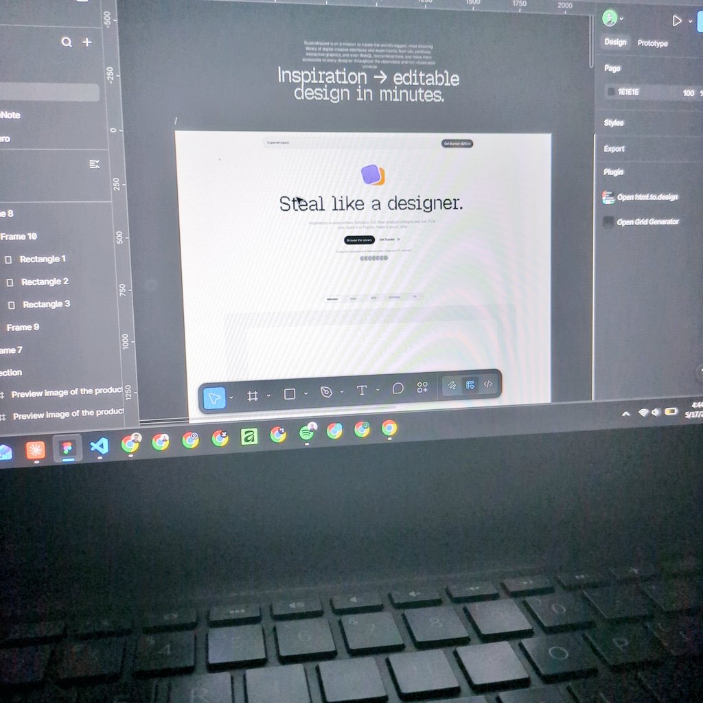
I've seen some of the craziest and best design works on the internet. And I want to have them all on supershipped.com.
From graphic arts and posters to design portfolios, UI/UX, microinteractions, motion design, landing pages, mobile apps, operating systems, product launches, show reels, and interactive novels, across various sources and websites.
I have 6 folders of Chrome bookmarks all worth 9-10 years of binge browsing for inspiration.
I keep visiting most of them, only to realize they change a lot over the years.
Sometimes there was a really good inspiration design I liked, and now it's lost to the void, forever.
Design inspiration that I, or anyone else could have used.
That's the main reason why I'm building Supershipped.

I have a new direction for Supershipped.
My goal is to make it the biggest design inspiration library in the observable universe.
supershipped.com
1
5
151

Jun 12
This tooltip component is built using GSAP in Webflow. Its a basic staggered letter-by-letter opacity hover interaction. Super simple.
Want to see the full microinteractions library?
Drop a comment below or click the link our bio to grab it!
#webdesign #uidesign #gsapanimation
31
Add this simple command to any agentic agent.
npx skills add iAmVishal16/swiftui-microinteractions
1
49
Use my free skill, and get your agent to create this beautiful bouncy hold button that floods and pops a checkmark, by just typing:
/swiftui-microinteractions bouncy hold button that floods and pops a checkmark
How to install my free skill 👇🏽
1
9
456
Here is the simple prompt:
/swiftui-microinteractions Create an Apple default bottom-sheet signature demo: a dimmed 'signature' SF Symbol auto-loops the .drawOn pen trace plus Clear & Done
Install Skill using:
npx skills add iAmVishal16/swiftui-microinteractions
1
72

Jun 8
Designers, here's a quick look at the new Siri AI design in a lenticular lens✨
Vertical or horizontal, which do you prefer?
Built with @ClaudeDevs
#WWDC26 #buildinpublic #claude #UIUX #microInteractions #animation
3
619

truly a wonderful site for referencing dope app patterns and microinteractions


1
10
4,183
Jun 7
Lenticular button built with Claude Code.
This interaction moves through multiple visual states rather than simply flipping between two images.
The arrow gradually shifts in both direction and colour as it transitions, reinforcing the sense of motion between states.
@ClaudeDevs #buildinpublic #Claude #UIUX #MicroInteractions #animation
2
2
370

Jun 5
I always avoided trimming in Screen Studio. Took me a while to figure out why: the UX makes you feel like the trimmed parts are gone forever. No sense of how much you cut or where.
In the alternative I'm building, fixing this is a top priority. Trimming should feel safe and reversible.
WDYT makes trimming feel better — clearer UX or better microinteractions?
#FlutterDev
#buildinpublic
#UX
1
1
3
309

Jun 5
Here's how to create your Netflix style personal portfolio website with AI.
Use this prompt: Design a cinematic personal portfolio website inspired by the visual language of Netflix, but reimagined with a futuristic 3D aesthetic. Use a dark luxury interface with immersive depth, glassmorphism, floating 3D cards, dynamic lighting, smooth parallax scrolling, animated gradients, holographic effects, and ultra-premium microinteractions. The homepage should feature a massive hero section with a bold personal brand statement, followed by Netflix-style horizontal content rows showcasing projects, case studies, skills, achievements, testimonials, and career milestones as interactive 3D tiles that expand into rich full-screen experiences on hover or click. Include cinematic transitions, AI-inspired visuals, subtle motion graphics, realistic shadows, glowing accents, and visually striking typography. Make every section feel highly engaging, viral, attention-grabbing, and designed to maximize the wow factor, while maintaining excellent usability, responsiveness, and a polished modern luxury aesthetic suitable for a top-tier creator, entrepreneur, or tech professional. Check the attached image of Netflix website for design inspiration.
Add your information in your prompt to create the portfolio website customised for you.
I've created this with Replit, but you can create it with other AI website builder tools and AI models/LLMs.
4
1
11
1,173


Jun 2
If you had to pick one single thing that makes a Framer template stand out — what would it be?
Typography? Microinteractions? The grid system?
Curious what you notice first.
#framer
3
51
Here is the simple prompt:
/swiftui-microinteractions bottom-left iOS 26 glass capsule with 3 icons that morphs the add-folder icon out into a tinted-red delete circle with rubber-band metaball physics, tap the circle to morph back
1
2
189