


ALT box-shadow: 0 1px 2px color-mix(in srgb, transparent 35%, currentColor)
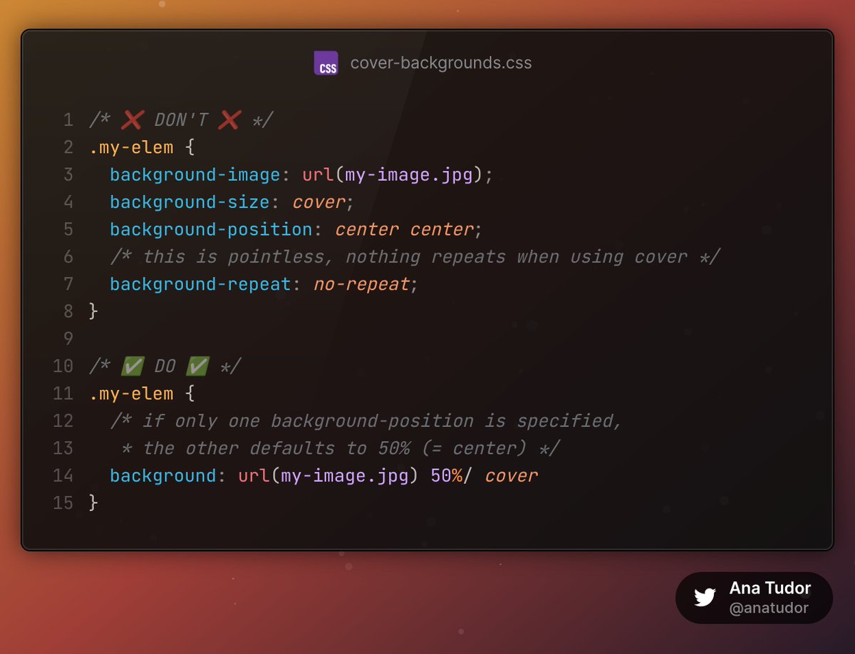
ALT /* ❌ DON'T ❌ */ .my-elem { background-image: url(my-image.jpg); background-size: cover; background-position: center center; /* this is pointless, nothing repeats when using cover */ background-repeat: no-repeat; } /* ✅ DO ✅ */ .my-elem { /* if only one background-position is specified, * the other defaults to 50% (= center) */ background: url(my-image.jpg) 50%/ cover }
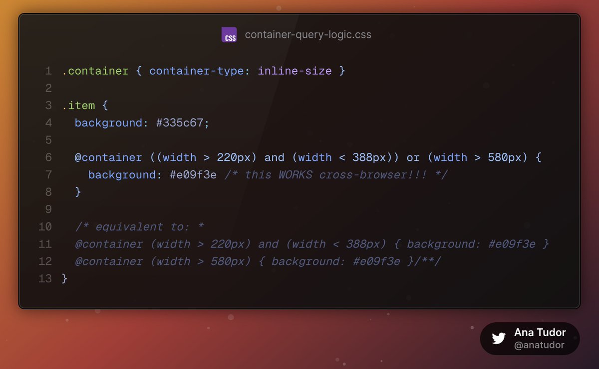
ALT .container { container-type: inline-size } .item { background: #335c67; @container ((width > 220px) and (width < 388px)) or (width > 580px) { background: #e09f3e /* this WORKS cross-browser!!! */ } /* equivalent to: * @container (width > 220px) and (width < 388px) { background: #e09f3e } @container (width > 580px) { background: #e09f3e }/**/ }
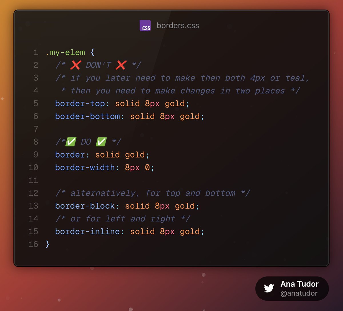
ALT ``` .my-elem { /* ❌ DON'T ❌ */ /* if you later need to make then both 4px or teal, * then you need to make changes in two places */ border-top: solid 8px gold; border-bottom: solid 8px gold; /*✅ DO ✅ */ border: solid gold; border-width: 8px 0; /* alternatively, for top and bottom */ border-block: solid 8px gold; /* or for left and right */ border-inline: solid 8px gold; } ```
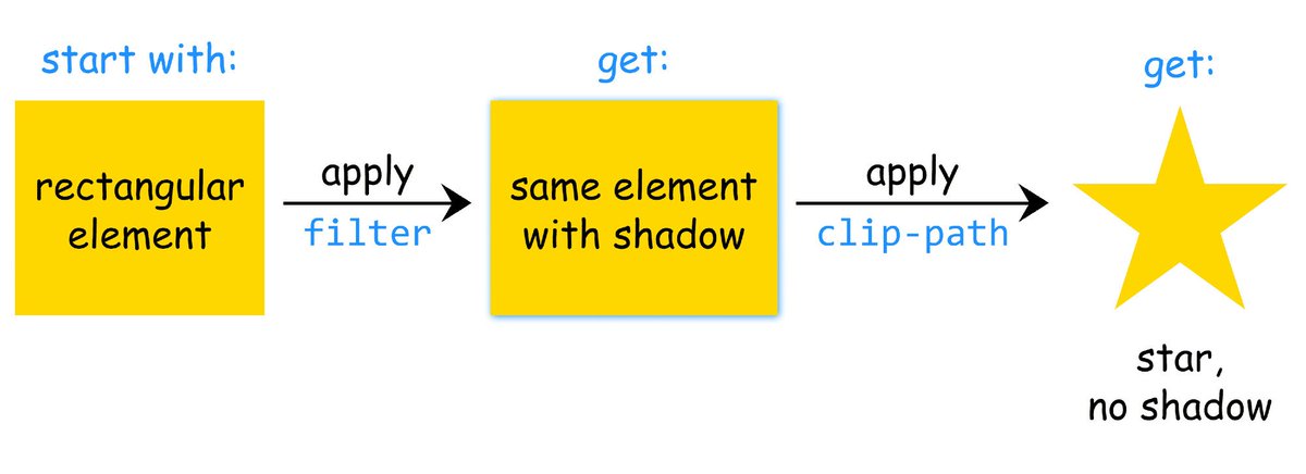
ALT Diagram of how browsers apply filter and clip-path when they’re set on the same element. First the drop-shadow() filter is applied on the initial rectangular box, then the element with drop-shadow() is clipped, cutting out the drop-shadow() too.
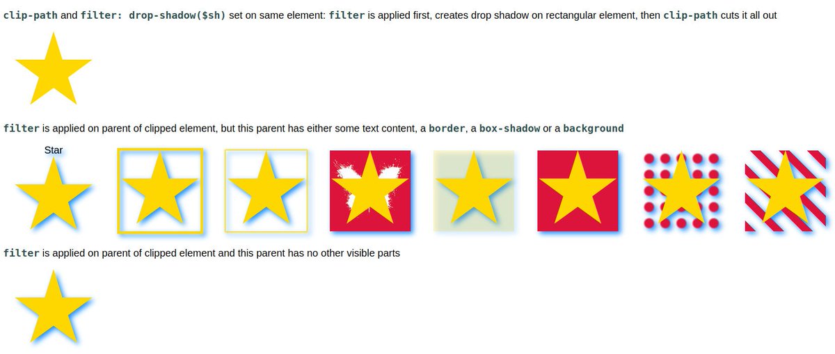
ALT Screenshot of the linked demo showing how applying the filter on the parent of the clipped (pseudo-)element can solve the problem if this parent has no other visible parts (text, borders, backgrounds, shadows).

ALT Old CSS ``` .my-elem { animation: glow 5s ease-in-out infinite } /* repeating most of the shadow so many times */ @keyframes glow { 0% { text-shadow: 0 0 5em red /* hsl( 0 100% 50%) */ } 16.7% { text-shadow: 0 0 1em yellow /* hsl( 60 100% 50%) */ } 33.3% { text-shadow: 0 0 5em lime /* hsl(120 100% 50%) */ } 50% { text-shadow: 0 0 1em cyan /* hsl(180 100% 50%) */ } 66.7% { text-shadow: 0 0 5em blue /* hsl(240 100% 50%) */ } 83.3% { text-shadow: 0 0 1em magenta/* hsl(300 100% 50%) */ } 100% { text-shadow: 0 0 5em red /* hsl(360 100% 50%) */ } } ``` New CSS ``` @property --hue { syntax: '<angle>'; initial-value: 0deg; inherits: false } .my-elem { /* no repetition */ text-shadow: 0 1px calc(3em 2em*cos(var(--hue))) hsl(var(--hue) 100% 50%); animation: hue 5s linear infinite } @keyframes hue { to { --hue: 1turn } } ```
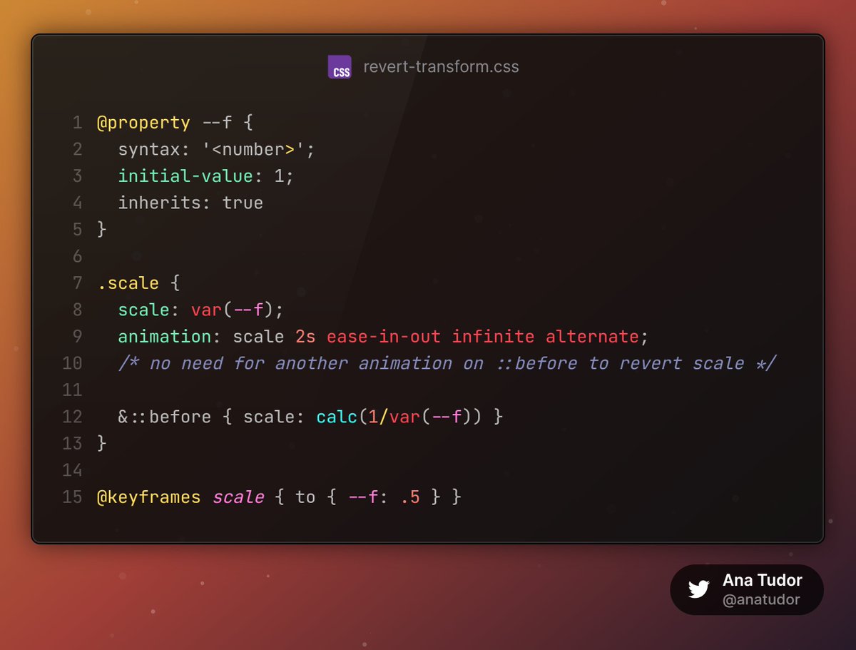
ALT ``` @property --f { syntax: '<number>'; initial-value: 1; inherits: true } .scale { scale: var(--f); animation: scale 2s ease-in-out infinite alternate; /* no need for another animation on ::before to revert scale */ &::before { scale: calc(1/var(--f)) } } @keyframes scale { to { --f: .5 } } ```

ALT ``` .mytext { /* 🚫 DON'T */ text-shadow: 2px 2px 0 black, -2px -2px 0 black, -2px 2px 0 black, 2px -2px 0 black, 2px 0 0 black, -2px 0 0 black, 0 2px 0 black, 0 -2px 0 black; } .mytext { /* ✅ DO */ -webkit-text-stroke: #000 4px; paint-order: stroke fill } ```
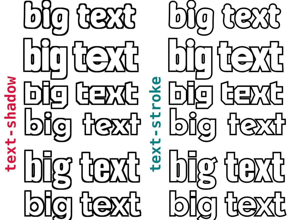
ALT Screenshot showing the same text with the DON'T (text-shadow emulating outlines) vs. the DO (paint-order to fix inner strokes mess) tactic. The text-shadow method comes with corner issues and angled lines getting thickened.
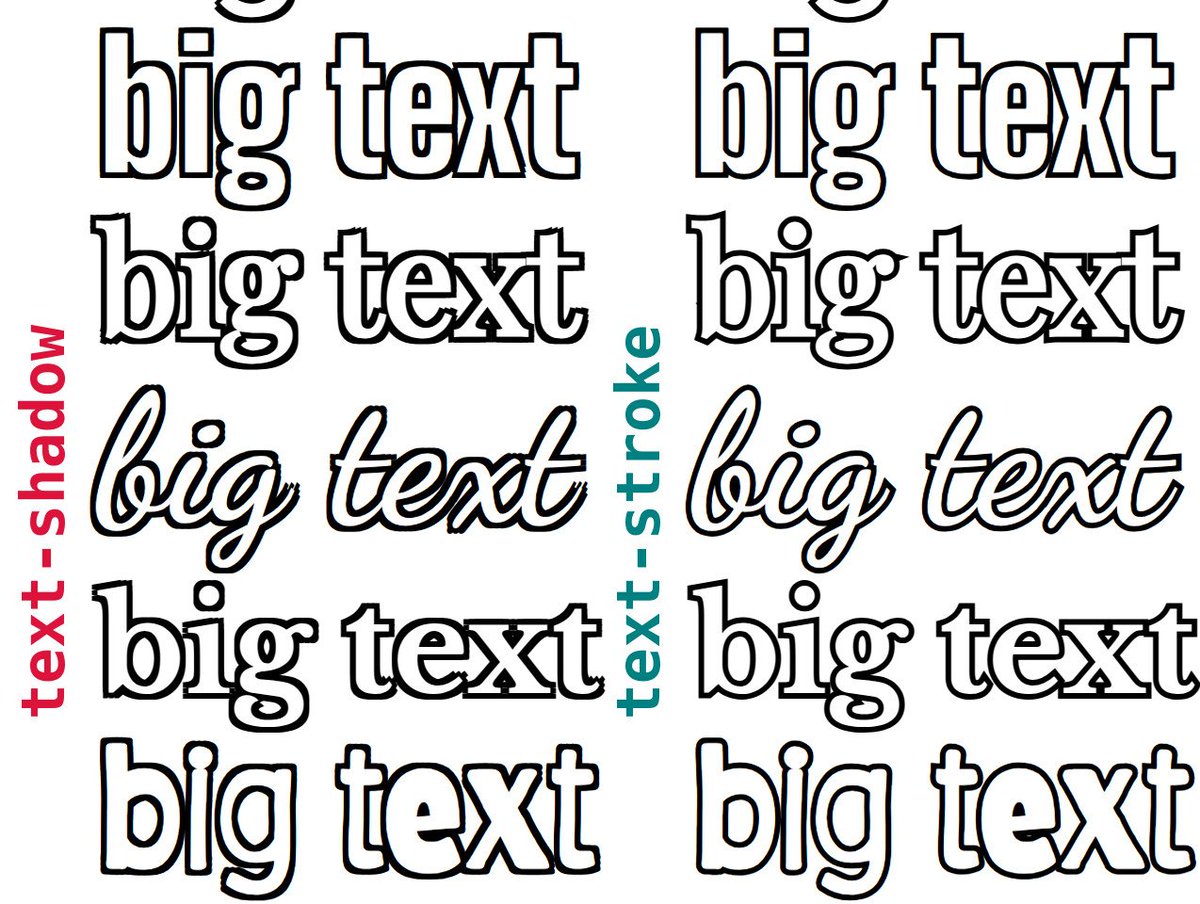
ALT Screenshot showing the same text with the DON'T (text-shadow emulating outlines) vs. the DO (paint-order to fix inner strokes mess) tactic. The text-shadow method comes with corner issues and angled lines getting thickened.
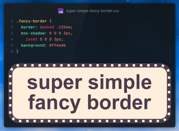
ALT The code and the live result. A dashed border framed by inner and outer box-shadows, all on top of a background is all that's needed for the effect.
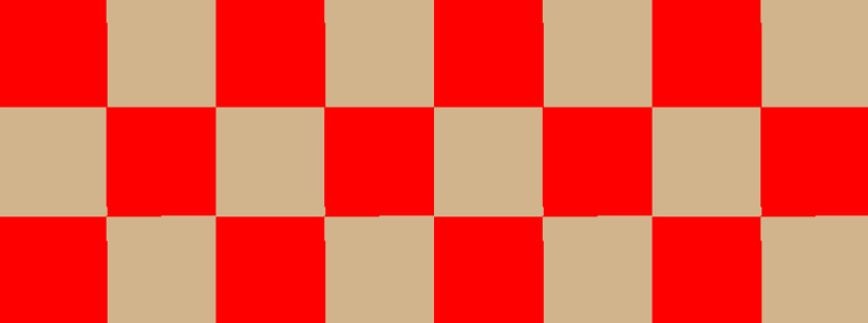
ALT Ugly (1px misalignment issues) checkerboard edges.
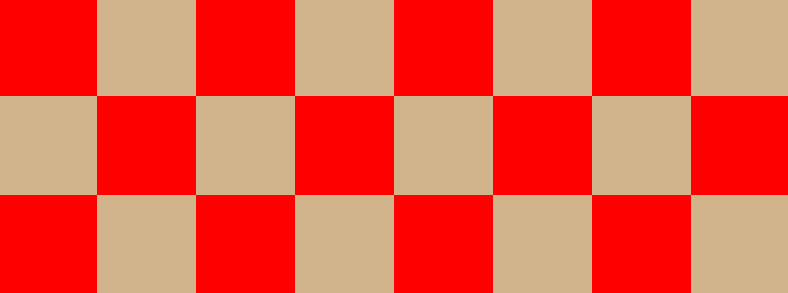
ALT Perfect checkerbox edges when every square is an integer number of pixels.
ALT Code from linked CodePen demo.
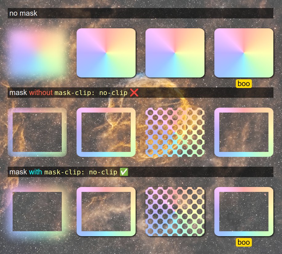
ALT Screenshot of the linked demo. Shows 4 examples in 4 cases: no mask, mask without mask-clip: no-clip and mask with mask-clip: no-clip. In the first case, the blur resulting from a filter, box-shadow and a pseudo can be seen outside the element's border-box. In the second case, we have an area inside the element masked out and all of the above that's outside the element's border-box is cut out too.In the third case, we have an area inside an element, but the blur, box-shadow and pseudo are still visible outside the element's border-box.
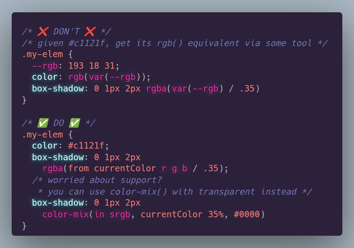
ALT The two options for getting a semitransparent version of currentColor: box-shadow: 0 1px 2px rgba(from currentColor r g b / .35); box-shadow: 0 1px 2px color-mix(in srgb, currentColor 35%, #0000);
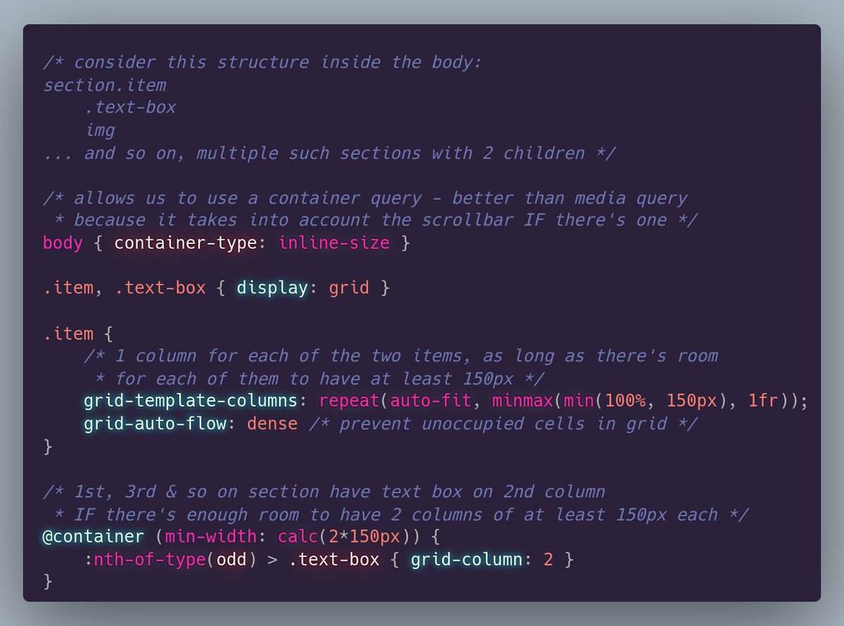
ALT /* consider this structure inside the body: section.item .text-box img ... and so on, multiple such sections with 2 children */ /* allows us to use a container query - better than media query * because it takes into account the scrollbar IF there's one */ body { container-type: inline-size } .item, .text-box { display: grid } .item { /* 1 column for each of the two items, as long as there's room * for each of them to have at least 150px */ grid-template-columns: repeat(auto-fit, minmax(min(100%, 150px), 1fr)); grid-auto-flow: dense /* prevent unoccupied cells in grid */ } /* 1st, 3rd & so on section have text box on 2nd column * IF there's enough room to have 2 columns of at least 150px each */ @container (min-width: calc(2*150px)) { :nth-of-type(odd) > .text-box { grid-column: 2 } }
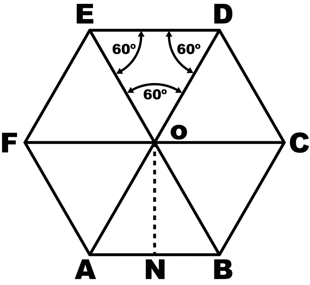
ALT Regular hexagon with circumradii drawn to all its vertices. This splits it into 6 equilateral triangles and we can see the box that tightly fits this regular hexagon has the same aspect ratio as an equilateral triangle, as it fits two equilateral triangle edges along its width and two equilateral triangle heights along its height.

ALT CSS to create a regular hexagon. ``` .regular-hexagon { width: var(--d, 90vmin); /* hex diagonal = twice hex edge length */ aspect-ratio: 1/ sin(60deg); background: hotpink; /* just to make it visible */ clip-path: polygon(25% 0 /* 1st point: top left */, 75% 0 /* 2nd point: top right */, 100% 50% /* 3rd point: middle right */, 75% 100% /* 4th point: bottom right */, 25% 100% /* 5th point: bottom left */, 0 50% /* 6th point: middle left */) } ```
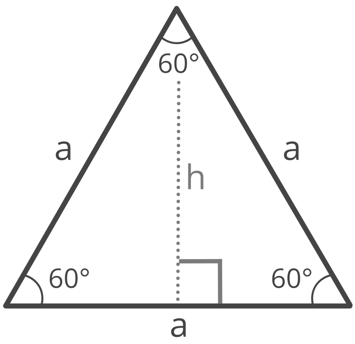
ALT Equilateral triangle of edge length a. All its angles are equal to 60°. A height is also drawn from the top vertex onto the horizontal base. This splits the equilateral triangle into two congruent right triangles, where this height is a cathetus opposing a 60° angle.
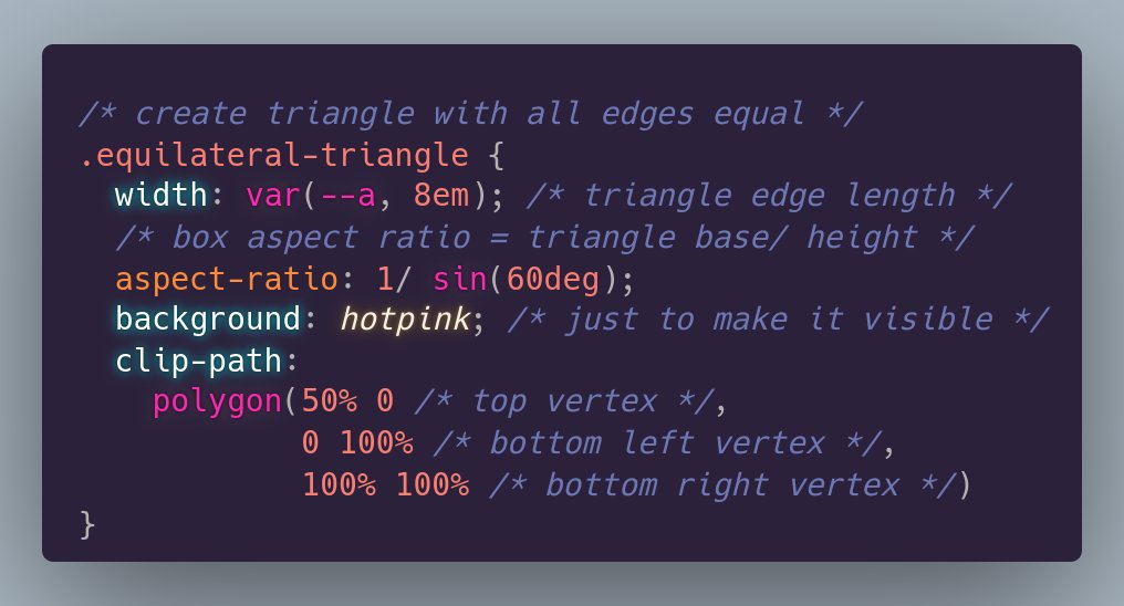
ALT CSS to create a triangle with all edges equal: ``` .equilateral-triangle { width: var(--a, 8em); /* triangle edge length */ /* box aspect ratio = triangle base/ height */ aspect-ratio: 1/ sin(60deg); background: hotpink; /* just to make it visible */ clip-path: polygon(50% 0 /* top vertex */, 0 100% /* bottom left vertex */, 100% 100% /* bottom right vertex */) } ```
ALT Equilateral triangle of edge length a. All its angles are equal to 60°. A height is also drawn from the top vertex onto the horizontal base. This splits the equilateral triangle into two congruent right triangles, where this height is a cathetus opposing a 60° angle.
ALT CSS to create a triangle with all edges equal: ``` .equilateral-triangle { width: var(--a, 8em); /* triangle edge length */ /* box aspect ratio = triangle base/ height */ aspect-ratio: 1/ sin(60deg); background: hotpink; /* just to make it visible */ clip-path: polygon(50% 0 /* top vertex */, 0 100% /* bottom left vertex */, 100% 100% /* bottom right vertex */) } ```
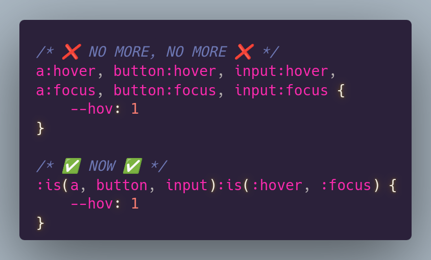
ALT /* ❌ NO MORE, NO MORE ❌ */ a:hover, button:hover, input:hover, a:focus, button:focus, input:focus { --hov: 1 } /* ✅ NOW ✅ */ :is(a, button, input):is(:hover, :focus) { --hov: 1 }