
Jun 11
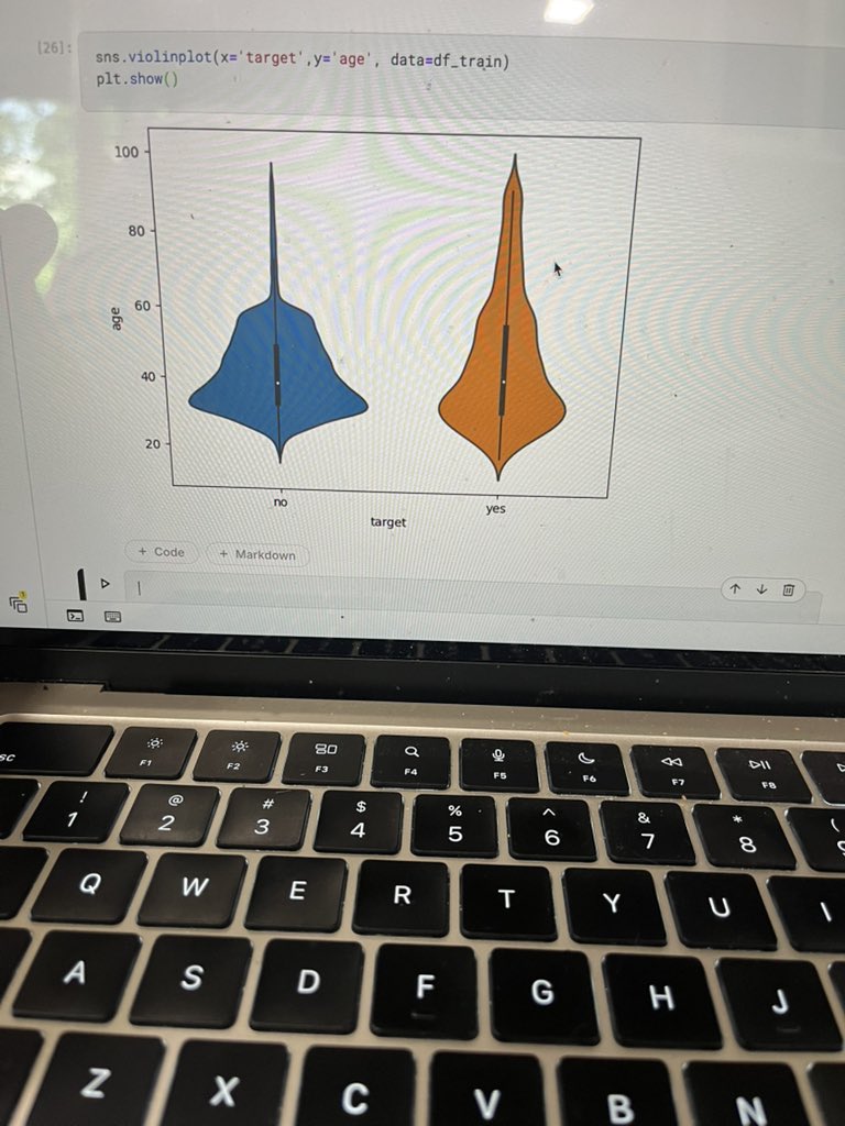
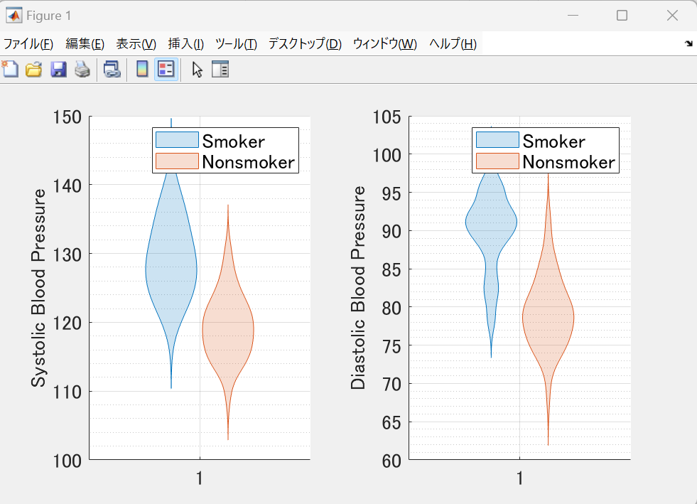
No sé si es que estoy quemada por el estudio pero yo veo claramente un gráfico tipo violinplot.

107

MATLAB 2026aで追加された raincloudplot 関数を使ってみました。
この関数は、violinplotとswarmchartを組み合わせて表示できます。デフォルトでは横向きですが、縦向きにもすることができました😀
1
11
1,237


連続変数はdistplot
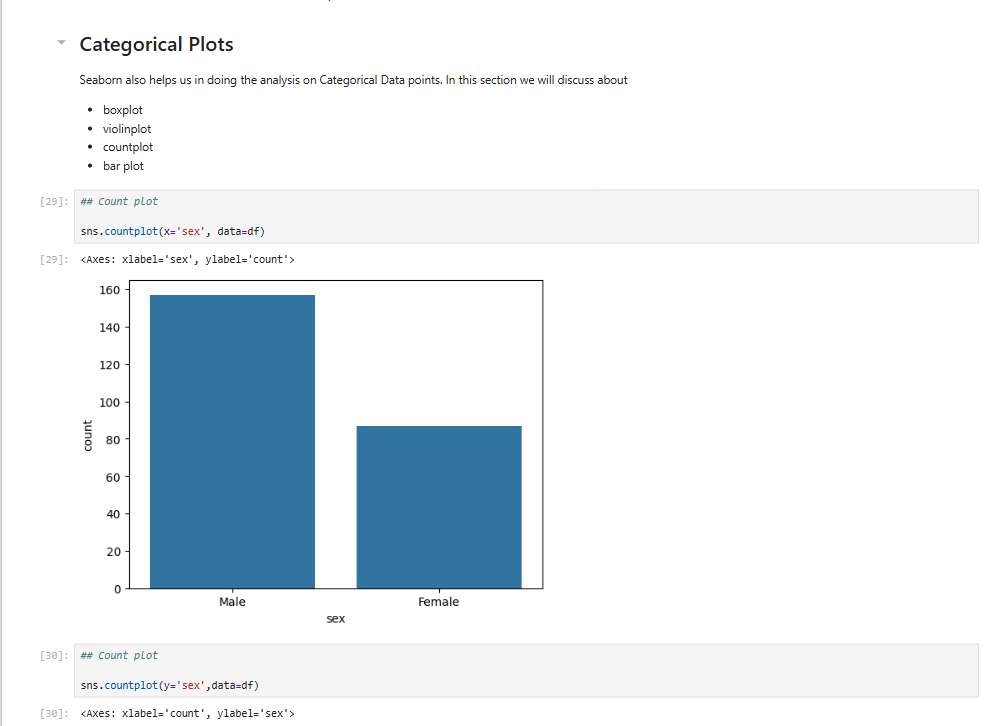
カテゴリ変数はcountplot
分布を見たい時はhistplotまたはviolinplot
探索的データ分析のやり方のコツをつかみ始めました
1
4
85

Feb 17
MATLABの公式violinplotは便利なんだけど、欲を言えばkdeとかksdensityみたいにカーネル密度推定の評価点とかバンド幅を設定したり、非負のサポートを入れられるようにしてほしい。直接渡す方式だと描画の自由度がガクッと落ちるし
2
343

Jan 14
Day 23/100 - Advanced visualization using matplotlib and seaborn.
I explored seaborn's plot like violinplot, stripplot using the CovidData from kaggle.
#machinelearning #100daysofcode


2
7
61

4 Nov 2025
#TidyTuesday 📊 Visualizing the Flint water crisis with {gghalves}. Half boxplot Half violinplot Half dot plot. #DataViz
Data: @MichiganEGLE @virginia_tech
Full Code 🔗 tinyurl.com/tidy-flint-h2o
Made with #rstats #ggplot2 #gghalves
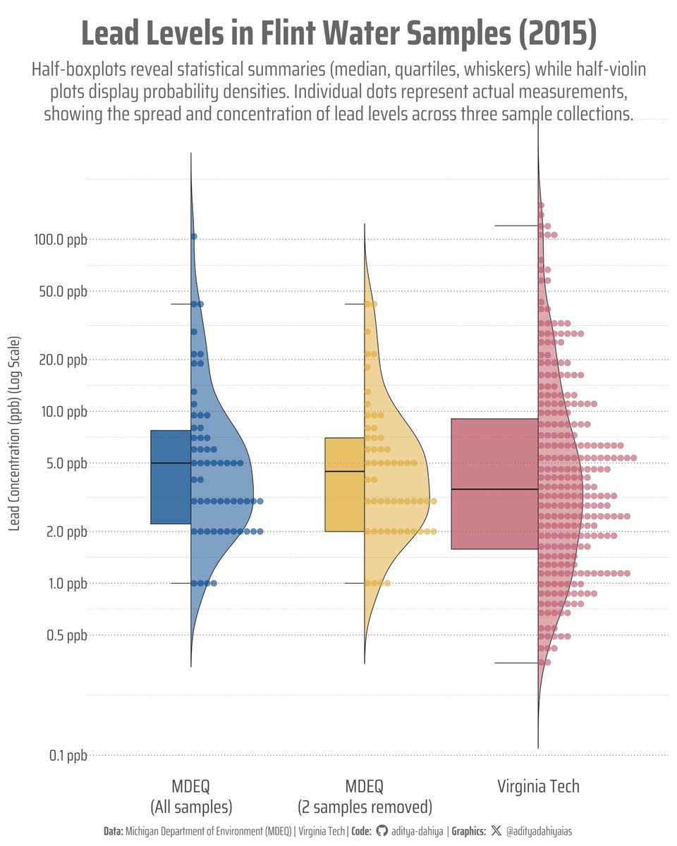
ALT This visualization compares lead concentrations across three water sample collections from Flint, Michigan (2015). The y-axis shows lead levels in parts per billion (ppb) on a logarithmic scale. Each panel combines a half-boxplot (left) displaying the median, quartiles, and whiskers (range excluding outliers), with a half-violin plot (right) showing the probability density. Individual measurements appear as colored dots. The MDEQ dataset with all samples includes two high outliers (104 and 58 ppb) that were controversially removed in the second MDEQ analysis. Virginia Tech's citizen science project collected 271 samples, showing higher variability and maximum lead levels reaching 158 ppb.
1
3
10
760

30 Sep 2025
🧵 Day 48: Seaborn Categorical Plots 📊
✅ Learned all types of categorical plots
✅ Covered: barplot, countplot, boxplot, violinplot, stripplot, swarmplot
✅ Understood use cases & comparisons for categorical data
#100DaysOfCode #Seaborn #Python #DataScience #Day48

9
64

18 Aug 2025
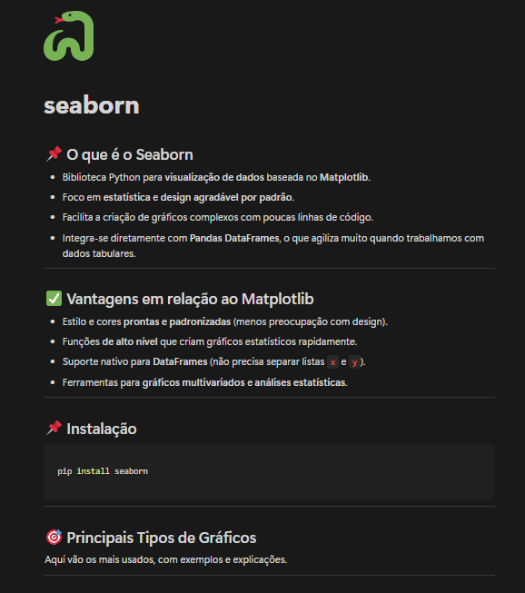
🎨 Seaborn: visualização estatística em Python
O Seaborn é uma biblioteca de visualização baseada no Matplotlib, mas com foco em gráficos estatísticos bonitos e fáceis de usar.
Ele se integra diretamente com Pandas DataFrames, simplificando muito o trabalho com dados tabulares.
🧠 No resumo visual:
• Gráficos prontos e padronizados (estilo e cores automáticos)
• Funções de alto nível para análises estatísticas
• Suporte nativo para DataFrames
• Gráficos multivariados com poucas linhas de código
📦 Instalação:
pip install seaborn
📌 Principais tipos de gráficos:
- scatterplot() → Relação entre variáveis (dispersão)
- lmplot() → Correlação com linha de regressão
- barplot() → Comparar médias ou somatórios por categoria
- countplot() → Contagem de registros por classe
- boxplot() → Distribuição outliers
- violinplot() → Distribuição densidade
- heatmap() → Mapas de correlação
💡 Dica: use sns.set_theme() para aplicar um estilo global em todos os gráficos automaticamente.
Link para o meu notion de anotações: notion.so/Mapa-de-Estudos-pa…


14 Aug 2025

Da séria série: Dados para dados.
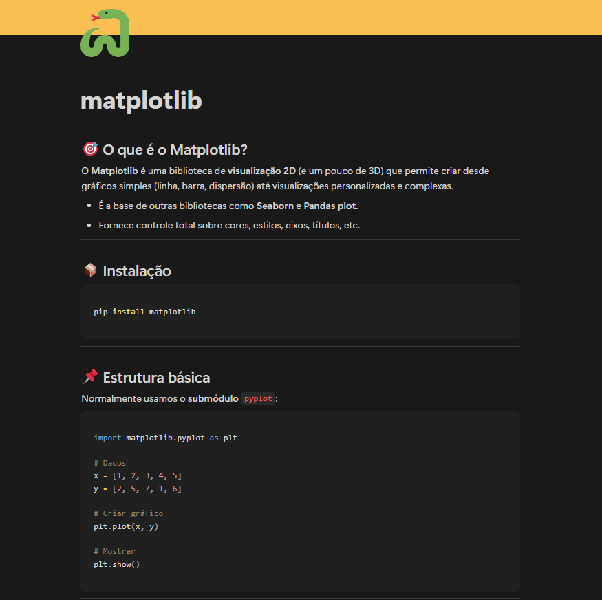
📊 Matplotlib: criando gráficos no Python
O Matplotlib é a biblioteca padrão para visualização de dados em 2D (e também alguns recursos em 3D).
Com ele, você cria de gráficos simples a visualizações totalmente personalizadas — controlando cores, estilos, títulos e muito mais.
🧠 No resumo visual:
• Gráficos de linha, barra, dispersão, pizza e outros
• Personalização de cores, marcadores e estilos
• Suporte a subplots para múltiplos gráficos
• Base de bibliotecas como Seaborn e pandas.DataFrame.plot()
📦 Instalação:
pip install matplotlib
📌 Exemplos rápidos:
Linha → plt.plot(x, y) — ótimo para séries temporais
Barra → plt.bar(categorias, valores) — comparar quantidades
Dispersão → plt.scatter(x, y) — encontrar padrões ou correlações
Pizza → plt.pie(sizes) — mostrar proporções
Subplots → plt.subplot() — vários gráficos lado a lado
💡 Dica: combine com Pandas (df.plot()) para gerar gráficos direto dos seus dados.

1
37
5,036

16 Aug 2025
hola martin, gracias por el comentario. quizás podría haberlo dividido en rangos de edades o elegir otro tipo de gráfico (boxplot, violinplot), pero me gustaba la idea de tener una visión general de la composición del plantel sin perder el detalle a nivel jugador
1
4
187

6 Aug 2025
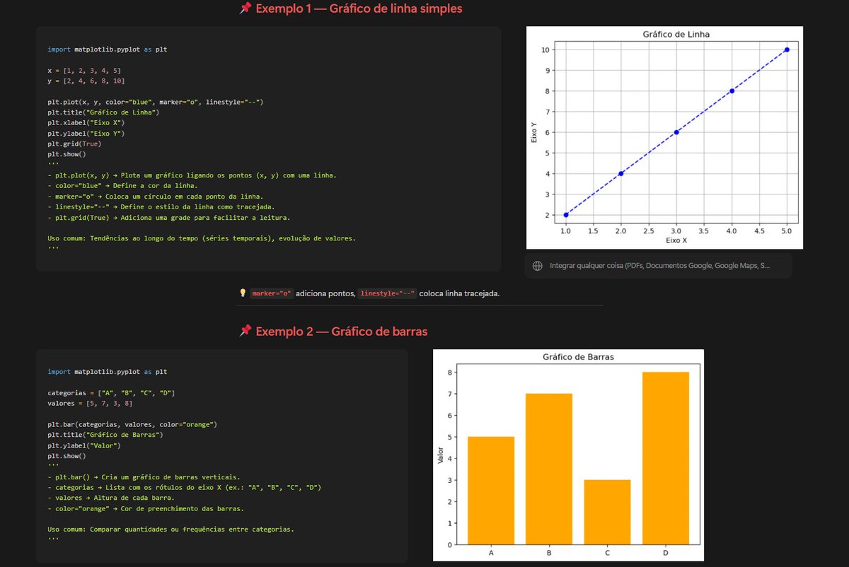
📊 R ile Violin Plot t-Test Uygulaması
Bu görselde, ToothGrowth veri seti kullanılarak OJ (portakal suyu) ve VC (vitamin C) takviyelerinin diş uzunluğu üzerindeki etkileri karşılaştırıldı.
Gelin birlikte bakalım! 🧵
👇
1️⃣ Amaç:
OJ ve VC grupları arasında diş uzunluğu (len) açısından anlamlı bir fark var mı?
🧪 Bunun için t-testi uyguladım.
📉 Görselde violin plot ile dağılım, boxplot ile medyan ve çeyrekler, üstte ise p-değeri gösteriliyor.
2️⃣ Kullanılan R Kodları:
# Gerekli kütüphaneler
library(ggplot2)
library(ggpubr)
# Veriyi yükle
data("ToothGrowth")
# Konsola t-test sonucu t.test(len ~ supp, data = ToothGrowth)
# Violin boxplot t-test etiketi
ggplot(ToothGrowth, aes(x = supp, y = len, fill = supp))
geom_violin(trim = FALSE)
geom_boxplot(width = 0.1, fill = "white")
stat_compare_means(method = "t.test", label.y = 35)
scale_fill_manual(values = c("#00BFC4", "#F44336"))
labs(
title = "Tooth Length by Supplement Type",
x = "Supplement Type",
y = "Tooth Length"
)
theme_minimal()
3️⃣ İstatistiksel Sonuç:
t = 1.915, df = 55.3, p = 0.061
➡️ Bu sonuca göre, %5 anlamlılık düzeyinde gruplar arasında anlamlı bir fark yok.
Ama buraya dikkat! ⚠️
4️⃣ Parametrik test uygun mu?
📌 OJ grubunun dağılımı incelendiğinde normal dağılımdan sapma olduğu görülüyor.
➡️ Bu durumda, doğrudan t-testi yerine non-parametrik bir test (örneğin Mann-Whitney U / Wilcoxon rank-sum test) daha uygun olurdu.
5️⃣ Görselleştirme neden önemli?
Görsel:
🧬 Dağılımın normalden sapıp sapmadığını gösterir
📏 Ortalamalar/medyan farkını daha iyi yansıtır
🧠 t-testi p-değeri tek başına yeterli olmayabilir!
6️⃣ Sonuç:
✅ Bu örnek, veri görselleştirmenin ve doğru test seçiminin ne kadar önemli olduğunu gösteriyor.
🧪 Her p-değerinin arkasında bir varsayım yatar.
🔍 Önce veriye bak, sonra test uygula!
#RStats #ggplot2 #DataScience #İstatistik #tTest #ViolinPlot
8
1,114

4 Aug 2025
✨Day 35 of #100DaysOfCode
Today I compared barplot, countplot, and violinplot in Seaborn.
Loved how violin plots show both distribution and summary stats in one go! Super handy for real-world data. 📊🎻
Which plot type do you prefer for category comparison?
#buildinpublic

3
489

5 Jun 2025
#LSPPDay5
Today’s Learning:
-Introduction to Seaborn
-Pair Plots
-Dist Plots (Histograms with KDE)
-Categorical Plots (Boxplot, Violinplot, Countplot, Bar
Plot)
GitHub: github.com/shkroyas/60-Dayso…
#60DaysOfLearning2025 #LearningWithLeapfrog @lftechnology


2
45


29 Dec 2024
🧬✨ Create beautiful violin plots effortlessly using SRplot – no coding, no scripts, just sleek visualizations in a few clicks. 🚀 Try it now and transform your data today! #ViolinPlot #DataVisualization #NoCodeTools"
1
8
625


9 Nov 2024
Day 30 of #100DaysOfCode 💻
Explored Seaborn's powerful plots today:
Barplot, Boxplot, Violinplot for data comparison
Countplot, Stripplot, Swarmplot for detailed visual insights
Loving the visualizations! 📊🔥
#Python #DataScience #Seaborn

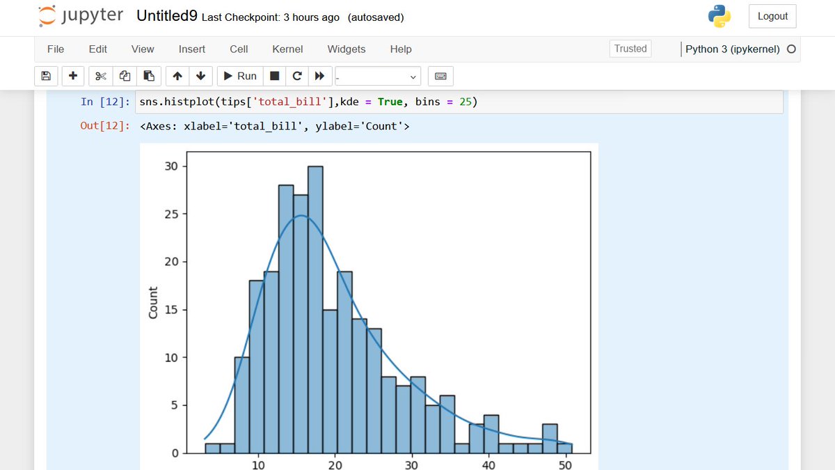
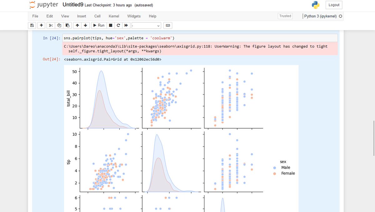
8 Nov 2024

Day 29 of #100DaysOfCode 🎉
🔍 Dived into data visualization with Seaborn today!
Explored:
-Histogram with KDE for 'total_bill'
-Hexbin plot to visualize 'total_bill' vs 'tip'
-Pairplot with hue based on gender
-Rugplot to show data distribution
✨ #DataScience #Python #Seaborn

1
3
994

31 Oct 2024
R2024b から使えるようになった violinplot 関数ですね!🎻
29 Oct 2024

逆張りわい、ずっとmatlabの古いバージョン使ってたけど、この修論ラススパの時期にバイオリンプロットが追加されたと聞いて速攻で最新版に乗り換え
1
9
50
7,687

16 Oct 2024
おっ、Week 1 Winners に選ばれてた!( ̄ー ̄)
jp.mathworks.com/matlabcentr…
今年はネタないな~と思ってたけど、R2024b に入った violinplot のおかげで (u_u)
高木先生も選ばれてます
#MATLAB
6
173