
25 Jul 2024
Unlocking the Power of Data Visualization: Key Insights for Business Growth
#DataVisualization #BusinessGrowth #ActionableInsights #DataReports #RevenueAnalysis #Budgeting #DecisionMaking #VisualizingData #BusinessGoals #DataDriven
3
839

12 May 2024
Refik Anadol: Blurring the Boundaries of Art, Data, and AI
antoninolavela.it/2024/05/re…
@refikanadol #DataArt #AIinArt #DigitalInstallations #MachineLearningArt #ArtTechFusion #QuantumArt #VisualizingData #FutureOfArt #TechEthicsInArt

1
2
32
3,578

1 Mar 2023
🎁 If you would like to take a look at Steve Wexler's book to prepare for the course, you can win a copy here: linkedin.com/posts/aloth_dat…
#DataVisualization #BusinessDashboards #DataAnalysis #DataDriven #VisualizingData #DashboardDesign #DataStorytelling @DataRevelations
3
3
354

16 Jun 2022
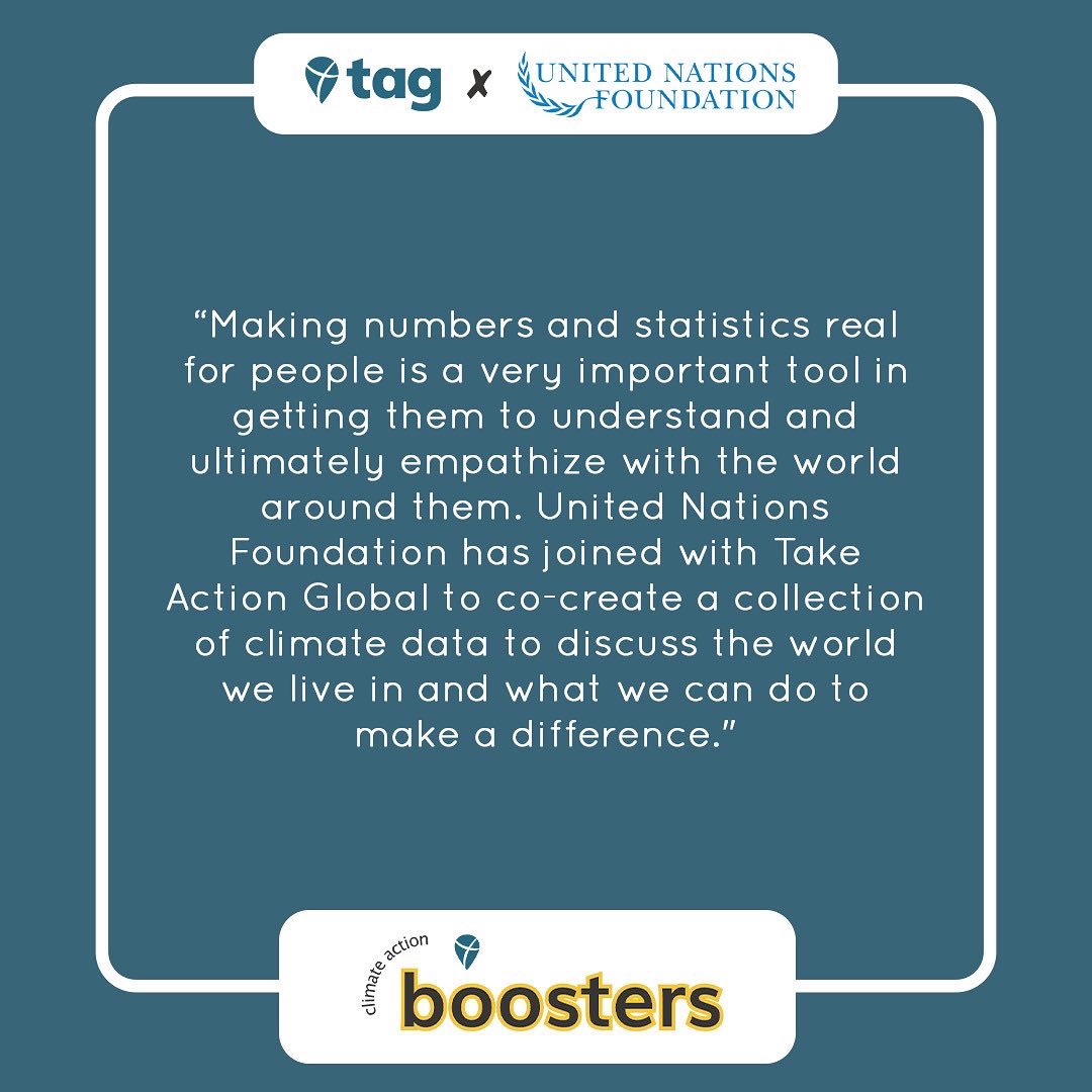
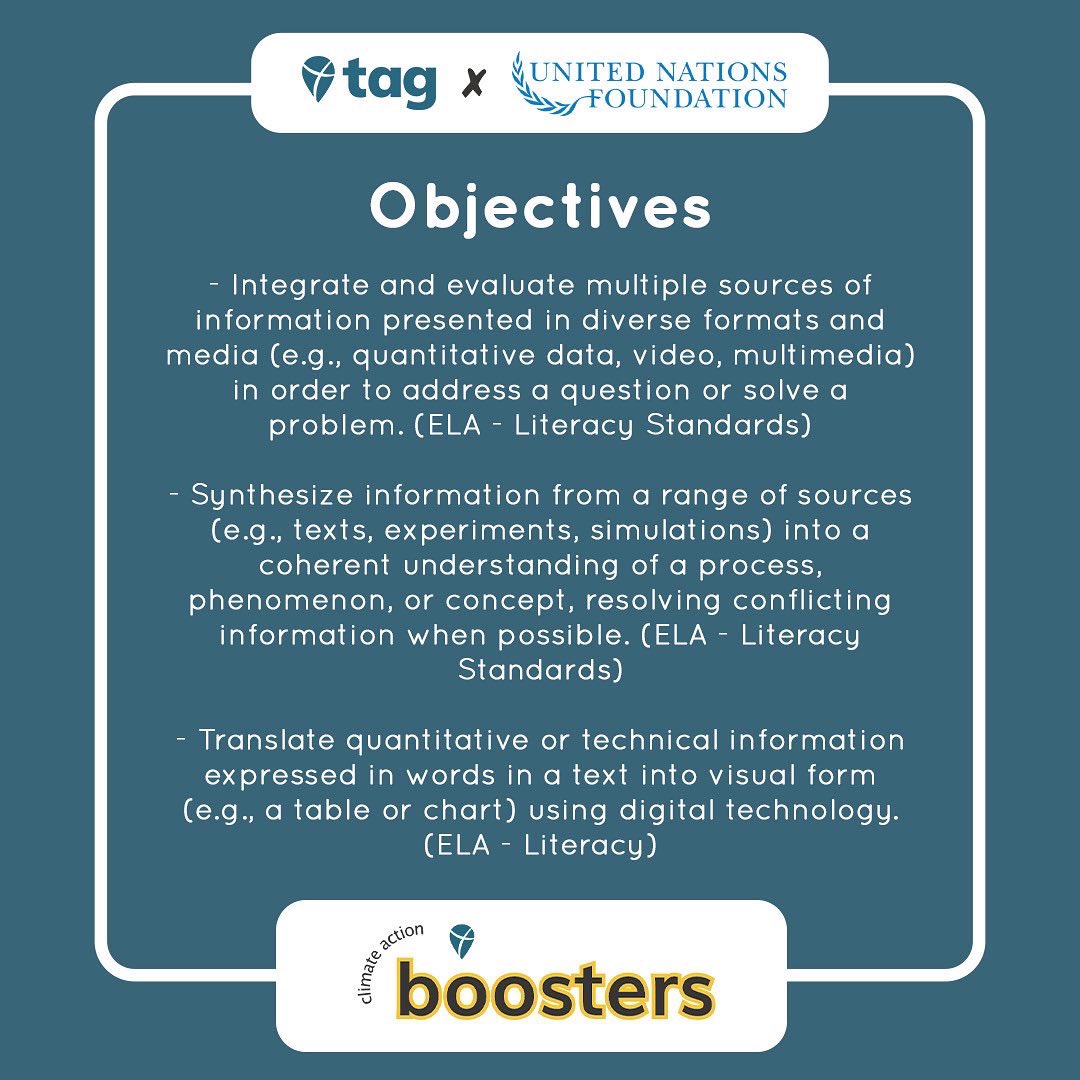
#BoosteroftheMonth @unfoundation has joined with #TakeActionGlobal to co-create a climate action activity for classrooms! Learn more about it
earthproject.org/boosters/vi…
#ClimateActionEdu #TakeActionEdu #VisualizingData

2
6

15 Nov 2021
Kudos to ROM for bringing in the first-ever climate curator. Museums are vital for public communication of complex issues in challenging times. #sciencematters #visualizingdata theglobeandmail.com/canada/a…
1
2

10 Sep 2021
Learn 10 of the best open health and science data repositories. Click here to know: bit.ly/3E3yda8
#fusionchart #visualizingdata #sciencedatarepositories

2

17 Nov 2020
2

Current distraction/focus on illustrating research.📝
🌈Both exploratory, in process, and explanatory visuals.
Current obsession is the brilliant @MonaChalabi 🦚
Wondering who else to follow? #visualizingdata #datajournalism #visualthinking

1
5

11 Mar 2020
Here’s another way to visualize #COVID19 data from @heads0rtai1s . Interesting comparisons!
#coronavirus #DataScience #visualizingdata
10 Mar 2020

An animated #rstats #dataviz view of #COVID19. Wait for it.
Rise pattern of confirmed cases suggests that US might be 10 days behind Italy; Germany & France 8 days behind. Assuming similar spread and reporting standards. Data from @JohnsHopkins.
2
8

8 Nov 2019
Latest @brilliant_labs #bBoard project. Using the noise click and display click along with a #neopixel strip to make a decibel metre. A useful tool in the classroom I would say :) #visualizingdata
1
6
14

28 Sep 2019
Advanced Excel Training in Uganda
Lean with the best in Analyzing & #VisualizingData with #Excel. Develop your skills with #MSExcel which is one of the common tools that data experts depend on to gather, analyze transform & visualize #Data
#HEConsulting
heconsulting.us/advanced-exc…
4
4

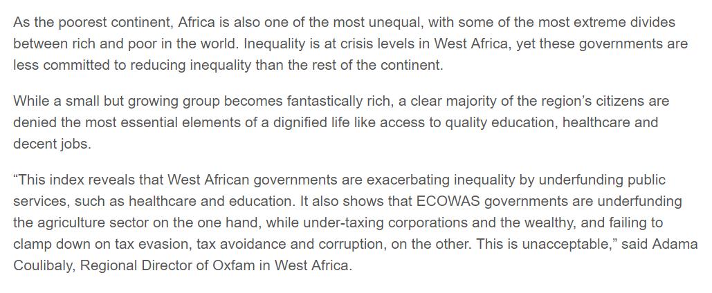
Explore stories on how offshore companies and accounts have been used to strip cash out of 11 West Africa countries with our #WestAfricaLeaks interactive map. bit.ly/2G7ddmJ #VisualizingData #InvestigativeJournalism
9 Jul 2019

New report has found that West African governments are "the least committed" to reducing inequality. Inequality was 1 reason @ICIJorg partnered with @CENOZO_Afrique and journalists in the region to expose secret financial dealings in #westafricaleaks. oxfam.org/en/pressroom/press…
1
6
10

13 Jun 2019
"We're doing this for viewers who have only a few seconds to grasp your message." @1SecondChart #creativeproweek #visualizingdata @CreativeProWeek

2

10 Jun 2019
A peek under the hood at the work we do with the design team at @IBMWatson on #visualizingdata using our core platform, g-speak, to drive 93M pixels in surround. medium.com/design-ibm/visual… #news
4
6

24 May 2019
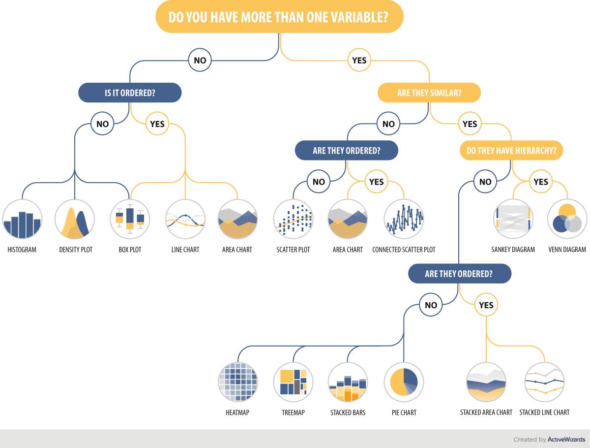
Play your #charts right: #VisualizingData
by @activewizards
#BigData #ArtificialIntelligence #ML #DataScience #Analytics #Tech #Technology #Data #DataAnalytics #Analysis #Infographic #DataScientist #IT
Cc: @kirkdborne @rick345 @davemcclure
1
12
20

20 May 2019
How to make 3D scatter plots with R: scatterplot3d package goo.gl/fb/3xehPY #rstats #visualizingdata
4
3
14 May 2019
2
2

9 Apr 2019
Should "hand draw" be added as a tool to Andy @visualizingdata Kirk's Chartmaker Directory?
50%
Yes!
8%
Sure!
23%
Why not?
19%
Definitively!
26 votes • Final results
1
5 Apr 2019
1
1
11 Mar 2019
How do Data Professionals Spend their Time on Data Science Projects?
by @bobehayes |
Read more at bit.ly/2SNZc5L
#DataScientist #GatheringData #CleaningData #VisualizingData #Analytics #DataAnalyst #RT
Cc: @iainljbrown @abxda @datasciencemsc

9
6