
Joined June 2009
- Tweets 3,633
- Following 824
- Followers 1,531
- Likes 2,610
827 Photos and videos


Pinned Tweet

21 Nov 2022
Redesigned icon picker 🤌 Later I will add support for custom icons
4
34
Apr 10
Nice

supabase-micro a micro-python library that makes it easy to connect microcontrollers to Supabase
1
168

Proud of our team for making this happen 🥲
Many years of work, lots of discussions, and many prototypes painfully taken back to the drawing board.
*of course it isn't just the Chrome team working on this--the web is a huge collaborative effort--but you can't deny that Chrome is leading the charge here and this post represents a ton of our engineering effort, feature championing, and vision.
blog.gitbutler.com/the-great…
2
32
205
11,569
Kasper Mikiewicz retweeted

ummm you can create some obnoxiously cool focus rings with the new HTML-in-Canvas API
70
114
2,361
261,242
Kasper Mikiewicz retweeted

Mar 31
We optimized everything for text.
But forgot about the most natural human interface: Voice.
VoiPi :: A simple way to give your Apps, CLIs, and Agents a voice.
Powered by local TTS engines (OS, browser, Piper) or free providers (Google, Microsoft Edge).

7
12
239
10,902
Kasper Mikiewicz retweeted

Mar 31
Introducing Design System Agents.
Turn your repos, npm packages and docs into an agent that builds prototypes engineering can actually ship.
The Prototype is t̶h̶r̶o̶w̶n̶ ̶a̶w̶a̶y̶ the Product.
61
62
554
111,761

🚨 CRITICAL: Active supply chain attack on axios -- one of npm's most depended-on packages.
The latest axios@1.14.1 now pulls in plain-crypto-js@4.2.1, a package that did not exist before today. This is a live compromise.
This is textbook supply chain installer malware. axios has 100M weekly downloads. Every npm install pulling the latest version is potentially compromised right now.
Socket AI analysis confirms this is malware. plain-crypto-js is an obfuscated dropper/loader that:
• Deobfuscates embedded payloads and operational strings at runtime
• Dynamically loads fs, os, and execSync to evade static analysis
• Executes decoded shell commands
• Stages and copies payload files into OS temp and Windows ProgramData directories
• Deletes and renames artifacts post-execution to destroy forensic evidence
If you use axios, pin your version immediately and audit your lockfiles. Do not upgrade.
541
4,026
16,168
12,403,757
Kasper Mikiewicz retweeted

Mar 29
the world's fastest JSON Schema validator for cold start and compilation.
try today: npm i ata-validator
ata-validator.com/
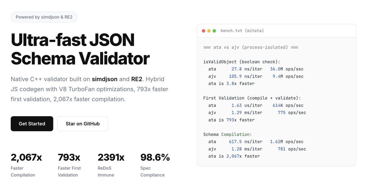
7
38
407
27,967

Kasper Mikiewicz retweeted

Mar 16
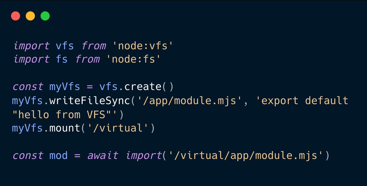
.@nodejs has always been about I/O. Streams, buffers, sockets, files. But there's a gap that has bugged me for years: you can't virtualize the filesystem.
You can't import a module that only exists in memory. You can't bundle assets into a Single Executable without patching half the standard library.
That changes now 👇
51
263
2,566
361,104
Mar 16
I can't wait for my video capture card to arrive! 😁 I'm not sure how much I'll use this project in the future, but tinkering with it is just too fun to abandon. And yes, this is for shiny hunting
Mar 15

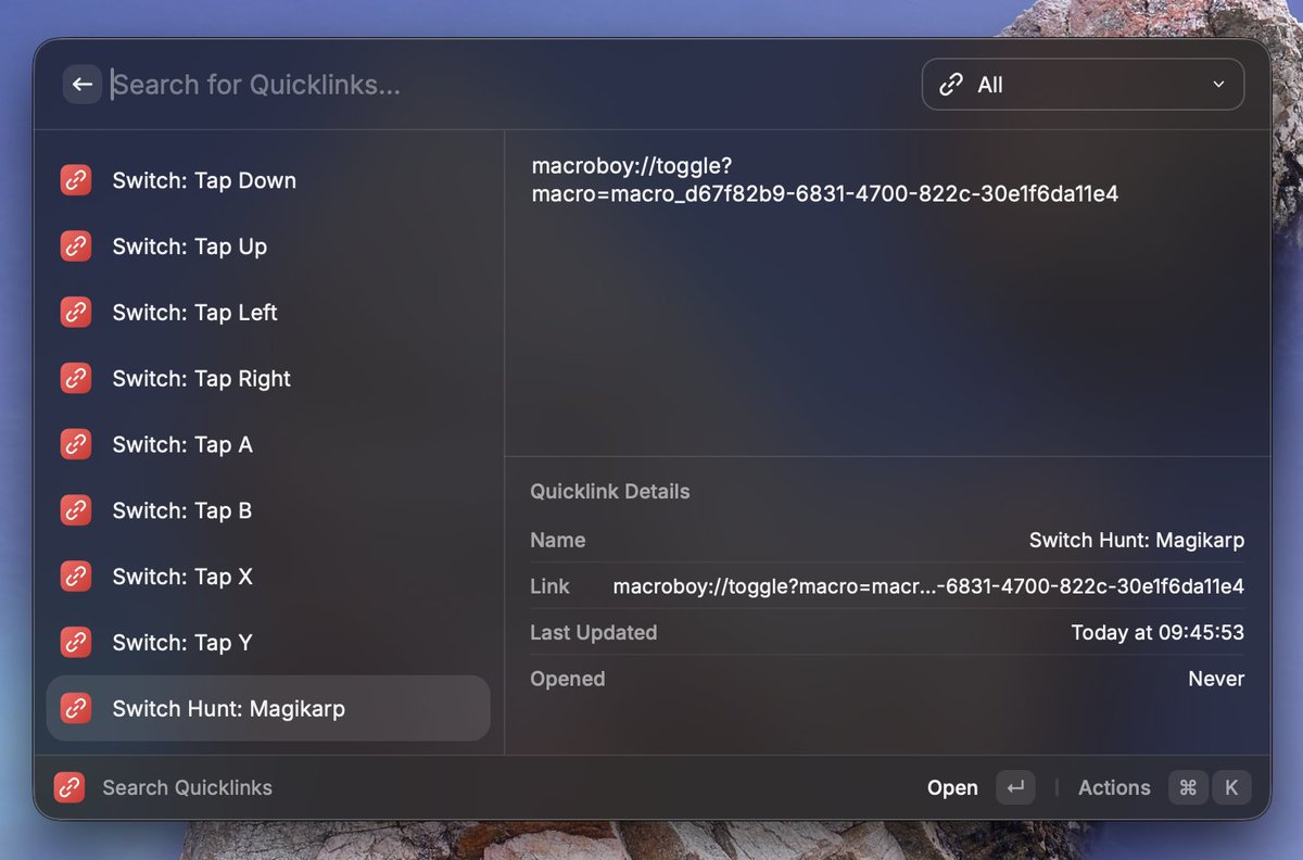
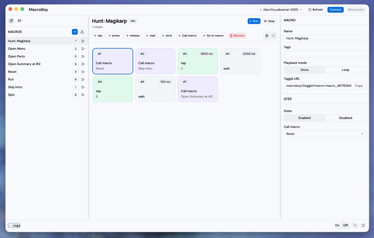
Weekend build: MacroBoy.
Automates Nintendo Switch input with programmable macros, using a desktop app and a ~$10 ESP32 board that emulates a controller.
1
117
Mar 15
Weekend build: MacroBoy.
Automates Nintendo Switch input with programmable macros, using a desktop app and a ~$10 ESP32 board that emulates a controller.
1
2
350
Mar 15
It can call other macros or jump to them, which makes it easy to break large flows into smaller reusable pieces. Fix one macro, and every macro that uses it benefits.
1
85
Mar 15
The project is still in development, but if you don't mind a few rough edges, enjoy!
github.com/Idered/MacroBoy
58
Kasper Mikiewicz retweeted

Mar 13
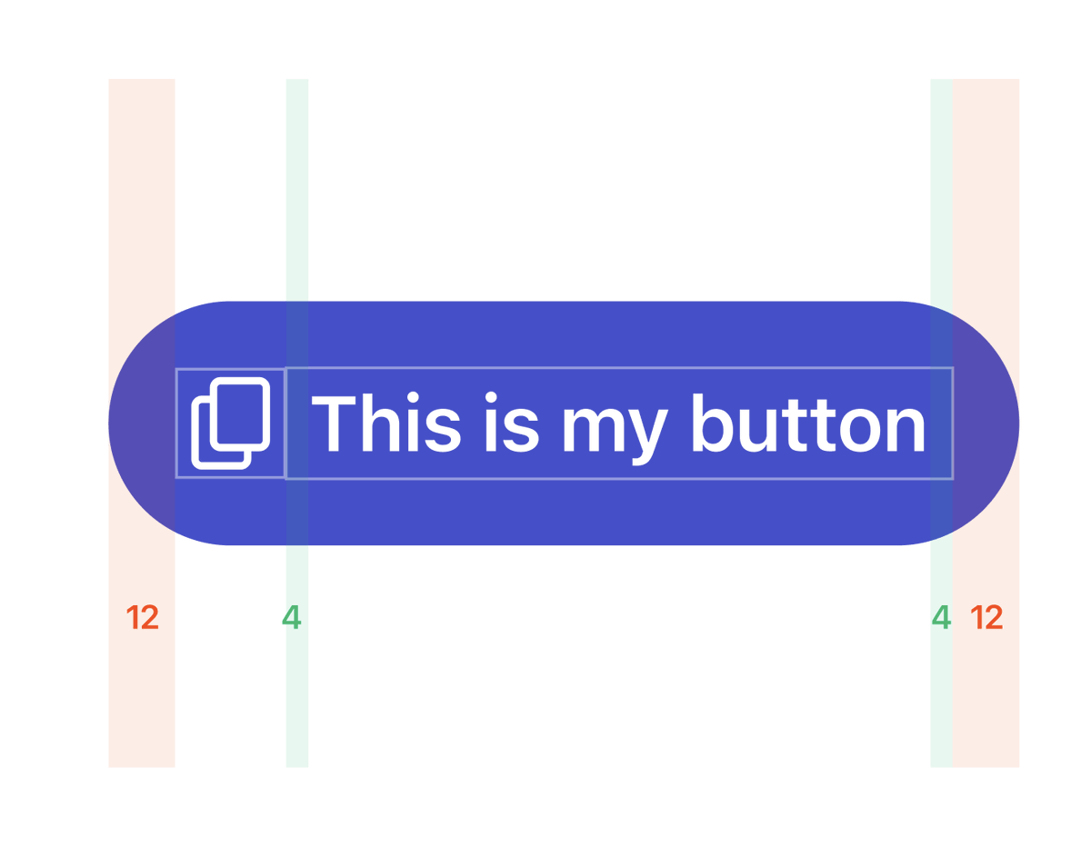
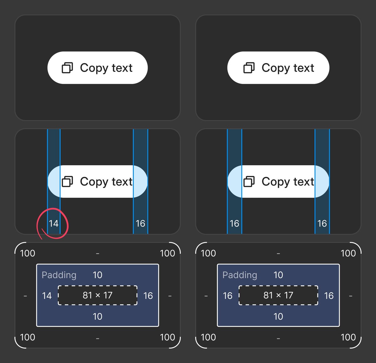
I found that instead of having different paddings depending on having an icon or not (which is annoying to set up) if you put some padding on the actual text inside the button, you get the same result.
If your button has an icon on the left, then the padding is just 12px. But when the padding is compounded with the padding of the text, you get 16px.
This way you don't have to juggle conditional paddings, and this just works

31
51
834
68,567
Kasper Mikiewicz retweeted

Mar 13
💡 Friday Codex tip:
If you are using the Codex app and regularly find yourself copy and pasting text from error messages or plans from other apps into Codex to start a new task, you can use @raycast deeplinks to map it to a hotkey.
25
24
527
92,290
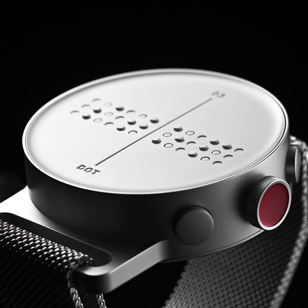
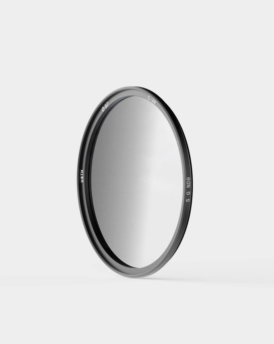
Mar 3
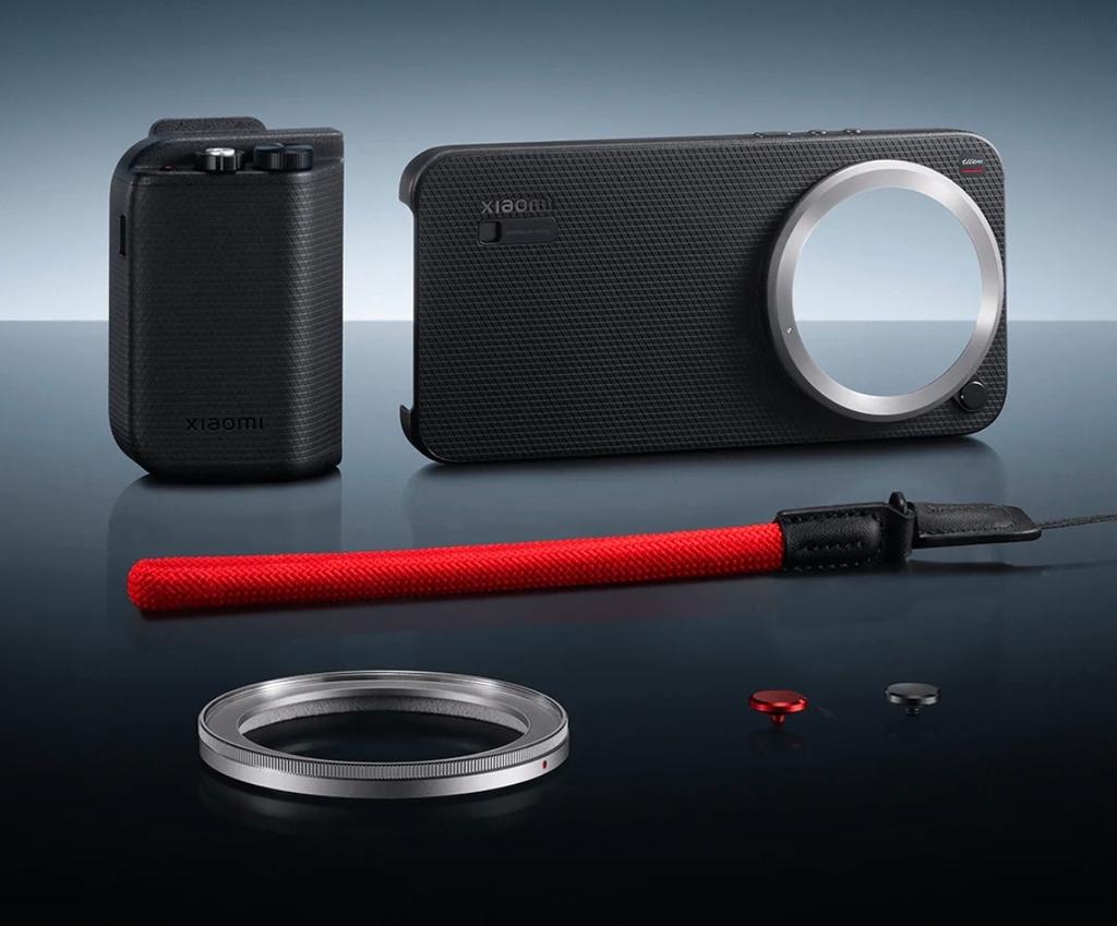
I've picked xiaomi 17 ultra as my next phone and it's possible to attach 67mm lens filter. Any recommendations for nice filters? I found these
3
1
467
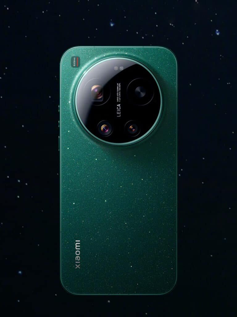
Mar 3
It already makes absolutely stunning photos out of the box but I would love to take them to next level
1
76
Kasper Mikiewicz retweeted

Mar 2
`tabular-nums` should be the default for any number that updates ( timers, counters, prices, percentages, scores, live data etc ).
you can enable this tnum OpenType feature using the CSS property `font-variant-numeric`.
.tabular-nums {
font-variant-numeric: tabular-nums;
}
92
562
8,751
1,184,179