
Joined November 2022
- Tweets 504
- Following 189
- Followers 58
- Likes 1,203
37 Photos and videos


Apr 19
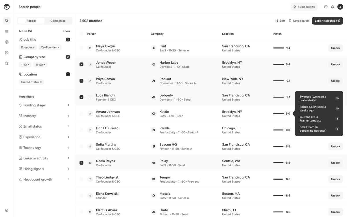
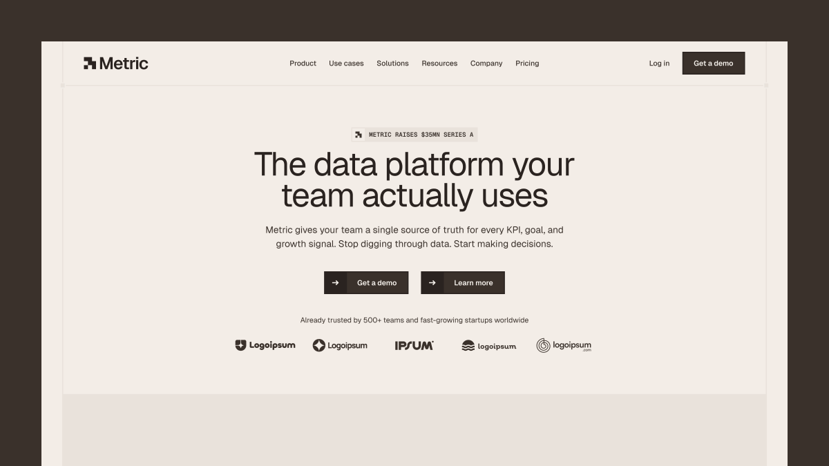
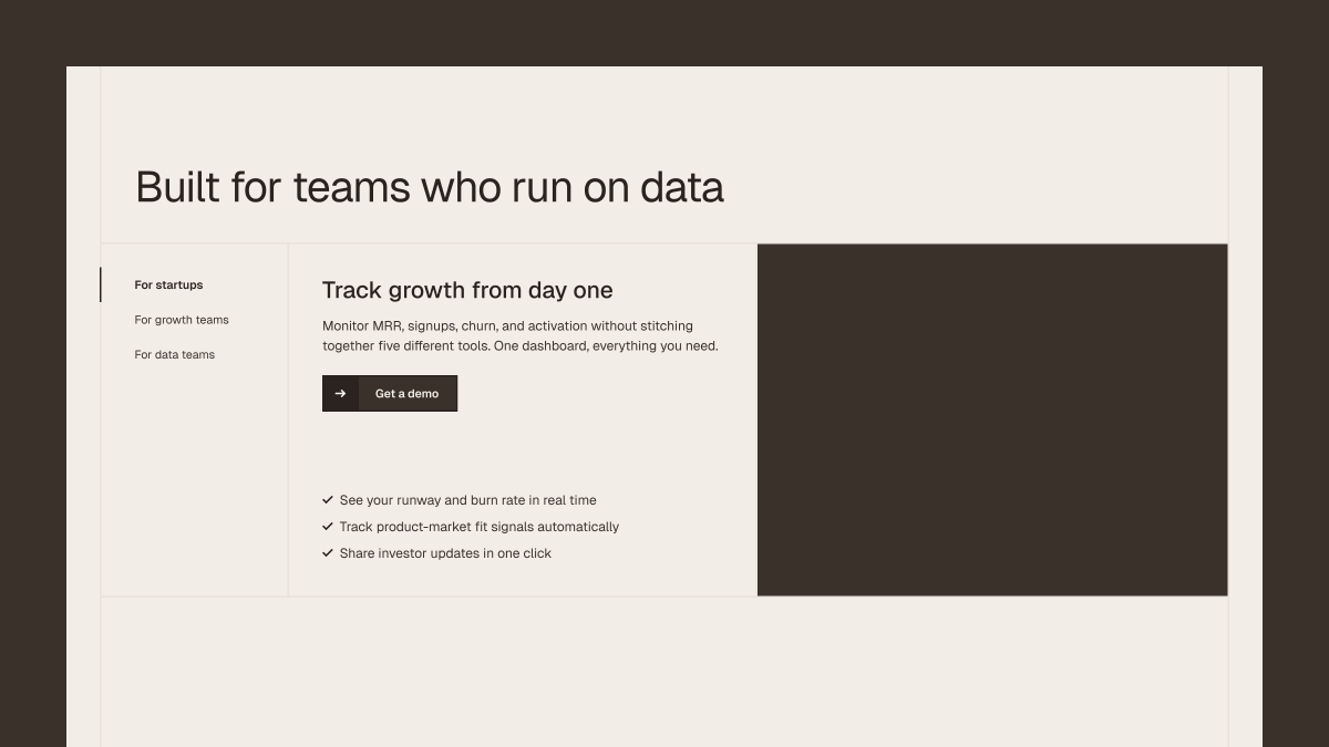
Dashboard wireframe breakdown (steal the stack):
Typography: Figtree. Medium and semibold. 12 and 14px.
Icons: @tabler_io. 16px, 1.2 stroke.
Colors: 5 grays. 333333, 666666, F5F5F5, FAFAFA, FFFFFF.
Company logos: @logoipsum
Good wireframes look boring on purpose.
Bookmark this.
3
171
Mar 23
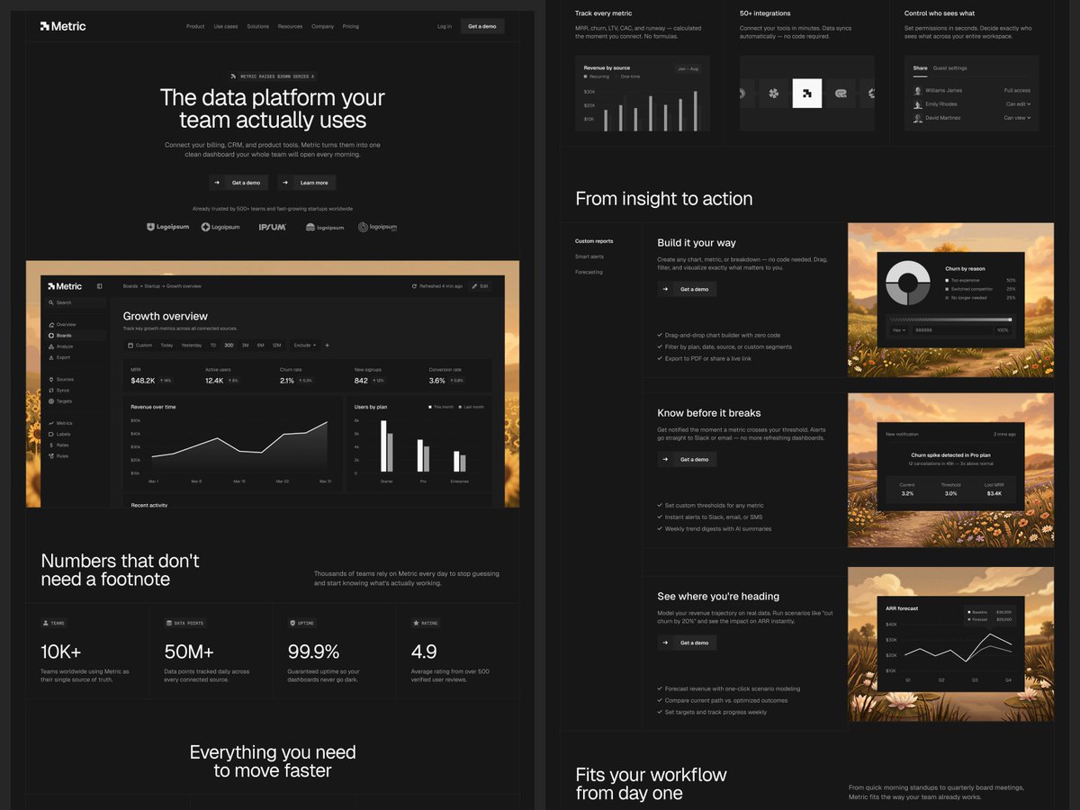
Dark mode SaaS landing pages > Light mode.

1
2
169
Mar 16
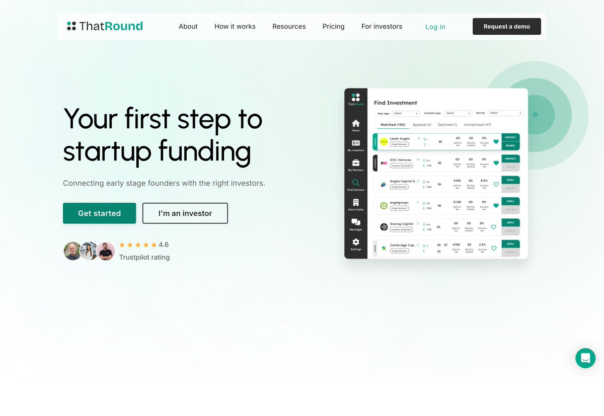
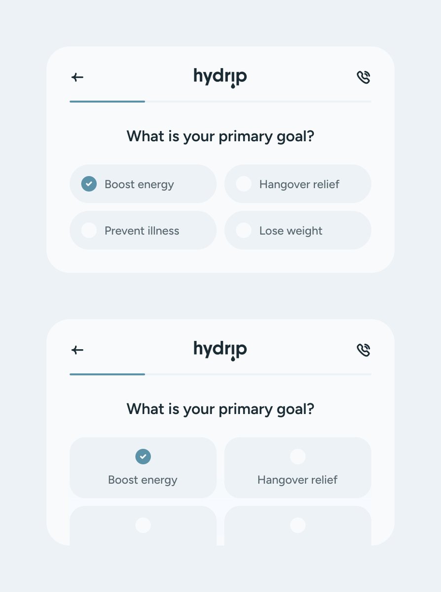
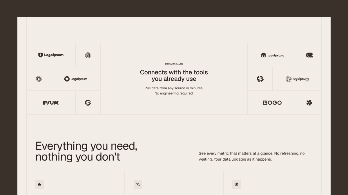
Building a free template for startups. Here's a sneak peek at some of the sections.
Dropping soon 🏗️
1
173
Mar 3
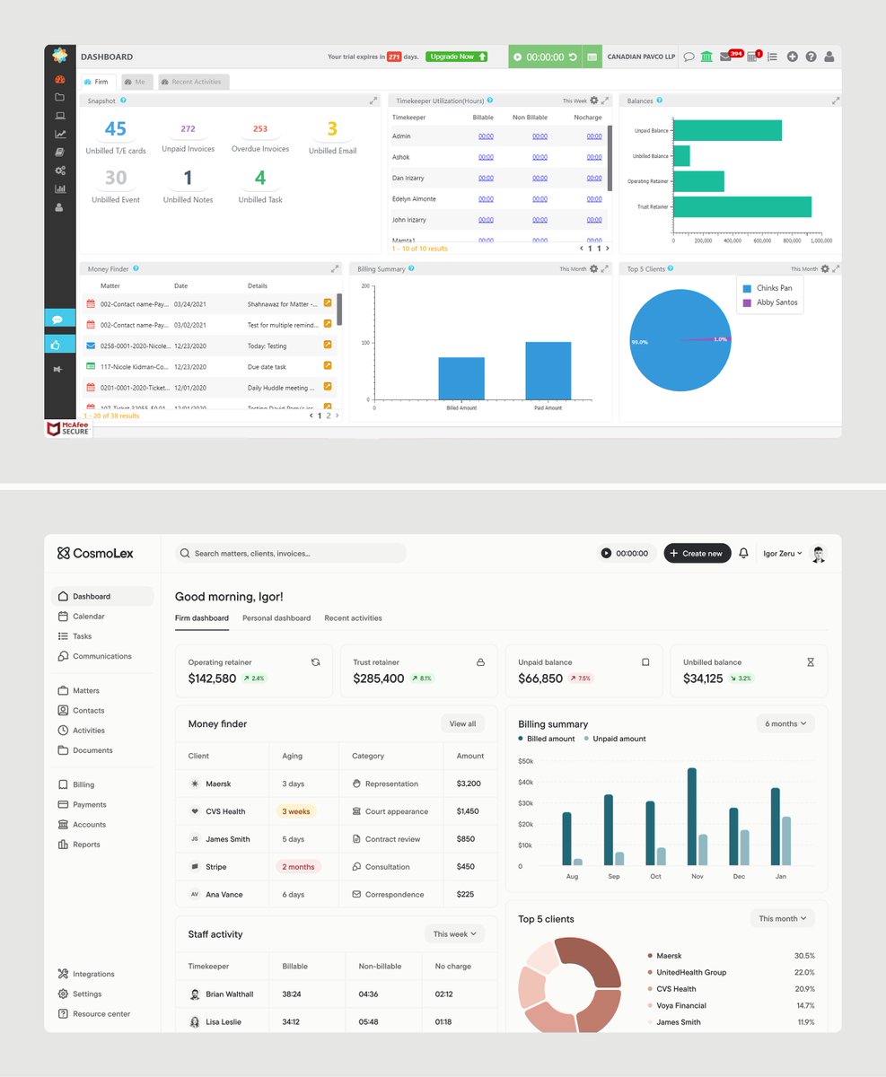
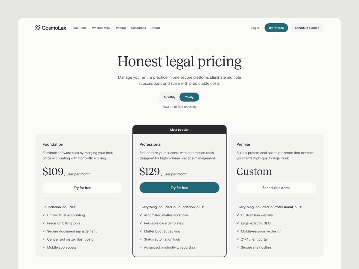
Redesigned the CosmoLex dashboard, a legal practice management tool used by thousands of law firms.
The original (top) works, but felt cluttered and dated. My redesign (bottom) focuses on cleaner hierarchy, better data visualization, and a layout that actually breathes.
Key changes:
→ Simplified navigation
→ Clearer financial snapshot up top
→ Refined typography and spacing
→ More intentional use of color for status indicators
What would you have done differently? Drop your thoughts below.
5
10
285
Feb 20
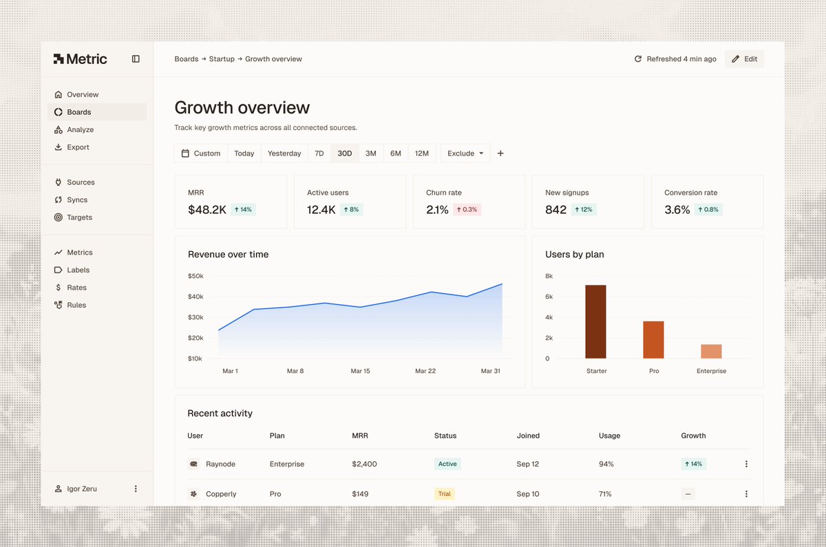
Everyone loves a flashy UI, but the real foundation is in spacing, typography, and hierarchy.
Your design should look flawless in black and white before adding the "pop." 🏗️
1
7
264
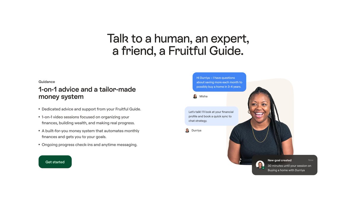
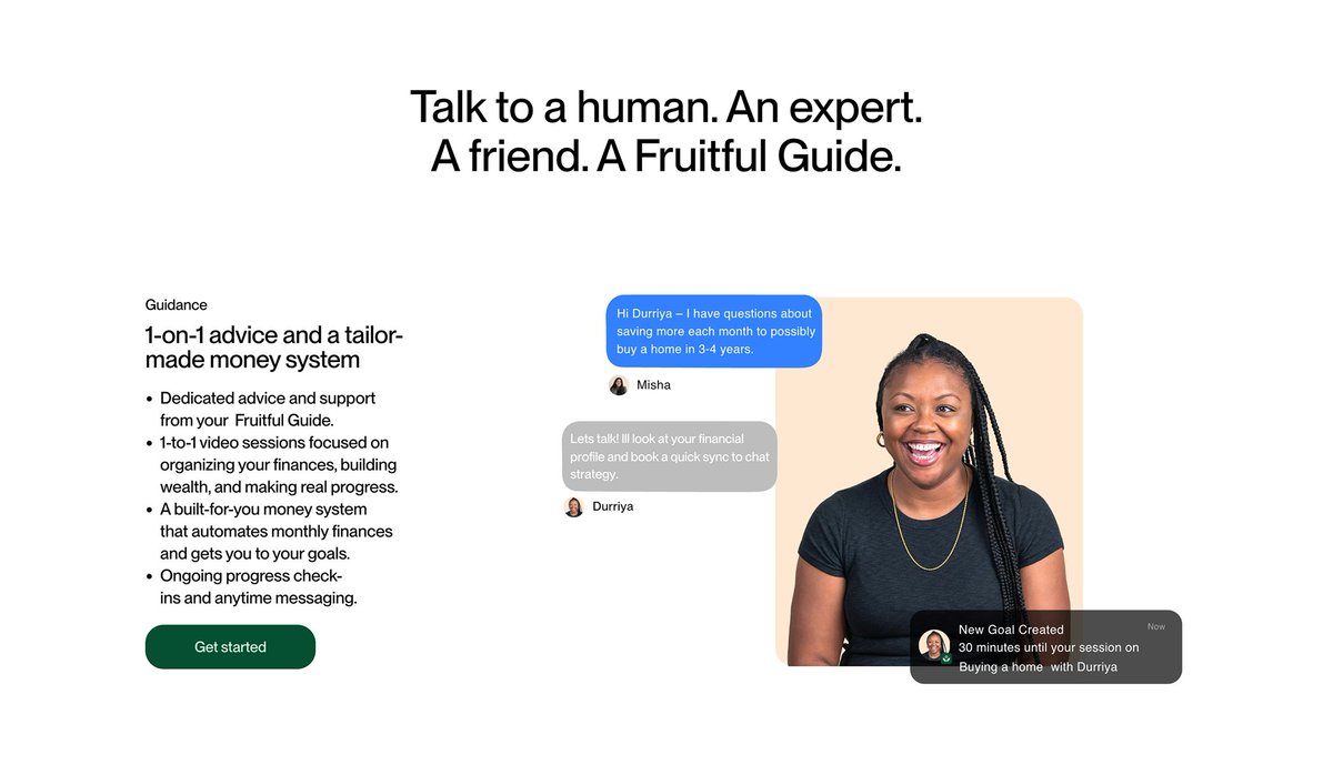
Feb 1
Redesigning Fruitful.
1️⃣ Typography: Switched to branded font for a distinct voice.
2️⃣ Geometry: Unified border radius across all containers.
3️⃣ Space: Increased padding to let the layout breathe.
4️⃣ Focus: Softened the background behind the guide to steer attention to the chat bubbles.
We moved from "cluttered" to "consistent."
👇 1: The redesign 2: The original
Curious how I’d redesign your site? Drop the link, and I might pick a section.
4
242