
Joined October 2023
- Tweets 33,694
- Following 6,310
- Followers 719
- Likes 126,319
601 Photos and videos


Pinned Tweet

I can't stop you from being a bigot but you sure as hell can't force everyone else to become bigots either 😂
The overwhelming majority of lesbians will continue to accept and support trans women as the women they are and you can cry about it.
1
1
13
2,810

Maybe I'm being too woke but calling yourself a man deep into fem transitioning (multiple years on estrogen plus facial surgery) just so you can joke around with one of the most outspoken Transphobic Misogynists is problematic to me and helps to paint transitioning as unserious


299
988
27,760
1,191,201
Maxima Inquisitrix Reipublicae retweeted

It's especially fun and cool how this happens regularly on this app with creepy men who are not even known or confirmed to be autistic, meanwhile autistic people - particularly autistic people who are not c!s white men - get ignored, talked over, or bullied on a daily basis.
4
31
430
4,864
Maxima Inquisitrix Reipublicae retweeted
Wow, it's so fun and cool how everyone suddenly cares about 'understanding' and being 'sympathetic' to autistic people the moment a man oversteps a boundary and is creepy towards a woman, and then that 'understanding' and 'sympathy' doesn't extend literally anywhere else at all.
22
492
3,980
41,203
Maxima Inquisitrix Reipublicae retweeted

happy pride month charlie
486
6,568
59,776
2,109,611
Maxima Inquisitrix Reipublicae retweeted

It's frankly INSANE that a full blown heterosexual paedophile man who identifies as a man is in that photograph, and you've censored his face to protect his anonymity while using the crime he's committed to slander the LGBT community, people who are not connected to these events.
1
4
40
832
Maxima Inquisitrix Reipublicae retweeted

Jun 1
finally someone far more intelligent than me has articulated what I've wanted to say for so fucking long. Everybody please read this.
16
475
9,828
493,641
Maxima Inquisitrix Reipublicae retweeted

Jun 1
Pete Hegseth could learn much about warfare by reading like, the Skyrim loading screen tips
6
72
2,546
26,429

It's actually much worse than this.
You essentially have, in the numerator, a highly selected sub-population: trans people [I can't remember the specific nuance of it -- whether it was those with a GRC or not, I forget] who happened to be in prison on some day in March 2021. The figure in the denominator is one the ONS explicitly warned against using in the way the graphic uses it, due to inaccuracies.
So you have what is essentially a really rather poor prison-prevalence ratio estimate, which does not consider any covariates or uncertainty quantification, and which is then misrepresented as some sort of generalisable offending rate.
It's a very annoying graphic I see quite often these days, because most people tend to just take these things at face value rather than thinking about whether the inferences the graphic is clearly trying to lead you towards are actually reasonable.
1
3
15
521
Maxima Inquisitrix Reipublicae retweeted

May 31
This graphic is used by TERFs to paint trans women in a bad light. However it's inaccurate and misleading, as explained by Hazel here.
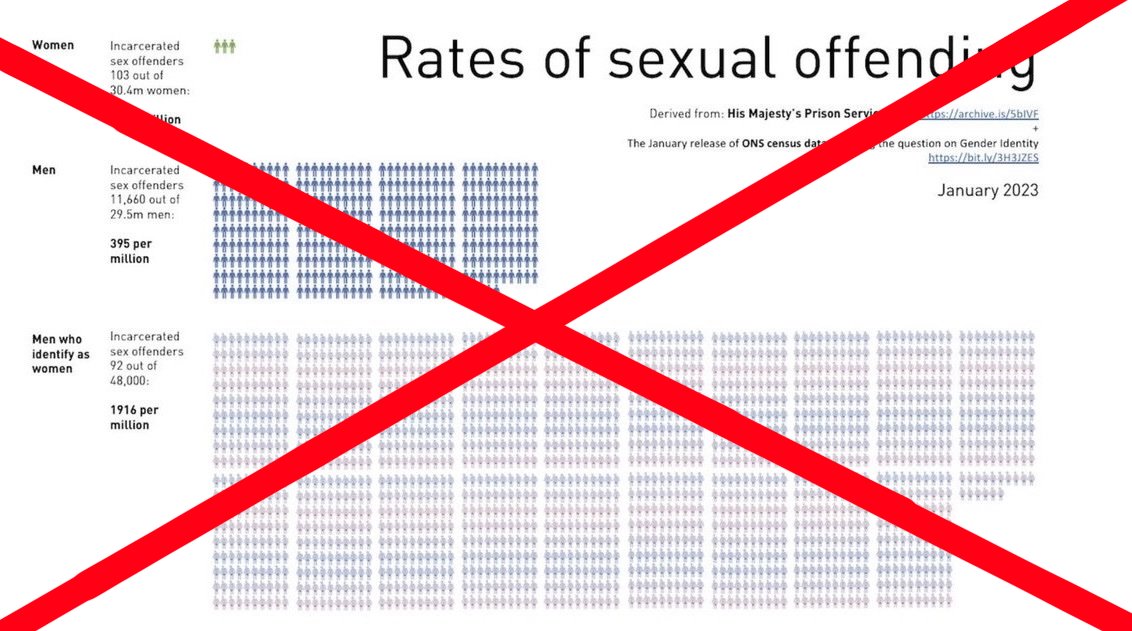

This is misleading Because trans women’s rate uses the prison population as the base while men/women use the general population. That’s not statistics, that’s manipulation.
6
20
204
7,122
Maxima Inquisitrix Reipublicae retweeted

May 31
The Pope is a great example of the idea that cruelty is actually dumb and that kindness and openness come from intelligence. A great juxtaposition to the (techno)fascists of our time. It takes a mind to create a better world, it takes zero to destroy it.
May 30

The Pope is very intelligent. I have to stop reading the encyclical, because I'm amazed by so much eloquence, intelligence, and care...
26
3,056
21,428
490,053

Faut vraiment arrêter avec ce fantasme des femmes qui sont dépressives à 35 ans parce qu’elles sont seules (elles vivent leur meilleure vie) aucune femme n’est jamais morte de célibat tandis que les cimetières sont remplis de femmes qui auraient préféré ne jamais s’être mariées

Le féminisme n’a pas libéré la femme, il l’a rendue esclave du système. Divorce massif, enfants sans père, solitude à 35 ans sous antidépresseurs, natalité effondrée voilà ses vrais résultats.
On nous vend de l’« empowerment » pendant qu’on nous vole notre fitra.
94
6,087
32,080
525,424
Maxima Inquisitrix Reipublicae retweeted

May 31
the iran war makes a lot more sense when you consider the art of war was written for the ancient chinese version of pete hegseth


47
1,998
30,987
514,394

like theres a specific subset of men who believe themselves to be a NormalGuy™ & position themselves as the neutral, rational baseline for society & yet somehow always end up as PR agents for sinister male behavior. their whole role is derailment through plausible deniability!!!
4
76
1,083
9,574
Maxima Inquisitrix Reipublicae retweeted

May 31
I was going to say it's kind of crazy how a pedophile cult has taken over an entire state (mormons in utah) but then I remembered a pedophile cult also controls all three branches of federal government.

YouTuber Reckless Ben was arrested and his Airbnb was searched while investigating a disputed $200,000 Lego Star Wars collection
Police say they were investigating allegations of stalking and targeted residential picketing rather than the missing Lego dispute


34
1,165
12,234
183,900
Maxima Inquisitrix Reipublicae retweeted

May 31
i've always wanted an excuse to use this video

38
3,325
14,385
548,797
I highly recommend reading this.
"I watched a man turn into a broad parody of the very thing I was in the earliest and most unsteady stages of becoming (...) it made the degradation of an entire people feel, to the people performing and watching it, like adoration."
4
50
3,607
Maxima Inquisitrix Reipublicae retweeted

Jun 1
also we need to decentralise abuse/trauma as the defining factor of being queer. even if this wasn’t the case, asexuality is still queer as it is different from the ‘norm’ and what is considered socially acceptable
3
84
1,331
16,544
Maxima Inquisitrix Reipublicae retweeted

Asexuals have extremely high rates of being correctively raped, or threatened with it, this is just false
Jun 1

Nobody is beating u up for not having sex. Nobody gaf man
43
3,803
28,831
312,334
Maxima Inquisitrix Reipublicae retweeted

Apr 23
happy lesbian visibility week

11
4,233
23,393
122,437
aged like milk lmao
23 Oct 2018

Defining gender as it actually is in reality isn't "labeling trans folk out of existence". Last time I checked nobody is saying trans people don't exist. The government is defining gender as it is in basic biology. And if you think Trump is like Hitler or Nazis, you're deranged.
11
196