
A Fresh Perspective on Your Customer Journey Through Lean Design & Dev. Trusted by 12,000 brands like Loop, Huel, Corkcicle, & Dr. Squatch. Try Oddit FREE ⬇️
Joined January 2021
- Tweets 4,778
- Following 402
- Followers 12,951
- Likes 3,767
1,677 Photos and videos


One question we get asked a lot by new customers (rightfully so) – "What can we expect the results to be?"
As a design-focused company, it's always hard to track results, because its up to our customers if they want to share data with us. We have amazing relationships with our clients, even though for many of them the project ends with their report being delivered.
One of the primary goals of the refresh we've been going through is to be more vocal about our successes, and our customers. While we'll never be able to promise specific results, we consistently see the value of a fresh perspective regardless of what you're selling.
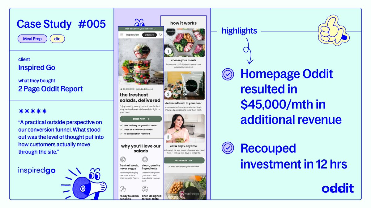
Here's a quick look at how Inspired Go paid back their Oddit within 12hrs of implementing it.
2
2
6
1,104
Oddit 👀 retweeted

Jun 4
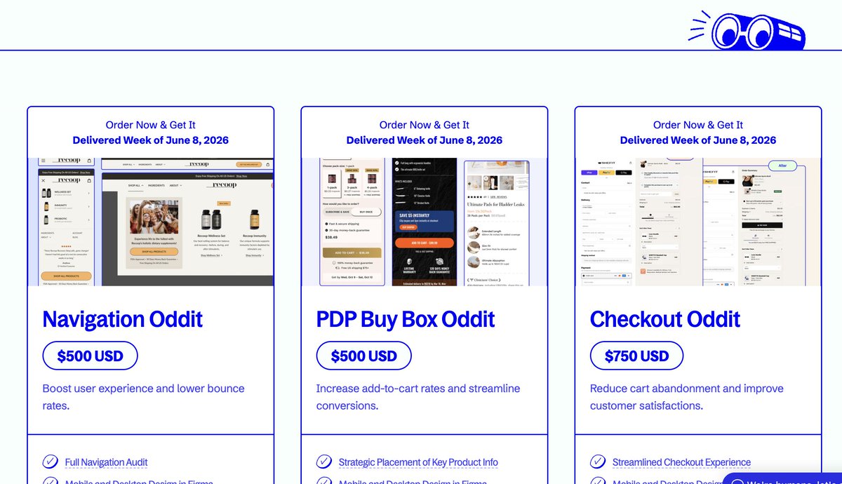
We get a lot of requests for just optimizing specific pieces of sites...so @itsOddit has products for that now.
Go check out the 9 new products on our site, and fill your boots. oddit.co/collections/oddit-m…
3
4
462
Don't tell customers why you think they'll like your product – tell them why your existing customers love it.
Here's a great take on this by Headstrong: headstrongltd.com/products/m…
1
269
Showing your products actually functioning can be the quickest way to communicate exactly what they do.
Why make users guess if it's what they need, when you can show clearly value in a few seconds?
Love this example on the decked.com site!
467
Grab your bag lunch and join us for another teardown session tomorrow – submit your site, and we'll give you actionable feedback live, 12pm MST.
See you tomorrow!
luma.com/v6busat7
320
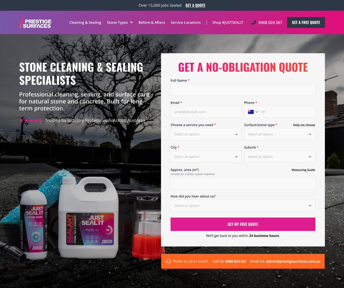
So many service companies sleep on their quote page.
Your form can be a point of conversion with just a few small tweaks:
1. Make it clear its free, right on the action button.
2. Tell them when to expect a response.
3. Offer an alternative to the form.
Easy as 1, 2, 3.
1
277
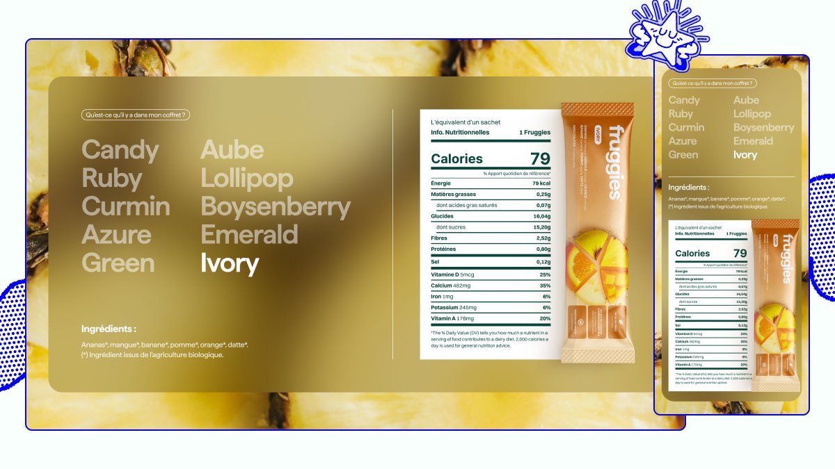
Big brands are built on small details.
Nutritional information is clean and simple for a reason – it's important. But that doesn't mean the canvas it sits on can't be a branded experience.
Love this recent one we did for @Fruggiesfoods
3
582
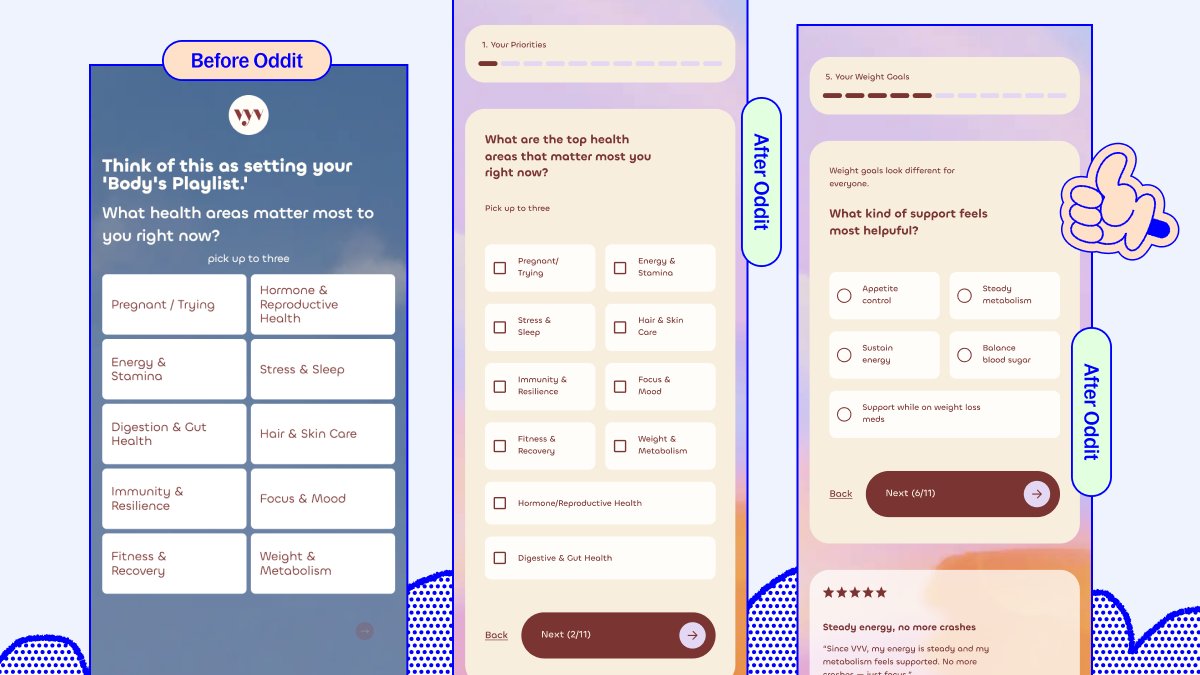
If you're going to push users through a quiz, make sure its a clean, clear experience.
1. Tell them where they are, and what's left
2. If there's something to select, add a radio selector (circle)
3. Give back and forward actions
4. Got space? Build trust with a simple review
341
Creative Playbook is back!
We're tearing down landing pages live on April 7th with @ImChaseMohseni.
Bringing your pages, or just a notebook, and sign up right here: luma.com/ku4d13e1
3
5
436
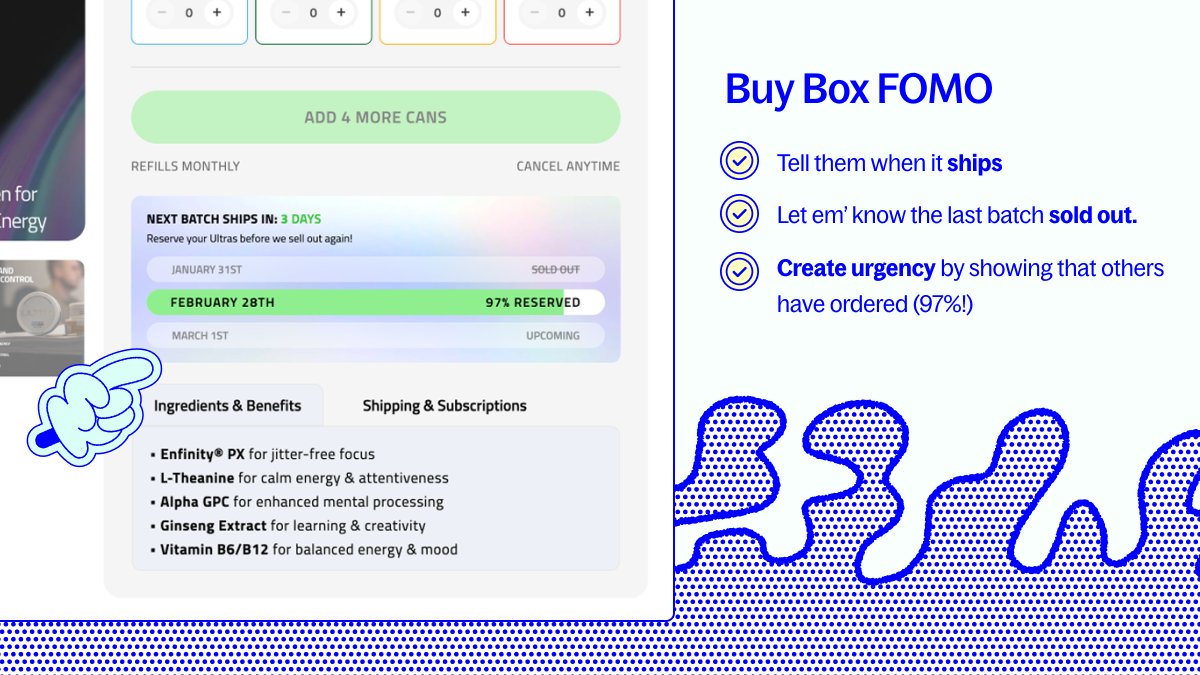
Love this buy box feature from @ultrapouches.
Simultaneously communicates clear shipping dates, while pushing urgency and FOMO.
Well done! 👏
8
821