
(/〃`∀´)/☆(〃□_□〃)
Joined May 2023
- Tweets 3,103
- Following 171
- Followers 178
- Likes 38,686
842 Photos and videos

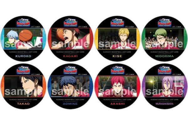


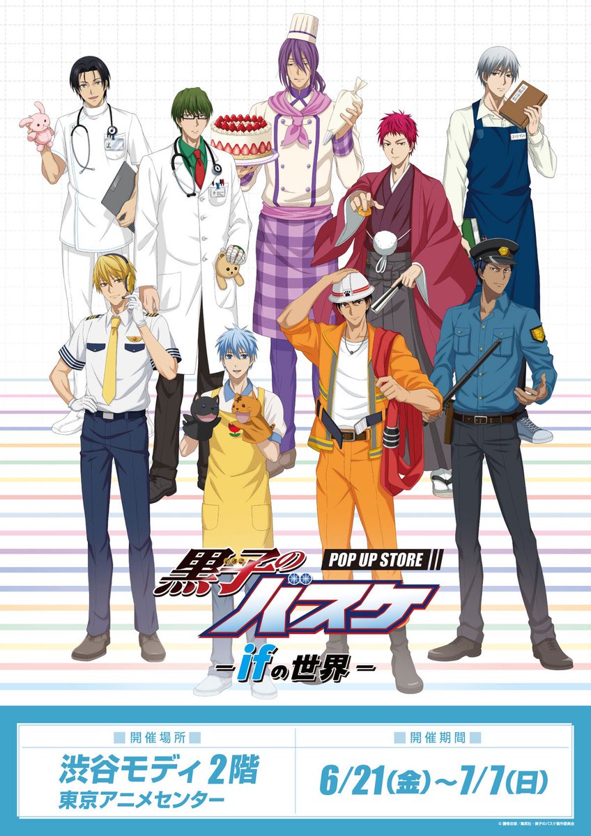
my thought is that he was added to make even pairs for this j-world 3d attraction but i still think it's so cute that they would rather pair shinchan up with him than figure something out w the rest of the gom or have a different miracle paired up w his respective bench warmer

this is my favorite instance of the of gom takao lineup by far because of how crazy it is that he is included here,,
its specifically a last game collab, where he is 1/3 bench warmers who never even touch the ball, and instead of just going with gom kagami they still added him
1
24
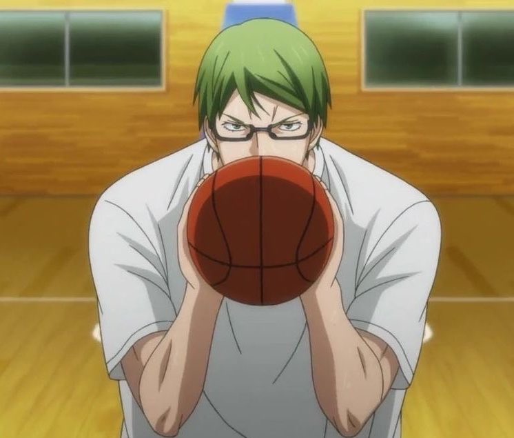
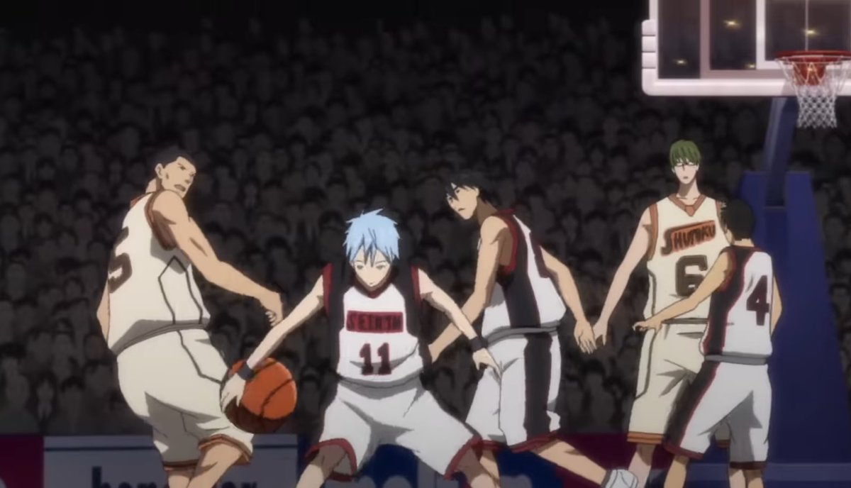
actually crazy set of frames, he literally has no scenes playing and was still not excluded
holy goat
this is my favorite instance of the of gom takao lineup by far because of how crazy it is that he is included here,,
its specifically a last game collab, where he is 1/3 bench warmers who never even touch the ball, and instead of just going with gom kagami they still added him
15
this is my favorite instance of the of gom takao lineup by far because of how crazy it is that he is included here,,
its specifically a last game collab, where he is 1/3 bench warmers who never even touch the ball, and instead of just going with gom kagami they still added him
2
32
666
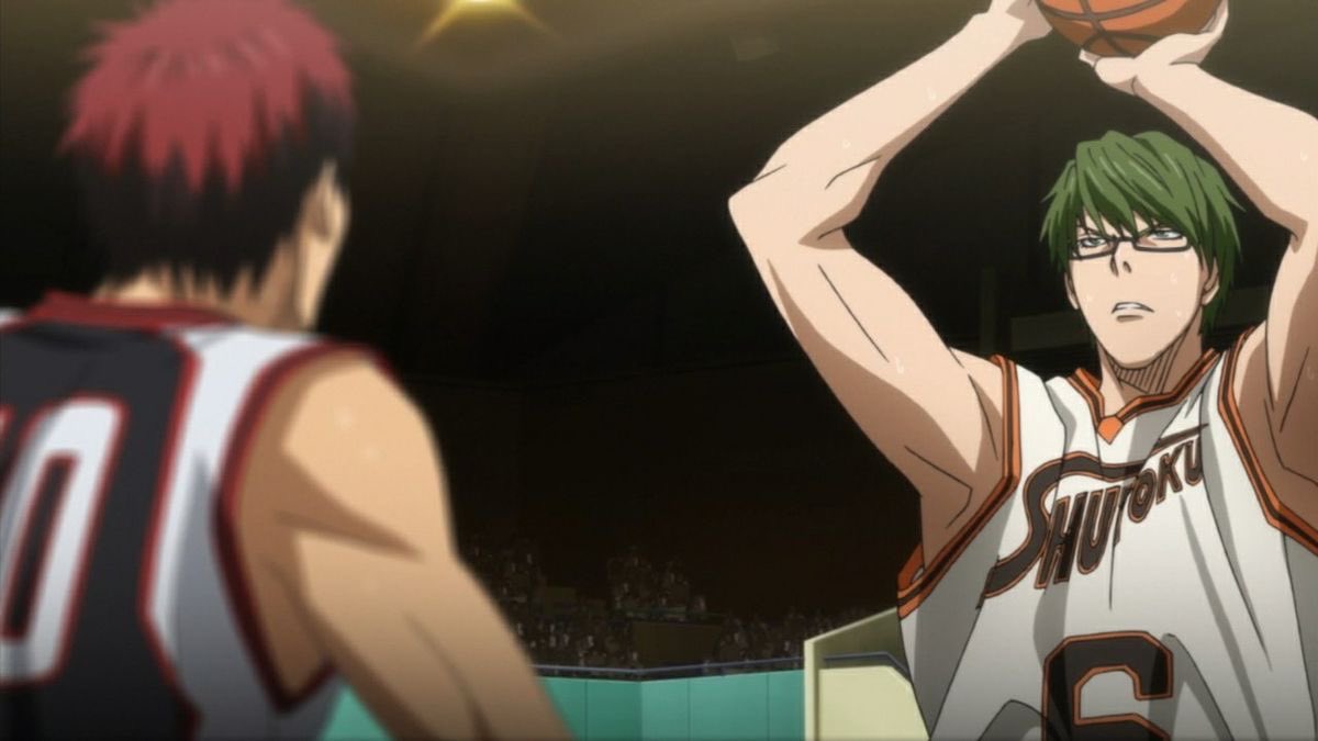
midotaka are THE duo of all time
21h

2
303
most goated moment in the history of anime
21h
6
393
just fell deeply in love with this artist's takao

3
86


coming for my goat is crazy, im ctfu 😭😭😭
Jun 11

If we talk average, 12-15 is where the big spurt is, and up to 18 is just adding a bit. So i'd say most of the main guys except Kuroko & Akashi got chances, sadly maybe not for the senpais and your goat Takao lol😛maybe he can be bench PG.
53
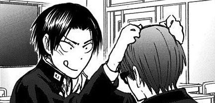
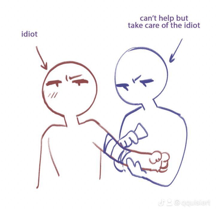
midotaka in that cd drama where takao gets sick and shinchan goes crazy taking care of him
Jun 9

6
19
303
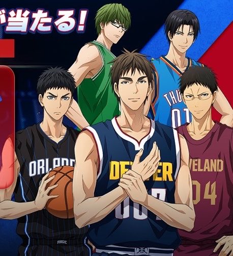
that first nba pic being all non-gom and then shinchan is the same thing as merch lines being all gom and then takao, midotaka just can't be apart from each other 🥰
absolute misinformation, i'm tired of this narrative fueled by the ALTERNATE non-basketball jobs merch line
1
235
mabel 😝 NBA TAKAO IS REALLLLL retweeted

Jun 9
緑高の日おめでとうー(´ノ・ω・)ノ
遅ればせながら、今年も祝えて嬉しいです!
いつまでも仲良く暮らしてね!
今回も古いので恐縮ですが、おいておきますね(`・ω・)っ□
海が見ていた privatter.net/p/8184225
#緑高の日2026
#緑高の日

10
20
699

absolute misinformation, i'm tired of this narrative fueled by the ALTERNATE non-basketball jobs merch line

Wait until you find out none of these guys are NBA level
5
46
365
22,211
scrolling through my fav midotaka masterdoc on a random wednesday, life i so good
56
i'm the first an only kudo on a midotaka one shot posted by an anon today, yall can't hide from me
2
80
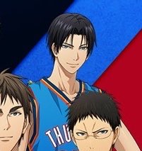
for every other team they make the white of the jerseys easier on the eyes by making it more grayish but for shutoku they start leaning towards a more cream color,,, it's really obvious in the can do opening
I love how the shutoku home uniforms aren't actually white, but instead an off white that makes the color combination easier on the eyes
my aesthetic kings


1
42
1,846
I love how the shutoku home uniforms aren't actually white, but instead an off white that makes the color combination easier on the eyes
my aesthetic kings
13
61
2,984

