
Typeface Design.
Joined February 2010
- Tweets 2,275
- Following 259
- Followers 21,785
- Likes 5
34 Photos and videos


Pinned Tweet

20 Jun 2023
Martina Plantijn is a better Plantin.
Informed by the workhorse qualities of Pierpont’s typeface and expanding upon his research of 16th century type at the Plantin-Moretus Museum in Antwerp, Martina Plantijn makes decisive digital updates across its roman and italic cuts.
10
19
96
23,242
Klim Type Foundry retweeted

19 Dec 2025
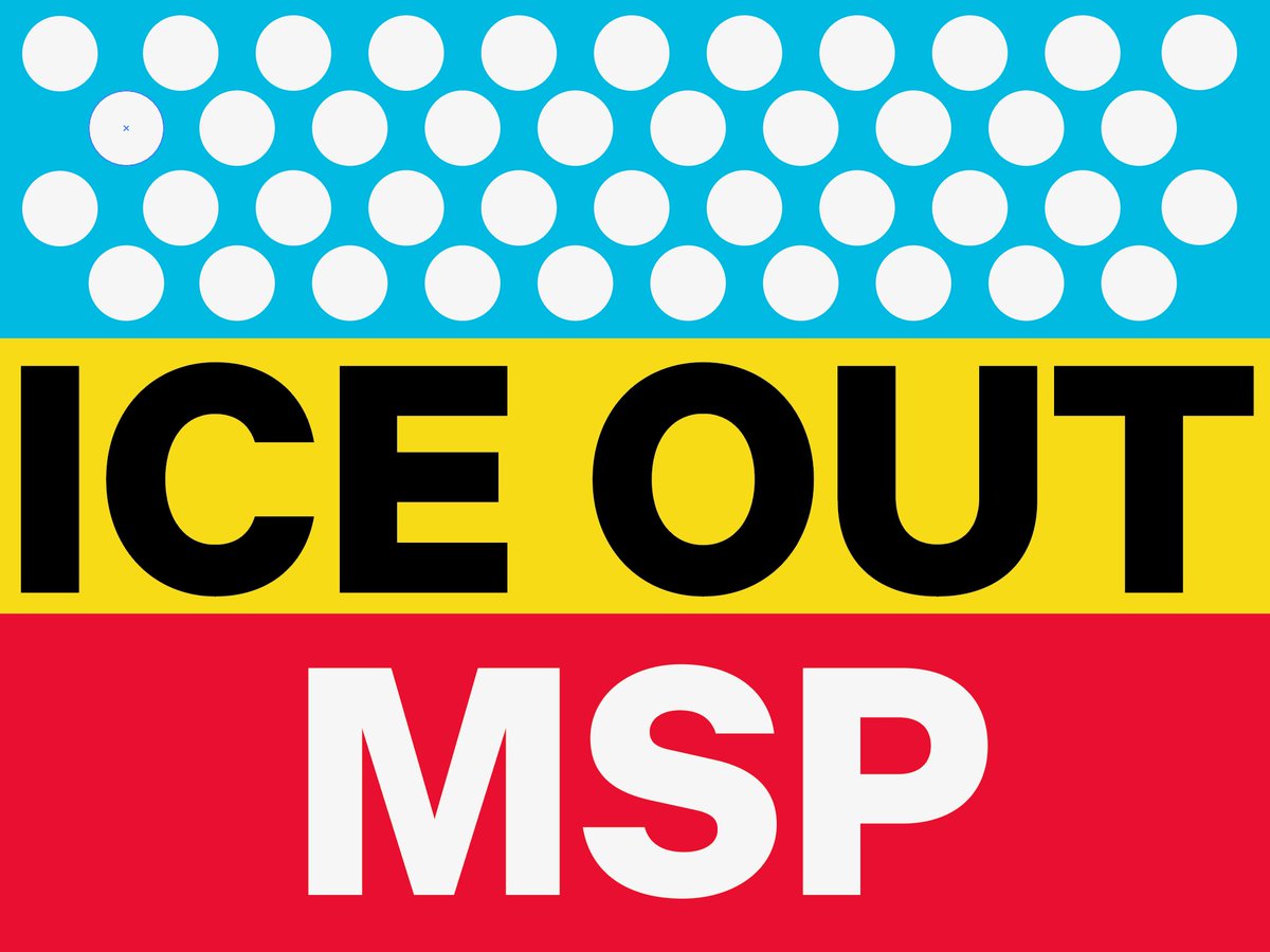
Erik Brandt, 2025. ICE OUT MSP. Rally 12/20/25 at 11:30AM, Lake Street and Bloomington in Minneapolis, MN. Ten thousand thanks to R.T. Rybak and to @klimtypefoundry for DIE GROTESK. Very happy to spec these out for you. #typografika #geotypografika #typografikapolitika #iceoutmsp
1
3
1,156
Klim Type Foundry retweeted

9 Dec 2025
@caligracomputer has excellent type thanks to @klimtypefoundry. From our logo, to the Workbench UI, to the terminal, to the labels on the keyboard. These fonts are doing so much work for us 👍👍👍

9 Dec 2025

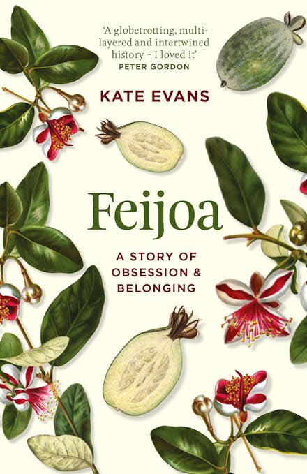
Caligra Developer Terminal computer advertisement.
Söhne, Signifier
fontofweb.com/pin/5419

2
4
1,511
Klim Type Foundry retweeted

9 Nov 2025
only just realised the other day that the claude font was made by a type foundry in wellington (@klimtypefoundry). now i feel justified reading everything he says in a mumbly kiwi accent klim.co.nz/collections/tiemp…
2
1
4
1,002
8 Oct 2025
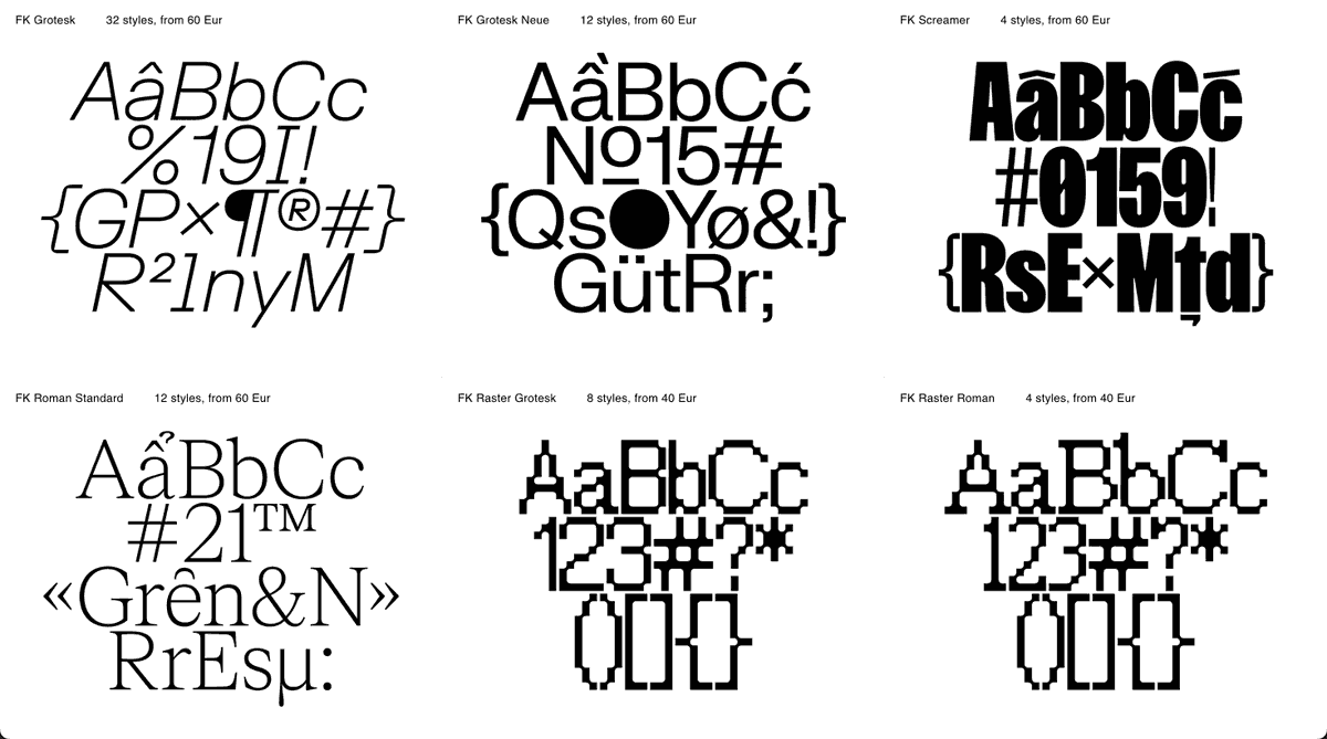
In an industry where commercial pressure and corporate monopoly conditions our typographic landscape, making yet another grotesk seems like the ultimate compromise. To dismiss Helvetica denies its power.
1
3
865
8 Oct 2025
To embrace it risks the charge of selling out. At once homage and critique, Die Grotesk is a breath of fresh air that acknowledges the tension between creative integrity and commercial reality.
6
792

Site of the Day · Every
typewolf.com/site-of-the-day…
Featuring Signifier from @klimtypefoundry
@every
1
9
1,647
Site of the Day · Great Catering
typewolf.com/site-of-the-day…
Featuring Feature from @commercialtype and Founders Grotesk from @klimtypefoundry
1
2
1,369
Site of the Day · Pact
typewolf.com/site-of-the-day…
Featuring Manuka Söhne from @klimtypefoundry and Feature from @commercialtype
1
4
1,711
13 Jun 2025
Kia ora font whānau,
Our good friends at @Fontstand need your help.
As part of their transition to be the first type foundry cooperative, they’re running a Font User Survey:
typotheque.qualtrics.com/jfe…
After completing the survey you’ll get a bundle of fonts as a reward.
1
2
3
1,135
13 Jun 2025
Klim isn’t on Fontstand. We’re asking this of you because we support their courageous effort to do something different. We’re also very interested in the results of the survey — simplifying font licensing is a long-standing goal of ours.
1
786
13 Jun 2025
Thank you so much for your time and consideration. We really appreciate it.
Hei konā mai me ngā mihi!
725
Site of the Day · Copper
typewolf.com/site-of-the-day…
Featuring Martina Plantijn from @klimtypefoundry and Monument Grotesk from @abcdinamo
1
6
1,172
Klim Type Foundry retweeted

6 May 2025
Norman Potter on unjustified text setting in 1990: "it is the only supportable procedure where meaning overrules look. Then it looks better anyway."
2
6
2,578
Site of the Day · SUPERSENSE
typewolf.com/site-of-the-day…
Featuring Untitled Sans from @klimtypefoundry
1
1,276