
Joined December 2017
- Tweets 303
- Following 40
- Followers 10
- Likes 7
89 Photos and videos


Pinned Tweet

May 21
Agreed. Focus is the currency right now.
How to keep focus?
1 screen 1 window at a time.
Also what if screen goes grayscale when you open non-work windows?

Context switching is a productivity killer.
You can run as many AI agents as you want, you’re still the bottleneck.
I work single threaded
1
78
Jun 12
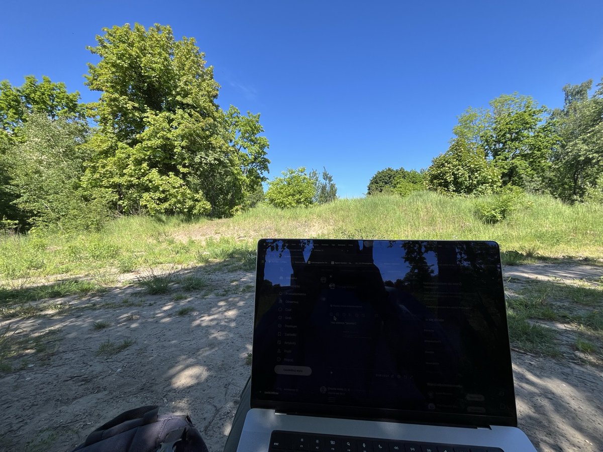
Grass maxxing
What is stopping you from working like this?
This is the best time to do it.
6
Jun 11
Making website for app that core mechanic is keyboard is harder than I thought.
How to show something that is inherently non-visual?
How to present the concept without overwhelming details.
This is the final result of hero section revamp
- Smooth transitions between 2d-3d mode
- Hero revamp
- tiny UX details
- less "clarifying texts"
- note the slow border animation around "simulator"
More to come.
Jun 10

I just 10 shotted functional macbook pro simulator that works inside of a website.
No fable 5, just composer 2.5 threejs
- physical keyboard works
- you can click keys on the "macbook"
- you can use the interface of the app by clicking onscreen
Is this new era of design?
10
Jun 11
Marketing is tiny details.
Guiding your client by hand.
Revealing the story step by step.
What else I'm missing?
1
3
Jun 11
This would take me ages to implement.
I would loose the goal from sight multiple times.
Perhaps I would even dump it.
Try it: switchflow.cc
2
Jun 10
I just 10 shotted functional macbook pro simulator that works inside of a website.
No fable 5, just composer 2.5 threejs
- physical keyboard works
- you can click keys on the "macbook"
- you can use the interface of the app by clicking onscreen
Is this new era of design?
2
1
76
Jun 11
@webadderall I just noticed some strange echo effect in recordly.
Listen around 0:59. This happens in few last versions.
OBS works perfect with same hardware. I use EarPods microphone in both cases.
6
Jun 10
This is an app that has to be installed to "get the feeling".
Does that kind of presentation make sense?
Is it better to stick to simple "screen" simulator and skip the 3d macbook mock up?
What are your thougts on that kind of websites and ui simulator overall @michalmalewicz ?
7
Jun 10
Fable 5 this fable 5 that.
I'm happy with composer 2.5
Would fable build this? Absolutely.
Perhaps it will even one shot it.
But then I would have to move to a tent for the rest of the year.
Someone up for testing this with cmux?
1
28
May 29
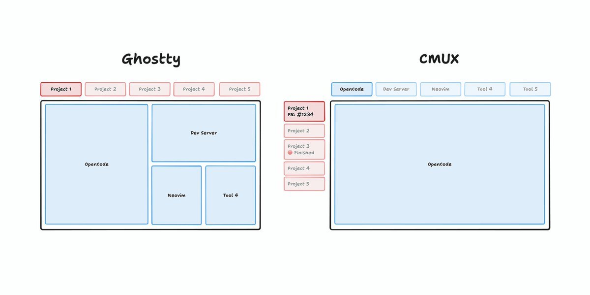
This also fits nicely into the concept that @vimtor proposed.
cmux projects perfectly connected with the rest of the windows in the OS.
With project specific chrome windows.
Imagine the possiblities.
You can have windows in Chrome dedicated for specific tasks:
projectA-marketing
projectA-email
projectA-documentation
projectB-marketing
projectB-email
projectB-documentation
May 29
Cmux solved the terminal, but what about the other windows?
Something more is needed when you leave cmux and try to navigate through the rest of the OS.
Something that would connect cmux workspaces with the other windows in the system.
Something so you always stay in the loop and you do not get distracted by other windows.
1
27
May 29
@michalmalewicz I saw you mentioning that "browsers should have 1 tab"
This could enable it.
Wanna try it?
7
May 29
Cmux solved the terminal, but what about the other windows?
Something more is needed when you leave cmux and try to navigate through the rest of the OS.
Something that would connect cmux workspaces with the other windows in the system.
Something so you always stay in the loop and you do not get distracted by other windows.
2
1
58
May 29
Wouldn't it be great if your OS turned your screen to grayscale when you switch from work to "fun"?
So your brain gets a visual hint that you are going into distraction zone?
8
May 25
What is stopping you from working like this?


Se romantizó tanto el trabajo remoto que mucha gente no se da cuenta que trabajar desde tu casa todos los días te aísla y te deprime.
Muchos te venden que trabajar desde el sillón es el éxito pero estamos creando una generación con ansiedad social que no puede sostener una charla de 5 minutos cara a cara.
Hay que salir más o está bien el homeoffice fulltime?
1
10
May 22
After vibejam 2026, shipping the game was easy — switching between 3 projects wasn’t.
So I built SwitchFlow.
Project-aware keys. Same fingers, different context underneath.
⚡ No macOS Spaces 500ms animation
⌨️ One key → one role (IDE / browser / terminal)
🪟 Windows follow the active project
Sounds like you? Multiple projects, tab hunting, Spaces feel broken.
Setup once, lives forever.
Same keys, same roles, same layout - survives reboots.
Try the simulator (no install): switchflow.cc
From one builder to others - roast or RT if this is your daily boss fight.
#buildinpublic #macos
Apr 16
Cube Rush
day 4 or day 5? I don't really now ...
Water water everywhere:
🏝️ added water in the background
🔊 splash sound
💦 water droplets on screen
🪳 small bug fixes
💥 new blast animation
thanks @DannyLimanseta for water droplets inspiration, hope you not mad (everybody go check his game, it looks absolutely stunning x.com/DannyLimanseta/status/…)
play: vibejam.switchflow.cc
@levelsio
@threejs
#indiedev #indiegame #vibejam #codinginpublic
1
60
May 22
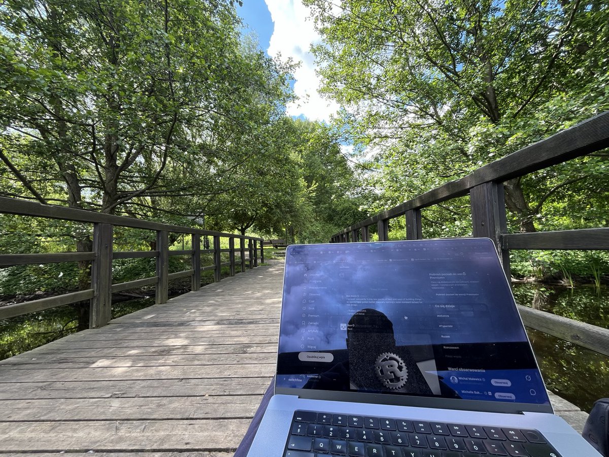
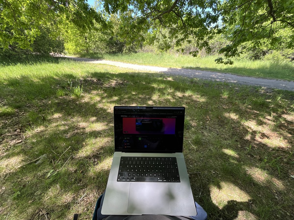
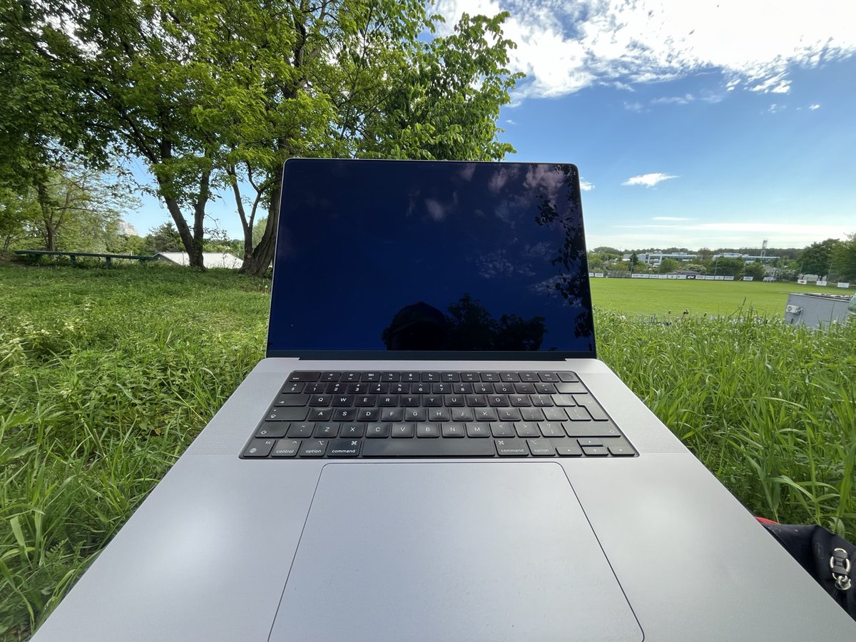
I sit in the middle of a park, closest "civilisation" is within 200 meters (650 feet), lots of trees, lots of leaves.
I'm buying Samsung Fridge as my router next time ...

1
21