
brand designer @/freelance - available for projects
Joined September 2020
- Tweets 4,988
- Following 1,028
- Followers 3,259
- Likes 10,181
329 Photos and videos


Pinned Tweet

11 Jan 2024
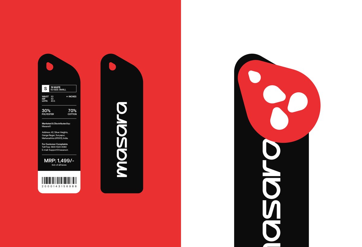
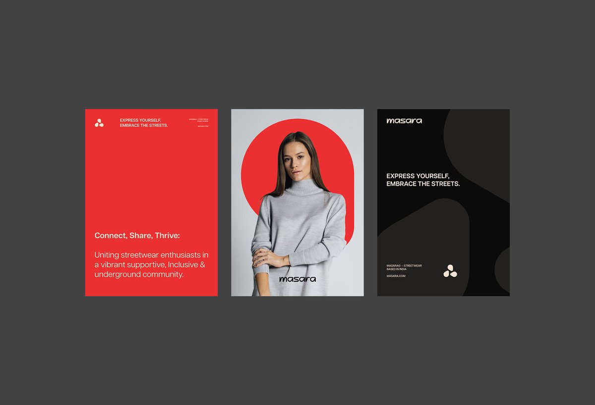
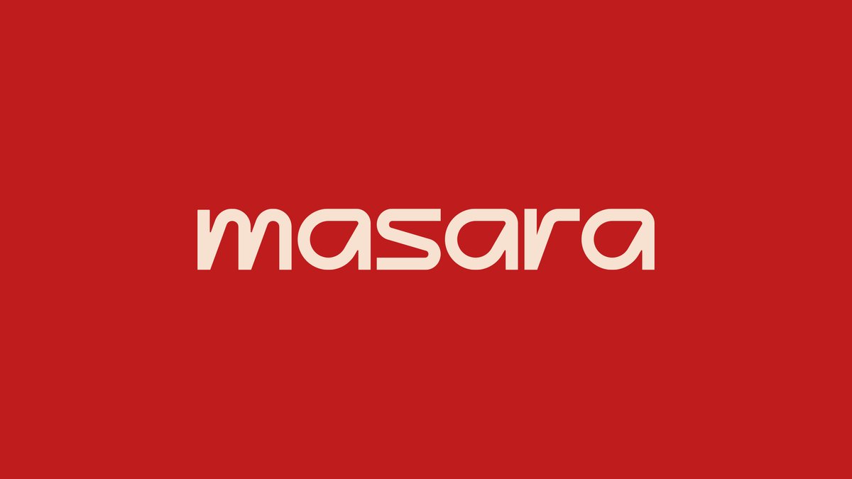
Masara© Visual Motion Identity.
Masara© is an Indian streetwear brand that caters to both hardcore and general streetwear enthusiasts.
Creative Direction: Prateek Sharma
Motion Design: @Sidddiquemotion

ALT Masara© is an Indian streetwear brand that caters to both hardcore and general streetwear enthusiasts. The visual identity project for Masara© focuses on creating an exceptional and new design style in the streetwear and apparel realm by focusing on a cohesive visual and motion design style.
7
16
208
14,632
23h
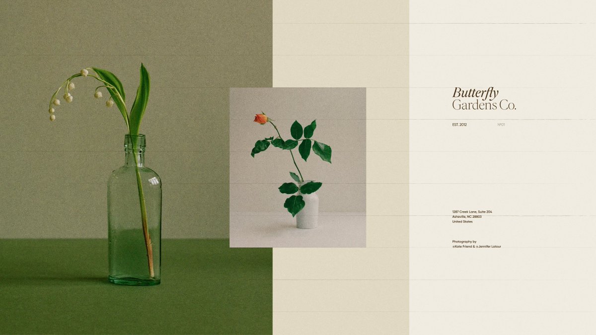
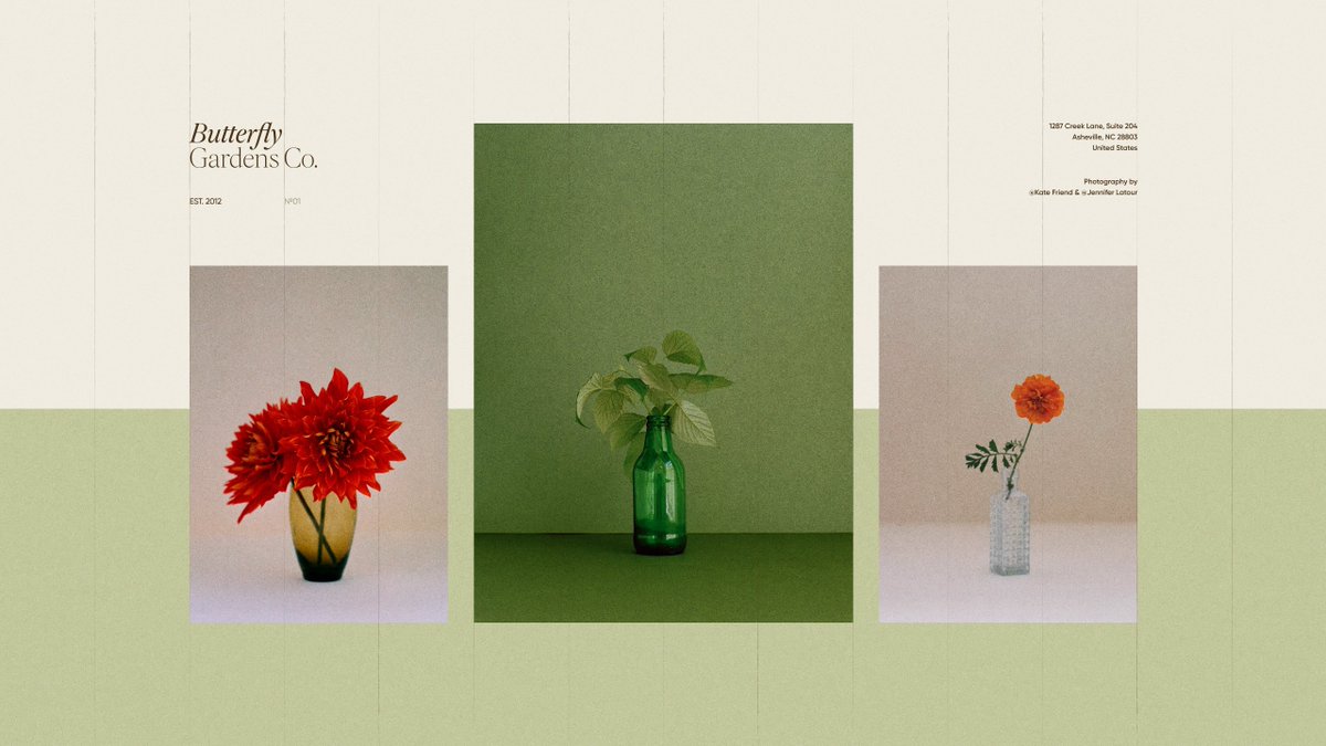
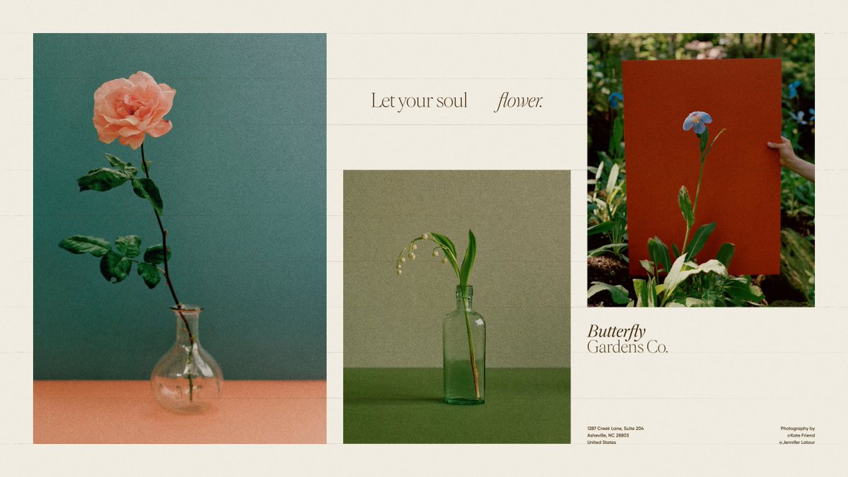
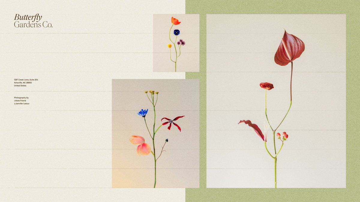
recent brand exploration for a bright and playful flower delivery service built around simplicity and seasonal blooms


25
23
525
14,310
Jun 13
man this was such a short but fun ride haha

Introducing Claude Fable 5: a Mythos-class model that we’ve made safe for general use.
Its capabilities exceed those of any model we’ve ever made generally available.
234
May 27
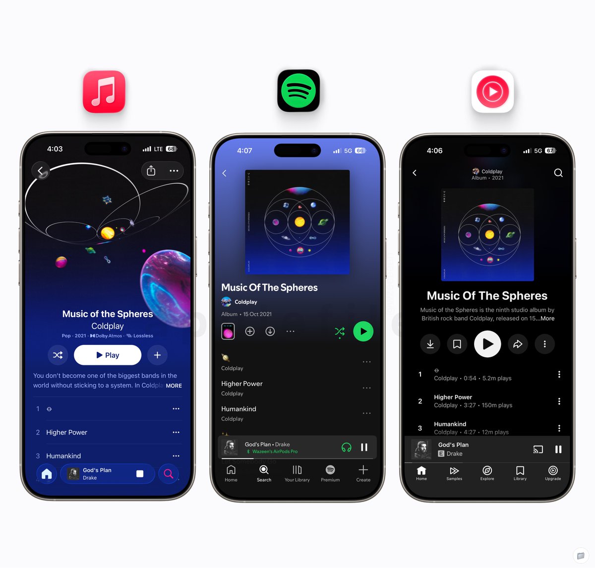
Apple: UI and overall experience
Spotify: Playback features and settings
YouTube Music: Recommendation algorithm
It’s a no brainer atp

1
479
prateek retweeted

May 21
inspiration is everywhere around you
just try making something

7
14
221
5,985
May 21
Someone copies someone else's work 1:1, even the copywriting word for word, and if I point it out, somehow it's my fault because 'I didn't label the callout properly'.
wow 😭
May 21

im not arguing. if you had clearly labeled both images it would have been easier. or you couldve used the captions better instead of vague one. either way, though this looks weirdly too similar, i dont think this layout and gradient is reserved for Parloa. And I wouldnt call this a copy too since there are considerable differences. I'll let @socoloffalex comment on this further.
1
3
1,964
May 21
are you kidding me?


29
7
510
153,906
May 19
well... well... no wonder I keep crying for not getting enough reach.
i'm so cooked.


3
880
May 18
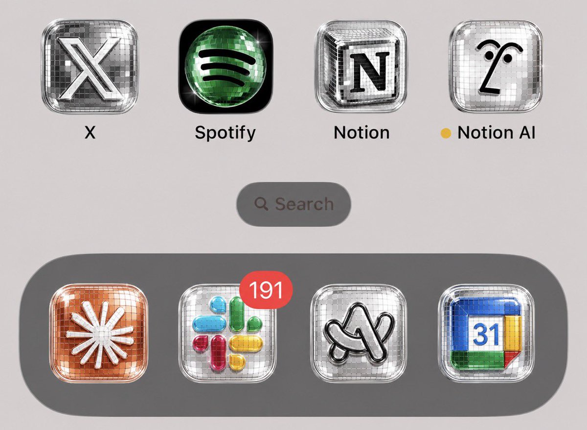
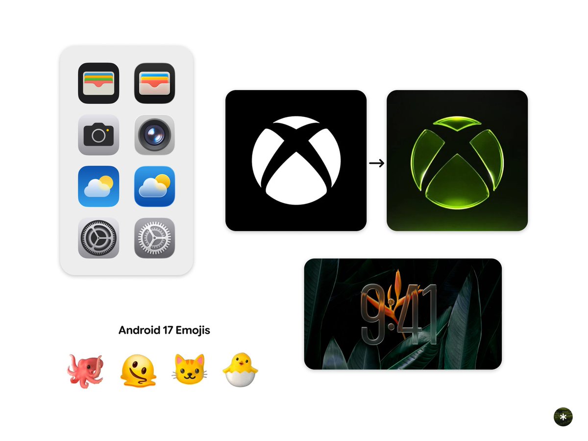
making icons fun, without disco-fying them.
🤷♂️✨

2
2
24
2,105
May 18
spotify used a disco ball because it actually made sense for the brand and now everyone’s just turning logos into random shiny objects 😭
2
1
17
844
May 18
I mean… why??
Spotify using a disco ball makes sense. They’re a music platform, the metaphor fits.
But what’s the need to slap this effect onto every app icon and call it “discomorphism” when there’s basically zero thinking involved beyond making things shiny?
Minimalism isn’t the problem. Lack of original thinking is.


2
4
1,015
May 13
photography by:
Kate Friend: instagram.com/kate_friend/
Jennifer Latour: instagram.com/bonjourlatour/
322
May 13
we're so back

The pendulum is swinging back from everything-completely-flat to shadows,highlights, and 3 dimensional materials
5
504
prateek retweeted
May 7
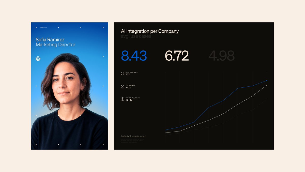
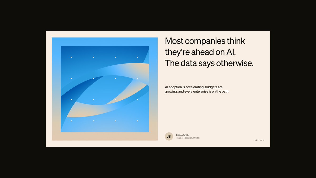
Designed a brand system for Orbital, a B2B AI intelligence and benchmarking platform built for enterprise companies.
Will share more from the project soon.


1
3
34
1,395
May 11
X on android feels so much smoother now. There are still a few bugs, which is expected since it’s still in beta, but the overall scrolling experience has never been this smooth
it's too good!
7
372
May 10
Sometimes I feel like I’m treating X like a portfolio by only posting my work. I actually want to tweet more random thoughts and observations here, both general stuff and design observations too
But I overthink every post so much that I just end up posting nothing. how do I fix this? 😭
2
4
319