
We make fonts. 🔤 We made this for you.™
Joined November 2020
- Tweets 179
- Following 28
- Followers 831
- Likes 208
19 Photos and videos


Mar 25
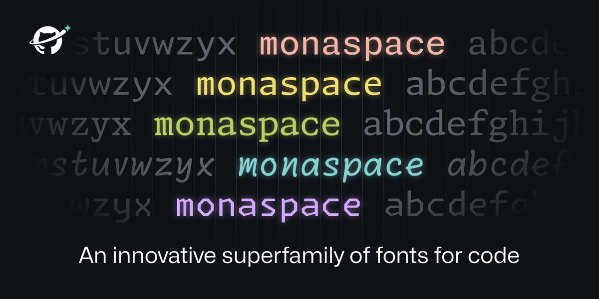
New work for GitHub: Monaspace. 🔤
A superfamily of 5 open-source typefaces for code.
2
2
12
31,684

Did you know that the unique fonts from Pentiment are available to download? Our beautiful custom fonts were prepared by the amazing @lettermatic_abc! lettermatic.com/custom/penti…
Check out the link below to get the fonts in the official Pentiment fan kit:
📜 pentiment.obsidian.net/
3
52
286
17,682
Lettermatic retweeted

10 Apr 2024
I have been watching @noclipvideo documentaries for years – super cool to see them make one about a game I worked on!
My colleagues at Lettermatic and I designed the fonts for the game, with the talented team at @Obsidian. Our full case study is here:
lettermatic.com/custom/penti…
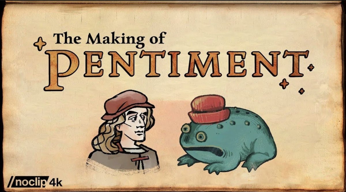
9 Apr 2024

🚨NEW DOCUMENTARY🕹️
We travel to @Obsidian to talk to the team behind Pentiment, the award winning historical RPG.
Runtime: 82 minutes
WATCH: youtu.be/ffIdgOBYwbc
1
17
115
24,114
Lettermatic retweeted

9 Nov 2023
monaspace.githubnext.com
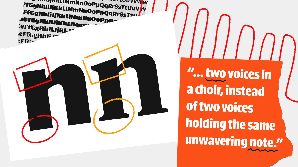
All code has been letters, on a grid, since the days of the teletype machine. How can we advance the state of the art to make code itself more expressive and powerful? How can we layer more meaning onto code?
40
376
2,032
507,613
Lettermatic retweeted

17 Sep 2023
In Pentiment there is a plot point about Brother Guy’s textura bookhand having a distinctive y tail because of his native Burgundian bastard script. We had @lettermatic_abc make a y variant for the textura font and Guy is the only character who uses it.
13
100
1,018
104,685
Lettermatic retweeted
26 Aug 2023
This is a great overview of the process @lettermatic_abc went through to develop Pentiment’s fonts!
26 Aug 2023

For anyone interested, we published a case study regarding the design of these fonts, here:
lettermatic.com/custom/penti…
🔤🔠
8
37
20,658
Lettermatic retweeted
17 May 2023
I'm very proud of Portamento, a new typeface designed for Google Developers by the team at @lettermatic_abc!
It has monospace fonts, and proportional fonts, all within one family. 🔤🔠
I wrote an in-depth case study about the design process, here:
lettermatic.com/custom/porta…
3
13
108
15,091
Lettermatic retweeted
16 May 2023
More than any other type family we’ve made, Portamento had a design process anchored in engineering. Naturally I didn’t want to get it wrong. Here’s the story of how I created a process that helped make sure I got it right:
lettermatic.com/custom/porta…
2
5
30
6,322
Lettermatic retweeted
16 May 2023
NEW WORK: Fonts for Google Developers.
We created Portamento, a flexible typeface with three subfamilies, and I’ve written an in-depth case study on the design process.
3
3
53
5,798
Lettermatic retweeted
12 Apr 2023
If you're curious to see more animations like this one, and a detailed description of the design process for Really Sans, you'll find that here:
lettermatic.com/custom/reall…

4
15
4,043

Really Sans Case Study by @rileycran – buff.ly/3Gd1n9o
3
197
1,709
169,227
Lettermatic retweeted
29 Mar 2023
A great use of Really Sans from @lettermatic_abc, on @haenschenhans's new website:
🔤
johannesecker.com/
ALT Screenshots from the website showing both optical sizes of Really Sans used together in harmony.
ALT Screenshots from the website showing both optical sizes of Really Sans used together in harmony.
ALT Screenshots from the website showing both optical sizes of Really Sans used together in harmony.
1
6
1,035
Lettermatic retweeted
29 Mar 2023
I recommend reading this case study if you are interested in:
• Animated Bézier curves.
• 1970s typography.
• Fonts designed to work at specific point sizes.
• A flexible sans serif typeface designed for contemporary use.
lettermatic.com/custom/reall…

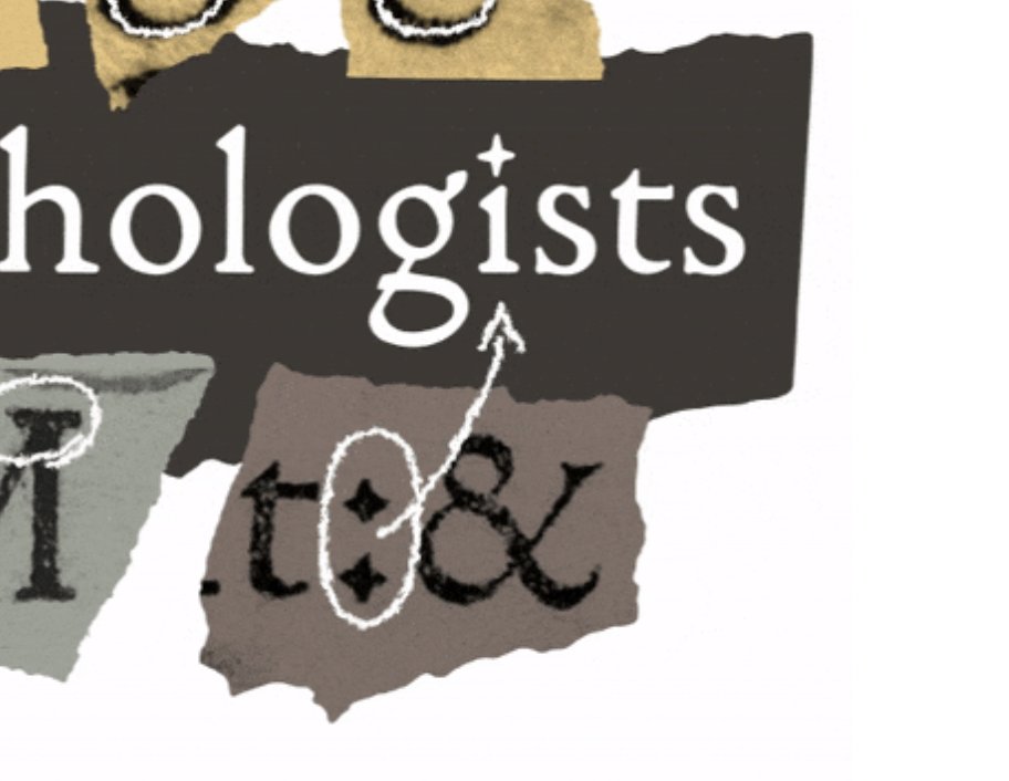
ALT A collage designed by Anna Thomas, showing samples of the Really Sans typeface in use on scraps of torn paper.
1
6
40
4,777
Lettermatic retweeted
22 Mar 2023
New: A case study about Really Sans – a typeface in two halves.
In this case study you'll find info on the design process, historical inspiration, and a thorough look at the features of this very flexible typeface.
lettermatic.com/custom/reall…
🎨🆕🪄🔤✍️
2
6
47
4,912
21 Mar 2023
We have a new case study on the site today!
21 Mar 2023
New: I wrote a 4000 word case study about the making of Really Sans, a typeface in the Lettermatic catalog.
lettermatic.com/custom/reall…
✍️🔤
#design #GraphicDesign #typeface #productdesign
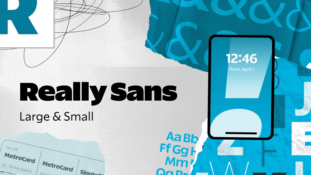
ALT A collage of images found in the case study, including an illustration of a mobile phone, and torn pieces of paper with alphabets on them.
2
292
Lettermatic retweeted
17 Feb 2023
I remember sitting at my desk and the image crossed my mind, of making letters out of construction paper, with the positive and negative shapes cut out separately.
1
3
10
1,131
Lettermatic retweeted
17 Feb 2023
I’ve been watching the incredible PsychOdyssey series from @2PProductions and @DoubleFine, about the making of Psychonauts 2.
It made me want to share a story of how we made the fonts for that game, that I haven’t really explained in-depth before.
(Thread! 🧵)
2
9
50
12,181